


自定义开关控件,效果一般,相互学习,谢谢。源码和示例如下:
Custom Switch Examples
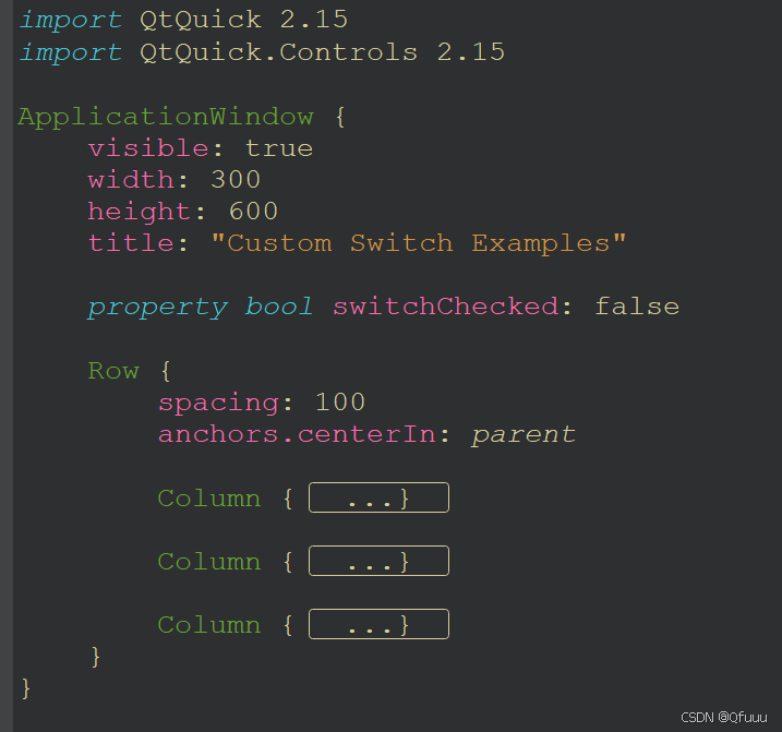
import QtQuick 2.15
import QtQuick.Controls 2.15
ApplicationWindow {
visible: true
width: 300
height: 600
title: "Custom Switch Examples"
property bool switchChecked: false
Row {
spacing: 100
anchors.centerIn: parent
Column {
spacing: 50
Text {
text: "卡通风格的开关"
font.family: "Arial"
font.bold: true
font.pixelSize: 24
color: "#333333"
anchors.horizontalCenter: parent.horizontalCenter
}
Rectangle {
width: 80
height: 40
radius: 20
color: switchChecked ? "#4CAF50" : "#CCCCCC"
border.color: "black"
border.width: 1
// Handle
Rectangle {
width: 35
height: 35
radius: 17.5
color: switchChecked ? "white" : "gray"
border.color: "black"
border.width: 1
x: switchChecked ? parent.width - width - 5 : 5
y: (parent.height - height) / 2
// Add text inside the handle
Text {
anchors.centerIn: parent
text: switchChecked ? "开" : "关"
color: switchChecked ? "black" : "white"
font.bold: true
font.pixelSize: 14
}
Behavior on x {
NumberAnimation { duration: 200 }
}
}
MouseArea {
anchors.fill: parent
onClicked: switchChecked = !switchChecked
}
}
Rectangle {
width: 80
height: 40
radius: 20
color: switchChecked ? "#3F51B5" : "#B0BEC5"
border.color: "black"
border.width: 1
// Handle with shadow
Rectangle {
width: 35
height: 35
radius: 17.5
color: switchChecked ? "white" : "#FFC107"
border.color: "black"
border.width: 1
x: switchChecked ? parent.width - width - 5 : 5
y: (parent.height - height) / 2
// Add text inside the handle
Text {
anchors.centerIn: parent
text: switchChecked ? "开" : "关"
color: switchChecked ? "black" : "black"
font.bold: true
font.pixelSize: 14
}
Behavior on x {
NumberAnimation { duration: 200 }
}
}
MouseArea {
anchors.fill: parent
onClicked: switchChecked = !switchChecked
}
}
Rectangle {
width: 80
height: 40
radius: 20
color: switchChecked ? "#BBDEFB" : "#E0E0E0"
border.color: "black"
border.width: 1
// Handle
Rectangle {
width: 35
height: 35
radius: 17.5
color: switchChecked ? "#2196F3" : "#FFFFFF"
border.color: switchChecked ? "#1976D2" : "#B0BEC5"
border.width: 2
x: switchChecked ? parent.width - width - 5 : 5
y: (parent.height - height) / 2
// Add text inside the handle
Text {
anchors.centerIn: parent
text: switchChecked ? "开" : "关"
color: switchChecked ? "white" : "black"
font.bold: true
font.pixelSize: 14
}
Behavior on x {
NumberAnimation { duration: 200 }
}
}
MouseArea {
anchors.fill: parent
onClicked: switchChecked = !switchChecked
}
}
Rectangle {
width: 80
height: 40
radius: 20
color: switchChecked ? "#E91E63" : "#B0BEC5"
border.color: "black"
border.width: 1
// Handle with gradient
Rectangle {
width: 35
height: 35
radius: 17.5
color: "white"
border.color: "black"
border.width: 1
x: switchChecked ? parent.width - width - 5 : 5
y: (parent.height - height) / 2
gradient: Gradient {
GradientStop { position: 0.0; color: switchChecked ? "#FF9800" : "#FF5722" }
GradientStop { position: 1.0; color: switchChecked ? "#FF5722" : "#FF9800" }
}
// Add text inside the handle
Text {
anchors.centerIn: parent
text: switchChecked ? "开" : "关"
color: "black"
font.bold: true
font.pixelSize: 14
}
Behavior on x {
NumberAnimation { duration: 200 }
}
}
MouseArea {
anchors.fill: parent
onClicked: switchChecked = !switchChecked
}
}
}
Column {
spacing: 50
Text {
text: "自定义的开关"
font.family: "Arial"
font.bold: true
font.pixelSize: 24
color: "#333333"
anchors.horizontalCenter: parent.horizontalCenter
}
ListModel {
id: switchModel
ListElement { label: "Wi-Fi"; style: "circle" }
ListElement { label: "Wi-Fi"; style: "text" }
ListElement { label: "Wi-Fi"; style: "textWithLabel" }
ListElement { label: "Bluetooth"; style: "modern" }
}
Repeater {
model: switchModel
Rectangle {
width: 100
height: 40
radius: height / 2
color: {
switch (model.style) {
case "circle":
return switchChecked ? "lightgreen" : "lightcoral";
case "text":
return switchChecked ? "lightyellow" : "lightgray";
case "textWithLabel":
return switchChecked ? "#D3F8D3" : "#F8D3D3";
case "modern":
return switchChecked ? "#4CAF50" : "#B0BEC5";
default:
return "gray";
}
}
border.color: "gray"
border.width: 1
// Handle
Rectangle {
width: 35
height: 35
radius: 17.5
color: "white"
border.color: "black"
border.width: 1
x: switchChecked ? parent.width - width - 5 : 5
y: (parent.height - height) / 2
// Add text inside the handle
Text {
anchors.centerIn: parent
text: switchChecked ? "开" : "关"
color: "black"
font.bold: true
font.pixelSize: 14
}
Behavior on x {
NumberAnimation { duration: 200 }
}
}
MouseArea {
anchors.fill: parent
onClicked: switchChecked = !switchChecked
}
}
}
}
Column {
spacing: 50
Text {
text: "系统默认开关"
font.family: "Arial"
font.bold: true
font.pixelSize: 24
color: "#333333"
anchors.horizontalCenter: parent.horizontalCenter
}
Switch {
text: qsTr("Wi-Fi")
checked: switchChecked
}
Switch {
text: qsTr("Bluetooth")
checked: switchChecked
}
Switch {
text: qsTr("Wi-Fi")
checked: switchChecked
}
Switch {
text: qsTr("Bluetooth")
checked: switchChecked
}
}
}
}


 扫一扫
扫一扫


 1092
1092

 被折叠的 条评论
为什么被折叠?
被折叠的 条评论
为什么被折叠?
 到【灌水乐园】发言


