


demo 来自 https://github.com/cjmdaixi/DarkSwitch添加链接描述
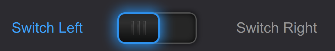
效果图

核心代码
DarkSwitch.qml
import QtQuick 2.7
import QtQuick.Controls 2.2
import QtGraphicalEffects 1.0
import QtQuick.Layouts 1.3

Switch {
    id: control
    indicator: Item{
        id: indicatorItem
        implicitWidth: 135
        implicitHeight: 58
        x: control.leftPadding
        y: parent.height / 2 - height / 2
        RectangularGlow {
            id: effect
            anchors.fill: boundaryRect
            glowRadius: 3
            spread: 0.2
            color: "black"
            cornerRadius: boundaryRect.radius + glowRadius
        }
        Item {
            id: src
            anchors.fill: boundaryRect

            Rectangle {
                anchors.centerIn: parent
                width: src.width - 2
                height: src.height - 2
                color: "#262626"
                radius: boundaryRect.radius
            }
        }

        InnerShadow {
            anchors.fill: src
            cached: true
            horizontalOffset: 0
            verticalOffset: 0
            radius: 16
            samples: 32
            color: "#000000"
            smooth: true
            source: src
        }
        Rectangle{
            id: boundaryRect
            anchors.fill: parent
            anchors.margins: 3
            border{color: "#515151"; width: 2}
            radius: 12
            color: "transparent"
        }

        Item{
            id: handle
            x: control.checked ? boundaryRect.x + boundaryRect.width - width + 2 : boundaryRect.x - 2
            y: parent.height / 2 - height / 2
            width: 70
            height: boundaryRect.height
            Behavior on x{
                NumberAnimation{duration: 100}
            }

            RectangularGlow {
                id: handleEffect
                anchors.fill: handleRect
                glowRadius: 15
                spread: 0.2
                color: "#2e91ed"
                cornerRadius: handleRect.radius + glowRadius
            }
            Rectangle {
                id: handleRect
                radius: boundaryRect.radius
                anchors.fill: parent
                border{color: "#2e91ed"; width: 3}
                gradient: Gradient {
                    GradientStop { position: 0.0; color: "#272727" }
                    GradientStop { position: 0.33; color: "#2e2e2e" }
                    GradientStop { position: 1.0; color: "#0c0c0c" }
                }
            }

            RowLayout{
                id: vLineRow
                anchors.centerIn: parent
                Repeater{
                    model: 3
                    delegate: vLineComp
                }
            }

            Component{
                id: vLineComp
                Rectangle{
                    id: vLine
                    width: 5
                    height: 24
                    gradient: Gradient {
                        GradientStop { position: 0.0; color: "#545454" }
                        GradientStop { position: 1.0; color: "#2b2b2b" }
                    }
                    Rectangle{
                        anchors.centerIn: parent
                        width: 3
                        height: 22
                        gradient: Gradient {
                            GradientStop { position: 0.0; color: "#2c2c2c" }
                            GradientStop { position: 0.33; color: "#373737" }
                            GradientStop { position: 1.0; color: "#1b1b1b" }
                        }
                    }
                }
            }
        }
    }
}
从中学习到什么
- 是个Switch类型,重定义Switch的indicator属性。
- 蓝色圆角矩形有光晕效果,且是向外发散的,可以采用RectangularGlow来实现。
- 黑色凹框有向内的阴影,这个可以用InnerShadow来实现。
- 光晕滑块上的黑色填充是渐变的,因此需要使用Rectangle的gradient属性。
Glow
Glow 效果会模糊光源的alpha通道,并使用颜色将其着色,然后将其放置在光源后面,从而在对象周围产生光晕或辉光。模糊边缘的质量可以通过采样samples和半径radius 来控制,发光强度可以通过spread 来改变。
Properties
- cached : alias
- color : alias
- radius : alias
- samples : alias
- source :alias
- spread : alias
- transparentBorder : alias
Glow 是通过使用高斯模糊实时模糊图像创建的。执行blur live是一项成本高昂的操作。在高端图形硬件上,即使采样数适中,全屏高斯模糊也只能以每秒60帧的速度运行。
注意:使用OpenGL运行时,此效果可用。
RectangularGlow
矩形的Glow

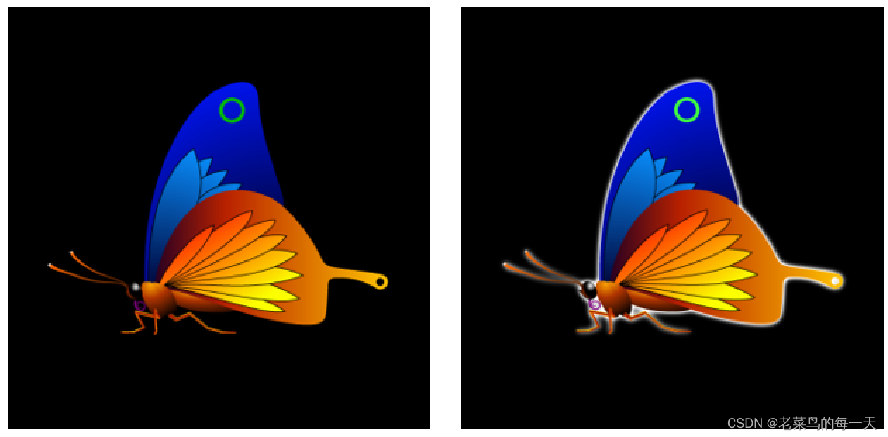
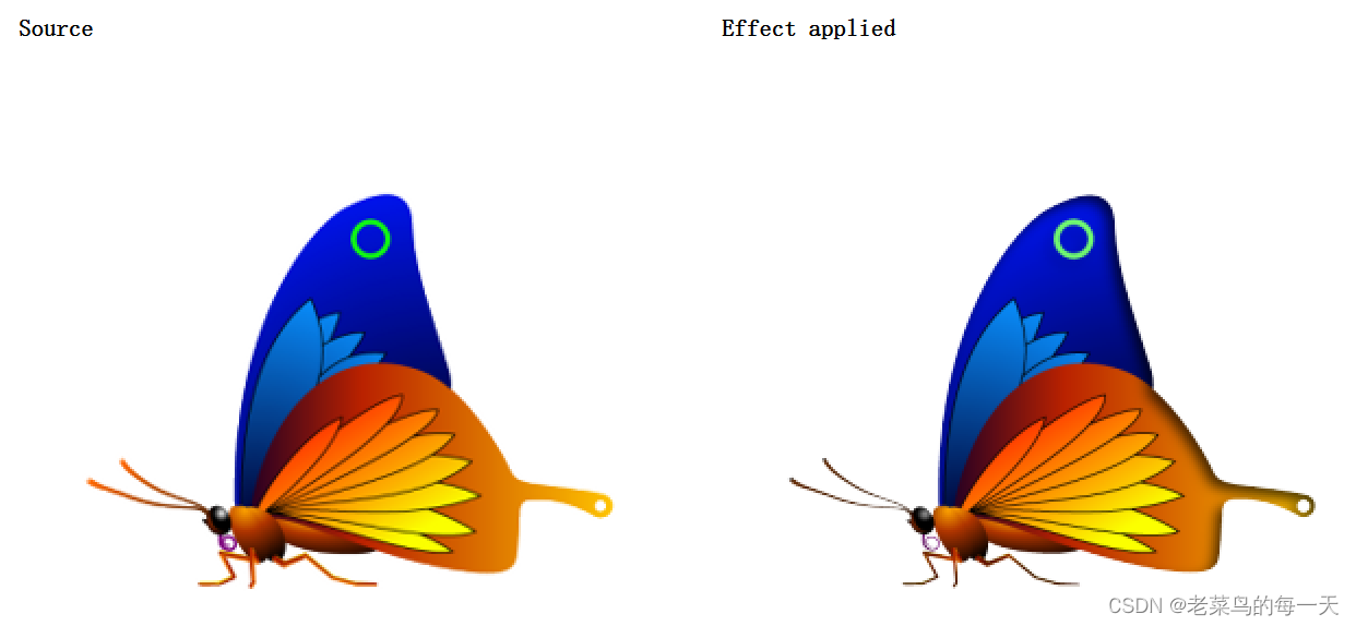
InnerShadow
默认情况下,该效果会生成高质量的阴影图像,因此阴影的渲染速度可能不是最高的。渲染速度会降低,尤其是阴影边缘严重软化时。对于需要更快渲染速度且不需要最高视觉质量的用例,可以将属性 fast设置为true。
Properties
- cached : bool
- color : color
- fast : bool
- horizontalOffset : real
- radius : real
- samples : int
- source : variant
- spread : real
- verticalOffset : real
  import QtQuick 2.12
  import QtGraphicalEffects 1.12

  Item {
      width: 300
      height: 300

      Rectangle {
          anchors.fill: parent
      }

      Image {
          id: butterfly
          source: "images/butterfly.png"
          sourceSize: Qt.size(parent.width, parent.height)
          smooth: true
          visible: false
      }

      InnerShadow {
          anchors.fill: butterfly
          radius: 8.0
          samples: 16
          horizontalOffset: -3
          verticalOffset: 3
          color: "#b0000000"
          source: butterfly
      }
  }


 279
279


 被折叠的 条评论
为什么被折叠?
被折叠的 条评论
为什么被折叠?
 到【灌水乐园】发言


