


一. 初体验
1. 基本配置
<body>
    <!-- 必须设置高度 -->
    <div id="main" style="width: 800px; height: 400px"></div>
    <!--
      window.echarts 对象
     -->
    <script src="../libs/echarts-5.3.3.js"></script>
    <script>
      // 1.拿到echarts的实例对象
      var myChart = echarts.init(document.getElementById("main"), null, {
        renderer: 'svg'
        // renderer: 'canvas'
      });
      // 2.编写图表配置项和数据
      var option = {
        xAxis: {
          data: ["衬衫", "羊毛衫", "雪纺衫", "裤子", "高跟鞋", "袜子"],
        },
        yAxis: {},
        series: [
          {
            name: "销量",
            type: "bar",
            data: [5, 20, 36, 10, 10, 20],
          },
        ],
      };
      // 3.将图表显示到界面上
      myChart.setOption(option);
    </script>
  </body>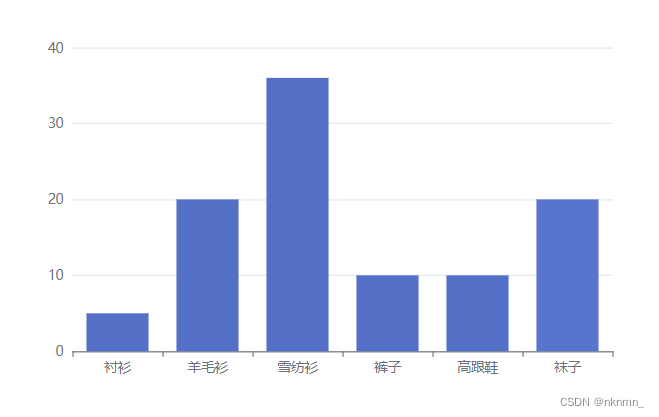
2. 切换渲染引擎 和 主题色
echarts.init(document.getElementById("main"), null, {renderer: "svg"});

echarts.init(document.getElementById("main"), "dark", {renderer: "canvas"});
二. 配置项(组件)
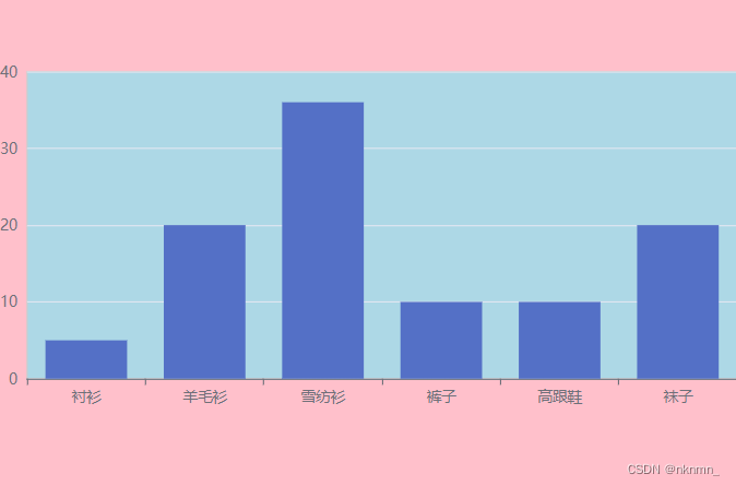
1. grid 网格
var option = {
    backgroundColor: "pink",
    grid: {
        show: true,
        backgroundColor: "lightblue",
        left: 0,  // 相对于组外层容器的位置
        right: 0,
        // top: 0,
        // bottom: 0,
        containLabel: true, // 是否保留坐标轴坐标标签
    },
    xAxis: {
        data: ["衬衫", "羊毛衫", "雪纺衫", "裤子", "高跟鞋", "袜子"],
    },
    yAxis: {},
    series: [
        {
        name: "销量",
        type: "bar",
        data: [5, 20, 36, 10, 10, 20],
        },
    ],
};
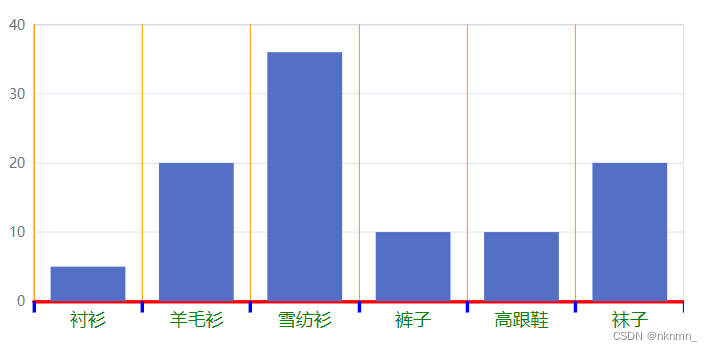
2. x/y 坐标轴
xAxis: {
    show: true,
    name: "类目坐标",  // 轴坐标名称

    type: "category", // 类目坐标才有data选项
    // type: "value",
    data: ["衬衫", "羊毛衫", "雪纺衫", "裤子", "高跟鞋", "袜子"],

    axisLine: { // 坐标轴轴线相关设置。
        show: true,
        lineStyle: {
        color: "red",
        width: 3,
        },
    },

    axisLabel: { // 坐标轴标签的相关设置。
        show: true,
        color: "green",
        fontSize: 16,
    },

    axisTick: {  // 坐标轴刻度相关设置。
        show: true,
        length: 10,
        lineStyle: {
        color: "blue",
        width: 3,
        },
    },

    splitLine: { // 坐标轴在 grid 区域中的分隔线。
        show: true,
        lineStyle: {
        color: "orange",
        width: 1,
        },
    },
}
3. series 系列
1. data 支持的书写方式
series: [
    {
    name: "产品销量柱形图",
    type: "bar",
    label: {
        show: true,
    },

    // 方式一
    // 按照坐标轴索引进行匹配,顺序不可变  [value1, value2]
    data: [5, 20, 36, 10, 10, 20],


    // 方式二
    // [index, value]
    data: [
      [0, 5],
      [1, 20],
      [2, 36],
      [3, 10],
      [4, 10],
      [5, 20],
    ],


    // 方式三(推荐)
    data: [
        {
            value: 5,
            name: "衬衫", // 数据项名称, 比如pie系列 tooltip 需要用到
        },
        {
            value: 20,
            name: "羊毛衫",
        },
        {
            value: 36,
            name: "雪纺衫",
        },
        {
            value: 10,
            name: "裤子",
        },
        {
            value: 10,
            name: "高跟鞋",
        },
        {
            value: 20,
            name: "袜子",
        },
    ],


    // 方式四
    data: [
      {
        value: [0, 5], // 数组第一项为x轴值,第二项为y轴值
        name: "衬衫", // 数据项名称, 比如pie系列 tooltip 需要用到
      },
      {
        value: [1, 20],
        name: "羊毛衫",
      },
      {
        value: [2, 36],
        name: "雪纺衫",
      },
      {
        value: [3, 10],
        name: "裤子",
      },
      {
        value: [4, 10],
        name: "高跟鞋",
      },
      {
        value: [5, 20],
        name: "袜子",
      },
    ],


    // 方式五(地理坐标系推荐)
    data: [
      {
        value: [0, 5, 500], // 第一项为x轴或纬度值,第二项为y或维度轴值,第三项以后为扩展值
        name: "衬衫", // 数据项名称, 比如pie系列 tooltip 需要用到
      },
      {
        value: [1, 20, 400],
        name: "羊毛衫",
      },
      {
        value: [2, 36, 200],
        name: "雪纺衫",
      },
      {
        value: [3, 10, 100],
        name: "裤子",
      },
      {
        value: [4, 10, 600],
        name: "高跟鞋",
      },
      {
        value: [5, 20, 300],
        name: "袜子",
      },
    ],
  },
],
2. type 图表类型
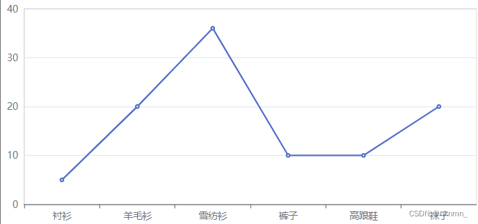
series: [
    {
        name: "产品销量柱形图",
        type: "line", // line 折线图  bar 柱状图  scatter 散点图  pie 饼图
        data: [5, 20, 36, 10, 10, 20],
    },
],
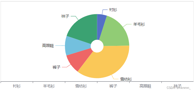
// 饼图
series: [
    {
        name: "产品销量柱形图",
        type: "pie",

        // 饼图的中心点相对于容器的位置
        center: ["50%", "50%"],

        // 饼图的直径百分比是参照容器高和宽中较小一项
        // [内圆的直径,外圆的直径]
        radius: ["10%", "50%"],

        //area玫瑰图(南丁格尔图)。 圆心角一样,通过半径展现数据大小(默认false)
        // roseType: "area",

        data: [
            {
                value: 5,
                name: "衬衫", // 数据项名称, 比如pie系列 tooltip 需要用到
            },
            {
                value: 20,
                name: "羊毛衫",
            },
            {
                value: 36,
                name: "雪纺衫",
            },
            {
                value: 10,
                name: "裤子",
            },
            {
                value: 10,
                name: "高跟鞋",
            },
            {
                value: 20,
                name: "袜子",
            },
        ],
    },
], 
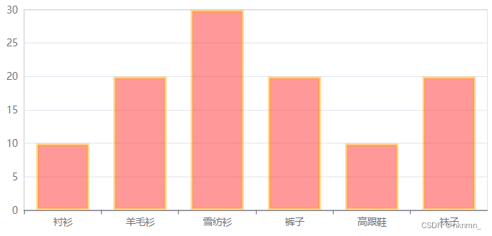
3. label 图表的标签
series: [
    {
        name: "产品销量柱形图",
        type: "bar",

        label: { // 系列图形上的文本标签
            show: true,
            position: [10, 20], // 标签所处于每项图表中的位置
            color: "white",
            fontSize: "20px",
        },
        data: [10, 20, 30, 20, 10, 20]
    },
]
4. itemStyle 图形默认色
series: [
    {
        name: "产品销量柱形图",
        type: "bar",
        itemStyle: { // 系列图形的样式
            color: "red", // 图形颜色
            borderColor: "orange", // 边框颜色
            borderWidth: 4,  // 边框宽度
            opacity: 0.4,   // 图形颜色的透明度
        },
        data: [10, 20, 30, 20, 10, 20]
    },
]
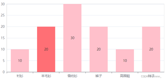
5. emphasis 鼠标悬浮时的高亮色
series: [
    {
        name: "产品销量柱形图",
        type: "bar",
        label: {
            show: true
        },
        itemStyle:{
            color: 'pink'
        },

        emphasis: { // 鼠标 hover 时的高亮色
            label: {
                show: true,
                color: "gold",
            },
            itemStyle:{
                color: 'red'
            },
            // ...
        },

        data: [10, 20, 30, 20, 10, 20]
    },
]
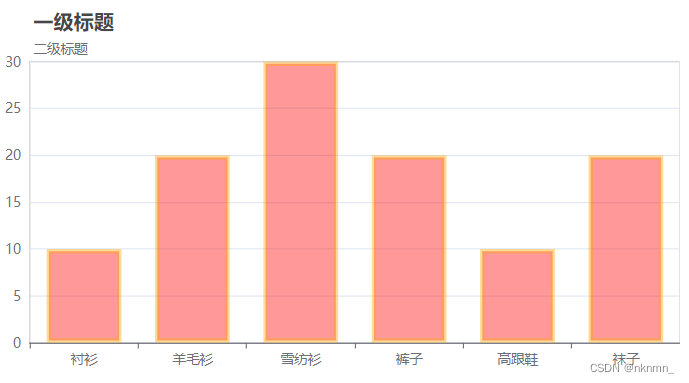
4. title 标题组件
title: {
    text: "一级标题",
    left: 20,
    top: 10,
    subText: "二级标题"
    // ...
},
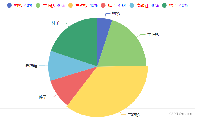
5. legend 图例组件
legend: {
    show: true,
    // width: 50, // 图例组件的总宽度,默认自适应
    itemWidth: 20, // 每个图例标记的图形宽度。
    icon: "circle",
    //   top: 10,
    // bottom: 0,

    // 用来格式化图例标记文本,支持字符串模板和回调函数两种形式
    // formatter: "liu-{name}",
    formatter: function (name) {
        // 富文本语法:{style_name|value} 不能有空格
        return name + "  {countSty|40%}";
    },
    textStyle: {
        color: "red",
        rich: { // 在 rich 里面,可以自定义富文本样式
            countSty: {
            color: "blue",
            },
        },
    },
}, 
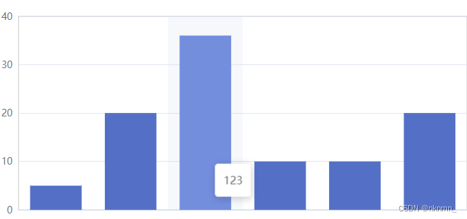
6. tooltip 提示组件
tooltip: {
    show: true,

    // 使用了 trigger ,一般也结合 axisPointer
    trigger: "axis",  // 默认是 item

    axisPointer: {
        type: "shadow", //  (默认是竖线 line)  (横线 + 竖线 cross)  (柱状 shadow)
    },
    formatter: "123"  // 自定义标签的显示内容
},
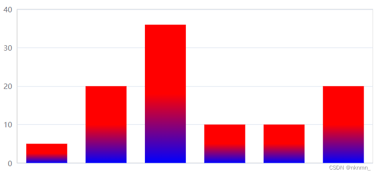
7. 图形渐变色
color: {
  // 渐变
  type: "linear",
  // 坐标配置  [0,0]  =>  [0,1]
  x: 0,
  y: 0,
  x2: 0,
  y2: 1,
  //
  colorStops: [
    {
      offset: 0.5,
      color: "red",
    },
    {
      offset: 1,
      color: "blue",
    },
  ],
},
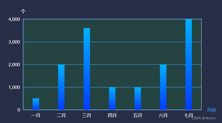
三. 图表实例
1. 柱形图
var option = {
  backgroundColor: "rgba(40, 46, 72)",
  grid: {
    show: true,
    backgroundColor: "rgba(0, 255, 0, 0.1)",
    left: "5%",
    right: "10%",
    top: "30%",
    bottom: "5%",
    containLabel: true, // grid 区域是否包含坐标轴的刻度标签
  },
  tooltip: {},
  xAxis: {
    name: "月份",
    axisLine: {
      show: true,
      lineStyle: {
        color: "#42A4FF",
      },
    },
    axisTick: {
      show: false,
    },
    axisLabel: {
      color: "white",
    },

    data: ["一月", "二月", "三月", "四月", "五月", "六月", "七月"],
  },
  yAxis: {
    name: "个",
    nameTextStyle: {
      color: "white",
      fontSize: 13,
    },
    axisLine: {
      show: true,
      lineStyle: {
        color: "#42A4FF",
      },
    },
    axisTick: {
      show: false,
    },
    splitLine: {
      show: true,
      lineStyle: {
        color: "#42A4FF",
      },
    },
    axisLabel: {
      color: "white",
    },
  },
  series: [
    {
      name: "销量",
      type: "bar",
      barWidth: 17,
      itemStyle: {
        color: {
          type: "linear",
          x: 0,
          y: 0,
          x2: 0,
          y2: 1,
          colorStops: [
            {
              offset: 0,
              color: "#01B1FF", // 0% 处的颜色
            },
            {
              offset: 1,
              color: "#033BFF", // 100% 处的颜色
            },
          ],
        },
      },
      data: [500, 2000, 3600, 1000, 1000, 2000, 4000],
    },
  ],
};


 861
861


 被折叠的 条评论
为什么被折叠?
被折叠的 条评论
为什么被折叠?
 到【灌水乐园】发言


