


50 天学习 50 个项目 - HTMLCSS and JavaScript
day24-Content placeholder(内容占位符)
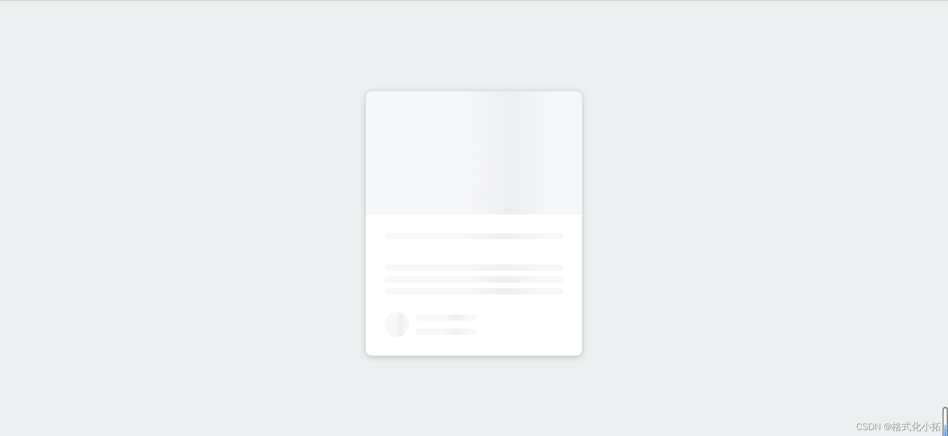
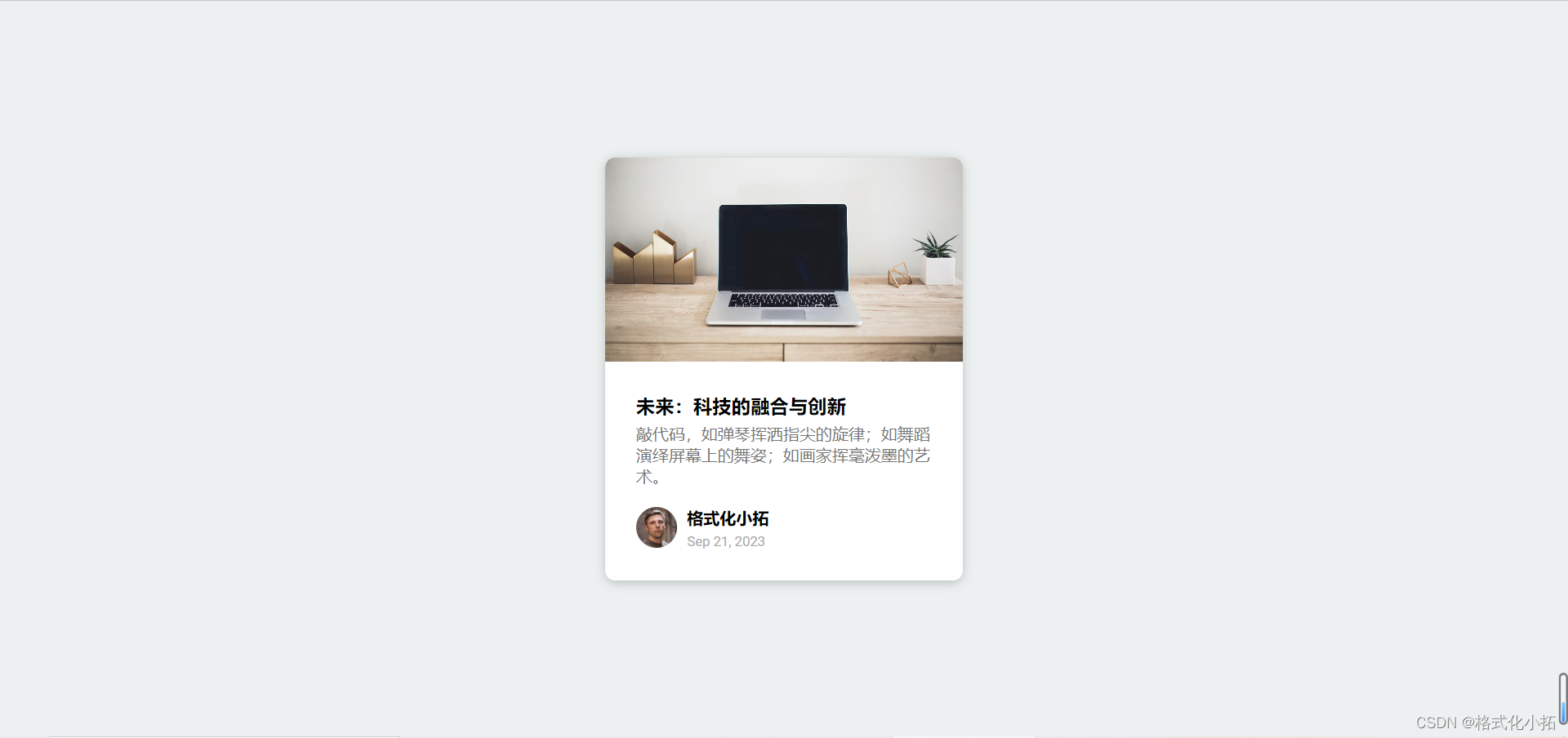
效果
index.html
<!DOCTYPE html>
<html lang="en">
<head>
<meta charset="UTF-8" />
<meta name="viewport" content="width=device-width, initial-scale=1.0" />
<title>Content Placeholder</title>
<link rel="stylesheet" href="style.css" />
</head>
<body>
<!-- 卡片 -->
<div class="card">
<!-- 卡片头部 显示图片 -->
<div class="card-header animated-bg" id="header"> </div>
<!-- 卡片内容 -->
<div class="card-content">
<!-- 标题 -->
<h3 class="card-title animated-bg animated-bg-text" id="title">
</h3>
<!-- 文本 -->
<p class="card-excerpt" id="excerpt">
<span class="animated-bg animated-bg-text"> </span>
<span class="animated-bg animated-bg-text"> </span>
<span class="animated-bg animated-bg-text"> </span>
</p>
<!-- 作者 -->
<div class="author">
<!-- 头像 -->
<div class="profile-img animated-bg" id="profile_img"> </div>
<!-- 作者信息 -->
<div class="author-info">
<!-- 名字 -->
<strong class="animated-bg animated-bg-text" id="name"> </strong>
<!-- 日期 -->
<small class="animated-bg animated-bg-text" id="date"> </small>
</div>
</div>
</div>
</div>
<script src="script.js"></script>
</body>
</html>
style.css
@import url('https://fonts.googleapis.com/css2?family=Roboto:wght@400;700&display=swap');

* {
    box-sizing: border-box;
}

body {
    background-color: #ecf0f1;
    font-family: 'Roboto', sans-serif;
    /* 垂直居中 */
    display: flex;
    align-items: center;
    justify-content: center;
    height: 100vh;
    overflow: hidden;
    margin: 0;
}

img {
    max-width: 100%;
}

/* 卡片 */
.card {
    box-shadow: 0 2px 10px rgba(0, 0, 0, 0.2);
    border-radius: 10px;
    overflow: hidden;
    width: 350px;
}

/* 卡片头部 */
.card-header {
    height: 200px;
}

/* 卡片头部的图片 */
.card-header img {
    /* 将img图片元素会被拉伸或缩放,以使其完全覆盖其容器(包含框),同时保持其原始的宽高比例。这意味着元素的内容可能会被裁剪,以确保填充满整个容器,且不会出现空白或变形。 */
    object-fit: cover;
    height: 100%;
    width: 100%;
}

/* 卡片主体内容 */
.card-content {
    background-color: #fff;
    padding: 30px;
}

/* 卡片标题 */
.card-title {
    height: 20px;
    margin: 0;
}

/* 卡片内容 */
.card-excerpt {
    color: #777;
    margin: 10px 0 20px;
}

/* 作者 */
.author {
    display: flex;
}

/* 作者头像 */
.profile-img {
    border-radius: 50%;
    overflow: hidden;
    height: 40px;
    width: 40px;
}

/* 作者信息 */
.author-info {
    display: flex;
    flex-direction: column;
    justify-content: space-around;
    margin-left: 10px;
    width: 100px;
}

/* 日期 */
.author-info small {
    color: #aaa;
    margin-top: 5px;
}

/* 重点 */

/* 背景 */
.animated-bg {
    background-image: linear-gradient(to right,
            #f6f7f8 0%,
            #edeef1 10%,
            #f6f7f8 20%,
            #f6f7f8 100%);
    background-size: 200% 100%;
    animation: bgPos 1s linear infinite;
}

/* 文本背景 */
.animated-bg-text {
    border-radius: 50px;
    display: inline-block;
    margin: 0;
    height: 10px;
    width: 100%;
}

/* 实现一种加载动画 */
@keyframes bgPos {
    0% {
        background-position: 50% 0;
    }

    100% {
        background-position: -150% 0;
    }
}
script.js
// 重点 flex animation background
// 1.获取元素节点
const header = document.getElementById('header')
const title = document.getElementById('title')
const excerpt = document.getElementById('excerpt')
const profile_img = document.getElementById('profile_img')
const name = document.getElementById('name')
const date = document.getElementById('date')

const animated_bgs = document.querySelectorAll('.animated-bg')
const animated_bg_texts = document.querySelectorAll('.animated-bg-text')
// 过2秒获取数据
setTimeout(getData, 2000)
// 获取数据
function getData() {
    header.innerHTML =
        '<img src="https://images.unsplash.com/photo-1496181133206-80ce9b88a853?ixlib=rb-1.2.1&ixid=eyJhcHBfaWQiOjEyMDd9&auto=format&fit=crop&w=2102&q=80" alt="" />'
    title.innerHTML = '未来:科技的融合与创新'
    excerpt.innerHTML =
        '敲代码,如弹琴挥洒指尖的旋律;如舞蹈演绎屏幕上的舞姿;如画家挥毫泼墨的艺术。'
    profile_img.innerHTML =
        '<img src="https://randomuser.me/api/portraits/men/36.jpg" alt="" />'
    name.innerHTML = '格式化小拓'
    date.innerHTML = 'Sep 21, 2023'
    // 去除加载效果
    animated_bgs.forEach((bg) => bg.classList.remove('animated-bg'))
    animated_bg_texts.forEach((bg) => bg.classList.remove('animated-bg-text'))
}


 270
270


 被折叠的 条评论
为什么被折叠?
被折叠的 条评论
为什么被折叠?
 到【灌水乐园】发言


