


目录
1、视图容器 view
- 普通视图区域
- 类似于HTML中的div,是一个块级元素
- 常用来实现页面的布局效果
页面结构:
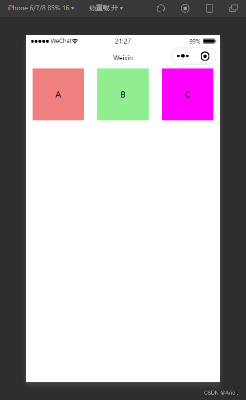
<!--pages/view/view.wxml-->
<view class="container1">
      <view>A</view>
      <view>B</view>
      <view>C</view>
</view>
页面样式:
/* pages/view/view.wxss */
.container1 view{
    width: 100px;/*盒子的宽度与高度*/
    height: 100px;
    text-align: center;/*居中显示*/
    line-height: 100px; /*文本的行间距*/
}
.container1 view:nth-child(1){
    background-color:lightcoral;/*设置子块的背景颜色*/
}
.container1 view:nth-child(2){
    background-color: lightgreen;
}
.container1 view:nth-child(3){
    background-color: magenta;
}
.container1{
    display: flex;/*盒子横向布局*/
    justify-content: space-around;/*分散布局*/
}
2、滚动视图容器 scroll-view
- 可滚动的视图区域
- 常用来实现滚动列表效果
页面结构:
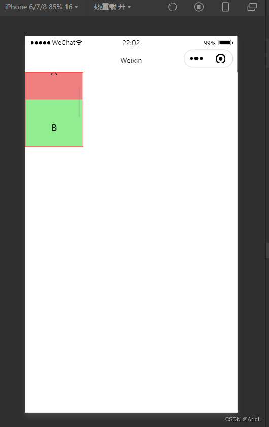
<!--pages/view/view.wxml-->
<!-- scroll-x 横向滚动 scroll-y 纵向滚动 -->
<scroll-view class="container1" scroll-y>
      <view>A</view>
      <view>B</view>
      <view>C</view>
</scroll-view>
页面样式:
/* pages/view/view.wxss */
.container1 view{
    width: 100px;/*盒子的宽度与高度*/
    height: 100px;
    text-align: center;/*居中显示*/
    line-height: 100px; /*文本的行间距*/
}
.container1 view:nth-child(1){
    background-color:lightcoral;/*设置子块的背景颜色*/
}
.container1 view:nth-child(2){
    background-color: lightgreen;
}
.container1 view:nth-child(3){
    background-color: magenta;
}
.container1{
    /*包裹滚动列表的边框线及其宽度*/
   border :1px solid red;
   width: 100px;
   /*给其强制限定一个高度,超过该高度的部分将进行滚动显示*/
    height: 130px;

}
3.轮播图 swiper&swiper-item
- 滑块视图容器
- 可内置swiper-item组件
- 一般用来实现图片的自动播放展示(这里以view块代替展示)
页面结构:
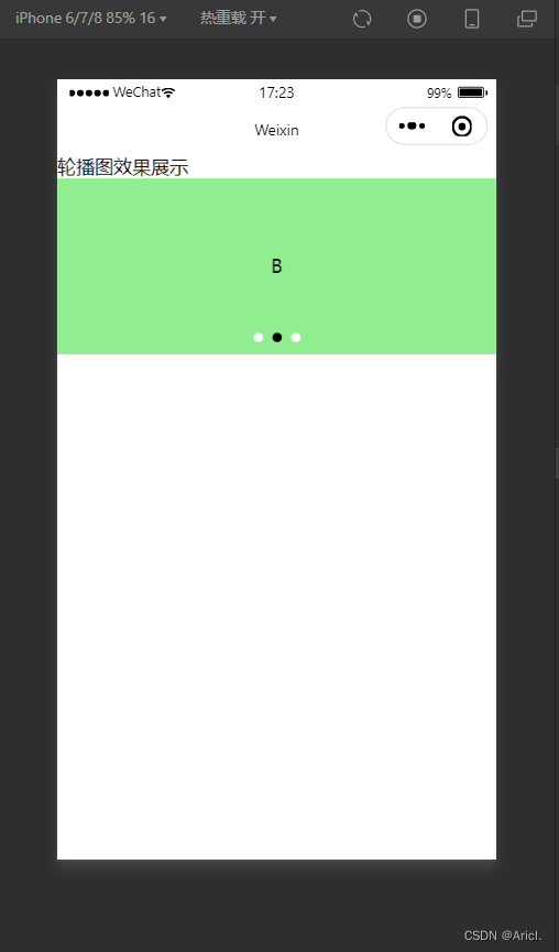
<!--pages/swiper/swiper.wxml-->
<text>轮播图效果展示</text>
<!-- 轮播图的结构 ,最外层为包裹性容器-->
<swiper class="swiper-container" indicator-dots indicator-color="white" autoplay circular>
      <!-- 第一张轮播图 -->
    <swiper-item>
      <view class="item">A</view>
    </swiper-item>
    <!-- 第二张轮播图 -->
    <swiper-item>
       <view class="item">B</view>
    </swiper-item>
    <!-- 第三张轮播图 -->
    <swiper-item>
       <view class="item">C</view>
    </swiper-item>
</swiper>
页面样式:
/* pages/swiper/swiper.wxss */
.swiper-container{
    height: 150px;
}
.item{
    height: 100%;
    line-height: 150px;
    text-align: center;
}
swiper-item:nth-child(1) .item{
    background-color: lightblue;
}
swiper-item:nth-child(2) .item{
    background-color: lightgreen;
}
.swiper-item:nth-child(3) .item{
    background-color: lightseagreen;
}
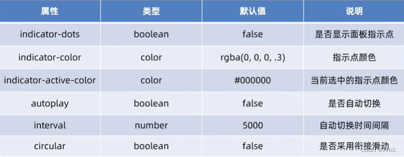
一些其它常用属性
4.文本组件text&富文本组件rich-text
- text类似于HTML中的span标签,是一个行内元素
- text可实现长按选中复制的功能(只能使用text)
- rich-text可以通过nodes属性节点,把HTML字符串渲染成对应的UI结构
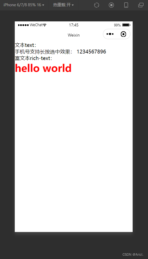
页面结构:
<!--文本text与富文本rich-text的演示-->
<text>文本text:</text>
<view>
手机号支持长按选中效果:
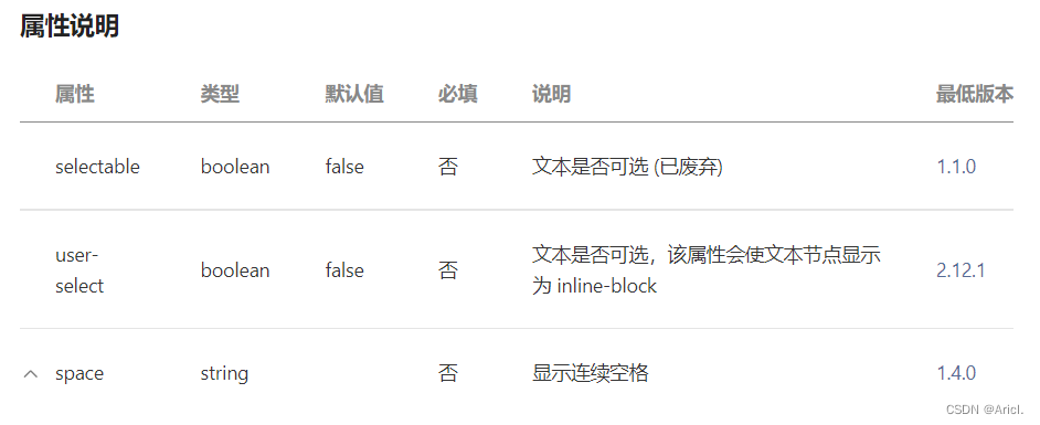
<!-- selectable属性表示文本可长按被选中,且只有在text标签中才有效 -->
<text selectable>1234567896</text>
</view>
<text>富文本rich-text:</text>
<rich-text nodes="<h1 style='color:red;'>hello world</h1>"></rich-text>属性
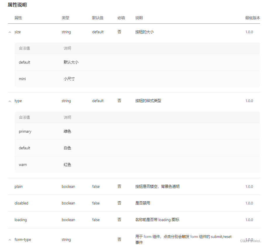
5.按钮组件button
- 其功能比HTML中的button丰富
- 可以通过open-type属性可以调用微信提供的各种功能(客服、转发、获取用户的授权、获取用户信息、打开定位服务等)
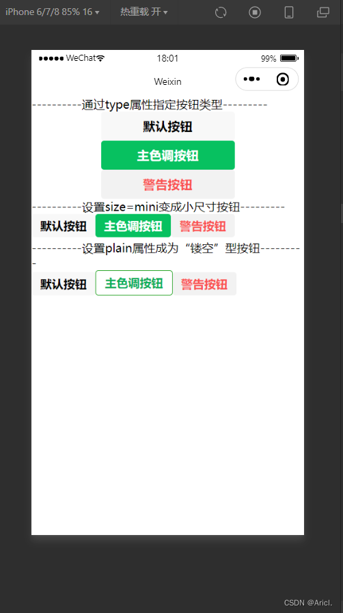
页面结构:
<view>----------通过type属性指定按钮类型---------</view>
<button>默认按钮</button>
<button type="primary">主色调按钮</button>
<button type="warn">警告按钮</button>
<view>----------设置size=mini变成小尺寸按钮---------</view>
<button size="mini">默认按钮</button>
<button type="primary" size="mini">主色调按钮</button>
<button type="warn" size="mini">警告按钮</button>
<view>----------设置plain属性成为“镂空”型按钮---------</view>
<button size="mini" plain="">默认按钮</button>
<button type="primary" size="mini" plain>主色调按钮</button>
<button type="warn" size="mini" plain="">警告按钮</button>
属性
6.图片组件image
- 用于展示图片元素
- 组件默认的宽度约为300px,高度约为240px
页面结构:
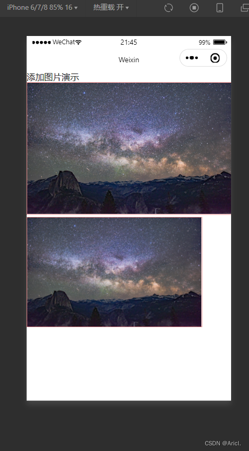
<!--pages/image/image.wxml-->
<text>添加图片演示</text>
<!-- heightFix高度固定,宽度自适应填满边框区域 -->
<image src="/images/2.jfif" mode="heightFix"></image>
<!-- widthFix宽度固定,高度自适应填满边框区域 -->
<image src="/images/2.jfif" mode="widthFix"></image>
属性
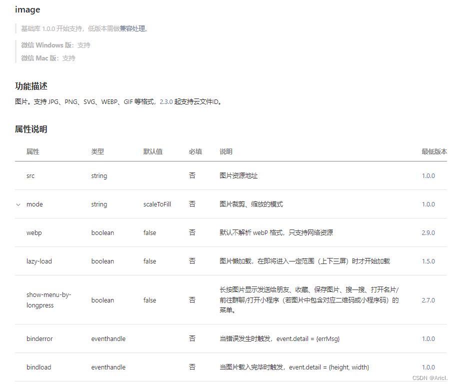
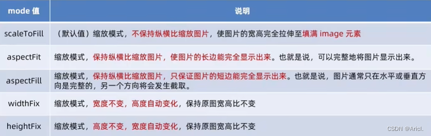
image mode重要属性


 1万+
1万+


 被折叠的 条评论
为什么被折叠?
被折叠的 条评论
为什么被折叠?
 到【灌水乐园】发言


