


 本文介绍了五种常见的网页布局方法,包括使用flex布局、浮动、绝对定位、圣杯布局及双飞翼布局等技巧,详细解释了每种方法的具体实现步骤。
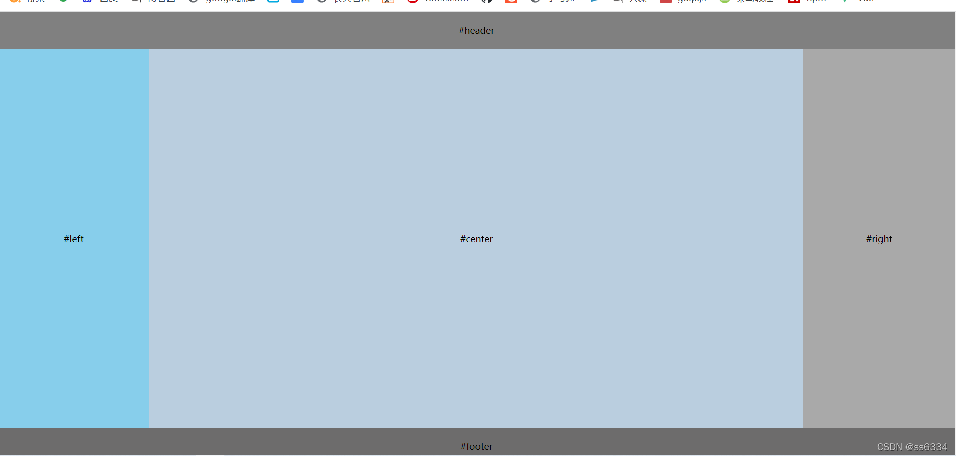
效果图如下:
【方法一】
使用flex布局,是最简便的。
为中间区域的父盒子添加dispaly:flex,将该布局变为flex布局,flex-direction:row表示布局的排列方式为按行排列。flex:1表示来分配剩余空间,用来表示占多少份数
//html代码
<div class="layout">
        <header>#header</header>
        <div class="container">
            <div class="left">#left</div>
            <div class="center">#center</div>
            <div class="right">#right</div>
        </div>
        <footer>#footer</footer>
    </div>
//css代码
 .container{
            display: flex;
            flex-direction: row;
            width: 100%;
            height: 500px;
        }
        .container .left{
            width: 200px;
            background-color: skyblue;
        }
        .container .center{
            height: 100%;
            flex: 1;
            background-color: rgb(186, 206, 223);
        }
        .container .right{
            width: 200px;
            background-color: darkgray;
        }
【方法二】
使用浮动来实现,左边盒子左浮动,右边盒子右浮动,中间的盒子自适应。
注意:这里需要注意的是html部分,必须将中间的盒子放到最后,因为左边盒子左浮动,中间盒子若在中间,会自动占满整行,右边盒子会换行。只有确定了左右浮动,再将中间盒子自适应插入。
//css代码
 .container {
            width: 100%;
            height: 500px;
        }

        .container .left {
            width: 200px;
            float: left;
            background-color: skyblue;
        }

        .container .center {
            background-color: rgb(186, 206, 223);
        }

        .container .right {
            width: 200px;
            background-color: darkgray;
            float: right;
        }
//html代码
 <div class="container">
            <div class="left">#left</div>
            <div class="right">#right</div>
            <div class="center">#center</div>
  </div>
【方法三】
使用绝对定位来实现。
给父盒子设置相对定位,子盒子设置绝对定位,都依据父盒子来进行偏移。左边盒子上左偏移量为0,右边盒子上右偏移量为0,中间盒子自适应,和方法二中的浮动类似。但是html布局文件不用更改。
//css代码
.container {
            width: 100%;
            height: 500px;
            position: relative;
        }
        .container .left {
            width: 200px;
            background-color: skyblue;
            position: absolute;
            top: 0;
            left: 0;
        }

        .container .center {
            background-color: rgb(186, 206, 223);
        }

        .container .right {
            width: 200px;
            background-color: darkgray;
            position: absolute;
            top: 0;
            right: 0;
        }
【方法四】
圣杯布局
父盒子padding+三个盒子浮动+左右盒子相对定位并负边距
header {
            background-color: grey;
            width: 100%;
            height: 50px;
            line-height: 50px;
            text-align: center;
        }

        .container {
            height: 500px;
            padding-left: 200px;
            padding-right: 300px;

        }

        .left {
            height: 100%;
            width: 200px;
            background-color: skyblue;
            margin-left: -100%;
            position: relative;
            left: -200px;
        }

        .center {
            width: 100%;
            height: 100%;
            background-color: rgb(186, 206, 223);
        }

        .right {
            width: 300px;
            height: 100%;
            background-color: darkgray;
            margin-left: -300px;
            position: relative;
            right: -300px;
        }

        .left,
        .center,
        .right {
            text-align: center;
            line-height: 500px;
            float: left;
        }

        footer {
            width: 100%;
            height: 50px;
            background-color: rgb(109, 108, 108);
            line-height: 50px;
            text-align: center;
            clear: both;
        }
布局这里要注意:中间盒子结构放在最前边
  <header>#header</header>
    <div class="container">
        <div class="center">#center</div>
        <div class="left">#left</div>
        <div class="right">#right</div>
    </div>
    <footer>#footer</footer>
【方法五】
双飞翼布局
三个盒子浮动+中间盒子左右margin留位+左右负边距
 .container {
            height: 500px;
        }

        .left {
            height: 100%;
            width: 200px;
            background-color: skyblue;
            margin-left: -100%;
        }
        .wrapper{
            width: 100%;
            height: 100%;
            background-color: rgb(186, 206, 223);
        }
        .center {
            height: 100%;
            margin-left: 200px;
            margin-right: 300px;
        }
        .right {
            width: 300px;
            height: 100%;
            background-color: darkgray;
            margin-left: -300px;
        }
        .left,
        .wrapper,
        .right {
            text-align: center;
            line-height: 500px;
            float: left;
        }
布局文件
注意:中间盒子外边要套个盒子,若只是给中间盒子设置外边距,会撑大整个盒子的宽度,影响布局。
<div class="container">
        <div class="wrapper">
            <div class="center">#center</div>
        </div>
        <div class="left">#left</div>
        <div class="right">#right</div>
    </div>
希望这篇文章对你有帮助哦~


 扫一扫
扫一扫


 被折叠的 条评论
为什么被折叠?
被折叠的 条评论
为什么被折叠?
 到【灌水乐园】发言


