


前言:为什么需要关注Ant Design性能?
Ant Design作为企业级React UI库,提供了丰富的组件和优雅的设计,但随着项目规模扩大,性能问题会逐渐显现。本文将系统性地剖析Ant Design的性能优化策略,从底层原理到具体实践,帮助你全面掌握优化技巧。
一、构建阶段优化
1 组件级按需加载
问题根源:Ant Design默认打包方式会导致全量引入,即使只使用少量组件
默认 - 全量引入(增加~800KB未使用代码
import { Button, Table } from 'antd';基础优化 - 直接引入ES模块
import Button from 'antd/es/button';
import Table from 'antd/es/table';
高级优化 - 配合babel-plugin-import
plugins: [
  ['import', {  // 配置 babel-plugin-import 插件
    libraryName: 'antd',  // 指定要按需加载的库(这里是 Ant Design)
    libraryDirectory: 'es',  // 指定从 antd 的 es 模块目录导入(ES Modules 版本)
    style: true  // 自动加载组件对应的 less 样式文件
  }]
]
例:
当你使用 import { Button } from 'antd'时,插件会自动转换成只导入 Button 组件:
import Button from 'antd/es/button'
| 引入方式 | 打包体积 | 构建时间 |
|---|---|---|
| 全量引入 | ~800KB | 20s |
| 按需引入 | ~150KB | 15s |
2 图标系统优化
默认 - 全量引入(增加~800KB未使用代码
import { SearchOutlined, UserOutlined } from '@ant-design/icons';推荐方案1 - 直接引入
import SearchOutlined from '@ant-design/icons/SearchOutlined';推荐方案2 - 创建图标封装组件
// components/Icons.js
export { default as Search } from '@ant-design/icons/SearchOutlined';
export { default as User } from '@ant-design/icons/UserOutlined';

// 使用时
import { Search, User } from '@/components/Icons';
二 运行时优化
1 Table组件
虚拟滚动列表(解决大型表格数据卡顿)
作用: 只渲染当前可见区域的内容,避免因数据量过大导致的性能问题
import React from "react";
import { Grid } from "react-window";

// 模拟数据:1000 行 x 5 列
const data = Array.from({ length: 1000 }, (_, rowIndex) => ({
  id: rowIndex,
  name: `User ${rowIndex}`,
  age: Math.floor(Math.random() * 50) + 18,
  email: `user${rowIndex}@example.com`,
  role: ["Admin", "User", "Guest"][rowIndex % 3],
}));

// 列配置
const columns = [
  { dataIndex: "id", width: 60, label: "ID" },
  { dataIndex: "name", width: 150, label: "Name" },
  { dataIndex: "age", width: 80, label: "Age" },
  { dataIndex: "email", width: 250, label: "Email" },
  { dataIndex: "role", width: 100, label: "Role" },
];

// 渲染表格
const VirtualizedGrid = () => (
  <div style={{ border: "1px solid #ddd", margin: "20px" }}>
    {/* 表头 */}
    <div style={{ display: "flex", background: "#f0f0f0", fontWeight: "bold" }}>
      {columns.map((col, index) => (
        <div key={index} style={{ width: col.width, padding: "8px" }}>
          {col.label}
        </div>
      ))}
    </div>

    {/* 虚拟滚动表格内容 */}
    <Grid
      columnCount={columns.length}
      columnWidth={(index) => columns[index].width}
      rowCount={data.length}
      rowHeight={() => 40} // 每行高度
      height={400} // 可视区域高度
      width={columns.reduce((sum, col) => sum + col.width, 0)} // 总宽度
    >
      {({ columnIndex, rowIndex, style }) => (
        <div
          style={{
            ...style,
            padding: "8px",
            borderBottom: "1px solid #eee",
            background: rowIndex % 2 === 0 ? "#f9f9f9" : "white",
          }}
        >
          {data[rowIndex][columns[columnIndex].dataIndex]}
        </div>
      )}
    </Grid>
  </div>
);

export default VirtualizedGrid;| 数据量 | 传统Table | 虚拟滚动 |
|---|---|---|
| 1,000行 | 1200ms | 150ms |
| 10,000行 | 卡死 | 200ms |
列渲染优化
const columns = [
  {
    title: 'Name',
    dataIndex: 'name',
    shouldCellUpdate: (record, prevRecord) =>
      record.name !== prevRecord.name // 仅当 name 变化时重新渲染该单元格
  }
];
shouldCellUpdate :是一个函数,返回值为boolean,在Ant Design Table 每次数据更新时,会用它来判断当前单元格是否需要重新渲染
对比默认行为:默认情况下,整行数据变化会触发该行所有单元格重新渲染。
2 Form表单
大型表单拆解策略(解决包含50+字段的表单响应迟缓问题)
(1)多步骤表单
将大型表单拆分为多个逻辑步骤,每次只渲染当前步骤的表单字段,显著减少同时渲染的组件数量
import { useState } from 'react';
import { Form, Input, Button, Steps } from 'antd';

const MultiStepForm = () => {
  const [step, setStep] = useState(0);
  const [form] = Form.useForm();

  const sections = [
    {
      title: '基本信息',
      fields: [
        { name: 'name', label: '姓名', component: <Input /> },
        { name: 'age', label: '年龄', component: <Input type="number" /> }
      ]
    },
    {
      title: '联系信息',
      fields: [
        { name: 'email', label: '邮箱', component: <Input /> },
        { name: 'phone', label: '电话', component: <Input /> }
      ]
    },
    {
      title: '其他信息',
      fields: [
        { name: 'address', label: '地址', component: <Input.TextArea /> },
        { name: 'notes', label: '备注', component: <Input.TextArea /> }
      ]
    }
  ];

  const next = () => {
    form.validateFields(sections[step].fields.map(f => f.name))
      .then(() => setStep(step + 1));
  };

  const prev = () => setStep(step - 1);

  return (
    <div>
      <Steps current={step}>
        {sections.map((section, i) => (
          <Steps.Step key={i} title={section.title} />
        ))}
      </Steps>

      <Form form={form} layout="vertical" style={{ marginTop: 24 }}>
        {sections[step].fields.map((field) => (
          <Form.Item
            key={field.name}
            name={field.name}
            label={field.label}
            rules={[{ required: true }]}
          >
            {field.component}
          </Form.Item>
        ))}

        <div style={{ marginTop: 24 }}>
          {step > 0 && (
            <Button style={{ marginRight: 8 }} onClick={prev}>
              上一步
            </Button>
          )}
          {step < sections.length - 1 ? (
            <Button type="primary" onClick={next}>
              下一步
            </Button>
          ) : (
            <Button type="primary" htmlType="submit">
              提交
            </Button>
          )}
        </div>
      </Form>
    </div>
  );
};
(2)条件渲染(动态显示/隐藏部分表单)
根据用户操作或某些条件,只渲染当前需要的表单部分,其他部分保持卸载状态。
import { useState } from 'react';
import { Form, Input, Select, Button } from 'antd';

const ConditionalForm = () => {
  const [activeSection, setActiveSection] = useState('basic');

  return (
    <div>
      <div style={{ marginBottom: 16 }}>
        <Button onClick={() => setActiveSection('basic')}>基本信息</Button>
        <Button onClick={() => setActiveSection('contact')}>联系信息</Button>
        <Button onClick={() => setActiveSection('other')}>其他信息</Button>
      </div>

      <Form layout="vertical">
        {activeSection === 'basic' && (
          <>
            <Form.Item name="name" label="姓名" rules={[{ required: true }]}>
              <Input />
            </Form.Item>
            <Form.Item name="age" label="年龄" rules={[{ required: true }]}>
              <Input type="number" />
            </Form.Item>
          </>
        )}

        {activeSection === 'contact' && (
          <>
            <Form.Item name="email" label="邮箱" rules={[{ type: 'email' }]}>
              <Input />
            </Form.Item>
            <Form.Item name="phone" label="电话">
              <Input />
            </Form.Item>
          </>
        )}

        {activeSection === 'other' && (
          <>
            <Form.Item name="address" label="地址">
              <Input.TextArea />
            </Form.Item>
            <Form.Item name="notes" label="备注">
              <Input.TextArea />
            </Form.Item>
          </>
        )}

        <Form.Item>
          <Button type="primary" htmlType="submit">
            提交
          </Button>
        </Form.Item>
      </Form>
    </div>
  );
};
(3) 动态字段
对于重复结构的字段组,使用Form.List动态渲染,避免硬编码大量相似字段,适合处理动态增减的字段组
import { Form, Input, Button, Space } from 'antd';
import { PlusOutlined, MinusCircleOutlined } from '@ant-design/icons';

const DynamicFieldsForm = () => {
  return (
    <Form layout="vertical">
      <Form.Item name="title" label="表单标题" rules={[{ required: true }]}>
        <Input />
      </Form.Item>

      <Form.List name="users">
        {(fields, { add, remove }) => (
          <>
            {fields.map(({ key, name, ...restField }) => (
              <Space key={key} style={{ display: 'flex', marginBottom: 8 }} align="baseline">
                <Form.Item
                  {...restField}
                  name={[name, 'firstName']}
                  rules={[{ required: true, message: '请输入名字' }]}
                >
                  <Input placeholder="名字" />
                </Form.Item>
                <Form.Item
                  {...restField}
                  name={[name, 'lastName']}
                  rules={[{ required: true, message: '请输入姓氏' }]}
                >
                  <Input placeholder="姓氏" />
                </Form.Item>
                <Form.Item
                  {...restField}
                  name={[name, 'age']}
                  rules={[{ required: true, message: '请输入年龄' }]}
                >
                  <Input placeholder="年龄" type="number" />
                </Form.Item>
                <MinusCircleOutlined onClick={() => remove(name)} />
              </Space>
            ))}

            <Form.Item>
              <Button
                type="dashed"
                onClick={() => add()}
                block
                icon={<PlusOutlined />}
              >
                添加用户
              </Button>
            </Form.Item>
          </>
        )}
      </Form.List>

      <Form.Item>
        <Button type="primary" htmlType="submit">
          提交
        </Button>
      </Form.Item>
    </Form>
  );
};| 策略 | 适用场景 | 优点 | 缺点 |
|---|---|---|---|
| 分步表单 | 字段有明显逻辑分组 | 用户体验好,易于验证 | 需要额外的导航控制 |
| 条件渲染 | 字段间有复杂依赖关系 | 灵活性高 | 状态管理稍复杂 |
| 动态字段 | 重复结构字段组 | 代码简洁,自动处理数组 | 不适合非重复结构 |
(2)校验性能优化
// 防抖校验示例
const debounceValidate = debounce(async (rule, value) => {
  const res = await checkAPI(value);
  if (res.error) throw new Error(res.message);
}, 500);

<Form.Item
  name="username"
  rules={[
    { required: true },
    { validator: debounceValidate }
  ]}
>
  <Input />
</Form.Item>
3 Modal(优化渲染策略)
// 传统方式(不推荐)
<Modal visible={visible} /> // 始终存在于DOM中

// 优化方案1 - 条件渲染
{visible && <Modal />}

// 优化方案2 - 使用React Portal
const ModalWrapper = () => {
  const [mounted, setMounted] = useState(false);

  useEffect(() => {
    setMounted(true);
    return () => setMounted(false);
  }, []);

  return mounted ? ReactDOM.createPortal(
    <Modal />,
    document.getElementById('modal-root')
  ) : null;
};
三 样式系统优化
1 主体定制
动态主题可能导致样式重计算
方式一:直接定义 Less 变量(自定义样式)
// config.less
@primary-color: #1890ff;
// 示例用法
// my-component.less
@import './config.less'; // 导入自定义变量
.my-button {
background: @primary-color; // 使用自定义变量(但不会影响 AntD 按钮)
}方式二:less-loader 配置(覆盖 Ant Design 主题)
// webpack.config.js
// 全局修改
{
  loader: 'less-loader',
  options: {
    lessOptions: {
      modifyVars: {
        'primary-color': '#1DA57A', // 覆盖 Ant Design 的变量
        'link-color': '#1DA57A'
      },
      javascriptEnabled: true
    }
  }
}
2 关键CSS提取
// webpack.config.js
const Critters = require('critters-webpack-plugin');

module.exports = {
  plugins: [
    new Critters({
      preload: 'swap',          // 最优的字体加载策略
      pruneSource: true,        // 移除未使用的CSS
      preloadFonts: true,       // 预加载字体
      compress: true,           // 压缩内联CSS
      logger: process.env.NODE_ENV !== 'production' // 非生产环境输出日志
    })
  ]
}; critters-webpack-plugin:这是一个用于优化 CSS 加载性能的 Webpack 插件,专门处理关键 CSS(Critical CSS)和异步加载 CSS 的优化
| 场景 | 首屏加载时间 | CSS文件大小 |
|---|---|---|
| 未优化 | 2.5s | 200KB |
| 使用Critters后 | 1.2s | 关键CSS: 15KB 异步CSS: 185KB |
四 预加载关键组件
// 在应用初始化时预加载
const PreloadComponents = () => {
  useEffect(() => {// 在应用初始化时,提前在后台异步加载 Table 和 Form 组件的代码
    import('antd/es/table');
    import('antd/es/form');
  }, []);
  return null;
};
// /条件预加载
useEffect(() => {
if (userRole === 'admin') { // 根据用户角色决定预加载内容
import('antd/es/table');
}
}, [userRole]);使用示例:
// 在应用根组件中引入
function App() {
  return (
    <>
      <PreloadComponents /> {/* 隐藏的预加载器 */}
      <Router>
        {/* 其他路由组件 */}
      </Router>
    </>
  );
}
五 服务端渲染优化
next-plugin-antd-less 插件:实现对 Ant Design 组件的按需加载和主题定制
// next.config.js集成
const withAntdLess = require('next-plugin-antd-less');  // 导入插件

module.exports = withAntdLess({  // 用插件包裹Next.js配置
  lessVarsFilePath: './styles/variables.less',  // 指定主题变量文件路径
  webpack(config) {
    return config;  // 可扩展Webpack配置
  }
})
六 Web Workers处理复杂计算
核心概念:
-
主线程:负责 UI 渲染和交互(如 React/Vue 所在的线程)
-
Worker 线程:独立的后台线程,用于在浏览器中创建多线程环境,将耗时的数据处理任务(如大型表格处理)放到后台线程执行,避免阻塞主线程(UI 线程)
-
通信机制:通过
postMessage和onmessage进行线程间数据传递 -
通信流程图
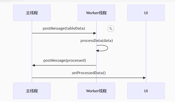
// worker.js
self.onmessage = function(e) {
  // 接收主线程发送的数据
  const { data } = e;

  // 执行耗时操作(如处理大型表格数据)
  const processed = processData(data);

  // 将结果发送回主线程
  postMessage(processed);
};

// 创建 Worker 实例
const worker = new Worker('./worker.js');

// 向 Worker 发送数据(如表格原始数据)
worker.postMessage(tableData);

// 监听 Worker 返回的结果
worker.onmessage = (e) => {
  setProcessedData(e.data); // 更新状态(React 示例)
};


 扫一扫
扫一扫


 被折叠的 条评论
为什么被折叠?
被折叠的 条评论
为什么被折叠?
 到【灌水乐园】发言


