


 该博客介绍爱心律动效果的前端实现。核心是关键帧动画,先定义律动爱心所需元素块,用弹性布局让9个块元素在一行,为每个块元素定义关键帧动画并设置速度和执行次数。还说明了HTML部分用无序列表构建元素,CSS部分改变样式、布局并定义动画,最后给出完整代码。
目录
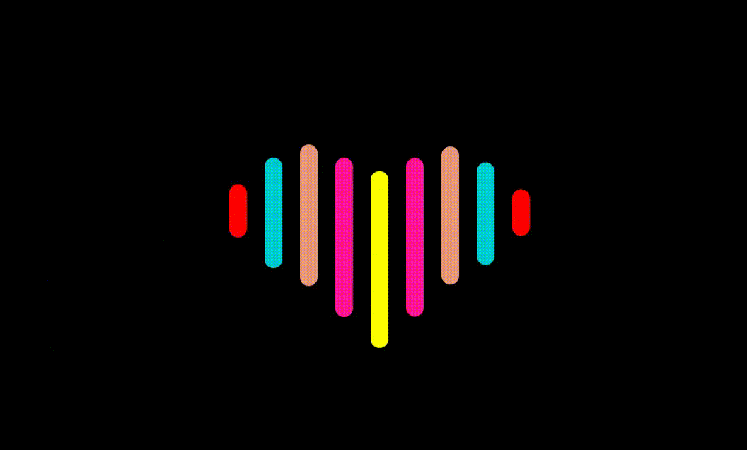
一.效果预览图
二.实现思路 
想要实现爱心律动效果并不难,核心点是关键帧动画。 定义律动爱心需要的元素块,使用定位或者弹性布局等方法(定位元素不适合布局,建议用弹性布局),使9个块元素在一行,给每个块元素定义关键帧动画@keyframes(关键帧动画关键字) 改变其长度,使用animation:love2 5s 1.4s infinite;定义关键字动画的速度,动画执行次数infinite(一直执行),你也可以设置动画的运动函数使其达到理想的动态效果。
1.html部分
用无序列表构建10个块元素(ul 1 ,li 9),li从1-9分别对应律动爱心的发生变化的9个元素
<!DOCTYPE html>
<html lang="en">
<head>
    <meta charset="UTF-8">
    <meta http-equiv="X-UA-Compatible" content="IE=edge">
    <meta name="viewport" content="width=device-width, initial-scale=1.0">
    <title>Document</title>
    <link rel="stylesheet" href="css/002.css">
</head>
<body>
    <ul>
        <li></li>
        <li></li>
        <li></li>
        <li></li>
        <li></li>
        <li></li>
        <li></li>
        <li></li>
        <li></li>
    </ul>
</body>
</html>
2.css部分
css样式,改变背景颜色,使用弹性布局使其居中,定义关键帧动画。
*{
    padding: 0;
    margin: 0;
}
body{
    display: flex;
    justify-content: center;
    align-items: center;
    height: 100vh;
    background-color: #000;
}
ul{
    position:relative;
    display: flex;
    height: 200px;
}
ul::after{
    content: '爱心怦怦跳';
    position: absolute;
    top: 100px;
    left: 50%;
    color: darkturquoise;
    font-size: 30px;
    font-weight: 700px;
    transform: translate(-50%,-700%);
}
li{
    width: 20px;
    height: 20px;
    border-radius: 10px;
    margin: 0 10px;
}
li:nth-child(1){
    background-color: red;
    animation:love1 5s 0s infinite;
}
li:nth-child(2){
    background-color: darkturquoise;
    animation:love2 5s 0.2s infinite;
}
li:nth-child(3){
    background-color: darksalmon;
    animation:love3 5s 0.4s infinite;
}
li:nth-child(4){
    background-color: deeppink;
    animation:love4 5s 0.6s infinite;
}
li:nth-child(5){
    background-color: yellow;
    animation:love5 5s 0.8s infinite;
}
li:nth-child(6){
    background-color: deeppink;
    animation:love4 5s 1s infinite;
}
li:nth-child(7){
    background-color: darksalmon;
    animation:love3 5s 1.2s infinite;
}
li:nth-child(8){
    background-color: darkturquoise;
    animation:love2 5s 1.4s infinite;
}
li:nth-child(9){
    background-color: red;
    animation:love1 5s 1.6s infinite;
}
/*定义动画*/
@keyframes love1 {
    30%,50%{
        height: 60px;
        transform: translateY(-30px);
    }
    70%,100%{
        height: 20px;
        transform: translateY(0px);
    }
}
@keyframes love2{
    30%,50%{
        height: 125px;
        transform: translateY(-60px);
    }
    70%,100%{
        height: 20px;
        transform: translateY(0px);
    }
}
@keyframes love3 {
    30%,50%{
        height: 160px;
        transform: translateY(-75px);
    }
    70%,100%{
        height: 20px;
        transform: translateY(0px);
    }
}
@keyframes love4 {
    30%,50%{
        height: 180px;
        transform: translateY(-60px);
    }
    70%,100%{
        height: 20px;
        transform: translateY(0px);
    }
}
@keyframes love5 {
    30%,50%{
        height: 200px;
        transform: translateY(-45px);
    }
    70%,100%{
        height: 20px;
        transform: translateY(0px);
    }
}
三.完整代码
<!DOCTYPE html>
<html lang="en">
<head>
    <meta charset="UTF-8">
    <meta http-equiv="X-UA-Compatible" content="IE=edge">
    <meta name="viewport" content="width=device-width, initial-scale=1.0">
    <title>Document</title>
    <style>
     *{
    padding: 0;
    margin: 0;
    }
body{
    display: flex;
    justify-content: center;
    align-items: center;
    height: 100vh;
    background-color: #000;
}
ul{
    position:relative;
    display: flex;
    height: 200px;
}
ul::after{
    content: '爱心怦怦跳';
    position: absolute;
    top: 100px;
    left: 50%;
    color: darkturquoise;
    font-size: 30px;
    font-weight: 700px;
    transform: translate(-50%,-700%);
}
li{
    width: 20px;
    height: 20px;
    border-radius: 10px;
    margin: 0 10px;
}
li:nth-child(1){
    background-color: red;
    animation:love1 5s 0s infinite;
}
li:nth-child(2){
    background-color: darkturquoise;
    animation:love2 5s 0.2s infinite;
}
li:nth-child(3){
    background-color: darksalmon;
    animation:love3 5s 0.4s infinite;
}
li:nth-child(4){
    background-color: deeppink;
    animation:love4 5s 0.6s infinite;
}
li:nth-child(5){
    background-color: yellow;
    animation:love5 5s 0.8s infinite;
}
li:nth-child(6){
    background-color: deeppink;
    animation:love4 5s 1s infinite;
}
li:nth-child(7){
    background-color: darksalmon;
    animation:love3 5s 1.2s infinite;
}
li:nth-child(8){
    background-color: darkturquoise;
    animation:love2 5s 1.4s infinite;
}
li:nth-child(9){
    background-color: red;
    animation:love1 5s 1.6s infinite;
}
/*定义动画*/
@keyframes love1 {
    30%,50%{
        height: 60px;
        transform: translateY(-30px);
    }
    70%,100%{
        height: 20px;
        transform: translateY(0px);
    }
}
@keyframes love2{
    30%,50%{
        height: 125px;
        transform: translateY(-60px);
    }
    70%,100%{
        height: 20px;
        transform: translateY(0px);
    }
}
@keyframes love3 {
    30%,50%{
        height: 160px;
        transform: translateY(-75px);
    }
    70%,100%{
        height: 20px;
        transform: translateY(0px);
    }
}
@keyframes love4 {
    30%,50%{
        height: 180px;
        transform: translateY(-60px);
    }
    70%,100%{
        height: 20px;
        transform: translateY(0px);
    }
}
@keyframes love5 {
    30%,50%{
        height: 200px;
        transform: translateY(-45px);
    }
    70%,100%{
        height: 20px;
        transform: translateY(0px);
    }
}
    </style>
</head>
<body>
    <ul>
        <li></li>
        <li></li>
        <li></li>
        <li></li>
        <li></li>
        <li></li>
        <li></li>
        <li></li>
        <li></li>
    </ul>
</body>
</html>


 扫一扫
扫一扫


 1623
1623

 被折叠的 条评论
为什么被折叠?
被折叠的 条评论
为什么被折叠?
 到【灌水乐园】发言


