


day04移动web
day04移动web
一、Flex布局
- 目标:能够使用Flex布局模型灵活、快速的开发网页
- 本质:浏览器提倡的布局模型
- 属性名:flex
- 使用场景:
结构化布局时使用,如:左右排版、左中右、上下、上中下 - 作用
1.基于 Flex 精确灵活控制块级盒子的布局方式,避免浮动布局中脱离文档流现象的发生。
- Flex布局非常适合结构化布局
- 设置方式
给父元素添加 display: flex,子元素可以自动的挤压或拉伸 - 注意:
1、 flex默认不换行
2、换行属性flex-wrap, 值:wrap
3.、换行之后 均分
1.1 flex的组成部分
- flexe的组成部分
1. 弹性容器
2. 弹性盒子
3. 主轴
4. 侧轴 - 盒子排列方式
永远沿着主轴的方向排列
1.2 Flex中的常用属性
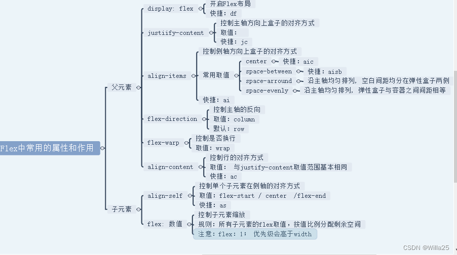
1.3 主轴对齐方式
- 目标:使用justify-content调节元素在主轴(水平方向时)的对齐方式
- 修改主轴对齐方式属性: justify-content(快捷:jc)
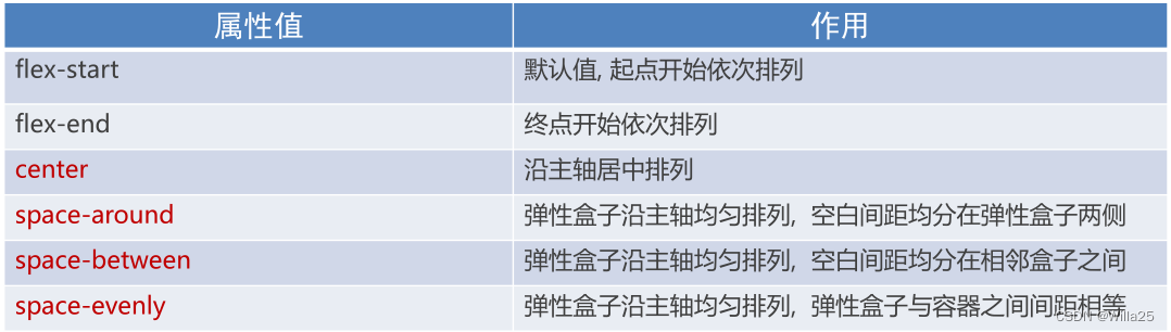
- 相关属性值:
- 注意:
- Flex布局模型中,弹性盒子默认沿水平方向排列
- 主轴方向是可以改变的
1.4 侧轴对齐方式
核心代码:
       display: flex;
        /* 侧轴对齐方式 ai */
        align-items: center;
        justify-content: center;
- 注意:
align-self 对于单独的弹性盒子设置,添加给需要设置侧轴方向的弹性盒子添加
1.5 主轴方向
- 目标:使用 flex-direction改变元素排列方向
- 主轴默认是水平方向, 侧轴默认是垂直方向
- 修改主轴方向属性: flex-direction

    .box {
        width: 800px;
        height: 800px;
        border: 1px solid ragb(48,33,33);
        /* 开启flex后,主轴默认是水平方向, 侧轴默认是垂直方向 */
        display: flex;
        /* 改变主轴方向:此时此刻,主轴垂直向下,侧轴水平向右 */
        flex-direction: column;
        /* 设置测轴水平居中 aic */
        /* ai 修改主轴方向 */
        align-items: center;
        /* 设置主轴方向平均分配空白间隙 */
        justify-content: space-evenly;
        width: 150px;
        height: 150px;
        border: 5px solid rgb(48, 33, 33);
      }
  <body>
    <div class="box">
      <img src="./images/media.png" alt="" />
      新闻资讯
    </div>
  </body>
- 效果图

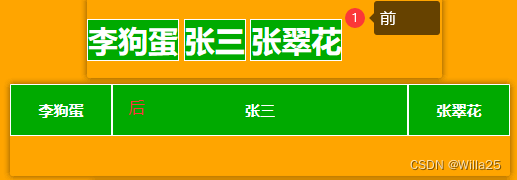
1.6 伸缩比
- 目标:使用flex属性修改弹性盒子伸缩比
- 属性: flex : 值;
- 取值分类: 数值(整数)

    <style>
      * {
        margin: 0;
        padding: 0;
      }

      .box {
        /* display: flex; */
        width: 1000px;
        height: 600px;
        background: orange;
      }

      .box span {
        width: 200px;
        height: 100px;
        color: #fff;
        font-size: 30px;
        font-weight: 700;
        text-align: center;
        line-height: 100px;
        background-color: #0a0;
        border: 1px solid #fff;
      }
    </style>
  </head>

  <body>
    <div class="box">
      <span>李狗蛋</span>
      <span style="flex: 1">张三</span>
      <span>张翠花</span>
    </div>
  </body>
- 效果
1.7 弹性盒子
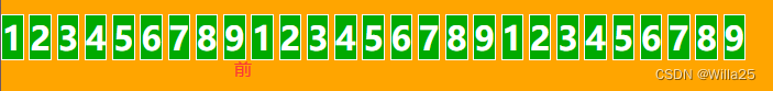
1.7.1 弹性盒子换行
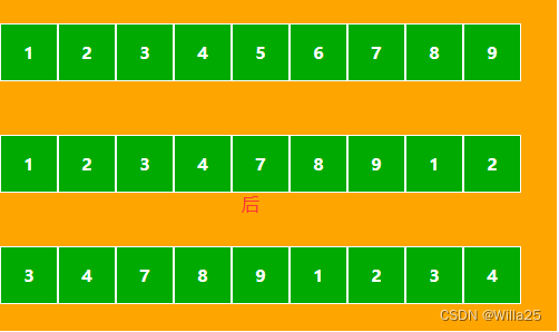
- 目标:使用flex-wrap实现弹性盒子多行排列效果
- 弹性盒子换行显示 : flex-wrap: wrap;
- 调整行对齐方式 : align-content
- 取值与 justify-content基本相同
<style>
    * {
      margin: 0;
      padding: 0;
    }
    .box {
      width: 1000px;
      height: 600px;
      background: orange;
    }
    .box span {
      width: 100px;
      /* height: 100px; */
      color: #fff;
      font-size: 30px;
      font-weight: 700;
      text-align: center;
      line-height: 100px;
      background-color: #0a0;
      border: 1px solid #fff;
    }
- 效果
换行核心代码
    /* 1、 flex默认不换行 */
        /* 2. 换行属性flex-wrap, 值:wrap */
        /* 3. 换行之后 均分 */
        display: flex;
        /* 让弹性盒子换行显示 */
        flex-wrap: wrap;
        /* 设置多行对齐方式,属性的取值与jc属性值一样 */
        /* align-content: space-evenly; */
        width: 1000px;
        /* 不设置高度行与行挨在一块,设置高度,会被均分 */
        height: 600px;
        background: orange;
        /* center:所有的行居中对齐 */
        /* align-content: 取值基本与jc justify-content相同 没有默认值是拉伸均分盒子高度  */
        /* acc  居中*/
        align-content: center;
        /* acfs 头贴 */
        align-content: flex-start;
        /* acfe 尾贴 */
        align-content: flex-end;
        align-content: space-between;
        align-content: space-around;
      }
- 效果
二、小兔鲜儿-个人中心
2.1 介绍
在工作中我们可能接手同事未完成的项目,那么当我们拿到这类项目时应该怎么做呢?首先要看项目的完成度,并以此确定自己所需完成的模块,再者查看版心等内容。本文主要介绍小兔鲜项目的个人中心模块,根据已完成的头部header和底部footer模块,完成剩下的个人中心模块。
2.2 main模块(left+right)
2.2.1 结构搭建
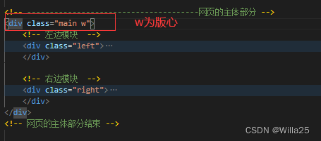
2.2.2 CSS样式
.main {
    /* 开启flex */
    display: flex;
    /* 设置两边对齐 快捷jcsb  */
    justify-content: space-between;
}

.left {
    width: 224px;
    background-color: pink;
    /* 辅助颜色pink,后面改为白色#fff */
}

.right {
        width: 999px;
}
- 注意:考虑部分顾客为会员,那么会比普通顾客多出一些会员信息内容,所以这里不设置高度,让它自由撑开。
2.3 个人中心–公共样式
/* 公共样式面板 start */
.pannel {
  padding: 28px 20px;
  background-color: #fff;
  margin-bottom: 20px;
}

.pannel .pannel-title {
  display: flex;
  justify-content: space-between;
  height: 44px;
  border-bottom: 2px solid #f4f4f4;
}

.pannel .pannel-title h5 {
  font-size: 22px;
  font-weight: 400;
  margin-left: 8px;
}

.pannel .pannel-title a {
  font-size: 16px;
  color: #999;
  margin-right: 4px;
  margin-top: 6px;
}
/* 公共样式面板 end */
2.4 左侧left模块
2.4.1 头像区域(avatar)
.avatar {
    padding: 46px 0 13px 0;
    /* 开启flex布局 快捷:df  */
    display: flex;
    /* 改变主轴方向 */
    flex-direction: column;
    /* 垂直居中 */
    justify-content: center;
    align-items: center;

    width: 230px;
    border-bottom: 2px solid  #f4f4f4;
}

.avatar .pic {
    width: 85px;
	height: 86px;
}

.avatar p {
    font-size: 18px;
	font-weight: normal;
	color: #333333;
    margin: 13px 0 11px 0;
}

.avatar a {
	width: 93px;
	height: 27px;
	background-image:
	linear-gradient(0deg,#e4973c 100%);
	background-blend-mode: normal, normal;
	border-radius: 13px;
    color: #fff;
    background-color: #ea745e;

    display: flex;
    justify-content: center;
    align-items: center;
    margin-bottom: 30px;
}

.avatar  img {
    width: 15px;
	height: 16px;
    margin-right: 5px;
}
- 头像区域结构代码
        <!-- 头像区域start -->
       <div class="profile">
            <div class="avatar">
            <img src="./uploads/avatar_1.png" alt="" class="pic"><p>张小花</p>
           <div>
                <a href="#"><img src="./uploads/vip_gold.png" alt="">黄金会员</a>
           </div>
        </div>
       </div>
        <!-- 头像区域end -->
- 效果图

2.4.2 我的账户(account)
/* ---账户信息start */
.account {
    padding: 34px 0 61px 0;

    display: flex;
    justify-content: center;
    align-items: center;
    border-bottom: 2px solid #f4f4f4;
}

.account dt {
	font-size: 18px;
	font-weight: normal;
	color: #333333;
    margin-bottom: 31px;
}

.account dd {
	font-size: 14px;
	font-weight: normal;
	color: #999999;
    margin-bottom: 29px;
}

.account dd a {
    position: relative;
}

.account a::before {
    position: absolute;
    content: '';
    width: 6px;
    height: 7px;
    left: -15px;
    top: 50%;
	border-radius: 50%;
	background-color: #5eb69c;
    transform: translateY(-50%);
    display: none;
}

.account a:hover::before{
    display: inline-block;
}

.account a:hover {
     color: #5eb69c;
}
/* 我的账户end */
    <div class="account">
        <dl>
            <dt><a href="#">我的账户</a></dt>
            <dd><a href="#">个人中心</a></dd>
            <dd><a href="#">消息通知</a></dd>
            <dd><a href="#">个人信息</a></dd>
            <dd><a href="#">安全设置</a></dd>
            <dd><a href="#">地址管理</a></dd>
            <dd><a href="#">我的积分</a></dd>
            <dd><a href="#">我的足迹</a></dd>
            <dd><a href="#">邀请有礼</a></dd>
            <dd><a href="#">幸运抽奖</a></dd>
        </dl>
    </div>
- 效果

2.4.3 交易管理(transaction)
    <!-- 交易管理start  -->
    <div class="transaction">
        <dl>
            <dt><a href="#">交易管理</a></dt>
            <dd><a href="#">我的订单</a></dd>
            <dd><a href="#">优惠券</a></dd>
            <dd><a href="#">礼品卡</a></dd>
            <dd><a href="#">评价晒单</a></dd>
            <dd><a href="#">售后服务</a></dd>
        </dl>
    </div>
    <!-- 交易管理end  -->
- 效果图样式和前面的一样,只是信息不同,样式和结构更改个名字和内容即可
2.4.4 我的收藏(collection)
样式和结构跟我的账户一样,改个名字即可,效果一样
2.4.5 帮助中心(assistance)
样式和结构跟我的账户一样,改个名字即可,效果一样。需要注意的是,最后这个把assistance的底部边框去掉即可。
border-bottom: 2px solid #f4f4f4;
2.5 右侧right模块
2.5.1 数据概括(overview)
/* 数据概括 开始 */
.overview {
    height: 133px;
    padding: 19px 0 22px 0;
     margin-bottom: 20px;

    display: flex;
    justify-content: space-evenly;
    align-items: center;
    background-color: #fff;
}

.overview a {
    width: 64px;
	height: 54px;
	font-size: 16px;
	font-weight: normal;
	color: #333333;

    /* 开启flex布局 */
    display: flex;
    justify-content: space-between;
    align-items: center;
    /* 改变主轴方向 */
    flex-direction: column;
}

.line{
    width: 2px;
    height: 92px;
    background-color: #f4f4f4;
}

.overview a span {
    width: 25px;
	height: 22px;
    background: url('../images/vip.png') no-repeat;
    /* 等比例缩放,拉满盒子的宽度或高度  */
    background-size: contain;
}

.overview a:nth-child(2) span {
    width: 25px;
	height: 23px;
    background-image: url('../images/safe.png');
}

.overview a:nth-child(3) span {
    width: 18px;
    height: 25px;
    background-image: url('../images/address.png');
}

.overview a h5 {
  font-size: 26px;
  color: #e05e30;
  font-weight: 400;
  line-height: 24px;
}
/* 数据概括 结束 */
<!-- 数据概括 开始-->
    <div class="overview">
             <a href="#">
                 <span></span>
                <p>会员中心</p>
            </a>
            <a href="#">
                 <span></span>
                <p>安全设置</p>
            </a>
            <a href="#">
                 <span></span>
                <p>地址管理</p>
            </a>
         <span class="line"></span>
              <a href="#">
                 <h5>6</h5>
              <p>优惠卷</p>
            </a>
            <a href="#">
                <h5>70 </h5>
                <p>礼品卡</p>
            </a>
            <a href="#">
                <h5>120</h5>
                <p>积分</p>
            </a>
    </div>
    <!-- 数据概括结束 -->
- 效果

2.5.2 我的订单(orders)
/* -----我的订单start */
.orders .content li {
    display: flex;
    align-items: center;

    height: 138px;
	background-color: #ffffff;
	border: solid 2px #f4f4f4;;
}

.orders li .product {
    display: flex;
    align-items: center;
}

.orders .product div {
    width: 210px;
}

.orders .product img {
    width: 107px;
	height: 107px;
}

.orders .product h4 {
	font-size: 16px;
	font-weight: normal;
	color: #333333;
     /* 行尾出现省略号的三件套 */
    white-space: nowrap;
    text-overflow: ellipsis;
    overflow: hidden;
}
.orders .product p {
    font-size: 14px;
	font-weight: normal;
	color: #999999;
}

.orders li .status {
    flex: 1;
}

.orders li .status p {
	font-size: 14px;
	color: #e05e30;
}

.orders .status a {
    font-size: 14px;
    color: #999999;
}
.orders li .price {
    width: 197px;
    height: 138px;
    border-left: 1px solid #e8e8e8;
    border-right: 1px solid #e8e8e8;
    padding-top: 40px;
}

.orders .price p:nth-child(1) {
    font-size: 14px;
    color: #9a2e1f;
}

.orders li .action {
    width: 179px;
}

.orders .action a:first-child {
    width: 100px;
	height: 31px;
    font-size: 14px;
	background-color: #5eb69c;
    /* 文本水平居中 */
    text-align: center;
    /* 垂直居中 */
    line-height: 31px;
    color: #fff;
    margin-bottom: 10px;
}

.orders .status,
.orders .price,
.orders .action{
    /* 开启 flex布局 */
    display: flex;
    /* 改变主轴方向 */
    flex-direction: column;
    /* 垂直居中 */
    align-items: center;
}

.orders li:nth-child(2) {
    height: 138px;
    padding-left: 9px;
    margin-top: 20px;
}
/* -----我的订单end */
  <!-- 我的订单 start -->
      <div class="orders pannel">
        <div class="pannel-title">
          <h5>我的订单</h5>
          <a href="#">查看更多 ></a>
        </div>
        <div class="content">
          <ul>
            <li>
              <a href="#" class="product">
                <img src="./uploads/clothes_goods_5.jpg" alt="">
                <div>
                  <h4>拉夫劳伦t恤男正品圆领短袖特别优惠特别好非常棒</h4>
                  <p>颜色:<span>白色</span> 尺码:<span>M</span> 数量:<span>1</span></p>
                </div>
              </a>
              <div class="status">
                <p>待付款</p>
                <a href="#">查看物流</a>
              </div>
              <div class="price">
                <p>¥99.00</p>
                <p>(含运费:¥10.00元)</p>
                <p>在线支付</p>
              </div>
              <div class="action">
                <a href="#">立即付款</a>
                <a href="">查看详情</a>
                <a href="">取消订单</a>
              </div>
            </li>
            <!-- 这里两个li,复制粘贴多一个li即可,修改内容 -->
        </ul>
      </div>
   </div>
- 效果图

2.5.3 收藏的商品(collect)
/* 我的收藏start */
.collect .content,
.history .content {
  padding: 20px 30px 0 12px;
}

.collect .content ul,
.history .content ul {
  display: flex;
  justify-content: space-between;
}

.card {
  width: 172px;
  height: 262px;
}

.card {
  display: flex;
  flex-direction: column;
  align-items: center;
  justify-content: space-between;
}
.card img {
  width: 160px;
  height: 160px;
}

.card h4 {
  font-size: 16px;
  font-weight: 500;
}

.card p {
  font-size: 18px;
  color: #9a2e1f;
  align-self: flex-start;
}

.card i {
  font-size: 22px;
}
/* 我的收藏end
       <!-- 收藏德商品 start -->
      <div class="pannel collect">
        <div class="pannel-title">
          <h5>我的收藏</h5>
          <a href="#">查看更多 ></a>
        </div>
        <div class="content">
          <ul>
            <li>
              <a href="" class="card">
                <img src="./uploads/collect_goods_1.jpg" alt="">
                <h4>人本秋季厚底帆布鞋
                  韩版低帮增高学生</h4>
                <p>¥<i>55</i></p>
              </a>
            </li>
            <li>
              <a href="" class="card">
                <img src="./uploads/collect_goods_2.jpg" alt="">
                <h4>人本秋季厚底帆布鞋
                  韩版低帮增高学生</h4>
                <p>¥<i>55</i></p>
              </a>
            </li>
            <li>
              <a href="" class="card">
                <img src="./uploads/collect_goods_3.jpg" alt="">
                <h4>人本秋季厚底帆布鞋
                  韩版低帮增高学生</h4>
                <p>¥<i>55</i></p>
              </a>
            </li>
            <li>
              <a href="" class="card">
                <img src="./uploads/collect_goods_4.jpg" alt="">
                <h4>人本秋季厚底帆布鞋
                  韩版低帮增高学生</h4>
                <p>¥<i>55</i></p>
              </a>
            </li>
          </ul>
        </div>
      </div>
      <!-- 收藏的商品 end -->
- 效果图

2.5.4 我的足迹(footprint)
我的足迹和收藏的商品样式和结构一样,更改名字和内容即可,效果一样
三、底部补充(footer)
 <!-- footer 上半部分  -->
          <footer>
               <!-- 联系模块 start -->
          <div class="contact w">
              <dl class="customer">
                  <dt>客户服务</dt>
                  <dd>在线客服</dd>
                  <dd>问题反馈</dd>
              </dl>

         <!-- 关注我们 -->
        <dl class="customer focus">
        <dt>关注我们</dt>
        <dd class="online weixin">公众号</dd>
        <dd class="feedback weibo">微博</dd>
      </dl>

      <!-- 下载APP -->
      <dl class="download">
        <dt>下载APP</dt>
        <dd class="code">
          <img src="./uploads/qrcode.png" alt="" />
        </dd>
        <dd class="now">
          <p class="saomiao">扫描二维码</p>
          <p>立马下载APP</p>
          <a href="#">下载页面</a>
        </dd>
      </dl>

      <!-- 服务热线 -->
      <dl class="hotline">
        <dt>服务热线</dt>
        <dd>
          <p class="tel">400-0000-000</p>
          <p>周一至周日 8:00-18:00</p>
        </dd>
      </dl>
          </div>
          <!-- 联系模块 end -->
          </footer>
/* 上半部分 服务 */
.serive .w {
  width: 1393px;
  height: 174px;
  border-bottom: 1px solid #434343;
}
.serive .w a {
  float: left;
  width: 33.33%;
  height: 100%;
  font-size: 28px;
  color: #fff;
  text-align: center;
  line-height: 173px;
}
.serive .w a::before {
  display: inline-block;
  content: "";
  width: 58px;
  height: 58px;
  background: url(../images/sprites.png) 0 0;
  vertical-align: middle;
  margin-right: 19px;
}
.serive .w a:nth-child(2)::before {
  background-position: -130px 0;
}
.serive .w a:nth-child(3)::before {
  background-position: -65px 0;
}

/* 下半部分 copyright */
.copyright {
  text-align: center;
}
.copyright p {
  margin-top: 40px;
}
.copyright p a {
  color: #999;
}
.copyright p span {
  color: #999;
  margin: 0 10px;
}
.copyright .xiao {
  color: #999;
  margin-top: 18px;
}

/* 联系模块 */
.contact.w {
  height: 303px;
}
.contact dl {
  float: left;
  width: 25%;
  height: 223px;
  margin-top: 80px;
  text-align: center;
  color: #999;
}
.contact dt {
  margin-bottom: 35px;
  font-size: 16px;
}
.contact dd {
  display: inline-block;
  font-size: 14px;
}
.contact .customer dd {
  width: 93px;
  height: 92px;
  border: 1px solid #eeeeee;
  cursor: pointer;
}
.customer dd::before {
  display: block;
  content: "";
  width: 29px;
  height: 28px;
  background: url(../images/sprites.png) -250px -70px;
  margin: 22px auto 10px;
}
.customer .feedback::before {
  background-position: -350px -70px;
}
.customer .online:hover::before {
  background-position: -205px -70px;
}
.customer .feedback:hover::before {
  background-position: -300px -70px;
}
/* 关注我们 */
.focus dd::before {
  width: 36px;
  height: 29px;
}
.focus .weixin::before {
  background-position: -250px -15px;
}
.focus .weibo::before {
  background-position: -350px -15px;
}
.focus .weixin:hover::before {
  background-position: -205px -15px;
}
.focus .weibo:hover::before {
  background-position: -300px -15px;
}

/* 下载APP */
.download .code {
  width: 116px;
  height: 116px;
  border: 1px solid #eee;
  padding-top: 7px;
  margin-right: 22px;
  vertical-align: top;
}
.download .code img {
  width: 105px;
  height: 103px;
}
.contact .download .now {
  text-align: left;
}
.contact .download .now a {
  display: block;
  width: 103px;
  height: 32px;
  background-color: #27ba9b;
  color: #fff;
  text-align: center;
  line-height: 32px;
  margin-top: 14px;
}
.contact .download .now .saomiao {
  padding-top: 10px;
}

/* 服务热线 */
.hotline .tel {
  font-size: 22px;
  color: #666;
  margin-top: 33px;
  margin-bottom: 6px;
}
/* 使用伪元素画竖线 */
.hotline {
  position: relative;
}
.hotline::before {
  position: absolute;
  left: 0;
  content: "";
  width: 0;
  height: 189px;
  border-left: 2px solid #f2f2f2;
}
- 效果图

总结
了解flex布局(流式布局),并掌握其使用方法。在这博博强烈推荐一款游戏通关掌握flex布局相关属性,本人亲测有效,希望大家今天又进步一点点😊,链接:http://flexboxfroggy.com
- 学习界面


 904
904


 被折叠的 条评论
为什么被折叠?
被折叠的 条评论
为什么被折叠?
 到【灌水乐园】发言


