


前言
关于学习,我认为一定要温故而知新,最好能够用自己的话讲述出来,于是乎,我写下了第一篇博客,记录一下我学习的过程。
前期准备:
1.注册一个阿里矢量图标库(支持微博账号登录).用于下载/引用图标
链接:https://www.iconfont.cn/
2.VScode
一、字体图标
字体图标展示的是图标,本质是字体。用于处理简单的、颜色单一的图片
优点:
- 灵活性:灵活地修改样式,例如:尺寸、颜色等
- 轻量级:体积小、渲染快、降低服务器请求次数
- 兼容性:几乎兼容所有主流浏览器
- 使用方便:
1.下载字体包
2.使用字体图标 - 使用步骤:
1.挑选图片
2.添加到项目中
3.下载字体或是用在线链接
1.1 iconfont
1.1.1 下载字体包:
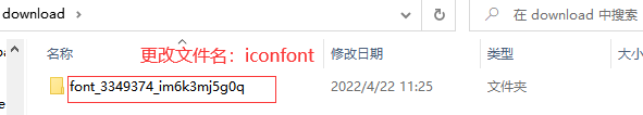
l 登录(新浪微博) → 选择图标库 → 选择图标,加入购物车 → 购物车 → 添加至项目 → 下载至本地

注意:使用需解压,并建议更改文件名为iconfont,并放在项目的根目录中
1.2 字体图标Unicode使用法
作用:通过小图标美化网页
- Unicode编码

- 使用方式:
1.引入样式表:iconfont.css
2.复制粘贴图标对应的Unicode编码
3.设置文字字体
<style>
span {
font-family: "iconfont";
}
</style>
</head>
<body>
<!-- 方法1 -->
<span></span>
</body>
1.3 字体图标Font-class使用法
- 类名

- 使用方式:
1.link引入iconfont.css文件
2.给标签设置类名: iconfont icon-xxx(两个类名)
3.自定义类名给icon设置额外的样式
  <link rel="stylesheet" href="./iconfont/iconfont.css">
  <style>
/* 方法2 */
/* 2.通过i标签承接字体图标
        类名:
          第一个类名是固定的:iconfont;
          第二个类名:通过html文件,直接去复制文字下方的类名即可 */
.big-icon {
font-size: 66px;
color: pink;
}
  </style>
</head>
<body>
  <!-- 方法2  -->
  <i class="iconfont icon-a-shuzhishijiaoyu big-icon"></i>
</body>
- 注意:
如果要给这个小图标设置额外样式,要新增一个类名(例如:big-icon),这是因为一个网页多处使用同一图标设置不用样式时,如果直接给这个图标(icon-a-shuzhishijiaoyu)设置的话,那么这几处的图标都变了,如果新增一个类,那么其他图表不受影响。
1.4 案例-购物车-普通做法
  <link rel="stylesheet" href="./iconfont/iconfont.css">
  <style>
    a {
      display: block;
      width: 200px;
      height: 50px;
      box-shadow: 0px 2px 12px 2px rgb(0 0 0 / 30%);
      text-align: center;
      line-height: 50px;
      color: #333;
      text-decoration: none;
    }
    .red-icon {
      color: red;
      font-size: 40px;
    }
  </style>
</head>
<body>
    <a href="#">
      <i class="iconfont icon-shouji red-icon"></i>
      <i class="iconfont icon-xiajiantou"></i>
    </a>
</body>
1.5 案例-购物车-搭配伪元素
 <!-- 1. 引入iconfont.css -->
  <link rel="stylesheet" href="./iconfont/iconfont.css">
  <style>
    a {
      display: block;
      width: 200px;
      height: 50px;
      box-shadow: 0px 2px 12px 2px rgb(0 0 0 / 30%);
      text-align: center;
      line-height: 50px;
      color: #333;
      text-decoration: none;
    }

    a::before {
   /* 2. 给a标签设置伪元素,设置content的值,复制图标的Unicode编码后四位放进content值 */
      content: "\e62d";
      /* 3. 设置字体类型等内容 */
      font-family: "iconfont";
    }

     a::after {
      content: "\e6cc";
      font-family: "iconfont";
    }
  </style>
</head>
<body>
  <a href="#">购物车</a>
</body>
1.6 在线引入字体图标
使用在线链接
优点:避免重复下载字体文件、替换本地文件
注意:引用在线链接需补全链接名,链接开头加http:
使用方式:
- 点击生成链接–复制链接

- 在
下面引入链接
<link rel="stylesheet" href="http://at.alicdn.com/t/font_3349374_kmj6adgzft.css">
- 注意:
1.需补齐链接名,在链接开头加http:
2.项目如果新增图表(即新加了图标进图标库项目),需重新生成链接 - 思考:如果图标库没有项目所需的图标怎么办?
答:IconFont网站上传矢量图生成字体图标
1.与设计师沟通,得到SVG矢量图
2.IconFont网站上传图标,下载使用
二、平面转换
作用:通过位移、旋转、缩放改变盒子在平面内的形态,给网页加上丰富的视觉效果
2.1 位移基本使用
- 目标:使用translate实现元素位移效果
- 属性名:transform
- 语法:
1.连写:transform: translate(x轴移动值, y轴移动值)
2.单方向:transform: translateX() 或 translateY()
3.快捷键:tf (transform)、ts (translate) - 取值(正负均可)
1.像素单位数值
2.百分比(基于自身尺寸计算百分比)
注意:X轴正向为右,Y轴正向为下 - 注意:
translate()如果只给出一个值, 表示x轴方向移动距离;
单独设置某个方向的移动距离:translateX() & translateY()
  <style>
    .box {
      width: 500px;
      height: 300px;
      margin: 100px auto;
      border: 4px solid #000;
    }


    .son {
      width: 200px;
      height: 100px;
      background-color: #6cf;
      /* 过渡 */
      transition: all 0.5s;
    }
    .box:hover .son {
      /* 需求1:盒子向右移动100px,向下移动100px */
      /* transform: translate(200px,100px); */

       /* ✨🔔百分比参照自身盒子的尺寸 */
       /* transform: translate(-50%,-100%); */

      /* 需求2:只会 向右移动100px,不需要向下移动*/
      /* transform: translateX(100px); */
      /* transform: translate(50%); */
       transform: translate(50%,0);

      /* 需求3:只会 向上移动50px,不需要水平移动*/
      /* transform: translateX(100px); */
      transform: translateY(-50%);
    }

    /* 需求4:盒子向左移动100px,向下移动100px*/
      /* transform: translateX(-100px);
      transform: translateY(100px); */
      /* 注意:此时只有Y轴的生效,同一属性会被覆盖 */
  </style>
</head>
2.1.1 绝对定位元素居中
- 目标:使用translate快速实现绝对定位的元素居中效果
- 原理:位移取值为百分比数值,参照盒子自身尺寸计算移动距离
  <style>
    .father {
      position: relative;
      width: 500px;
      height: 300px;
      margin: 100px auto;
      border: 4px solid #6cf;
    }

    .son {
      width: 200px;
      height: 200px;
      background-color: tomato;
      /* 核心代码 */
      position: absolute;
       left: 50%;
        top: 50%;
        transform: translate(-50%, -50%);
    }
  </style>
2.1.2 使用位移的三个注意事项
1.位移对行内元素无效
2.位移会提高标签的层级,但会保留原来盒子的位置–类似相对定位
3.小写x、y是可以正常运行,但是不推荐这么写
回顾绝对定位居中
   <style>
        * {
            margin: 0;
            padding: 0;
        }

        .box {
            /* 1.子绝父相 */
            position: relative;
            width: 500px;
            height: 300px;
            border: 1px solid #000;
            margin: 0 auto;
        }
        .son {
            position: absolute;

            /* 3.设置left 和top  */
            left: 50%;
            top: 50%;

            /* 设置margin 向左、向上偏移 */
            /* margin-left: -100%;
            margin-top: -75px; */
            /* 4.使用位移代替margin实现盒子偏移 */
            width: 200px;
            height: 150px;
            background-color: pink;
        }
    </style>
2.1.3 案例-双开门
目标:使用translate实现元素位移效果
  <style>
    * {
      margin: 0;
      padding: 0;
    }

    .box {
      width: 1366px;
      height: 600px;
      background: url("./images/bg.jpg");
      margin: 50px auto;

      /* 6.溢出隐藏 */
      overflow: hidden;
    }

    /* 1. 设置before和after两个伪元素 ,并且设置宽高、背景图*/
    .box::before,
    .box::after {
      /* 2.设置浮动,让伪元素变成行内块元素 */
      float: left;
      content: "";
      width: 50%;
      height: 100%;
      background: url('./images/fm.jpg');

      /* 5.过渡 */
      transition: all .5s;
    }

     .box::after{
      /* 3.使用position调整第二张背景图的位置 */
       /* 写法1 后面的0可以省略 */
       /* background-position: right 0; */
       background-position: 100% 0;
     }

     /* 4.hover时,让向左向右盒子移动 */
     .box:hover::before {
transform: translateX(-100%);
     }
    .box:hover::after {
      transform: translateX(100%);
    }
  </style>
</head>

<body>
  <div class="box"></div>
</body>
- 效果图:点击后两车分别向左右两边移动

点击一半后,两侧打开

2.2 旋转效果
- 目标:使用rotate实现元素旋转效果
- 语法
- transform: rotate(角度);
- 快捷键:tf ro
- 注意:角度单位是deg
- 技巧:取值正负均可
1.取值为正, 则顺时针旋转
2.取值为负, 则逆时针旋转
  <style>
    img {
      width: 250px;
      /* 过渡 */
      /* 1. 测试旋转时,要加上过渡效果,否者看不到旋转效果 */
      transition: 2s;
    }

    img:hover {
      /* 2. 角度黑正负值都可以,正值表示顺时针旋转,负值表示逆时针旋转 */
      /* transform: rotate(360deg); */
      /* 3. 快捷键ro */
      transform: rotate(-360deg);
    }
  </style>
</head>

<body>
  <img src="./images/rotate.png" alt="" />
</body>
2.2.1 转换原点
- 目标:使用transform-origin属性改变转换原点
- 语法
1 默认圆点是盒子中心点
2.transform-origin: 原点水平位置 原点垂直位置;
3.快捷键:tfo - 取值
1.方位名词(left、top、right、bottom、center)
2.像素单位数值
3.百分比(参照盒子自身尺寸计算)
  <style>
    img {
      display: block;
      width: 250px;
      border: 1px solid #000;
      margin: 200px auto;
      transition: all 3s;
      /* 旋转原点改变 */
    /* 注意事项:x轴和y轴取值,用空格隔开 */
    /* 记忆方法:有小括号内用逗号隔开,没有小括号用空格隔开 */


      /* 1. 👍取值方位名词,用的最多最推荐 */
transform-origin: left center;
      /* 2. 具体的像素单位(正负均可) */

      /* transform-origin: -50px 50px; */
      /* 3. 百分比(参考与盒子自身尺寸) */
      transform-origin: 100% 100%;
    }

    img:hover {
      transform: rotate(360deg);
    }
  </style>
</head>

<body>
  <img src="./images/rotate.png" alt="" />
</body>
- 效果图:以右下角为原点顺时针旋转
*
2.2.2 多重转换效果
- 目标:使用transform复合属性实现多形态转换
- 多重转换原理:
1.旋转会改变网页元素的坐标轴向
2.先写旋转,则后面的转换效果的轴向以旋转后的轴向为准,会影响转换结果 - 多重转换技巧
transform: translate() rotate();
注意:
1. rotate会改变坐标轴的轴向,
transform: rotate(9999deg) translate(600px);(可以执行,但方向轴改变了)
2. 同时指定位移和旋转,需要先写位移
    .box {
      width: 800px;
      height: 200px;
      /* border: 1px solid #000; */
      margin: 200px auto;
    }

    img {
      width: 50px;
      transition: all 2s;
    }
    /* 需求: 位移的同时,需要旋转图片 */
    .box:hover img {
      /* transform: translateX(800px);
      transform: rotate(600deg); */
      /* transform:是可以同时指定translate 和rotate的- 类似复合属性的写法 */
      transform: translateX(600px) rotate(9999deg);
      /*
        注意:
          1. 先写rotate会改变坐标轴的轴向,
           transform: rotate(9999deg) translate(600px);
          2. 正常:同时指定位移和旋转,需要先写位移
       */
    }
2.2.3 平面转换的三个效果图
    <style>
      div {
        height: 200px;
        border: 5px solid rgb(155, 90, 90);
        margin-bottom: 20px;
      }
      img {
        height: 100%;
        /* 过渡 */
        transition: 1s;
      }
      .box1:hover img {
        transform: translateX(500px);
      }
      .box2:hover img {
        transform: rotateZ(360deg);
      }
      .box3:hover img {
        transform: scale(1.3);
      }
    </style>
  </head>
  <body>
    <div class="box1">
      <img src="./images/daji.jpg" alt="" />
    </div>
    <div class="box2">
      <img src="./images/daji.jpg" alt="" />
    </div>
    <div class="box3">
      <img src="./images/daji.jpg" alt="" />
    </div>
  </body>
2.3 缩放效果
- 目标:使用scale改变元素的尺寸
- 语法
transform: scale(x轴缩放倍数, y轴缩放倍数);
快捷键:tfs - 技巧
一般情况下, 只为scale设置一个值, 表示x轴和y轴等比例缩放
transform: scale(缩放倍数);
scale值大于1表示放大, scale值小于1表示缩小
  <style>
    .box {
      width: 300px;
      height: 210px;
      margin: 100px auto;
      background-color: skyblue;
      border: 10px solid #000;
      /* 溢出隐藏 */
      /* overflow: hidden; */
    }

    .box img {
      width: 100%;
      transition: all 0.5s;
    }
    /* 直接在hover时改变宽高,能不能实现图片缩放效果 */
    .box:hover img {
      /* 平面转换使用scale  快捷键sc*/
      /* 大于1 时表示放大 */
      transform: scale(1.2,1.2);
      /* 小于1时表示缩小 */
      transform: scale(.2,.2);

      /* 注意:
      1. 图片缩放要保持等比例缩放
      2. 推荐只写一个值,表示等比例缩放 */
    }
  </style>
</head>
<body>
  <div class="box">
    <img src="./images/product.jpeg" alt="" />
  </div>
</body>
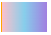
三、渐变
- 目标:使用background-image属性实现渐变背景效果
- 语法:
background-image: linear-gradient(transparent,rgba(0,0,0,.5));
快捷键:bgi li
   <style>
    .box {
      width: 300px;
      height: 200px;
      border: 2px solid orange;
      /* 给box 添加渐变效果 */
      background-image: linear-gradient(to right, pink,skyblue, #a17fe0);
      /* 完全透明,等同于opacity = 0的效果 */
      /* background-image: linear-gradient(transparent,rgba(0,0,0,.5)); */
    }
  </style>
效果展示:
- 注意:一般我们不自己设置渐变,可以到网站查找使用,渐变样式链接:https://uigradients.com
3.1华为综合案例
  <style>
    * {
      margin: 0;
      padding: 0;
      box-sizing: border-box;
    }


    li {
      float: left;
      list-style: none;
      margin: 0 20px;

    }

    li a {
      position: relative;
      display: block;
      color: #fff;
      /* 2. 设置宽高和溢出隐藏 */
      width: 350px;
      height: 247px;
      overflow: hidden;
    }

    .info {
      position: absolute;
      left: 0;
      /* bottom: 20px; */
      /* 1.  设置初始不显示p */
      bottom: -20px;
      padding: 0 20px;
      transition: all .3s;
      z-index: 1;

    }

    .info h4 {
      margin-top: 8px;
      margin-bottom: 20px;
    }
    .red-icon {
      color: red
    }

    img {
      transition: all .2s;
    }

    /* 2. 文字向上移动 */
    li:hover .info {
      /* bottom: 20px; */
      transform: translateY(-40px);
    }

    /* 3. 图片要放大 */
    li:hover img {
      transform: scale(1.2);
    }

    /* 4. 背景要渐变 */
    .mask {
      position: absolute;
      width: 100%;
      height: 100%;
      left: 0;
      top: 0;
      background-image: linear-gradient(transparent, rgba(0, 0, 0, .7));
      opacity: 0;
      transition: all .2s;
    }

    li:hover .mask {
      opacity: 1;
    }
 </style>
<body>
  <ul>
    <li>
      <a href="#">
        <img src="./images/pic1.png" alt="">
        <div class="info">
          <h5>行业洞察</h5>
          <h4>笃行致远,共建具有获得感、幸福感、安全感的智慧城市</h4>
          <p>了解更多 <i class="iconfont icon-arrow-right red-icon"></i></p>
        </div>
        <div class="mask"></div>
      </a>
    </li>
    <li>
      <a href="#">
        <img src="./images/pic2.png" alt="">
        <div class="info">
          <h5>行业洞察</h5>
          <h4>笃行致远,共建具有获得感、幸福感、安全感的智慧城市</h4>
          <p>了解更多 <i class="iconfont icon-arrow-right red-icon"></i></p>
        </div>
        <div class="mask"></div>
      </a>
    </li>
    <li>
      <a href="#">
        <img src="./images/pic3.png" alt="">
        <div class="info">
          <h5>行业洞察</h5>
          <h4>笃行致远,共建具有获得感、幸福感、安全感的智慧城市</h4>
          <p>了解更多 <i class="iconfont icon-arrow-right red-icon"></i></p>
        </div>
        <div class="mask"></div>
      </a>
    </li>
  </ul>
</body>```


 801
801


 被折叠的 条评论
为什么被折叠?
被折叠的 条评论
为什么被折叠?
 到【灌水乐园】发言


