


1、CSS是什么
如何学习
1.CSS是什么
2.CSS怎么用(快速入门)
3.CSS选择器(重点 , 难点)
4.美化网页(文字,阴影,超链接,列表,渐变…)
5.盒子模型
6.浮动
7.定位
8.网页动画(特效效果)
1.1什么是CSS
Cascading Style Sheet 层叠级联样式表
1.2 发展史
CSS1.0
CSS2.0 DIV(块) + CSS, HTML与CSS结构分离的思想 网页变得简单
CSS2.1 浮动,定位
CSS3.0 圆角,阴影,动画…. 浏览器兼容性~
1.3 快速入门
style
基本入门
代码示例
<!DOCTYPE html>
<html lang="en">
  <head>
    <meta charset="UTF-8">
    <title>Title</title>

    <!--规范,<style> 可以编写CSS代码 每一个声名使用分号结尾
    语法:
    选择器{
    声名1;
    声名2;
    声名3;
    }
    -->
    <style>
      h1{
        color: aquamarine;
      }
    </style>

  </head>
  <body>

    <h1>这是一个标题</h1>

  </body>
</html>
css的优势
1、内容和表现分离
2、网页结构表现统一,可以实现复用
3、样式十分的丰富
4、建议使用独立于HTML的css文件
5、利用SEO,容易被搜索引擎收录
1.4 CSS的3种导入方式
优先级:就近原则 行内样式>内部样式>外部样式
<!DOCTYPE html>
<html lang="en">
  <head>
    <meta charset="UTF-8">
    <title>导入方式</title>

    <!-- 内部样式 -->
    <style>
      h1 {
        color: black;
      }
    </style>

    <!-- 外部样式 -->
    <link rel="stylesheet" href="css/style.css">
  </head>
  <body>

    <!-- 行内样式:在标签元素中,编写一个style属性,编写样式即可 -->
    <h1 style="color: aqua">标签</h1>

  </body>
</html>
拓展:外部样式两种写法
1.链接式
HTML
<!-- 外部样式 -->
<link rel="stylesheet" href="css/style.css">
2.导入式
@import是CSS 2.1特有的
<!-- 导入式 -->
<style>
  @import url("css/style.css");
<style>
2、选择器
作用:选择页面上的某一个或某一类元素
2.1 基本选择器
1.标签选择器
**特点:选择一类标签 标签{},**会选择到页面上所有的这个标签的元素
<!DOCTYPE html>
<html lang="en">
  <head>
    <meta charset="UTF-8">
    <title>Title</title>
    <style>
      h1{
        color: green;
      }
      p{
        color: red;
      }

    </style>
  </head>
  <body>
    <h1> 标题1 </h1>
    <h1> 标题1 </h1>
    <p> 我是段落 </p>
  </body>
</html>
2.类选择器
特点:选择所有class属性一致的标签,跨标签 .类名{}
<!DOCTYPE html>
<html lang="en">
  <head>
    <meta charset="UTF-8">
    <title>title</title>

    <style>
      /* 类选择器
      对同一个类操作
      */
      .class-name1{
        color: red;
      }

      .class-name2{
        color: green;
      }
    </style>

  </head>
  <body>

    <h1 class="class-name1">标题1</h1>
    <h1 class="class-name2">标题2</h1>
    <p class="class-name2">段落2</p>

  </body>
</html>
3.ID选择器
特点:全局唯一 #id{}
<!DOCTYPE html>
<html lang="en">
  <head>
    <meta charset="UTF-8">
    <title>title</title>

    <style>
      /* ID选择器
      只能对一个ID操作,ID唯一,用#
      */
      #id-1{
        color: red;
      }

      #id-2{
        color: green;
      }
    </style>

  </head>
  <body>

    <h1 id="id-1">标题1</h1>
    <h1 id="id-2">标题2</h1>

  </body>
</html>
总结
#id > .class > h1
ID选择器 > 类选择器 > 标签选择器
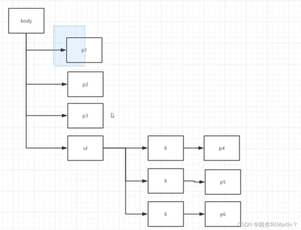
2.2 层次选择器
<!DOCTYPE html>
<html lang="en">
<head>
    <meta charset="UTF-8">
    <title>Title</title>

  <!--/* 后代选择器 */-->
  <!--<style>-->
  <!--  body p{-->
  <!--    background: red;-->
  <!--  }-->
  <!--</style>-->

  <!--/** 子选择器 **/-->
  <!--<style>-->
  <!--  body > p{-->
  <!--    background: aquamarine;-->
  <!--  }-->
  <!--</style>-->

  <!--/* 相邻选择器 */-->
  <!--<style>-->
  <!--  .active + p{-->
  <!--    background: red;-->
  <!--  }-->
  <!--</style>-->

  /* 通用兄弟选择器 */
  <style>
    .active ~ p{
      background: red;
    }
  </style>


</head>
<body>

<p>p1</p>
<p class="active">p2</p>
<p>p3</p>

<ul>
  <li>
    <p>p4</p>
  </li>
  <li>
    <p>p5</p>
  </li>
  <li>
    <p>p6</p>
  </li>
</ul>
</body>
</html>
1、后代选择器
在某个元素的后面全部变了、祖爷爷,爸爸,儿子,选中所有的后辈
/* 后代选择器 */
<style>
body p{
  background: red;
}
</style>
2、子选择器
只有一代,选中所有的儿子
/** 子选择器 **/
<style>
body > p{
  background: aquamarine;
}
</style>
3、相邻兄弟选择器
同辈、相邻(对下不对上)、只往同一层 向后 传递一次,选中他的第一个弟弟
/* 相邻选择器 */
<style>
.active + p{
  background: red;
}
</style>
4、通用选择器
当前选中元素的向后的所有兄弟元素(同一层),选中他所有的弟弟
/* 通用兄弟选择器 */
<style>
.active ~ p{
  background: red;
}
</style>
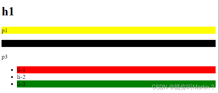
2.3 结构伪类选择器
<!DOCTYPE html>
<html lang="en">
<head>
    <meta charset="UTF-8">
    <title>Title</title>

    <!--避免使用 class id 选择器-->
    <style>
        /*ul的第一个子元素*/
        ul li:first-child{
            background: red;
        }

        /*ul的最后一个子元素*/
        ul li:last-child{
            background: green;
        }

        /*
        p的父元素下的第二个元素,如果是P,就生效,否则不生效
        */
        p:nth-child(2){
            background: yellow;
        }
        /*选中父元素,下的p元素的第二个,*/
        p:nth-of-type(2){
            background: black;
        }
    </style>


</head>
<body>

    <h1>h1</h1>
    <p>p1</p>
    <p>p2</p>
    <p>p3</p>
    <ul>
        <li>li-1</li>
        <li>li-2</li>
        <li>li-3</li>
    </ul>


</body>
</html>
2.4 属性选择器(重要)
把ID + class结合
= 绝对等于
*= 类似与通配符,只要包含该关键词即可
^= 选择以什么开头的属性
$= 选择以什么结尾的属性
<!DOCTYPE html>
<html lang="en">
<head>
    <meta charset="UTF-8">
    <title>Title</title>

    <style>
        .demo a{
            float: left;
            display: block;
            height: 50px;
            width: 50px;
            border-radius: 10px;text-align: center;
            text-decoration: none;
            margin-right: 5px;
            font: bold 20px/50px Arial;
        }
        /*属性选择器    属性名 = 属性值(正则)
        存在ID属性的元素   a[id = ]{}
        */

        /*包含id=first的a标签*/
        a[id=first]{

        }

        /*class的属性为links的a标签*/
        a[class ="links"]{

        }


        /*包含links关键词的class的a标签*/
        a[class *="links"]{

        }

        /*href以http开头*/
        a[href ^= "http"]{
            background: red;
        }

        /*href以g结尾*/
        a[href $= g]{
            background: green;
        }

    </style>

</head>
<body>

<p class="demo">
    <a href="http://www.baidu.com" class="links itme" id="first">1</a>
    <a href="http://www.bilibili.com" class="links itme itme">2</a>
    <a href="images/123.html" class="links itme">3</a>
    <a href="images/456.jpg" class="links itme">4</a>
    <a href="sad" class="links itme itme">5</a>
    <a href="adc" class="links itme">6</a>
</p>

</body>
</html>
3、美化网页元素
3.1 为什么要美化网页
1、有效的传递页面信息
2、美化网页,页面漂亮,才能吸引用户
3、凸显页面的主题
4、提高用户的体验
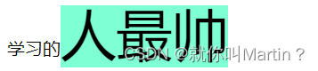
span标签:重点要突出的字,使用span套起来
<!DOCTYPE html>
<html lang="en">
<head>
    <meta charset="UTF-8">
    <title>Title</title>

    <style>
        .title1{
            font-size: 50px;
            background: aquamarine;
        }
    </style>

</head>
<body>

学习的<span class="title1">人最帅</span>

</body>
</html>
3.2 字体样式
<!--
font-family: 字体
font-size:  字体大小
font-weigth:字体粗细
color:      字体颜色
-->
<style>
    body{
        font-family: 仿宋_GB2312;
    }
</style>
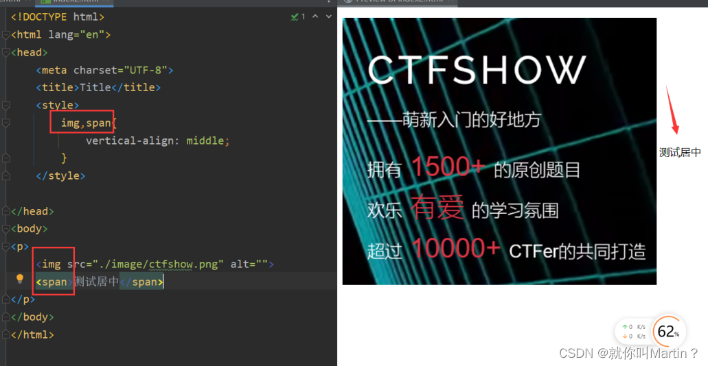
3.3 文本样式
1、颜色 color rgb rgba
2、文本对齐的方式 text-align = center(居中)
3、首行缩进 text-indent: 2em
4、行高 line-heigth: 单行文字上下居中 line-heigth = heigth
5、装饰 text-decoration
6、文本图片水平对齐:vertical-align:middle(需要有参照物)
<!DOCTYPE html>
<html lang="en">
  <head>
    <meta charset="UTF-8">
    <title>Title</title>
    <!--
    颜色:
    单词
    RGB: 0~F
    RGBA  A: 0~1
    text-align:排版,居中(center)
    text-indent: 首行缩进
    line-heigth:行高 (和快点高度一致,就可以上下居中)
    -->
    <style>
      h1{
        color: rgba(0,255,255,0.8);
        text-align: center;
      }
      .p1{
        text-indent: 2em;
      }
    </style>
  </head>
  <body>

    <h1>背景故事</h1>
    <p class="p1">天地初开,太古混乱。</p>
    <p>灵长之战后,时空人祖、九巫、始佛、幽冥、大魔神相继出世,开创道法,威临八方,众生朝迎,世人尊为始祖。</p>
    <p>天尊无敌当世,始祖名传古今。</p>
    <p>但,皆不可得长生……</p>
    <p>…………</p>
    <p>张若尘自逆境中崛起,从平凡中非凡,在这一条满是英才、妖魔、美人的长生路上,走出一个崭新的大世。</p>

  </body>
</html>
3.4 阴影
#id-1{
    /*右下为正方向*/
    text-shadow: red 10px 10px 10px;
}
3.5 超链接伪类
<!DOCTYPE html>
<html lang="en">
<head>
<meta charset="UTF-8">
<title>Title</title>
<style>
a{
text-decoration: none;
color: black;
}
/*鼠标悬浮的颜色*/
a:hover{
color: red;
}
/*鼠标被按住的颜色*/
a:active{
color: green;
}
/*被访问过的颜色*/
a:visited{
color: yellow;
}
#id-1{
/*右下为正方向*/
text-shadow: red 10px 10px 10px;
}
</style>
</head>
<body>
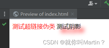
<a href="#">
<img src="#" alt="">测试超链接伪类
</a>
<a href="#" id="id-1">
测试阴影
</a>
</body>
</html>
3.6 列表
<!DOCTYPE html>
<html lang="en">
<head>
<meta charset="UTF-8">
<title>Title</title>
</head>
<body>
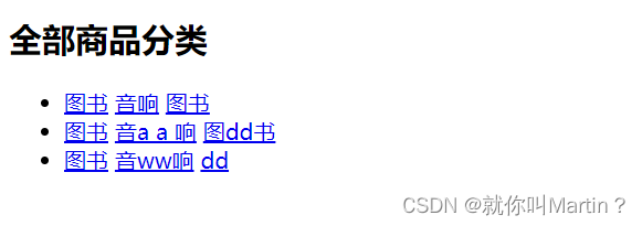
<h2 class="title">全部商品分类</h2>
<ul>
<li><a href="#">图书</a> <a href="#">音响</a> <a href="#">图书</a> </li>
<li><a href="#">图书</a> <a href="#">音a a 响</a> <a href="#">图dd书</a> </li>
<li><a href="#">图书</a> <a href="#">音ww响</a> <a href="#">dd</a> </li>
</ul>
</body>
</html>
<!DOCTYPE html>
<html lang="en">
<head>
<meta charset="UTF-8">
<title>Title</title>
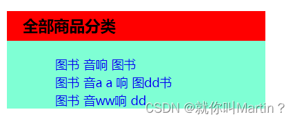
<style>
#nav{
width: 300px;
background: aquamarine;
}
h2{
font-size: 18px;
font-weight: bold;
text-indent: 1em;
line-height: 35px;
background: red;
}
/*
list-style
none 去掉原点
circle 空心圆
decimal 数字
square 正方形
*/
ul li{
list-style: none;
text-indent: 1em;
}
/*ul{*/
/* background: aquamarine;*/
/*}*/
a{
text-decoration: none;
font-size: 14px;
}
a:hover{
color: orange;
text-decoration: underline;
}
</style>
</head>
<body>
<div id="nav">
<h2 class="title">全部商品分类</h2>
<ul>
<li><a href="#">图书</a> <a href="#">音响</a> <a href="#">图书</a> </li>
<li><a href="#">图书</a> <a href="#">音a a 响</a> <a href="#">图dd书</a> </li>
<li><a href="#">图书</a> <a href="#">音ww响</a> <a href="#">dd</a> </li>
</ul>
</div>
</body>
</html>
3.7 背景
<style>
div{
  width: 1000px;
  height: 1000px;
  border: 1px solid red;
	/*默认全部平铺*/
  background-image: url("images/OIP-C.jpg");
}
/*沿X平铺*/
.div1{
  background-repeat: repeat-x;
}
/*沿Y平铺*/
.div2{
  background-repeat: repeat-y;
}
/*不平铺*/
.div3{
  background-repeat: no-repeat;
}
</style>
4、盒子模型
4.1 边框和内外边距
- margin 框架向外扩张
- border 框架的粗细
- padding 框架向内扩张
- 最里层的是 比如input的大小
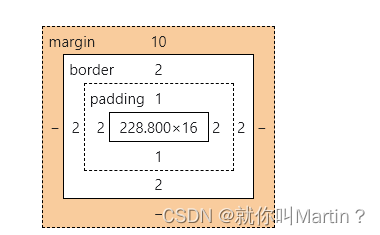
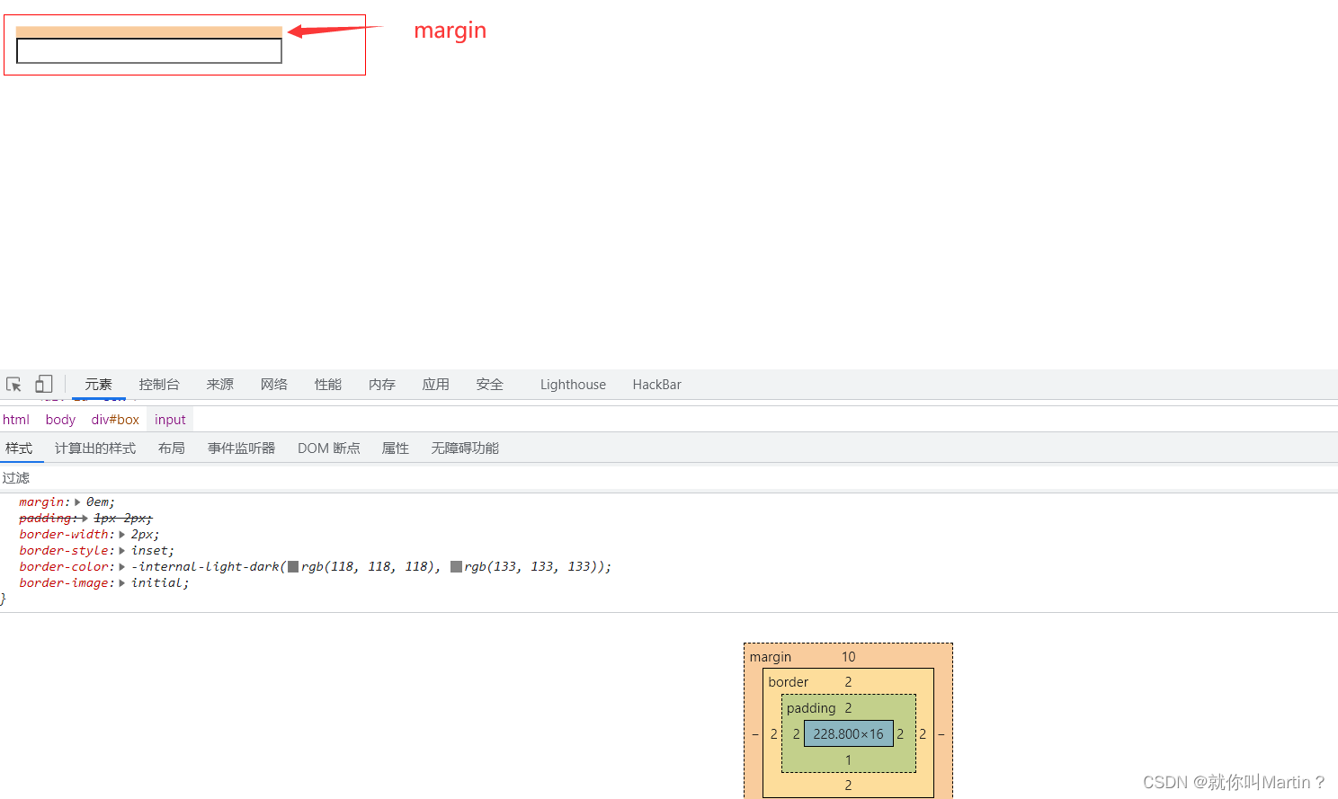
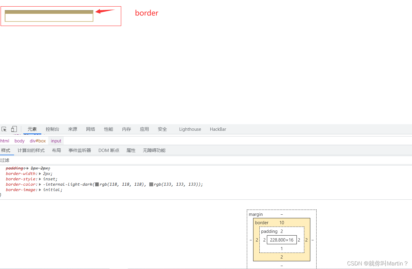
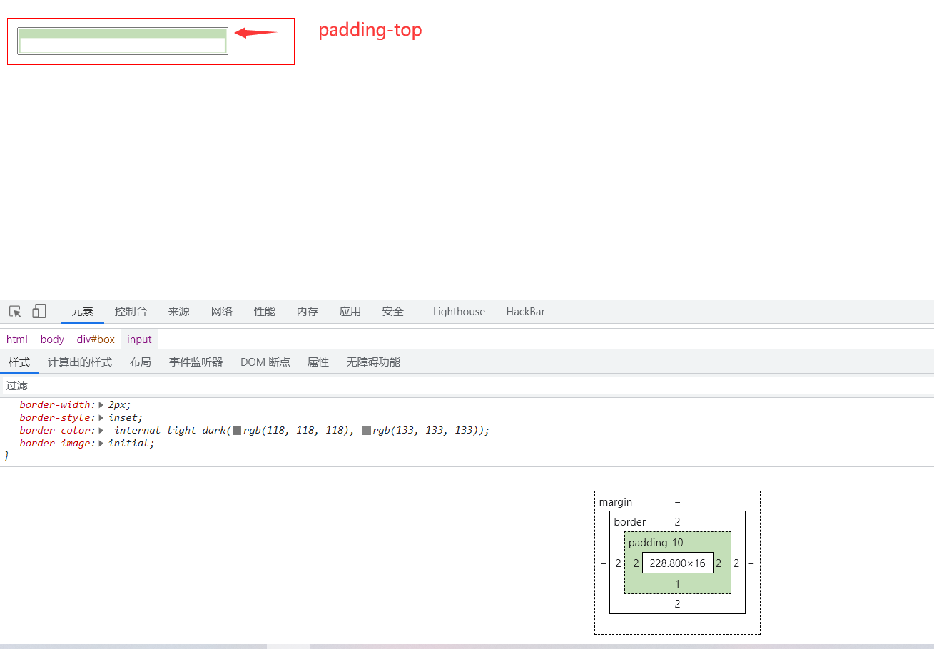
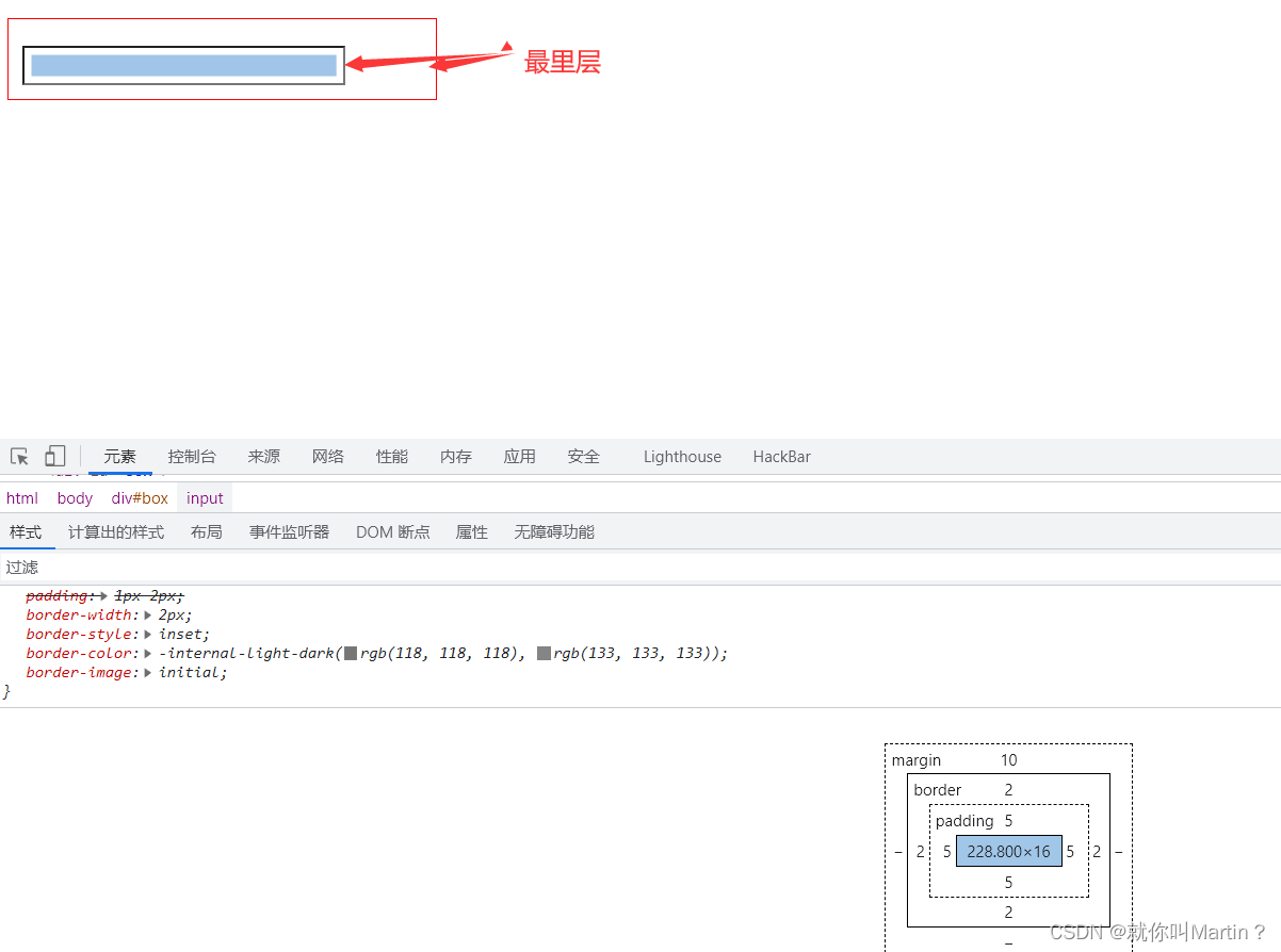
一张图片的大小,应该等于=margin+border+padding+自己本身的width/height
5、浮动
5.1 display
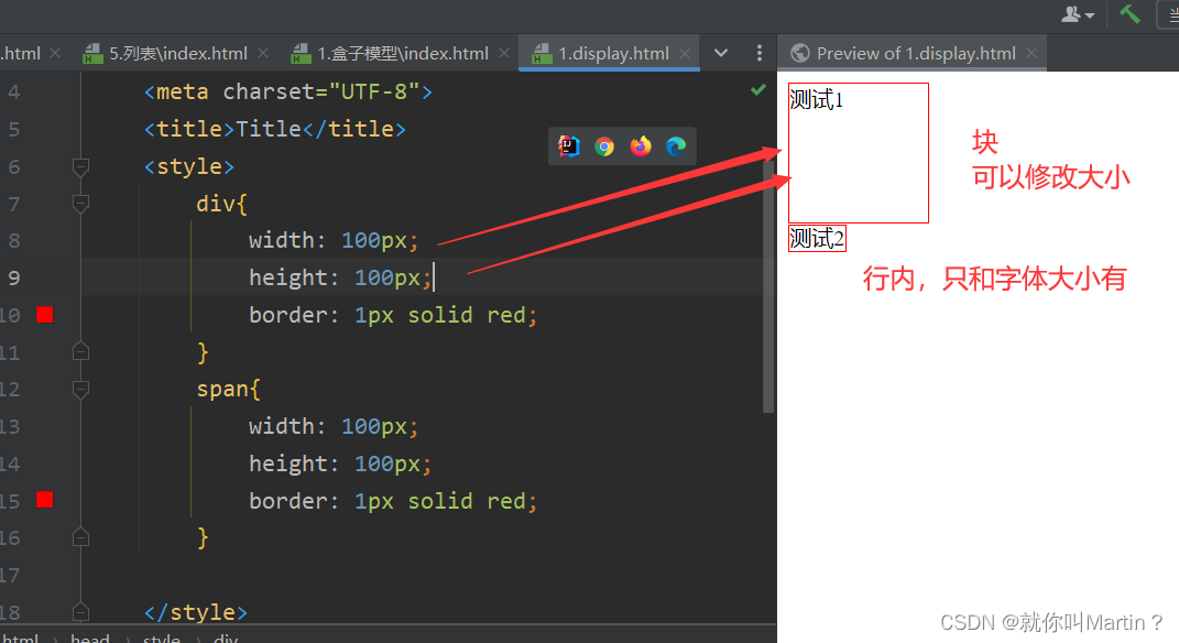
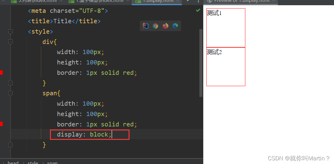
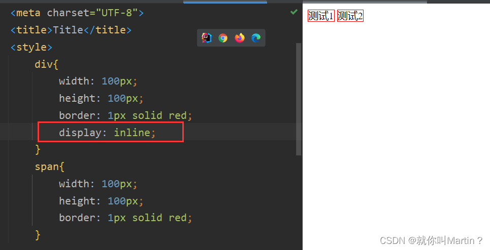
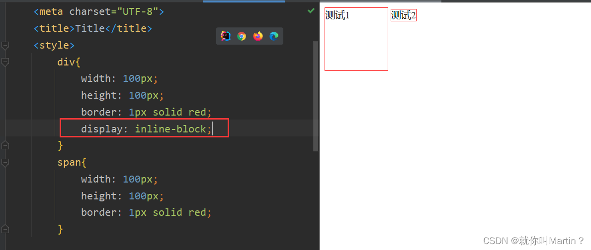
块内元素:h1-h6 p div 列表 独占一行
行内元素:span a img strong 不独占一行
display
display:block独占一行的块display:inline不独占一行的display:inline-block不独占一行的块,本质是块,但是后面可以加东西
基础:
<!DOCTYPE html>
<html lang="en">
<head>
    <meta charset="UTF-8">
    <title>Title</title>
    <style>
        div{
            width: 100px;
            height: 100px;
            border: 1px solid red;
        }
        span{
            width: 100px;
            height: 100px;
            border: 1px solid red;
        }

    </style>
</head>
<body>

<div>测试1</div>
<span>测试2</span>
</body>
</html>
5.2 float
float
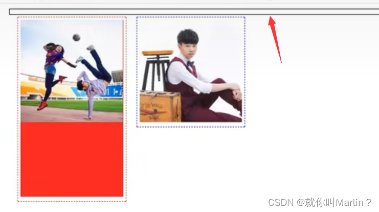
float: right向右浮动,不独占一行(后面的浮动和他一行),类似于wordclear:both(/left/right只有左右)配合float使用,独占一行
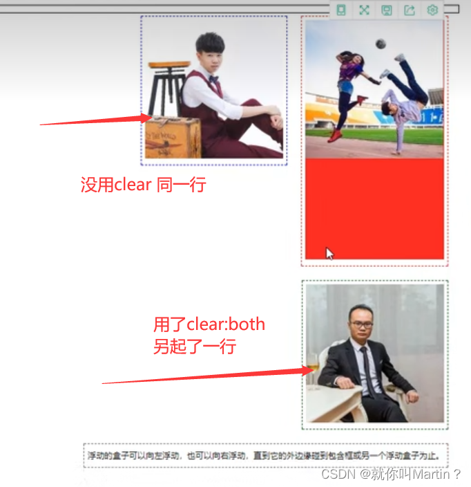
5.3 父级边框塌陷问题
问题:浮动之后,没有图片在父级边框之内
解决方案:
1、增加父级元素高度
#father{
  border:1px #000 solid;
  height:800px;
}
2、增加一个空DIV标签,清除浮动 (标准写法,但是添加了空div代码不美观)
<div class = "clear"></div>
.cleal{
  clear:both;
  margin:0;
  padding:0;
}
3、在父级元素中增加一个overflow
#father{
  border:1px #000 solid;
  height:800px;
  overflow:hidden;   //意思是超出范围就隐藏(如果有宽高的话) scroll 滚动条
}
4、父类添加一个伪类:after (本质和添加一个空div一样,但是代码更美观,方便实用)
#father:after{
    content:'';
    display:block;
    clear:both;/*消除浮动*/
}
小结
- 浮动元素后面增加空div
简单,代码中尽量避免空div
- 设置父元素的高度
简单,元素假设有了固定的高度,就会被限制
- overflow
简单,下拉的一些场景避免使用
- 父类添加一个伪类: after(推荐)
写法稍微复杂一点,但是没有副作用,推荐使用!
5.4 display和float对比
- display
方向不可以控制o
- float
浮动起来的话会脱离标准文档流,所以要解决父级边框塌陷的问题-
6、定位
标准:
<!DOCTYPE html>
<html lang="en">
<head>
<meta charset="UTF-8">
<title>Title</title>
<style>
div{
margin: 10px;
padding: 5px;
font-size: 12px;
line-height: 25px;
}
#father{
border: 1px solid green;
}
#first{
border: 1px dashed red;
}
#second{
border: 1px dashed orange;
}
#third{
border: 1px dashed blue;
}
</style>
</head>
<body>
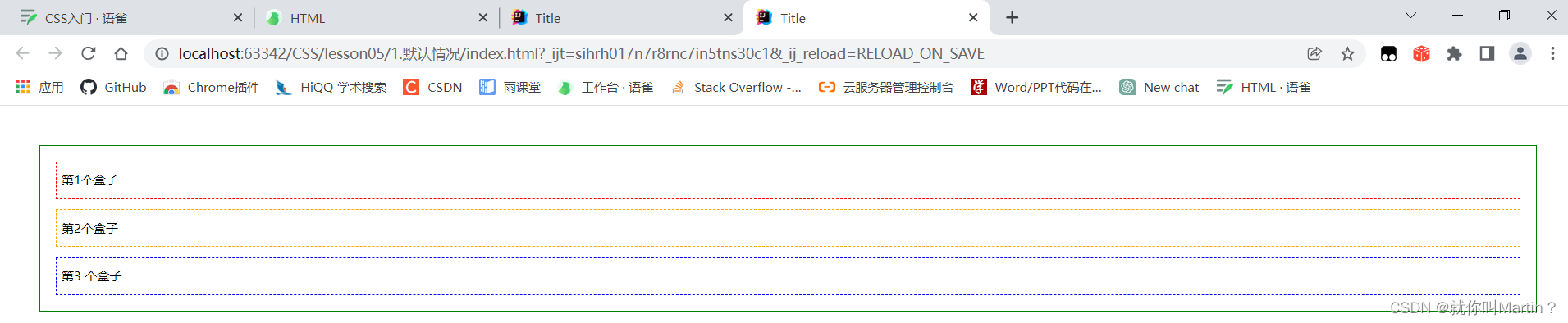
<div id="father">
<div id="first">第1个盒子</div>
<div id="second">第2个盒子</div>
<div id="third">第3 个盒子</div>
</div>
</body>
</html>
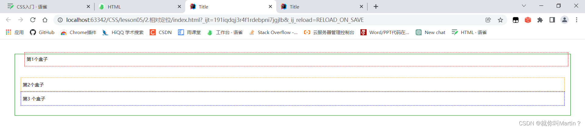
6.1 相对定位relative
相对于原来的位置,进行指定的偏移,相对定位的话,它任然在标准文档流中,原来的位置会被保留
#father{
  border: 1px solid green;
}
#first{
  border: 1px dashed red;
  position: relative; /*相对定位,上下左右*/
  top: -20px;
  left: 10px; /*以原来为界限,距离左边10个单位*/
}
#second{
  border: 1px dashed orange;
}
#third{
  border: 1px dashed blue;
  position: relative;
  bottom: 10px; /*距离原来的下面有10个单位*/
}
6.2 绝对定位absolute
定位:基于xxx定位,上下左右~
- 没有父级元素定位的前提下,相对于浏览器定位
- 假设父级元素存在定位,我们通常会相对于父级元素进行偏移,(父元素要postion:relative一下)
相对于父级或浏览器的位置,进行指定的偏移,绝对定位的话,它不在在标准文档流中,原来的位置不会被保留
div{
  position: absolute;
  left: 50px;
  top: 100px
}
6.3 固定定位fixed
<!DOCTYPE html>
<html lang="en">
<head>
    <meta charset="UTF-8">
    <title>Title</title>

    <style>
        body{
            height: 1000px;
        }
        div:nth-of-type(1){ /*绝对定位,浏览器右下角,浏览器滑动,他会变位置*/
            width: 100px;
            height: 100px;
            background: red;
            position: absolute;
            right: 0;
            bottom: 0;
        }
        div:nth-of-type(2){/*绝对定位,浏览器右下角,即使有滑动条,他也位置不变*/
            width: 50px;
            height: 50px;
            background: green;
            position: fixed;
            right: 0;
            bottom: 0;
        }
    </style>
</head>
<body>


<div>div1</div>
<div>div2</div>
</body>
</html>
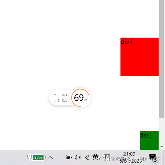
总结
- 绝对定位,浏览器滑动,它变位置了
- 固定定位,浏览器滑动,它永远在右下角
6.4 z-index
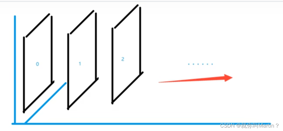
图层,层级的概念
.tipText{
    z-index: 999; /*图层级别*/
}
透明度
.tipBg{
    opacity: 0.5; /*背景透明度*/
    filter: alpha(opacity=50); !*背景透明度*!
}


 扫一扫
扫一扫


 291
291

 被折叠的 条评论
为什么被折叠?
被折叠的 条评论
为什么被折叠?
 到【灌水乐园】发言


