


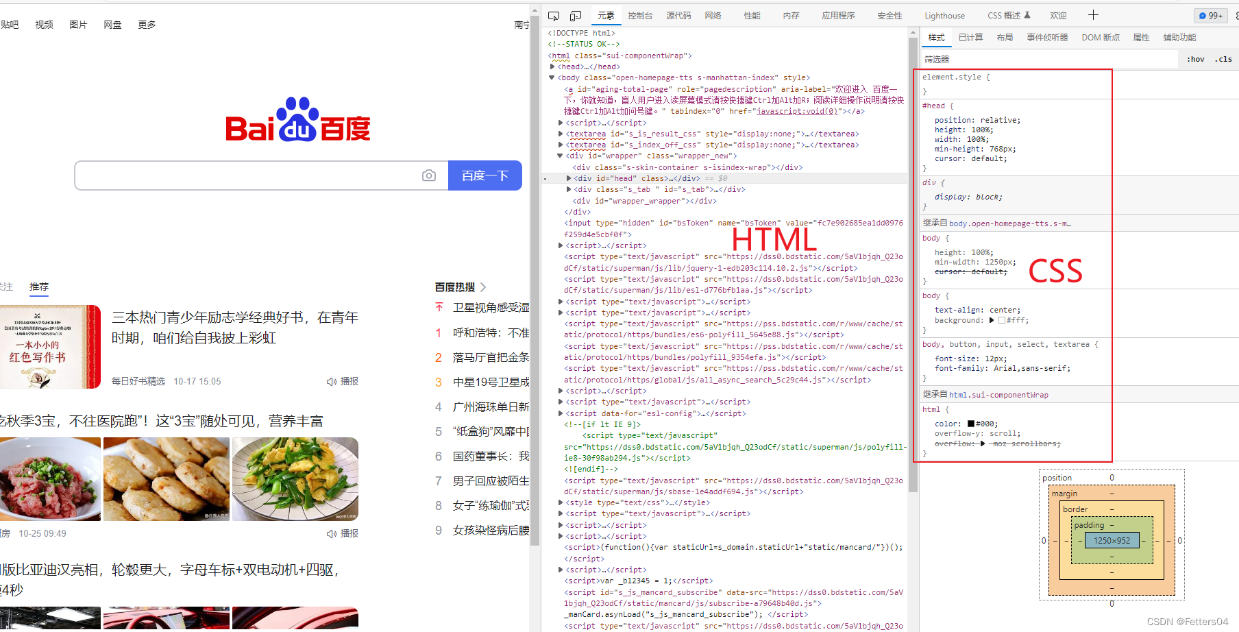
1、CSS概述
1.1、什么是CSS
Cascading Style Sheets 层叠样式表
CSS:表现(美化标签)
1.2、发展历程
CSS1.0
CSS2.0 DIV(块)+ CSS,HTML与CSS结构分离的思想,网页变得简单,利于SEO(搜索引擎优化)
CSS2.1 浮动,定位
CSS3.0 圆角、阴影、动画… 浏览器兼容性
1.3、快速入门
<!DOCTYPE html>
<html lang="en">
<head>
    <meta charset="UTF-8">
    <title>Title</title>

    <!--规范,<style>可以编写css的代码
    语法:
        选择器 {
            声明 1;
            声明 2;
            声明 3;
        }
    -->
    <style>
        h1 {
            color: aqua;
        }
    </style>

</head>
<body>

    <h1>我是标题</h1>

</body>
</html>
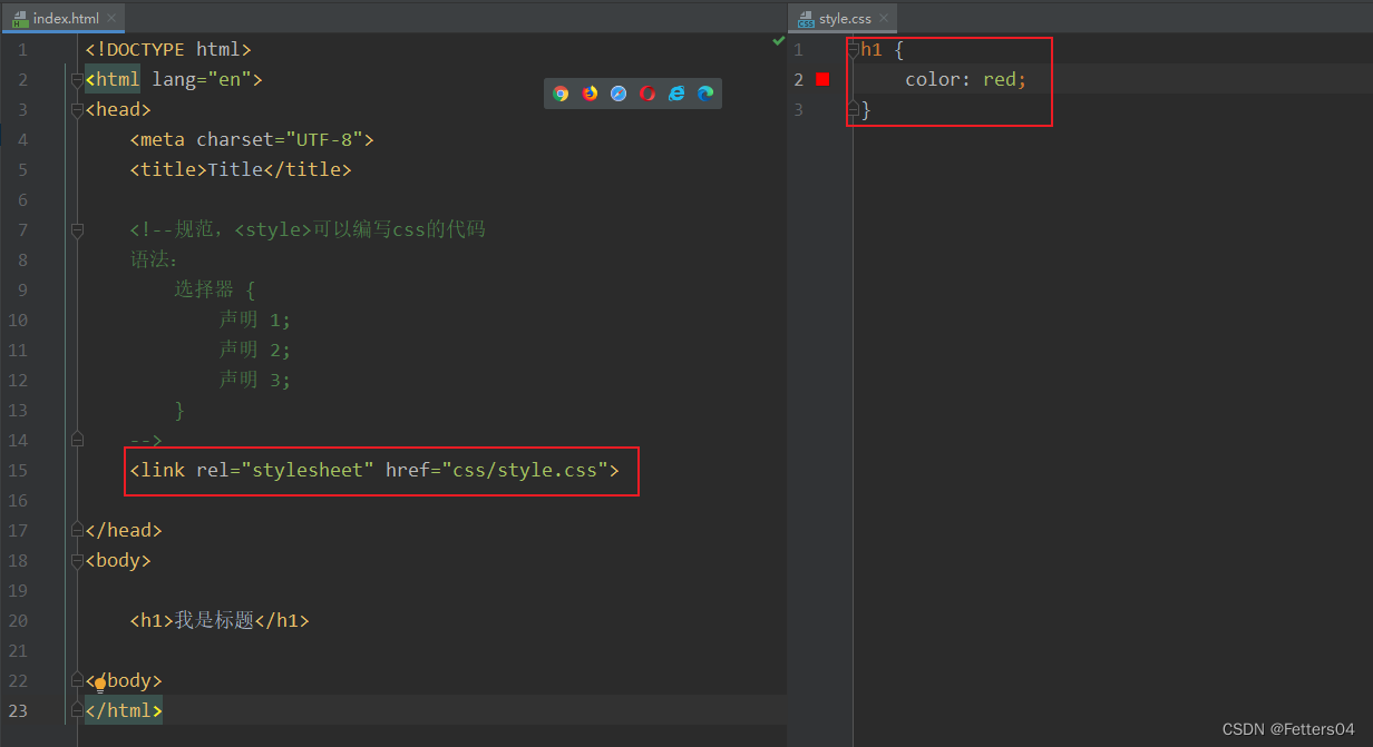
建议使用这种规范写,link标签用来链接样式表
CSS的优势:
1、内容和表现分离
2、网页结构表现统一,可以实现复用
3、样式十分的丰富
4、建议使用与html分离的css文件
5、利用SEO,容易被搜索引擎收录
1.4、CSS的三种导入方式
<!DOCTYPE html>
<html lang="en">
<head>
    <meta charset="UTF-8">
    <title>Title</title>

    <!--内部样式-->
    <style>
        h1 {
            color: green;
        }
    </style>

    <!--外部样式-->
    <link rel="stylesheet" href="css/style.css">

</head>
<body>

    <!--优先级:就近原则-->

    <!--行内样式-->
    <h1 style="color:red">我是标题</h1>

</body>
</html>
拓展:外部样式的两种写法,推荐使用 link
- 链接式:
html 标签
<!--外部样式-->
<link rel="stylesheet" href="css/style.css">
- 导入式:
@import 是 CSS2.1 特有
弊端:先展现结构再进行渲染
<!--导入式-->
<style>
	@import url("css/style.css");
</style>
2、选择器
作用:选择页面上的某一个或者某一类元素
2.1、基本选择器
优先级:不遵循就近原则,固定的
id选择器 > class 选择器 > 标签选择器
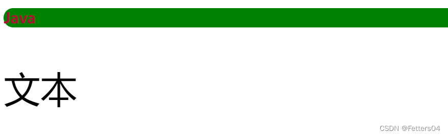
1、标签选择器: 选择一类标签 (格式:标签{} 例如:h1{}、p{})
<!DOCTYPE html>
<html lang="en">
<head>
    <meta charset="UTF-8">
    <title>Title</title>

    <style>
        /*标签选择器,会选择到页面上所有的该标签元素*/
        h1 {
            color: #aa1133;
            background: green;
            border-radius: 24px;
        }

        p {
            font-size: 80px;
        }
    </style>

</head>
<body>

    <h1>Java</h1>
    <p>文本</p>
</body>
</html>
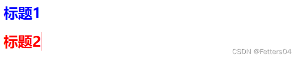
2、类选择器 class: 选择所有class属性一致的标签,跨标签 (格式:.class_name{})
<!DOCTYPE html>
<html lang="en">
<head>
    <meta charset="UTF-8">
    <title>Title</title>

    <style>
        /*
        类选择器的格式:.class_name{}
        可以对一类 class 样式归类,重复使用
        */
        .blue {
            color: blue;
        }
        .abc {
            color: red;
        }
    </style>

</head>
<body>
    <h1 class="blue">标题1</h1>
    <h1 class="abc">标题2</h1>
</body>
</html>
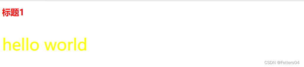
3、id 选择器: 全局唯一 (格式:#id_name{})
<!DOCTYPE html>
<html lang="en">
<head>
    <meta charset="UTF-8">
    <title>Title</title>

    <style>
        /*
            id选择器:id 必须保证全局唯一
            格式:#id_name{}
        */
        #color {
            color: red;
        }
        #text {
            color: yellow;
            font-size: 60px;
        }
    </style>
</head>
<body>

    <h1 id="color">标题1</h1>
    <p id="text">hello world</p>
</body>
</html>
2.2、层次选择器
1、后代选择器 在某个元素的后面多代
/*后代选择器*/
body p {
	background: red;
}
2、子选择器 父元素的子一代
/*子选择器*/
body > p {
	background: #abcabc;
}
3、相邻兄弟选择器 同辈,相邻向下只有一个
/*相邻兄弟选择器*/
.active + p {
	background: #aa1133;
}
4、通用选择器 同辈,向下所有
/*通用兄弟选择器*/
.active ~ p {
	background: green;
}
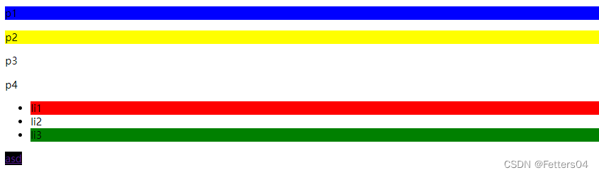
2.3、结构伪类选择器
伪类:条件过滤
(用的不多,混个眼熟)
<style>
    /*ul的第一个子元素*/
    ul li:first-child {
    	background: red;
    }

    /*ul的最后一个子元素*/
    ul li:last-child {
    	background: green;
    }

    /*选择当前p元素的父级元素,选中父级元素的第一个,并且是当前元素才生效*/
    p:nth-child(1) {
    	background: blue;
    }

    /*选择p元素的父元素下的p元素中的第二个*/
    p:nth-of-type(2) {
    	background: yellow;
    }

    /*鼠标移动到a标签上出现的状态*/
    a:hover {
    	background: black;
    }
</style>
2.4、属性选择器(常用)
标签 + 属性 结合
<!DOCTYPE html>
<html lang="en">
<head>
    <meta charset="UTF-8">
    <title>属性选择器</title>

    <style>
        /*后代选择器*/
        .demo a {
            float: left;
            display: block;
            height: 50px;
            width: 50px;
            border-radius: 10px;
            background: blue;
            text-align: center;
            color: red;
            text-decoration: none;
            margin-right: 5px;
            line-height: 50px;
        }

        /*标签,属性名=属性值(正则)
             = 绝对等于
            *= 包含这个元素
            ^= 以这个开头
            $= 以这个结尾
        */

        /*存在id属性的元素  a[]{}*/
        a[id] {
            background: green;
        }
        /*id=first的元素*/
        a[id = first] {
            background:black;
        }
        /*class中含有links的元素*/
        a[class*="links"] {
            background: yellow;
        }
        /*选中href中以image开头的元素*/
        a[href^=image] {
            background: blueviolet;
        }
        /*选中href中以jpg结尾的元素*/
        a[href$=jpg] {
            background: cornflowerblue;
        }

    </style>
</head>
<body>
    <p class="demo">
        <a href="http://www.baidu.com" class="link item first" id="first">1</a>
        <a href="http://bilibili.com" class="link item active" target="_blank" title="test">2</a>
        <a href="image/123.png" class="links item">3</a>
        <a href="image/123.jpg" class="links item">4</a>
        <a href="image/123.html" class="links item">5</a>
        <a href="abc" class="links item">6</a>
        <a href="/a.pdf" class="links item">7</a>
        <a href="/b.pdf" class="links item">8</a>
        <a href="abc.doc" class="links item">9</a>
    </p>
</body>
</html>

3、美化网页元素
3.1、为什么要美化网页
- 有效地传递页面信息
- 美化网页,吸引用户
- 凸显页面主题
- 提高用户的体验
span标签:重点要修饰的字,用span套起来应用
<!DOCTYPE html>
<html lang="en">
<head>
    <meta charset="UTF-8">
    <title>span</title>

    <style>
        #demo {
            font-size: 50px;
            color: red;
        }
    </style>
</head>
<body>
    hello <span id="demo">world</span>
</body>
</html>

3.2、字体样式
<!--
font-family: 字体
font-size:   字体大小
font-weight: 字体粗细
color:       字体颜色
-->
<style>
    body {
        font-family: "Arial Black", 楷体;
        color: #aa1133;
    }

    h1 {
        font-size: 50px;
    }

    .p1 {
        font-weight: bolder;
    }
</style>
3.3、文本样式
1、颜色 color rgb rgba(a 是透明度)
2、文本对齐方式 text-align=center
3、首行缩进 text-indent: 2em;
4、行高 line-height:
5、装饰 text-decoration:
6、文本图片水平对齐 vertical-align: middle
<!DOCTYPE html>
<html lang="en">
<head>
    <meta charset="UTF-8">
    <title>Title</title>

    <style>
        h1 {
            color: rgba(0, 255, 255, 0.7);
            text-align: center;
        }

        .p1 {
            text-indent: 2em;
        }

        .p2 {
            background: green;
            height: 100px;
            line-height: 100px;
        }

        /*下划线*/
        .l1 {
            text-decoration: underline;
        }
        /*中划线*/
        .l2 {
            text-decoration: line-through;
        }
        /*上划线*/
        .l3 {
            text-decoration: overline;
        }
    </style>
</head>
<body>
    <h1 class="l1">title1</h1>
    <h1 class="l2">title2</h1>
    <h1 class="l3">title3</h1>

    <p class="p1">Java 是由 Sun Microsystems 公司于 1995 年 5 月推出的高级程序设计语言。</p>
    <p class="p2">Java 可运行于多个平台,如 Windows, Mac OS 及其他多种 UNIX 版本的系统。</p>
</body>
</html>

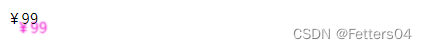
3.4、文本阴影
阴影偏移的坐标系
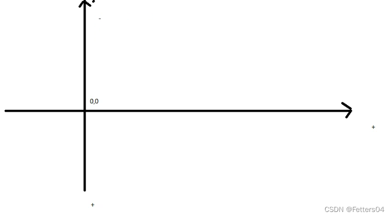
/*text-shadow: 阴影颜色,水平偏移,垂直偏移,阴影半径*/
#price {
    text-shadow: #ee0bcf 10px 10px 2px;
}
3.5、超链接伪类
<style>
    /*默认的颜色*/
    a {
        text-decoration: none;
        color: black;
    }
    /*鼠标悬浮的状态*/
    a:hover {
        color: blue;
    }
    /*鼠标按住未释放的状态*/
    a:active {
        color: red;
    }
    /*已访问的状态*/
    a:visited {
        color: rebeccapurple;
    }
</style>
3.6、列表样式
/*ul li*/
/*list-style:
    none 去掉原点
    circle 空心圆
    decimal 数字
    square 正方形*/

ul li {
    height: 30px;
    list-style: none;
    text-indent: 1em;
}
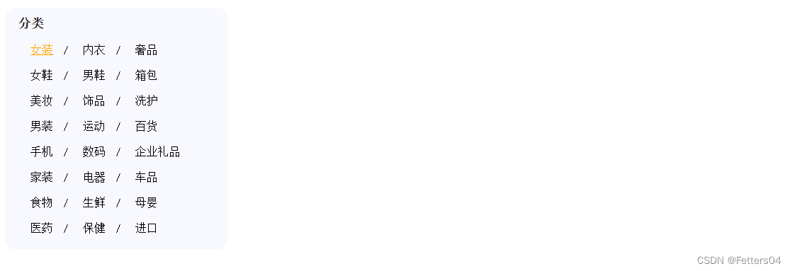
练练手:模仿淘宝分类列表栏

taobao.html
<!DOCTYPE html>
<html>
<head>
<meta charset="utf-8">
<title></title>
<link href="taobao.css" rel="stylesheet" type="text/css"/>
</head>
<body>
<div class="nav">
<h1 class="title">分类</h1>
<ul>
<li>
<a href="">女装</a> /
<a href="">内衣</a> /
<a href="">奢品</a>
</li>
<li>
<a href="">女鞋</a> /
<a href="">男鞋</a> /
<a href="">箱包</a>
</li>
<li>
<a href="">美妆</a> /
<a href="">饰品</a> /
<a href="">洗护</a>
</li>
<li>
<a href="">男装</a> /
<a href="">运动</a> /
<a href="">百货</a>
</li>
<li>
<a href="">手机</a> /
<a href="">数码</a> /
<a href="">企业礼品</a>
</li>
<li>
<a href="">家装</a> /
<a href="">电器</a> /
<a href="">车品</a>
</li>
<li>
<a href="">食物</a> /
<a href="">生鲜</a> /
<a href="">母婴</a>
</li>
<li>
<a href="">医药</a> /
<a href="">保健</a> /
<a href="">进口</a>
</li>
</ul>
</div>
</body>
</html>
taobao.css
.nav {
	background: ghostwhite;
	height: 380px;
	width: 350px;
	border-radius: 5%;

}

.title {
	font-size: 20px;
	font-family: 宋体;
	text-indent: 1em;
	height: 40px;
	line-height: 50px;
}

ul li {
	list-style: none;
	height: 40px;
	font-family: 宋体;
}

a {
	text-decoration: none;
	color: black;
	font-size: 18px;
}

a:hover {
	color: orange;
	text-decoration: underline;
}
效果如下:
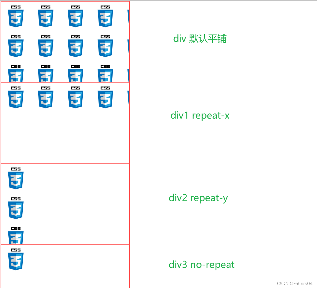
3.7、背景
可以使用 background-image:url(图片位置)属性为元素设置背景图像。
元素的背景占据了元素的全部尺寸,包括内边距和边框,但不包括外边距。
默认地,背景图像位于元素的左上角,并在水平和垂直方向上重复。
可以用background-repeat:设置图片的平铺方式
<!DOCTYPE html>
<html lang="en">
<head>
    <meta charset="UTF-8">
    <title>Title</title>

    <style>
        div {
            width: 1720px;
            height: 1080px;
            border: 1px solid red;
            background-image: url("image/css.jpeg");
            /*默认为全部平铺 repeat*/
        }
        /*只按 x 轴平铺*/
        .div1 {
            background-repeat: repeat-x;
        }
        /*只按 y 轴平铺*/
        .div2 {
            background-repeat: repeat-y;
        }
        /*不选择平铺*/
        .div3 {
            background-repeat: no-repeat;
        }
    </style>
</head>
<body>
    <div></div>
    <div class="div1"></div>
    <div class="div2"></div>
    <div class="div3"></div>
</body>
</html>
3.8、渐变
CSS 渐变使您可以显示两种或多种指定颜色之间的平滑过渡。
CSS 定义了两种渐变类型:
- 线性渐变(向下/向上/向左/向右/对角线)
- 径向渐变(由其中心定义)
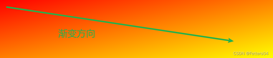
1、CSS 线性渐变
如需创建线性渐变,您必须定义至少两个色标。色标是您要呈现平滑过渡的颜色。您还可以设置起点和方向(或角度)以及渐变效果。
语法:
/*渐变方向 色标1 色标2 ...*/
background-image: linear-gradient(direction, color-stop1, color-stop2, ...);
线性渐变—从上到下(默认)
<style>
#grad1 {
    height: 200px;
    background-color: red; /* 针对不支持渐变的浏览器 */
    background-image: linear-gradient(red, yellow);
}
</style>
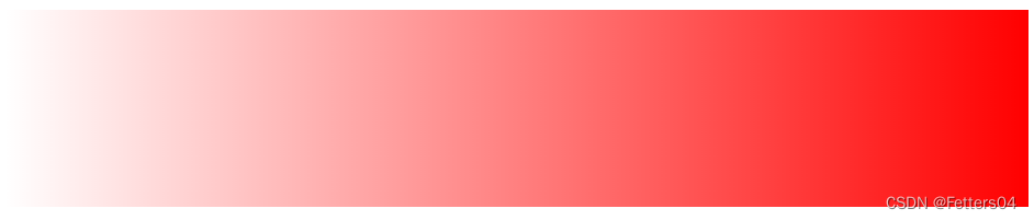
从红色渐变到黄色
改变渐变方向—从左到右
<style>
#grad1 {
    height: 200px;
    background-color: red; /* 针对不支持渐变的浏览器 */
    background-image: linear-gradient(to right, red , yellow);
}
</style>
线性渐变—对角线
<style>
#grad1 {
    height: 200px;
    background-color: red; /* 针对不支持渐变的浏览器 */
    background-image: linear-gradient(to bottom right, red, yellow);
}
</style>
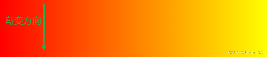
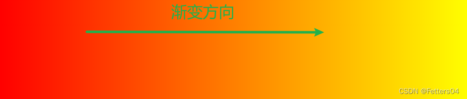
使用角度
如果你想要在渐变的方向上做更多的控制,你可以定义一个角度,而不用预定义方向(to bottom、to top、to right、to left、to bottom right,等等)。
语法:
/*角度 色标1 色标2 ...*/
background-image: linear-gradient(angle, color-stop1, color-stop2, ...);
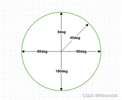
角度表示的渐变方向参照下图,箭头所指即为渐变的方向
<style>
#grad1 {
    height: 100px;
    background-color: red; /* 针对不支持渐变的浏览器 */
    background-image: linear-gradient(0deg, red, yellow);
}

#grad2 {
    height: 100px;
    background-color: red; /* 针对不支持渐变的浏览器 */
    background-image: linear-gradient(90deg, red, yellow);
}

#grad3 {
    height: 100px;
    background-color: red; /* 针对不支持渐变的浏览器 */
    background-image: linear-gradient(180deg, red, yellow);
}

#grad4 {
    height: 100px;
    background-color: red; /* 针对不支持渐变的浏览器 */
    background-image: linear-gradient(-90deg, red, yellow);
}
</style>

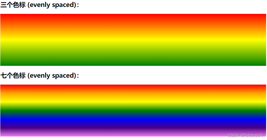
使用多个色标
<style>
#grad1 {
    height: 200px;
    background-color: red; /* 针对不支持渐变的浏览器 */
    background-image: linear-gradient(red, yellow, green);
}

#grad2 {
    height: 200px;
    background-color: red; /* 针对不支持渐变的浏览器 */
    background-image: linear-gradient(red, orange, yellow, green, blue, indigo, violet);
}

</style>
颜色终止位置
你不需要让你设置的颜色在默认位置终止。你可以通过给每个颜色设置 0,1% 或者 2% 或者其他的绝对数值来调整它们的位置。
如果你将位置设置为百分数, 0% 表示起始点,而 100% 表示终点,但是如果需要的话你也可以设置这个范围之外的其他值来达到你想要的效果。如果有些位置你没有明确设置,那么它将会被自动计算,第一种颜色会在 0% 处停止,而最后一种颜色是 100%,至于其他颜色则是在它邻近的两种颜色的中间停止。
<style>
#grad {
    height: 200px;
    background-color: red; /* 针对不支持渐变的浏览器 */
    background-image: linear-gradient(red 10%, green 85%, blue 90%);
}
</style>

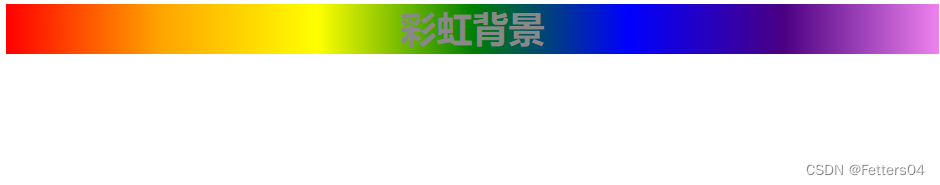
演示如何创建一个带有彩虹颜色和文本的线性渐变:
<!DOCTYPE html>
<html>
<head>
	<meta charset="utf-8">
    <style>
        #grad1 {
            height: 55px;
            background-color: red; /* 浏览器不支持的时候显示 */
            background-image: linear-gradient(to right, red, orange, yellow, green, blue, indigo, violet); /* 标准的语法(必须放在最后) */
        }
    </style>
</head>
<body>
    <div id="grad1" style="text-align:center;margin:auto;color:#888888;font-size:40px;font-weight:bold">
    渐变背景
    </div>
</body>
</html>
使用透明度
CSS 渐变还支持透明度,也可用于创建渐变效果。
如需添加透明度,我们使用 rgba() 函数来定义色标。 rgba() 函数中的最后一个参数可以是 0 到 1 的值,它定义颜色的透明度:0 表示全透明,1 表示全彩色(无透明)。
下面的例子展示了从左开始的线性渐变。它开始完全透明,然后过渡为全色红色:
<style>
#grad1 {
    height: 200px;
    background-image: linear-gradient(to right, rgba(255,0,0,0), rgba(255,0,0,1));
}
</style>
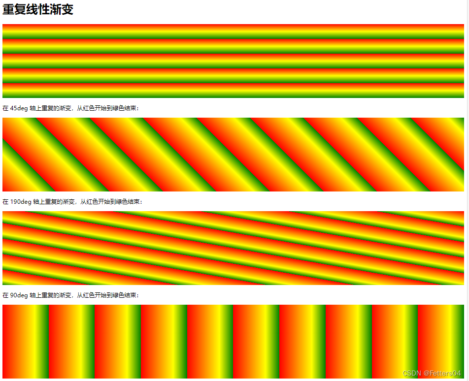
重复线性渐变
repeating-linear-gradient() 函数用于重复线性渐变:
<style>
#grad1 {
    height: 200px;
    background-color: red;
    background-image: repeating-linear-gradient(red, yellow 10%, green 20%);
}

#grad2 {
    height: 200px;
    background-color: red;
    background-image: repeating-linear-gradient(45deg,red,yellow 7%,green 10%);
}

#grad3 {
    height: 200px;
    background-color: red;
    background-image: repeating-linear-gradient(190deg,red,yellow 7%,green 10%);
}

#grad4 {
    height: 200px;
    background-color: red;
    background-image: repeating-linear-gradient(90deg,red,yellow 7%,green 10%);
}
</style>
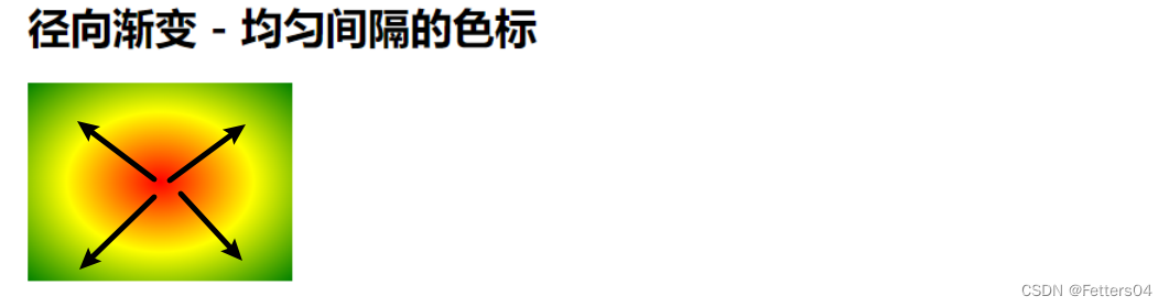
2、CSS径向渐变
径向渐变由它的中心定义(从中心点发散出去)。
为了创建一个径向渐变,你也必须至少定义两种颜色节点。颜色节点即你想要呈现平稳过渡的颜色。同时,你也可以指定渐变的中心、形状(圆形或椭圆形)、大小。默认情况下,渐变的中心是 center(表示在中心点),渐变的形状是 ellipse(表示椭圆形),渐变的大小是 farthest-corner(表示到最远的角落)。
语法:
background-image: radial-gradient(shape size at position, start-color, ..., last-color);
径向渐变-均匀间隔的色标(默认)
<style>
#grad1 {
    height: 150px;
    width: 200px;
    background-color: red; /* 针对不支持渐变的浏览器 */
    background-image: radial-gradient(red, yellow, green);
}
</style>
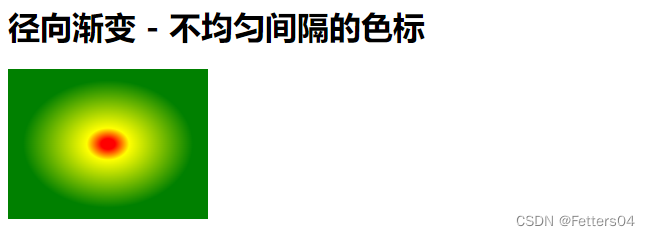
径向渐变-不同间距的色标
<style>
#grad1 {
    height: 150px;
    width: 200px;
    background-color: red; /* 针对不支持渐变的浏览器 */
    background-image: radial-gradient(red 5%, yellow 15%, green 60%);
}
</style>
设置形状
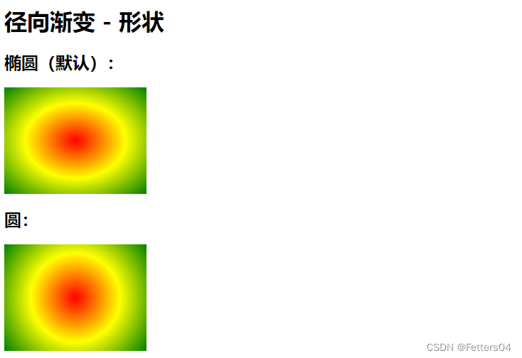
shape 参数定义形状。它可接受 circle 或 ellipse 值。默认值为 ellipse(椭圆)。
<!DOCTYPE html>
<html>
<head>
<style>
#grad1 {
  height: 150px;
  width: 200px;
  background-color: red;
  background-image: radial-gradient(red, yellow, green);
}

#grad2 {
  height: 150px;
  width: 200px;
  background-color: red;
  background-image: radial-gradient(circle, red, yellow, green);
}
</style>
</head>
<body>

<h1>径向渐变 - 形状</h1>

<h2>椭圆(默认):</h2>
<div id="grad1"></div>

<h2>圆:</h2>
<div id="grad2"></div>

</body>
</html>
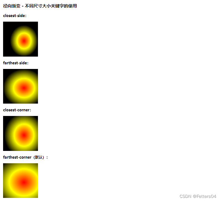
不同尺寸大小关键字的使用
size 参数定义了渐变的大小,它可以是以下四个值:
- closest-side 指定径向渐变的半径长度为从圆心到离圆心最近的边
- farthest-side 指定径向渐变的半径长度为从圆心到离圆心最远的边
- closest-corner 指定径向渐变的半径长度为从圆心到离圆心最近的角
- farthest-corner(默认) 指定径向渐变的半径长度为从圆心到离圆心最远的角
<!DOCTYPE html>
<html>
<head>
<meta charset="utf-8">
<style>
#grad1 {
  height: 150px;
  width: 150px;
  background-color: red; /* 浏览器不支持的时候显示 */
  background-image: radial-gradient(closest-side at 60% 55%, red, yellow, black);
}

#grad2 {
  height: 150px;
  width: 150px;
  background-color: red; /* 浏览器不支持的时候显示 */
  background-image: radial-gradient(farthest-side at 60% 55%, red, yellow, black);
}

#grad3 {
  height: 150px;
  width: 150px;
  background-color: red; /* 浏览器不支持的时候显示 */
  background-image: radial-gradient(closest-corner at 60% 55%, red, yellow, black);
}

#grad4 {
  height: 150px;
  width: 150px;
  background-color: red; /* 浏览器不支持的时候显示 */
  background-image: radial-gradient(farthest-corner at 60% 55%, red, yellow, black);
}
</style>
</head>
<body>

<h3>径向渐变 - 不同尺寸大小关键字的使用</h3>

<p><strong>closest-side:</strong></p>
<div id="grad1"></div>

<p><strong>farthest-side:</strong></p>
<div id="grad2"></div>

<p><strong>closest-corner:</strong></p>
<div id="grad3"></div>

<p><strong>farthest-corner(默认):</strong></p>
<div id="grad4"></div>
</body>
</html>
重复的径向渐变
repeating-radial-gradient() 函数用于重复径向渐变:
<style>
#grad1 {
    height: 200px;
    background-image: repeating-radial-gradient(red, yellow 10%, green 15%);
}
</style>

3、一个简单的使用方法
可以使用网站 Grabient 调配自己需要的颜色,然后应用到 css 中
<!DOCTYPE html>
<html lang="en">
<head>
    <meta charset="UTF-8">
    <title>Title</title>
    <style>
        body {
            /*复制过来的CSS代码*/
            background-color: #00DBDE;
            background-image: linear-gradient(90deg, #00DBDE 0%, #FC00FF 100%);
        }

        h1 {
            text-align: center;
            line-height: 500px;
            color: white;
        }
    </style>
</head>
<body>
    <h1>来一起学习CSS吧</h1>
</body>
</html>

4、盒子模型
4.1、什么是盒子模型
CSS盒模型本质上是一个盒子,封装周围的HTML元素,它包括:边距,边框,填充和实际内容。
盒模型允许我们在其它元素和周围元素边框之间的空间放置元素。
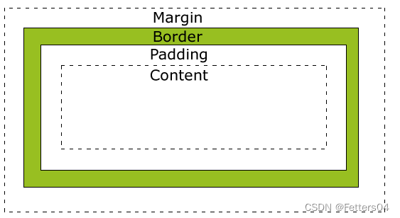
- Margin(外边距) - 清除边框外的区域,外边距是透明的。
- Border(边框) - 围绕在内边距和内容外的边框。
- Padding(内边距) - 清除内容周围的区域,内边距是透明的。
- Content(内容) - 盒子的内容,显示文本和图像。
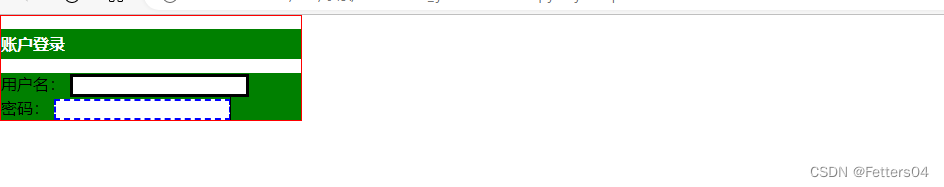
4.2、边框 border
1、边框的粗细 width
2、边框的样式 style
3、边框的颜色 color
<!DOCTYPE html>
<html lang="en">
<head>
    <meta charset="UTF-8">
    <title>Title</title>

    <style>
        /*一些元素会有默认的外边距,需要手动消除*/
        h1, ul, li, a, body {   /*常用规范*/
            margin: 0;
            padding: 0;
            text-decoration: none;
        }

        /*border: 粗细 样式 颜色
        width style color 三个属性可以合在一起写
        */
        #box {
            width: 300px;
            border: 1px solid red;
        }

        h2 {
            font-size: 16px;
            background: green;
            line-height: 30px;
            color: white;
        }

        form {
            background: green;
        }

        div:nth-of-type(1) input {
            border: 3px solid black;	/*3px 实线 黑色*/
        }

        div:nth-of-type(2) input {
            border: 2px dashed blue;	/*2px 虚线 蓝色*/
        }

    </style>
</head>
<body>
    <div id="box">
        <h2>账户登录</h2>
        <form>
            <div>
                <span>用户名:</span>
                <input type="text">
            </div>
            <div>
                <span>密码:</span>
                <input type="text">
            </div>
        </form>
    </div>
</body>
</html>
4.3、内外边距
外边距 (边框到外部的区域)
- margin-top
- margin-bottom
- margin-right
- margin-left

/*表示上下左右全为 0px */
margin: 0px;

/*表示上下为 0px 左右为 10px */
margin: 0px 10px;
/*在块中可以实现居中效果*/
margin: 0px auto;

/*表示上右下左(顺时针)的距离*/
margin: 0px 5px 10px 20px;
内边距 (内容到边框的区域)
- padding-top
- padding-bottom
- padding-right
- padding-left

/*表示上下左右全为 0px */
padding: 0px;

/*表示上下为 0px 左右为 10px */
padding: 0px 10px;

/*表示上右下左(顺时针)的距离*/
padding: 0px 5px 10px 20px;
4.4、元素的宽度和高度
当您指定一个 CSS 元素的宽度和高度属性时,你只是设置内容区域的宽度和高度。要知道,完整大小的元素,你还必须添加内边距,边框和外边距。

最终元素的总宽度计算公式是这样的:
总元素的宽度=宽度+左填充+右填充+左边框+右边框+左边距+右边距
元素的总高度最终计算公式是这样的:
总元素的高度=高度+顶部填充+底部填充+上边框+下边框+上边距+下边距
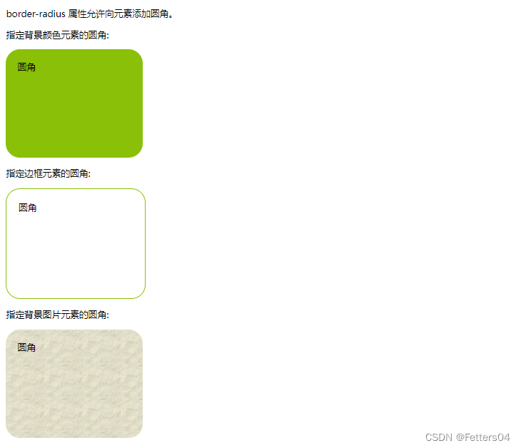
4.5、圆角
使用 CSS3 border-radius 属性,你可以给任何元素制作 “圆角”。
<!DOCTYPE html>
<html>
    <head>
        <meta charset="utf-8">
        <style>
            #rcorners1 {
                border-radius: 25px;
                background: #8AC007;
                padding: 20px;
                width: 200px;
                height: 150px;
            }

            #rcorners2 {
                border-radius: 25px;
                border: 2px solid #8AC007;
                padding: 20px;
                width: 200px;
                height: 150px;
            }

            #rcorners3 {
                border-radius: 25px;
                background: url(/images/paper.gif);
                background-position: left top;
                background-repeat: repeat;
                padding: 20px;
                width: 200px;
                height: 150px;
            }
        </style>
    </head>
    <body>

        <p> border-radius 属性允许向元素添加圆角。</p>
        <p>指定背景颜色元素的圆角:</p>
        <p id="rcorners1">圆角</p>
        <p>指定边框元素的圆角:</p>
        <p id="rcorners2">圆角</p>
        <p>指定背景图片元素的圆角:</p>
        <p id="rcorners3">圆角</p>

    </body>
</html>
CSS3 圆角属性
| 属性 | 描述 |
|---|---|
| border-radius | 所有四个边角 border-*-*-radius 属性的缩写 |
| border-top-left-radius | 定义了左上角的弧度 |
| border-top-right-radius | 定义了右上角的弧度 |
| border-bottom-right-radius | 定义了右下角的弧度 |
| border-bottom-left-radius | 定义了左下角的弧度 |
通过 border-*-*radius 系列函数能够分别为元素的四个角设置圆角效果,函数的语法格式如下:
border-*-*-radius:[ <length> | <percentage> ]{1,2}
语法的含义为,需要为 border-*-radius 属性提供 1~2 个参数,参数之间使用空格进行分隔。其中第一个参数表示圆角水平方向的半径或半轴,第二个参数表示圆角垂直方向的半径或半轴,如果省略第二个参数,那么该参数将直接沿用第一个参数的值。
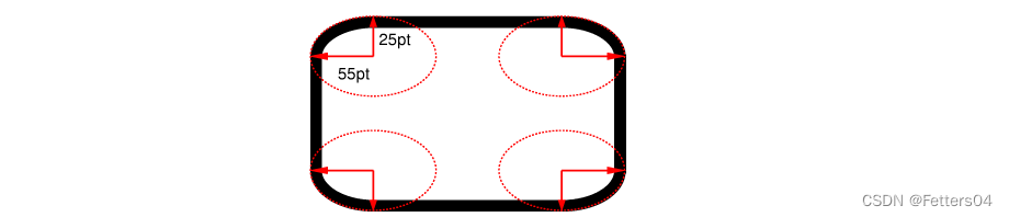
CSS3 border-radius - 指定每个圆角
border-radius:[ <length> | <percentage> ]{1,4} [ / [ <length> | <percentage> ]{1,4} ]?
语法说明如下:
border-radius 属性可以接收两组参数,参数之间使用斜杠/进行分隔,每组参数都允许设置 1~4 个参数值,其中第一组参数代表圆角水平方向上的半径或半轴,第二组参数代表圆角垂直方向上的半径或半轴,如果省略第二组参数的值,那么该组参数将直接沿用第一组参数的值。
但是,如果你要在四个角上一一指定,可以使用以下规则:
- 四个值: 第一个值为左上角,第二个值为右上角,第三个值为右下角,第四个值为左下角。
- 三个值: 第一个值为左上角, 第二个值为右上角和左下角,第三个值为右下角
- 两个值: 第一个值为左上角与右下角,第二个值为右上角与左下角
- 一个值: 四个圆角值相同
4.6、盒子阴影
容器设置阴影 box-shadow
语法:
box-shadow: h-shadow v-shadow blur spread color inset;
-
horizontal(水平):指定水平偏移阴影。正值(即:5px)阴影向右,而为负值(即:- 10px)将使它偏向左。
-
vertical(垂直):指定垂直偏移阴影。正值(即:5px)会使阴影在框的底部,而负值(即:- 10px)将使它偏向上。
-
blur(模糊):设置的柔化半径。默认值为0,这意味着没有模糊。正值增加了模糊,而负值,实际上缩小了阴影。此属性默认为0。
-
spread:阴影的尺寸,该参数为可选参数。0px代表阴影和当前的实体一样大,大于0则表示大于实体的尺寸。
-
color(颜色):颜色值,也就是设置阴影颜色。
-
inset:将外部阴影 (outset) 改为内部阴影。该参数为可选参数。
5、浮动
5.1、行内元素和块级元素
块级元素
特点:
1.每个块级元素都是独自占一行,其后的元素也只能另起一行,并不能两个元素共用一行。
2.元素的高度、宽度、行高和顶底边距都是可以设置的。
3.元素的宽度如果不设置的话,默认为父元素的宽度。
常见的块级元素:div、h1-h6、form、p、li、ol、li、dl、dt、dd、address、caption、table、tbody、td、tfoot、th、thead、tr
行级元素
特点:1.可以和其他元素处于一行,不用必须另起一行。
2.元素的高度、宽度及顶部和底部边距不可设置。
3.元素的宽度就是它包含的文字、图片的宽度,不可改变。
5.2、display
display 属性是 CSS 中最重要的属性之一,主要用来控制元素的布局,通过 display 属性您可以设置元素是否显示以及如何显示。
根据元素类型的不同,每个元素都有一个默认的 display 属性值,例如默认的 display 属性值为 block(块级元素),而默认的 display 属性值为 inline(行内元素),您也可以手动将元素的 display 属性转换为其它值。
display 属性的可选值如下:
| 值 | 描述 |
|---|---|
| none | 隐藏元素 |
| block | 将元素设置为块级元素 |
| inline | 将元素设置为内联元素 |
| list-item | 将元素设置为列表项目 |
| inline-block | 将元素设置为行内块元素(既具有 block 能够设置宽高的特性又具有 inline 不独占一行的特性) |
| table | 将元素设置为块元素级的表格(类似<table>) |
| inline-table | 将元素设置为内联元素级的表格(类似<table>) |
| table-caption | 将元素设置为表格的标题(类似<caption>) |
| table-cell | 将元素设置为表格的单元格(类似<td>和<th>) |
| table-row | 将元素设置为表格的行(类似<tr>) |
| table-row-group | 将元素设置为表格的内容部分(类似tbody) |
| table-column | 将元素设置为表格的列(类似col) |
| table-column-group | 将元素设置为表格中一个或多个列的分组(类似colgroup) |
| table-header-group | 将元素设置为表格的头部(类似<thead>) |
| table-footer-group | 将元素设置为表格的脚(类似tfoot) |
| box | CSS3 中新增的属性值,表示将对象设置为弹性伸缩盒(伸缩盒的最老版本) |
| inline-box | CSS3 中新增的属性值,表示将对象设置为内联元素级的弹性伸缩盒(伸缩盒的最老版本) |
| flexbox | CSS3 中新增的属性值,表示将对象设置为弹性伸缩盒(伸缩盒的过渡版本) |
| inline-flexbox | CSS3 中新增的属性值,表示将对象设置为内联元素级的弹性伸缩盒(伸缩盒的过渡版本) |
| flex | CSS3 中新增的属性值,表示将对象设置为弹性伸缩盒(伸缩盒的最新版本) |
| inline-flex | CSS3 中新增的属性值,表示将对象设置为内联元素级的弹性伸缩盒(伸缩盒的最新版本) |
| run-in | 根据上下文来决定将元素设置为块级元素或内联元素 |
| inherit | 从父元素继承 display 属性的值 |
伸缩盒子(弹性盒子)是 CSS3 中一种新的布局模式,引入伸缩盒子的目的是提供一种更加有效的方式来对页面中的元素进行排列、对齐和分配空间,当页面需要适应不同的屏幕大小以及设备类型时这种布局方式能够确保元素拥有恰当尺寸和位置。
5.3、float
CSS 的 Float(浮动),会使元素向左或向右移动,其周围的元素也会重新排列。
Float(浮动),往往是用于图像,但它在布局时一样非常有用。
定义和用法
float 属性定义元素在哪个方向浮动。以往这个属性总应用于图像,使文本围绕在图像周围,不过在 CSS 中,任何元素都可以浮动。浮动元素会生成一个块级框,而不论它本身是何种元素。
如果浮动非替换元素,则要指定一个明确的宽度;否则,它们会尽可能地窄。
注释: 假如在一行之上只有极少的空间可供浮动元素,那么这个元素会跳至下一行,这个过程会持续到某一行拥有足够的空间为止。
| 值 | 描述 |
|---|---|
| left | 元素向左浮动。 |
| right | 元素向右浮动。 |
| none | 默认值。元素不浮动,并会显示在其在文本中出现的位置。 |
| inherit | 规定应该从父元素继承 float 属性的值。 |
元素怎样浮动
元素的水平方向浮动,意味着元素只能左右移动而不能上下移动。
一个浮动元素会尽量向左或向右移动,直到它的外边缘碰到包含框或另一个浮动框的边框为止。
浮动元素之后的元素将围绕它。
浮动元素之前的元素将不会受到影响。
如果图像是右浮动,下面的文本流将环绕在它左边:
<!DOCTYPE html>
<html>
<head>
<meta charset="utf-8">
<style>
img
{
	float:right;
}
</style>
</head>

<body>
<p>在下面的段落中,我们添加了一个 <b>float:right</b> 的图片。导致图片将会浮动在段落的右边。</p>
<p>
<img src="logocss.gif" width="95" height="84" />
这是一些文本。这是一些文本。这是一些文本。
这是一些文本。这是一些文本。这是一些文本。
这是一些文本。这是一些文本。这是一些文本。
这是一些文本。这是一些文本。这是一些文本。
这是一些文本。这是一些文本。这是一些文本。
这是一些文本。这是一些文本。这是一些文本。
这是一些文本。这是一些文本。这是一些文本。
这是一些文本。这是一些文本。这是一些文本。
这是一些文本。这是一些文本。这是一些文本。
这是一些文本。这是一些文本。这是一些文本。
</p>
</body>

</html>

彼此相邻的浮动元素
如果你把几个浮动的元素放到一起,如果有空间的话,它们将彼此相邻。
在这里,我们对图片廊使用 float 属性:
<!DOCTYPE html>
<html>
<head>
<meta charset="utf-8">
<style>
.thumbnail
{
	float:left;
	width:110px;
	height:90px;
	margin:5px;
}
</style>
</head>

<body>
<h3>图片库</h3>
<p>试着调整窗口,看看当图片没有足够的空间会发生什么。</p>
<img class="thumbnail" src="/images/klematis_small.jpg" width="107" height="90">
<img class="thumbnail" src="/images/klematis2_small.jpg" width="107" height="80">
<img class="thumbnail" src="/images/klematis3_small.jpg" width="116" height="90">
<img class="thumbnail" src="/images/klematis4_small.jpg" width="120" height="90">
</body>
</html>

当调整窗口时,元素会适应窗口大小排列:
清除浮动 - 使用 clear
元素浮动之后,周围的元素会重新排列,为了避免这种情况,使用 clear 属性。
clear 属性指定元素两侧不能出现浮动元素。
| 值 | 描述 |
|---|---|
| left | 在左侧不允许浮动元素。 |
| right | 在右侧不允许浮动元素。 |
| both | 在左右两侧均不允许浮动元素。 |
| none | 默认值。允许浮动元素出现在两侧。 |
| inherit | 规定应该从父元素继承 clear 属性的值。 |
5.4、父级边框塌陷
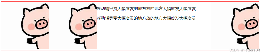
在文档流中,父元素的高度默认是被子元素撑开的,也就是子元素多高,父元素就多高。但是当子元素设置浮动之后,子元素会完全脱离文档流,此时将会导致子元素无法撑起父元素的高度,导致父元素的塌陷。
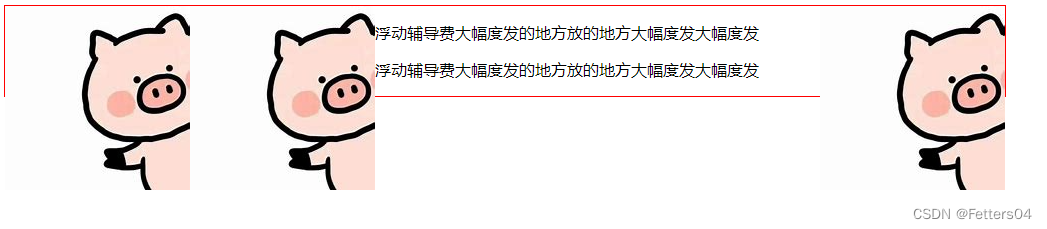
解决办法:
1、重设父级元素的高度(不建议)
不能从根本解决问题,当图像的高度变高时还是会塌陷
<style>
    .box {
        border: 1px solid red;
        width: 1000px;
        height: 300px;
    }
    .layer1 {
        float: left;
    }
    .layer2 {
        float: left;
    }
    .layer3 {
        float: right;
    }
</style>
<body>
    <div class="box">
        <div class="layer1"><img src="image/pig.jfif" alt=""/></div>
        <div class="layer2"><img src="image/pig.jfif" alt=""/></div>
        <div class="layer3"><img src="image/pig.jfif" alt=""/></div>
        <p>浮动辅导费大幅度发的地方放的地方大幅度发大幅度发</p>
        <p>浮动辅导费大幅度发的地方放的地方大幅度发大幅度发</p>
    </div>
</body>

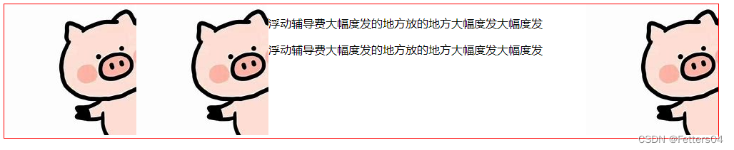
2、增加一个空的 div 标签,清除浮动
<style>
    .box {
        border: 1px solid red;
        width: 1000px;
    }
    .layer1 {
        float: left;
    }
    .layer2 {
        float: left;
    }
    .layer3 {
        float: right;
    }
    .clear {
        clear: both;
        margin: 0px;
        padding: 0px;
    }
</style>
<body>
    <div class="box">
        <div class="layer1"><img src="image/pig.jfif" alt=""/></div>
        <div class="layer2"><img src="image/pig.jfif" alt=""/></div>
        <div class="layer3"><img src="image/pig.jfif" alt=""/></div>
        <p>浮动辅导费大幅度发的地方放的地方大幅度发大幅度发</p>
        <p>浮动辅导费大幅度发的地方放的地方大幅度发大幅度发</p>
        <div class="clear"></div>
    </div>
</body>
3、为父级元素增加 overflow 属性
CSS overflow 属性用于控制内容溢出元素框时显示的方式。
overflow 属性有以下值:
| 值 | 描述 |
|---|---|
| visible | 默认值。内容不会被修剪,会呈现在元素框之外。 |
| hidden | 内容会被修剪,并且其余内容是不可见的。 |
| scroll | 内容会被修剪,但是浏览器会显示滚动条以便查看其余的内容。 |
| auto | 如果内容被修剪,则浏览器会显示滚动条以便查看其余的内容。 |
| inherit | 规定应该从父元素继承 overflow 属性的值。 |
<style>
    .box {
        border: 1px solid red;
        width: 1000px;
        overflow: auto;
    }
    .layer1 {
        float: left;
    }
    .layer2 {
        float: left;
    }
    .layer3 {
        float: right;
    }
</style>
<body>
    <div class="box">
        <div class="layer1"><img src="image/pig.jfif" alt=""/></div>
        <div class="layer2"><img src="image/pig.jfif" alt=""/></div>
        <div class="layer3"><img src="image/pig.jfif" alt=""/></div>
        <p>浮动辅导费大幅度发的地方放的地方大幅度发大幅度发</p>
        <p>浮动辅导费大幅度发的地方放的地方大幅度发大幅度发</p>
    </div>
</body>
4、父类添加一个伪类:after(推荐)
和增加空 div 效果一样,但是更加规范
<style>
    #father {
        border: 1px solid red;
        width: 1000px;
    }
    #father:after {
        content: '';
        display: block;
        clear: both;
    }
    .layer1 {
        float: left;
    }
    .layer2 {
        float: left;
    }
    .layer3 {
        float: right;
    }
</style>
<body>
    <div id="father">
        <div class="layer1"><img src="image/pig.jfif" alt=""/></div>
        <div class="layer2"><img src="image/pig.jfif" alt=""/></div>
        <div class="layer3"><img src="image/pig.jfif" alt=""/></div>
        <p>浮动辅导费大幅度发的地方放的地方大幅度发大幅度发</p>
        <p>浮动辅导费大幅度发的地方放的地方大幅度发大幅度发</p>
    </div>
</body>
5.5、display 和 float 的对比
-
display
位置方向不可控,会解析空格
-
float
浮动起来的话元素会脱离标准文档流,所以要解决父级边框塌陷的问题
6、定位
position 属性指定了元素的定位类型。
position 属性的五个值:
- static 静态定位(默认)
- relative 相对定位
- fixed 固定定位
- absolute 绝对定位
- sticky 粘性定位
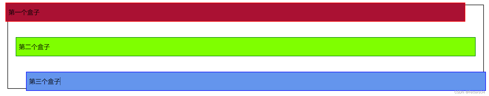
6.1、相对定位
相对定位 position: relative;
相对原来的位置进行指定的偏移,任然在标准文档流中,原来的位置会被保留
用 top、bottom、left、right 来指定偏移,例如 top = -20px 表示在元素距离顶部的原始位置上减去20px,即为向上移动
<!DOCTYPE html>
<html lang="en">
<head>
    <meta charset="UTF-8">
    <title>相对定位</title>
    <style>
        div {
            margin: 10px;
            padding: 5px;
            font-size: 12px;
            line-height: 25px;
        }
        #father {
            border: 1px solid black;
        }
        #first {
            border: 1px solid red;
            background-color: #aa1133;
            position: relative;
            top: -20px;
            right: 20px;
        }
        #second {
            border: 1px solid green;
            background-color: chartreuse;
        }
        #third {
            border: 1px solid blue;
            background-color: cornflowerblue;
            position: relative;
            bottom: -20px;
            left: 20px;
        }
    </style>
</head>
<body>
    <div id="father">
        <div id="first">第一个盒子</div>
        <div id="second">第二个盒子</div>
        <div id="third">第三个盒子</div>
    </div>
</body>
</html>
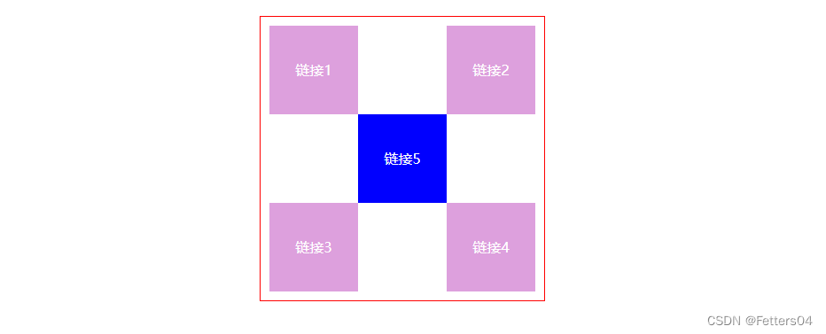
小练习

<!DOCTYPE html>
<html lang="en">
<head>
    <meta charset="UTF-8">
    <title>Title</title>
    <style>
        #box {
            border: 1px solid red;
            width: 300px;
            height: 300px;
            margin: 20px auto;
            padding: 10px;
        }
        box:after {
            content: '';
            display: block;
            clear: both;
        }
        .a {
            background-color: plum;
            width: 100px;
            height: 100px;
            text-align: center;
            line-height: 100px;
            position: relative;
        }
        .a:hover {
            background: blue;
        }
        a {
            color: white;
            text-decoration: none;
        }
    </style>
</head>
<body>
    <div id="box">
        <div class="a" style="float: left">
            <a href="#">链接1</a>
        </div>
        <div class="a" style="float: right">
            <a href="#">链接2</a>
        </div>
        <div class="a" style="clear: both; right: -100px">
            <a href="#">链接5</a>
        </div>
        <div class="a" style="float: left">
            <a href="#">链接3</a>
        </div>
        <div class="a" style="float: right">
            <a href="#">链接4</a>
        </div>

    </div>
</body>
</html>
6.2、绝对定位
绝对定位 position: absolute;
绝对定位是相对于离元素最近的设置了绝对或相对定位的父元素决定的,如果没有父元素设置绝对或相对定
位,则元素相对于根元素即html元素定位。设置了 absolute 的元素脱了了文档流,元素在没有设置宽度的情况
下,宽度由元素里面的内容决定。脱离后原来的位置相当于是空的,下面的元素会来占据位置。
实例:
css
.box1 {
    height: 100px;
    background-color: red;
}
.box2 {
    height: 100px;
    background-color: green;
}
.box3 {
    height: 100px;
    background-color: blue;
}
.box4 {
    height: 100px;
    background-color: yellow;
}
.box5 {
    height: 100px;
    background-color: cyan;
}
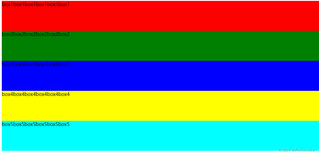
html
<body>
    <div class="box1">box1box1box1box1box1box1</div>
    <div class="box2">box2box2box2box2box2box2</div>
    <div class="box3">box3box3box3box3box3box3</div>
    <div class="box4">box4box4box4box4box4box4</div>
    <div class="box5">box5box5box5box5box5box5</div>
</body>
初始效果:
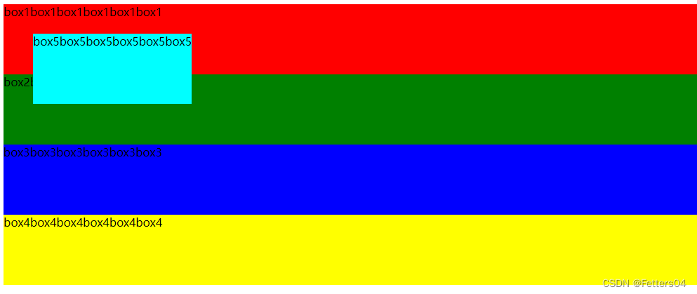
只给第五个box设置absolute:
说明:元素在没有定义宽度的情况下,宽度由元素里面的内容决定,效果和用float方法一样。

1.在父元素没有设置相对定位或绝对定位的情况下,元素相对于根元素定位(即html元素)(是父元素没有)。
现在给box5偏移值来验证:
.box1 {
    height: 100px;
    background-color: red;
}
.box2 {
    height: 100px;
    background-color: green;
}
.box3 {
    height: 100px;
    background-color: blue;
}
.box4 {
    height: 100px;
    background-color: yellow;
}
.box5 {
    height: 100px;
    background-color: cyan;
    position: absolute;
    left: 50px;
    top: 50px;
}
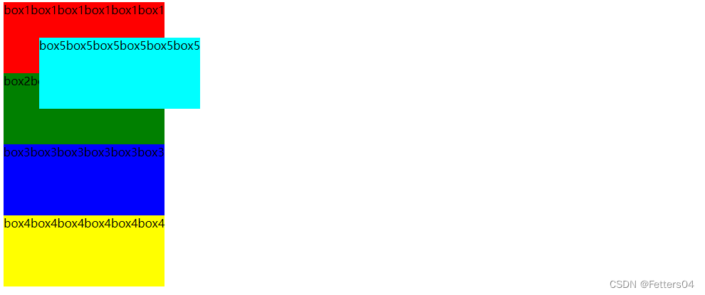
2.父元素设置了相对定位或绝对定位,元素会相对于离自己最近的设置了相对或绝对定位的父元素进行定位(或者
说离自己最近的不是static的父元素进行定位,因为元素默认是static)。
现在给body元素一个绝对定位(body元素设置为了absolute,整个容器的宽度由最长div决定,宽度变小了):
此时的box5现在相对于body元素定位
6.3、固定定位
绝对定位 position: fixed;
元素的位置相对于浏览器窗口是固定位置。
即使窗口是滚动的它也不会移动:
<!DOCTYPE html>
<html>
    <head>
        <meta charset="utf-8">
        <style>
            p.pos_fixed
            {
                position:fixed;
                top:30px;
                right:5px;
            }
        </style>
    </head>
    <body>
        <p class="pos_fixed">Some more text</p>
        <p>Some text</p><p>Some text</p><p>Some text</p><p>Some text</p><p>Some text</p><p>Some text</p><p>Some text</p><p>Some text</p><p>Some text</p><p>Some text</p><p>Some text</p><p>Some text</p><p>Some text</p><p>Some text</p><p>Some text</p><p>Some text</p>
    </body>
</html>
不管怎么滑动,该元素一直在网页中的这个位置

6.4、粘性定位
粘性定位position: sticky;
粘性定位的元素是依赖于用户的滚动,在 position:relative 与 position:fixed 定位之间切换。
它的行为就像 position:relative; 而当页面滚动超出目标区域时,它的表现就像 position:fixed;,它会固定
在目标位置。元素定位表现为在跨越特定阈值前为相对定位,之后为固定定位。这个特定阈值指的是 top, right,
bottom 或 left 之一,换言之,指定 top, right, bottom 或 left 四个阈值其中之一,才可使粘性定位生效。否则其
行为与相对定位相同。
<!DOCTYPE html>
<html>
<head>
<meta charset="utf-8">
<style>
div.sticky {
  position: -webkit-sticky;
  position: sticky;
  top: 0;
  padding: 5px;
  background-color: #cae8ca;
  border: 2px solid #4CAF50;
}
</style>
</head>
<body>

<p>尝试滚动页面。</p>

<div class="sticky">我是粘性定位!</div>

<div style="padding-bottom:2000px">
  <p>滚动我</p>
  <p>来回滚动我</p>
  <p>滚动我</p>
  <p>来回滚动我</p>
  <p>滚动我</p>
  <p>来回滚动我</p>
</div>

</body>
</html>
在跨越特定阈值 top: 0; 前效果和相对定位一致
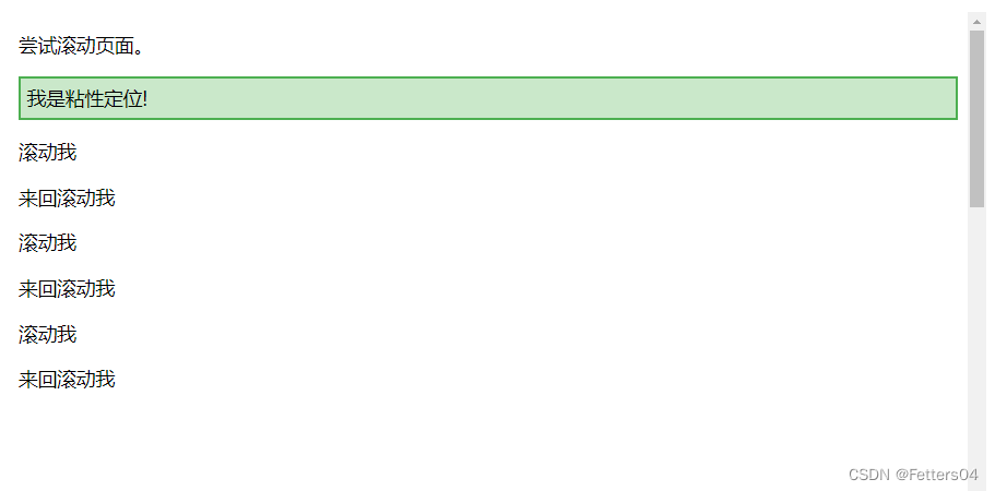
在跨越了特定阈值之后效果和固定定位一致,固定在特定阈值 top: 0; 的位置上

6.5、z-index
z-index 属性指定一个元素的堆叠顺序。
拥有更高堆叠顺序的元素总是会处于堆叠顺序较低的元素的前面。
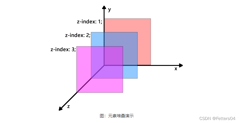
每个元素都有一个默认的 z-index 属性,将 z-index 属性与 position 属性相结合可以创建出类似 PhotoShop
中的图层效果。z-index 属性可以设置元素的层叠级别(当元素出现重叠时,该元素在其它元素之上还是之下)
,拥有更高层叠级别的元素会处于层叠级别较低的元素的前面(或者说上面)。
| 值 | 描述 |
|---|---|
| auto | 默认值,堆叠顺序与父元素相等 |
| number | 使用具体数值(整数)设置元素的堆叠顺序 |
| inherit | 从父元素继承 z-index 属性的值 |
关于元素的层级关系有以下几点需要注意:
- 对于未设置 position 属性的元素或者 position 属性的值为 static 时,后定义的元素会覆盖前面的元素;
- 对于设置有 position 属性且属性值不为 static 的元素,这些元素会覆盖没有设置 position 属性或者 position 属性值为 static 的元素;
- 对于 position 属性值不为 static 且定义了 z-index 属性的元素,z-index 属性值大的元素会覆盖 z-index 属性值小的元素,即 z-index 属性值越大优先级越高,若 z-index 属性值相同,则后定义的元素会覆盖前面定义的元素;
- z-index 属性仅在元素定义了 position 属性且属性值不为 static 时才有效。
示例:
<!DOCTYPE html>
<html>
<head>
    <style>
        .box-x {
            width: 150px;
            height: 350px;
            border: 1px dashed red;
            background-color: rgba(255, 153, 153, 0.7);
            float: left;
        }
        .box-y {
            width: 300px;
            height: 120px;
            border: 1px dashed green;
            background-color: rgba(179, 255, 153, 0.7);
        }
        .one {
            position: absolute;
            top: 5px;
            left: 5px;
            z-index: 4;
        }
        .two {
            position: relative;
            top: 30px;
            left: 80px;
            z-index: 3;
        }
        .three {
            position: relative;
            top: -10px;
            left: 120px;
            z-index: 2;
        }
        .four {
            position: absolute;
            top: 5px;
            right: 5px;
            z-index: 1;
        }
        .five {
            margin-left: 100px;
            margin-top: -50px;
            background-color: rgba(255, 255, 153, 0.7);
            z-index: 5;
        }
    </style>
</head>
<body>
    <div class="box-x one">one</div>
    <div class="box-y two">two</div>
    <div class="box-y three">three</div>
    <div class="box-x four">four</div>
    <div class="box-y five">five</div>
</body>
</html>

6.6、不透明度 opacity
opacity 属性设置元素的不透明级别。
opacity-level 描述透明度级别,其中 1 完全不透明,0.5 为 50% 透明,0 为完全透明。
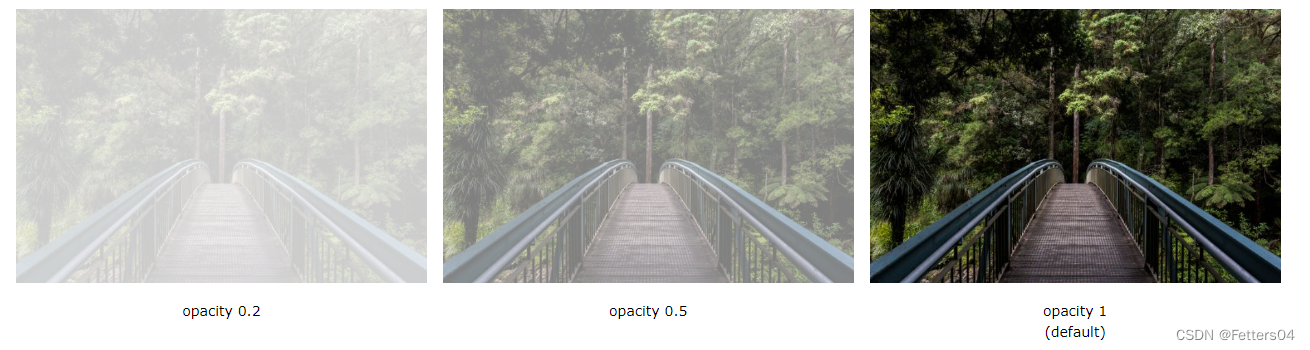
使用 opacity 不透明度属性向元素的背景添加透明度时,其所有子元素也将变为透明。 这会使完全透明元
素中的文本难以读取。如果不希望对子元素应用不透明度,请改用RGBA颜色值。
实例一:
opacity 属性为元素的背景以及所有子元素添加透明度。这使得透明元素中的文本难以读取:
<!DOCTYPE html>
<html>
<head>
<style>
div {
background-color: #4CAF50;
padding: 10px;
}
div.first {
opacity: 0.1;
}
div.second {
opacity: 0.3;
}
div.third {
opacity: 0.6;
}
</style>
</head>
<body>
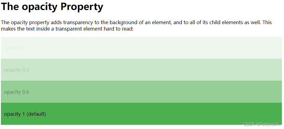
<h1>The opacity Property</h1>
<p>The opacity property adds transparency to the background of an element, and to all of its child elements as well. This makes the text inside a transparent element hard to read:</p>
<div class="first"><p>opacity 0.1</p></div>
<div class="second"><p>opacity 0.3</p></div>
<div class="third"><p>opacity 0.6</p></div>
<div><p>opacity 1 (default)</p></div>
</body>
</html>
实例二:
想要不将不透明度应用于子元素(如上面的示例中),请改用 RGBA 颜色值。
以下示例设置背景色的不透明度,但不设置文本的不透明度:
<!DOCTYPE html>
<html>
<head>
<style>
div {
  background: rgb(76, 175, 80);
  padding: 10px;
}

div.first {
  background: rgba(76, 175, 80, 0.1);
}

div.second {
  background: rgba(76, 175, 80, 0.3);
}

div.third {
  background: rgba(76, 175, 80, 0.6);
}
</style>
</head>
<body>

<h1>Transparent Boxes</h1>

<h2>Using the opacity property:</h2>
<div style="opacity:0.1;"><p>10% opacity</p></div>
<div style="opacity:0.3;"><p>30% opacity</p></div>
<div style="opacity:0.6;"><p>60% opacity</p></div>
<div><p>opacity 1</p></div>

<h2>Using RGBA color values:</h2>
<div class="first"><p>10% opacity</p></div>
<div class="second"><p>30% opacity</p></div>
<div class="third"><p>60% opacity</p></div>
<div><p>default</p></div>

</body>
</html>


 2531
2531


 被折叠的 条评论
为什么被折叠?
被折叠的 条评论
为什么被折叠?
 到【灌水乐园】发言


