


CSS盒子模型

边框border

<head>
    <meta charset="UTF-8">
    <meta http-equiv="X-UA-Compatible" content="IE=edge">
    <meta name="viewport" content="width=device-width, initial-scale=1.0">
    <title>Document</title>
    <style>
        div {
            width: 50px;
            height: 50px;
            border-width: 4px;
            border-style: dashed;
           /* 边框样式: solid实线边框;dashed 虚线边框   dotted 点线边框 */
             border-color: greenyellow;
             /* border: 1px solid red;  复合写法*/
             border-top: 1px solid red;
              /* 只设定上边框,其余同理 */
        }
    </style>
</head>
表格细线边框
border改变边框,但不改变表格内的细线,于是要选择td单元格,改变单元格的边框。但是相邻单元格会叠加像素,所以要合并边框
table,
        td,
        th {
            border-width: 1px;
            border-collapse: collapse;
            /* 合并相邻的边框 */
            font-size: 14px;
            text-align: center;
        }
边框会影响盒子实际大小
内边距
默认内容紧贴边框。

padding可连写。
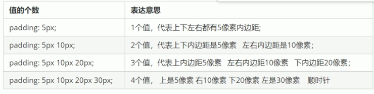
padding也会影响盒子实际大小
用width或height减去内边距大小。
有时候可以巧妙运用padding影响盒子。
如每个导航栏里面的字数不一样是,不用给每个盒子设置宽度

导航框案例
<head>
    <style>
        div {
            height: 41px;
            border-bottom: 1px solid #edeef0;
            border-top: 3px solid #ff8500;
            border-left: solid #fcfcfc;
            border-right: solid #fcfcfc;
            line-height: 41px;
        }
        /* 大框架的样式 */

        div a {
            display: inline-block;
            height: 41px;
            font-size: 12px;
            text-decoration: none;
            color: #4c4c4c;
            padding: 0 20px;
            border: 1px;
            border-collapse: collapse;
        }
        /* 链接框的设置 */

        div a:hover {
            background-color: coral;
            border-top: 0px;
        }
        /* 鼠标悬停样式 */
    </style>
</head>

<body>
    <div>
        <a href="#">新浪导航</a>
        <a href="#">手机新浪网</a>
        <a href="#">移动客户端</a>
        <a href="#">微博</a>
    </div>
</body>

注意:如果盒子本身没有指定weigh/height属性,只是继承父盒子的属性,则padding不会撑开盒子大小
外边距(margin)
与padding用法一致。

<style>
        .one {
            width: 200px;
            height: 200px;
            background-color: coral;
            /*margin-bottom: 20px;*/
             margin: auto;
            /* 水平居中 */
        }
    </style>
行内块和行内元素不能设置宽度,所以让块级元素水平居中,给其父元素添加text-align:center。
<style>
div {
            text-align: center;
        }
    </style>

    <div class="one">
        <span>文字</span>
    </div>
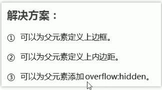
外边距合并问题
使用margin定义块元素的垂直外边距时,可能会出现外边距的合并。所以尽量只给一个盒子设置margin值。

水平的时候不会出现合并的问题。
垂直外边距的塌陷
两个嵌套关系的块元素,父元素有上外边距同时子元素也有上外边距,此时不是在内部有子元素的外边距,而是父元素会塌陷较大的外边距值。
清除网页元素内外编剧
网页元素很多都带有默认的内外边距,所以布局前要清除
* {
            margin: 0%;
            padding: 0%;
        }
注意:行内元素为了照顾兼容性,尽量只设置左右内外边距,不要设置上下内外编剧。但是可以转换为块级和行内块元素就可以了。
案例1:

<!DOCTYPE html>
<html lang="en">

<head>
    <meta charset="UTF-8">
    <meta http-equiv="X-UA-Compatible" content="IE=edge">
    <meta name="viewport" content="width=device-width, initial-scale=1.0">
    <title>Document</title>
    <style>
        * {
            margin: 0;
            padding: 0;
        }

        body {
            background-color: #f5f5f5;
        }

        .chanpin {
            color: rgb(134, 138, 141);
            margin: 15px 0 0 60px;
            font-weight: 400;
        }

        .box2 {
            background-color: #fff;
            width: 298px;
            height: 415px;
            display: inline-block;
        }

        .box {
            background-color: #fff;
            width: 298px;
            height: 415px;
            margin: 15px 0 0 60px;
            display: inline-block;
        }

        .box img {
            width: 100%;
        }

        .box2 img {
            width: 100%;
        }

        .评价 {
            height: 70px;
            /* 设置框的高度,内容多少都占一定的空间 */
            font-size: 14px;
            padding: 20px 28px 0px;
            /* 段落没有width,padding不会撑开 */
            margin-bottom: 12px;
            /* 与下端有一定距离 */
        }

        .小灰 {
            font-size: 12px;
            color: #b0b0b0;
            padding: 0px 28px;
            margin-top: 45px;
            /* 灰字和info往下压,在盒子底部的效果 */
        }

        .info {
            font-size: 14px;
            padding: 0 28px;
        }

        .info h4 {
            font-weight: 400;
            display: inline-block;
            /* 改为行内块才可与价格在同一行 */
        }

        .价钱 {
            color: #ff6700;
        }

        em {
            font-style: normal;
            color: #ebe4e0;
            margin: 0 6px 0 15px;
            /* 把细线看作在盒子里,盒子之间间隔用margin */
        }

        a {
            text-decoration: none;
            color: black;
        }
    </style>
</head>

<body>
    <h2 class="chanpin">热评产品</h2>
    <div class="box">
        <a href="#"><img src="img.jpg" alt=""></a>
        <p class="评价">
            <a href="#"> 快递牛,整体不错蓝牙可以说秒连。红米给力</a>
        </p>
        <div class="小灰">来自于 117384232 的评价</div>
        <div class="info">
            <h4><a href="#"> Redmi AirDpts真无线蓝...</a></h4>
            <em>|</em>
            <span class="价钱">99.9元</span>
        </div>
    </div>
    <div class="box2">
        <a href="#"><img src="img1.jpg" alt=""></a>
        <p class="评价">一到家就忙着安装,太好了,小巧玲珑的,外观精美,洗的照片太好看了</p>

        <h4 class="小灰">来自于lhz的评价</h4>
        <div class="info">
            <h4><a href="#">小米米家照片打印机</a></h4>
            <em>|</em>
            <span class="价钱">479元</span>
        </div>

    </div>
</body>

</html>
存在问题:
- 块元素转换为行内块元素时,外边框与原行内元素共用,大则取代。
- 调整盒子位置时,若有其他盒子在周围在,则用外边距
- 合理运用标签,产品标题用h,大量文字段落用p
- 多起类名,可以更好找到这个盒子
案例2:

<!DOCTYPE html>
<html lang="en">

<head>
    <meta charset="UTF-8">
    <meta http-equiv="X-UA-Compatible" content="IE=edge">
    <meta name="viewport" content="width=device-width, initial-scale=1.0">
    <title>Document</title>
    <style>
        * {
            margin: 0;
            padding: 0;
        }

        /* .box {
            width: 300px;
            height: 200px;
            border: 1px solid rgb(205, 206, 207);
        } */

        .kuaibao {
            width: 258px;
            height: 20px;
            border: 1px solid rgb(205, 206, 207);
            border-bottom: dotted;
            margin: 15px 15px 0;
            padding: 10px 0 10px 10px;
            color: rgb(144, 148, 153);
            font-weight: 550;
        }
        .tehui{
            width: 248px;
            border: 1px solid rgb(205, 206, 207);
            border-top: none;
            border-collapse: collapse;
            margin: 0 15px ;
            padding: 10px 0 10px 20px;
            color: rgb(114, 119, 126);
        }
    </style>
</head>

<body>
    <div class="box">
        <div class="kuaibao">品优购快报</div>
        <div class="tehui">
            【特惠】爆款耳机5折秒!<br>
            【特惠】爆款耳机5折秒!<br>
            【特惠】爆款耳机5折秒!<br>
            【特惠】爆款耳机5折秒!<br>
            【特惠】爆款耳机5折秒!<br>
        </div>
    </div>
</body>

</html>
存在问题:
- 特惠中,可以用表格嵌套链接,表格布局更美观。
        .box ul li a {
            font-size: 13px;
            text-decoration: none;
            color: rgb(114, 119, 126);

        }
        li{
            list-style: none;
            height: 23px;
            line-height: 23px;
            /* 去掉li前面的项目符号(小圆点) */
        }

<ul class="tehui">
            <li><a href="#">【特惠】爆款耳机5折秒!</a></li>
            <li><a href="#">【特惠】爆款耳机5折秒!</a></li>
            <li><a href="#">【特惠】爆款耳机5折秒!</a></li>
            <li><a href="#">【特惠】爆款耳机5折秒!</a></li>
            <li><a href="#">【特惠】爆款耳机5折秒!</a></li>
        </ul>


 341
341


 被折叠的 条评论
为什么被折叠?
被折叠的 条评论
为什么被折叠?
 到【灌水乐园】发言


