


transform: translate(1000px,100px);表示x方向移动1000px,y方向移动100px
优点是,移动之后不会影响其他的元素:
        .one{
            width: 200px;
            height: 200px;
            background-color: red;
            transform: translate(100px,100px);

        }
        .two{
            width: 200px;
            height: 200px;
            background-color: aqua;
        }


    </style>
</head>
<body>
    <div class="one">


    </div>
    <div class="two">

    </div>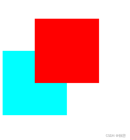
盒子垂直水平居中
采用的方法是先用定位移动50%,再用translate移动-50%。此处translate移动的百分比是针对移动者本身的:
    <style>
        .one{
            position: relative;
            width: 500px;
            height: 500px;
            background-color: red;


        }
        .two{
            position: absolute;
            width: 200px;
            height: 200px;
            background-color: aqua;
            top: 50%;
            left: 50%;
            transform: translate(-50%,-50%);
        }


    </style>
</head>
<body>
    <div class="one">
        <div class="two">

        </div>
    </div>


</body>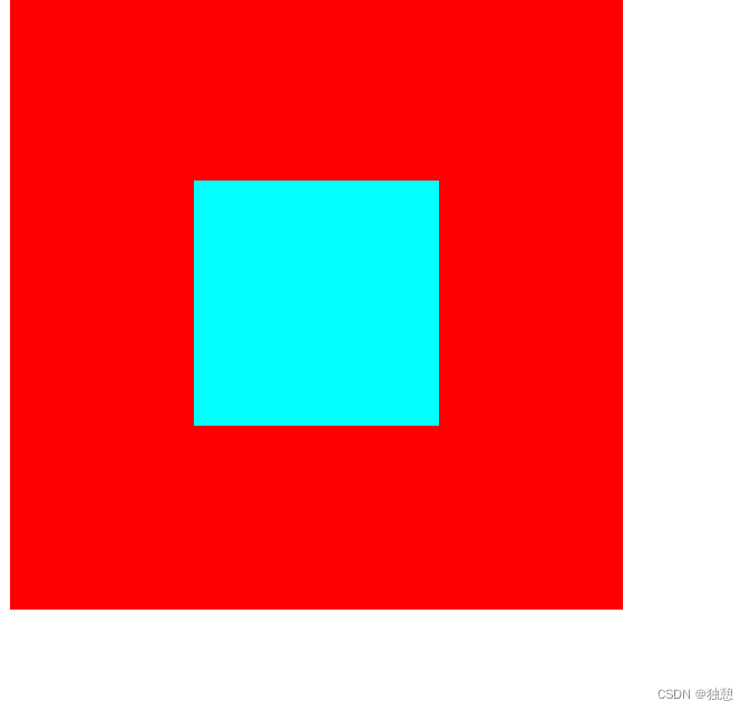


 5642
5642


 被折叠的 条评论
为什么被折叠?
被折叠的 条评论
为什么被折叠?
 到【灌水乐园】发言


