


@keyframes
指定一个 CSS 样式和动画将逐步从目前的样式更改为新的样式。
注意:@keyframes 规则不兼容 IE 9 以及更早版本的浏览器.
语法:@keyframes animationname {keyframes-selector {css-styles;}
| 值 | 说明 |
| animationname | 必需的。定义动画的名称。 |
| keyframes-selector | 必需的。动画持续时间的百分比。 合法值: 0-100% 注意: 您可以用一个动画keyframes-selectors。 |
| css-styles | 必需的。一个或多个合法的CSS样式属性 |
@keyframes 创建动画,把它绑定到一个选择器,否则动画不会有任何效果。
属性:
| 属性 | 描述 |
|---|---|
| @keyframes | 规定动画。 |
| animation | 所有动画属性的简写属性。 |
| animation-name | 规定 @keyframes 动画的名称。 |
| animation-duration | 规定动画完成一个周期所花费的秒或毫秒。默认是 0。 |
| animation-timing-function | 规定动画的速度曲线。默认是 "ease"。 |
| animation-fill-mode | 规定当动画不播放时(当动画完成时,或当动画有一个延迟未开始播放时),要应用到元素的样式。 |
| animation-delay | 规定动画何时开始。默认是 0。 |
| animation-iteration-count | 规定动画被播放的次数。默认是 1。 |
| animation-direction | 规定动画是否在下一周期逆向地播放。默认是 "normal"。 |
| animation-play-state | 规定动画是否正在运行或暂停。默认是 "running"。 |
演示1:
为了得到最佳的浏览器支持,您应该始终定义 0% 和 100% 选择器(可以不由0%出发,不由100%结束)

代码:
<!DOCTYPE html>
<html>
	<head>
		<meta charset="utf-8">

		<style>
			div {
				width: 150px;
				height: 150px;
				background: red;
				position: relative;
				animation: a 3s infinite;//动画名a 时间5s
			}

			@keyframes a {
				10% {
					top: 0px;
				}

				30% {
					top: 200px;
				}

				50% {
					top: 50px
				}

				60% {
					top: 100px;
				}

				90%{
					top: 0px
				}
			}
		</style>
	</head>
	<body>
		<div></div>
	</body>
</html>
演示2:
代码(部分):
<!DOCTYPE html>
<html>
	<head>
		<meta charset="UTF-8">
		<style>
			html,
			body,
			div,
			span,
			applet,
			object,
			iframe,
			h1,
			h2,
			h3,
			h4,
			h5,
			h6,
			p,
			blockquote,
			pre,
			a,
			abbr,
			acronym,
			address,
			big,
			cite,
			code,
			del,
			dfn,
			em,
			img,
			ins,
			kbd,
			q,
			s,
			samp,
			small,
			strike,
			strong,
			sub,
			sup,
			tt,
			var,
			b,
			u,
			i,
			center,
			dl,
			dt,
			dd,
			ol,
			ul,
			li,
			fieldset,
			form,
			label,
			legend,
			table,
			caption,
			tbody,
			tfoot,
			thead,
			tr,
			th,
			td,
			article,
			aside,
			canvas,
			details,
			embed,
			figure,
			figcaption,
			footer,
			header,
			hgroup,
			menu,
			nav,
			output,
			ruby,
			section,
			summary,
			time,
			mark,
			audio,
			video {
				margin: 0;
				padding: 0;
				border: 0;
				font-size: 100%;
				font: inherit;
				vertical-align: baseline
			}

			article,
			aside,
			details,
			figcaption,
			figure,
			footer,
			header,
			hgroup,
			menu,
			nav,
			section {
				display: block
			}

			body {
				line-height: 1
			}

			ol,
			ul {
				list-style: none
			}

			blockquote,
			q {
				quotes: none
			}

			blockquote:before,
			blockquote:after,
			q:before,
			q:after {
				content: '';
				content: none
			}

			table {
				border-collapse: collapse;
				border-spacing: 0
			}
		</style>
		<style>
			#contain {
				width: 300px;
				height: 100px;
				position: absolute;
				top: 0;
				right: 0;
				left: 0;
				bottom: 0;
				margin: auto;
				opacity: 0;
				animation: fadeIn 1s 1;
				animation-fill-mode: forwards;
			}

			.wrap {
				animation: rotate 1000ms infinite ease-in-out alternate, zindex 2000ms infinite ease-in-out;
				position: absolute;
				z-index: 0;
			}

			.part {
				width: 100px;
				height: 100px;
				background: radial-gradient(circle at 0 0, rgba(0, 0, 0, 0), rgba(0, 0, 0, 0) 65%, rgba(0, 0, 0, 0.1) 65%, rgba(0, 0, 0, 0.1));
				background-color: #E3746B;
				border-radius: 50%;
				animation: scale 1000ms infinite ease-in-out alternate;
				animation-delay: -500ms;
				transform: scale(0.5);
			}

			.part:after {
				content: '';
				width: 100px;
				height: 10px;
				background: #eee;
				position: absolute;
				top: 130px;
				border-radius: 50%;
			}

			#wrap2 {
				animation-delay: -1000ms;
			}

			#part2 {
				background-color: #397BF9;
				animation-delay: -1500ms;
			}

			#wrap3 {
				animation-delay: -1500ms;
			}

			#part3 {
				background-color: #F4B400;
				animation-delay: -2000ms;
			}

			#wrap4 {
				animation-delay: -2500ms;
			}

			#part4 {
				background-color: #0F9D58;
				animation-delay: -3000ms;
			}

			@keyframes rotate {
				100% {
					transform: translateX(200px);
				}
			}

			@keyframes scale {
				100% {
					transform: scale(1);
				}
			}

			@keyframes zindex {
				25% {
					z-index: 1;
				}

				75% {
					z-index: -1;
				}
			}

			@keyframes fadeIn {
				100% {
					opacity: 1;
				}
			}
		</style>
		<script src="js/prefixfree.min.js"></script>
		<script src="js/modernizr.js"></script>
	</head>

	<body>
		<div id="contain">
			<div class='wrap' id='wrap1'>
				<div class='part' id='part1'></div>
			</div>
			<div class='wrap' id='wrap2'>
				<div class='part' id='part2'></div>
			</div>
			<div class='wrap' id='wrap3'>
				<div class='part' id='part3'></div>
			</div>
			<div class='wrap' id='wrap4'>
				<div class='part' id='part4'></div>
			</div>
		</div>
		<script src='js/jquery.js'></script>
	</body>
</html>
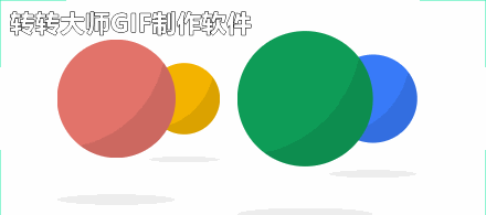
演示3:
这个是响应式动画,玩家下棋后触发两个动画。(使用jq)
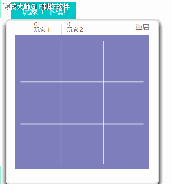
css关键部分
.rotate {
	-webkit-animation: rotating 2s linear infinite;/* Safari 和 Chrome */
	-moz-animation: rotating 2s linear infinite;/* Firefox */
	-ms-animation: rotating 2s linear infinite;/* Triden */
	-o-animation: rotating 2s linear infinite;/* Opera */
	animation: rotating 2s linear infinite;/*IE*/
}

@keyframes rotating {

/*使用@keyframes规则,你可以创建动画。

创建动画是通过逐步改变从一个CSS样式设定到另一个。

在动画过程中,您可以更改CSS样式的设定多次。

指定的变化时发生时使用%,或关键字"from"和"to",这与0%到100%相同。*/
	from {
		-ms-transform: rotateY(0deg);
		-moz-transform: rotateY(0deg);
		-webkit-transform: rotateY(0deg);s
		-o-transform: rotateY(0deg);
		transform: rotateY(0deg);
	}

	to {
		-ms-transform: rotateY(360deg);
		-moz-transform: rotateY(360deg);
		-webkit-transform: rotateY(360deg);
		-o-transform: rotateY(360deg);
		transform: rotateY(360deg);
	}
}
js部分
showPlayerOnePrompt: function() {
		if (MYAPP.secondPlayer) {
			$('.player-one-turn p').text('玩家 1 下棋!');
		} else {
			$('.player-one-turn p').text('该你下了!');
		}
		$('.player-one-turn').animate({
			'top': '-45px'
		}, 500);
	},

	hidePlayerOnePrompt: function() {
		$('.player-one-turn').animate({
			'top': '0'
		}, 500);
	},

	showPlayerTwoPrompt: function() {
		if (MYAPP.secondPlayer) {
			$('.player-two-turn p').text('玩家 2 下棋!');
		} else {
			$('.player-two-turn p').text('电脑回合');
		}
		$('.player-two-turn').animate({
			'top': '-45px'
		}, 500);
	},

	hidePlayerTwoPrompt: function() {
		$('.player-two-turn').animate({
			'top': '0'
		}, 500);
	},
html部分(p是文本显示,js内修改)
<div class="player-one-turn">
	<p></p>
</div>
<div class="player-two-turn">
	<p></p>
</div>


 1453
1453


 被折叠的 条评论
为什么被折叠?
被折叠的 条评论
为什么被折叠?
 到【灌水乐园】发言


