


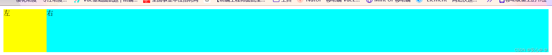
两栏布局 左侧固定右侧自适应
 <div class="out">
        <div class="left">左</div>
        <div class="right">右</div>
    </div>
1.浮动
- 左侧固定,设置向左浮动
- 右边margin-left: 200px;,右边元素宽度默认为auto
 .out{
            height: 100px;
        }
        .left{
            height: 100px;
            width: 200px;
            float: left;
            background-color: yellow;
        }
        .right{
        height: 100px;
            margin-left: 200px;
            background-color: aqua;
        }
2.浮动加BFC
- 左侧宽度固定,设置浮动
- 右边overflow:hidden,触发bfc盒子 ,bfc不会与浮动元素发生重叠
 .out{
            height: 100px;
        }
        .left{
            height: 100%;
            width: 200px;
            float: left;
            background-color: yellow;
        }
        .right{
        height: 100px;
          overflow: hidden;
            background-color: aqua;
        }
3.flex布局
- 外围盒子设置 display: flex;
- 左边固定高度,右边flex设置为1
.out{
    display: flex;
            height: 100px;
        }
        .left{
            height: 100%;
            width: 200px;
            background-color: yellow;
        }
        .right{
        height: 100px;
        flex: 1;
            background-color: aqua;
        }
4.绝对定位
- 父元素相对定位,
- 左边元素设置为
absolute定位,并且固定宽度设置为200px,left值设置为0。 - 右盒子 margin-left: 200px;
 .out{
           position: relative;
            height: 100px;
        }
        .left{
            position: absolute;
            height: 100%;
            width: 200px;
            background-color: yellow;
        }
        .right{
        height: 100px;
        margin-left: 200px;
            background-color: aqua;
        }
5.gird布局
- 盒子添加"display: grid"属性,再添加"grid-template-columns: 100px 1fr"属性,表示第一列宽度始终为100px,第二列的宽度为剩余的所有空间。
  .out{
             height: 100px;
             display: grid;
             grid-template-columns: 100px 1fr;
        }
        .left {
            width: 100px;
            height: 100px;
         background-color: yellow;
     }
       .right {
        height: 100px;
      background-color: aqua;
      }


 866
866


 被折叠的 条评论
为什么被折叠?
被折叠的 条评论
为什么被折叠?
 到【灌水乐园】发言


