


文章目录
Flex布局
01-标准流
标准流也叫文档流,指的是标签在页面中默认的排布规则,例如:块元素独占一行,行内元素可以一行显示多个。
02-浮动(了解即可)
基本使用
作用:让块元素水平排列。
属性名:float
属性值
- left:左对齐
- right:右对齐
<!DOCTYPE html>
<html lang="en">
<head>
<meta charset="UTF-8">
<meta http-equiv="X-UA-Compatible" content="IE=edge">
<meta name="viewport" content="width=device-width, initial-scale=1.0">
<title>浮动</title>
<style>
.left,
.right {
/* width: 200px; */
height: 200px;
background-color: pink;
}
.left {
/* 左浮动 */
float: left;
margin-left: 20px;
}
.right {
float: left;
height: 300px;
background-color: purple;
}
.bottom {
/* 标准流 */
height: 50px;
background-color: black;
}
</style>
</head>
<body>
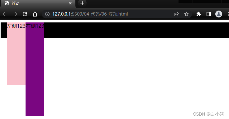
<div class="left">左侧123</div>
<div class="right">右侧123</div>
<div class="bottom"></div>
</body>
</html>
特点:
- 浮动后的盒子顶对齐
- 浮动后的盒子具备行内块特点(当盒子不设置宽高时,盒子的宽高由内容决定)
- 浮动后的盒子脱标,不占用标准流的位置
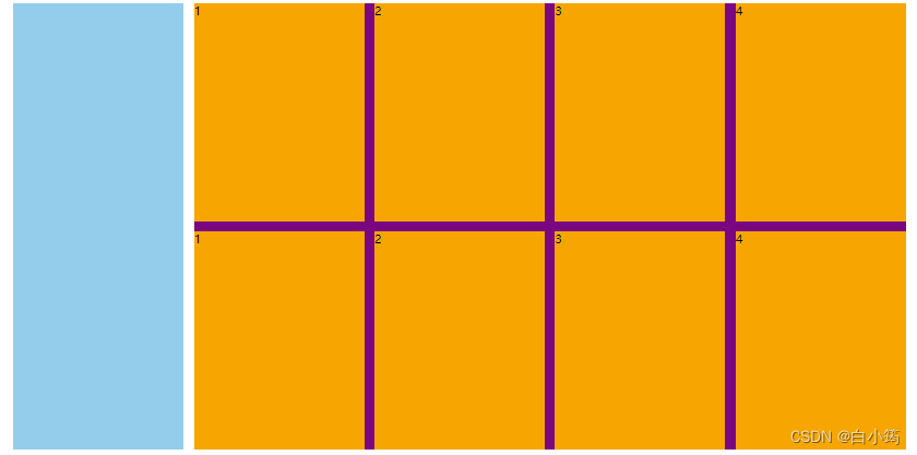
产品区域布局
左右布局
html结构
  <div class="mi">
    <div class="left">左侧</div>
    <div class="right">右侧</div>
  </div>
css样式
 <style>
    * {
      margin: 0;
      padding: 0;
      box-sizing: border-box;
    }

    li {
      list-style: none;
    }

    .mi {
      width: 1226px;
      height: 614px;
      /* background-color: pink; */
      margin: 100px auto;
    }

    .left {
      float: left;
      width: 234px;
      height: 614px;
      background-color: skyblue;
    }

    .right {
      float: right;
      width: 978px;
      height: 614px;
      background-color: purple;
    }
</style>
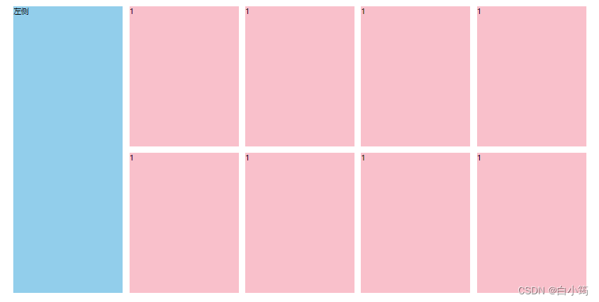
效果:
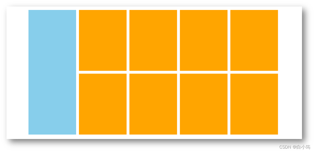
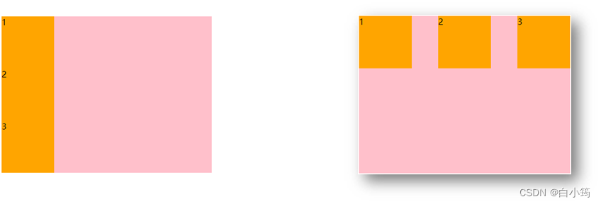
区域小li布局
完整写法
<!DOCTYPE html>
<html lang="en">

<head>
  <meta charset="UTF-8">
  <meta http-equiv="X-UA-Compatible" content="IE=edge">
  <meta name="viewport" content="width=device-width, initial-scale=1.0">
  <title>Document</title>
  <style>
    * {
      margin: 0;
      padding: 0;
      box-sizing: border-box;
    }

    li {
      list-style: none;
    }

    .mi {
      width: 1226px;
      height: 614px;
      /* background-color: pink; */
      margin: 100px auto;
    }

    .left {
      float: left;
      width: 234px;
      height: 614px;
      background-color: skyblue;
    }

    .right {
      float: right;
      width: 978px;
      height: 614px;
      /* background-color: purple; */
    }

    .right li {
      float: left;
      width: 234px;
      height: 300px;
      background-color: pink;
      margin-bottom: 14px;
      margin-right: 14px;
    }

    /* 让第4,8 个li 去掉外边距 */
    .right li:nth-child(4n) {
      margin-right: 0;
    }
  </style>
</head>

<body>
  <div class="mi">
    <div class="left">左侧</div>
    <div class="right">
      <ul>
        <li>1</li>
        <li>1</li>
        <li>1</li>
        <li>1</li>
        <li>1</li>
        <li>1</li>
        <li>1</li>
        <li>1</li>
      </ul>
    </div>
  </div>
</body>

</html>
清除浮动
场景:浮动元素会脱标,如果父级没有高度,子级无法撑开父级高度(可能导致页面布局错乱)
解决方法:清除浮动(清除浮动带来的影响)
场景搭建
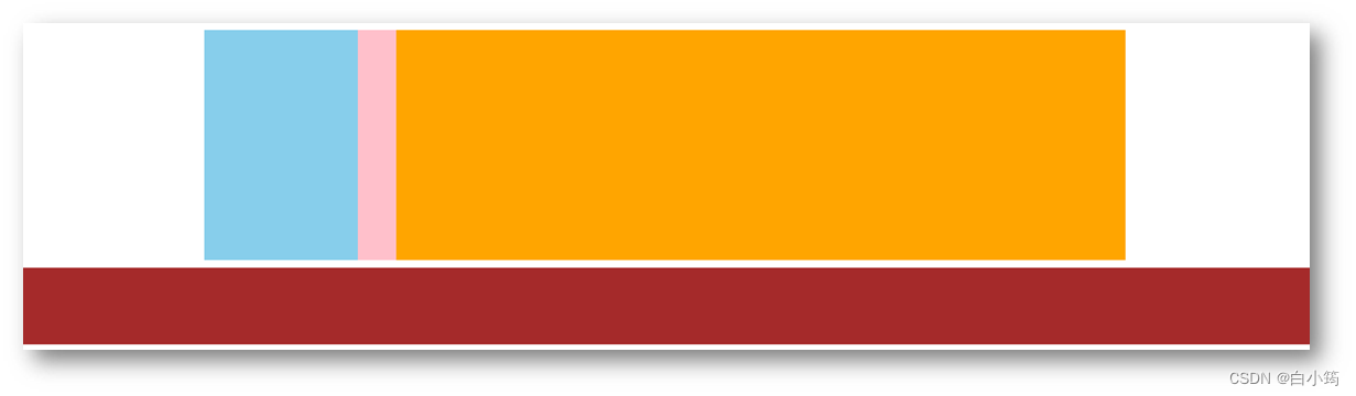
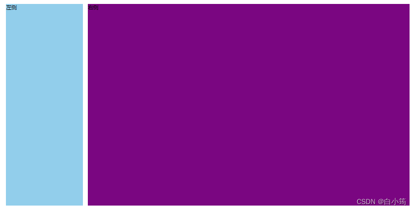
<style>
  .top {
    margin: 10px auto;
    width: 1200px;
    /* height: 300px; */
    background-color: pink;
  }

  .left {
    float: left;
    width: 200px;
    height: 300px;
    background-color: skyblue;
  }

  .right {
    float: right;
    width: 950px;
    height: 300px;
    background-color: orange;
  }

  .bottom {
    height: 100px;
    background-color: brown;
  }

</style>

<div class="top">
  <div class="left"></div>
  <div class="right"></div>
</div>
<div class="bottom"></div>
清除浮动的方法
1、额外标签法
在父元素内容的最后添加一个块级元素,设置 CSS 属性 clear: both
<style>
.clearfix {
  clear: both;
}
</style>

<div class="father">
  <div class="left"></div>
  <div class="right"></div>
  <div class="clearfix"></div>
</div>
2、单伪元素法
- 准备 after 伪元素
.clearfix::after {
  content: "";
  display: block;
  clear: both;
}
- 父级使用 clearfix 类
<div class="father clearfix"></div>
3、双伪元素法(推荐)
- 准备 after 和 before 伪元素
/* before 解决外边距塌陷问题 */
/* 双伪元素法 */
.clearfix::before,
.clearfix::after {
  content: "";
  display: table;
}

/* after 清除浮动 */
.clearfix::after {
  clear: both;
}
- 父级使用 clearfix 类
<div class="father clearfix"></div>
4、overfow法
.father {
  margin: 10px auto;
  width: 1200px;
  /* height: 300px; */
  background-color: pink;

  overflow: hidden;
}
03-Flex布局(重点)
Flex 布局也叫弹性布局,是浏览器提倡的布局模型,非常适合结构化布局,提供了强大的空间分布和对齐能力。
Flex 模型不会产生浮动布局中脱标现象,布局网页更简单、更灵活。
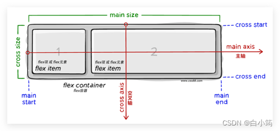
Flex组成
设置方式:给父元素设置 display: flex,子元素可以自动挤压或拉伸
组成部分:
- 弹性容器
- 弹性盒子
- 主轴:默认在水平方向
- 侧轴 / 交叉轴:默认在垂直方向
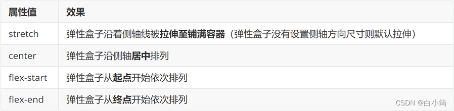
主轴对齐方式
属性名:justify-content
重点记住标红的。如果非要问我那个常用,我只能说是 space-between
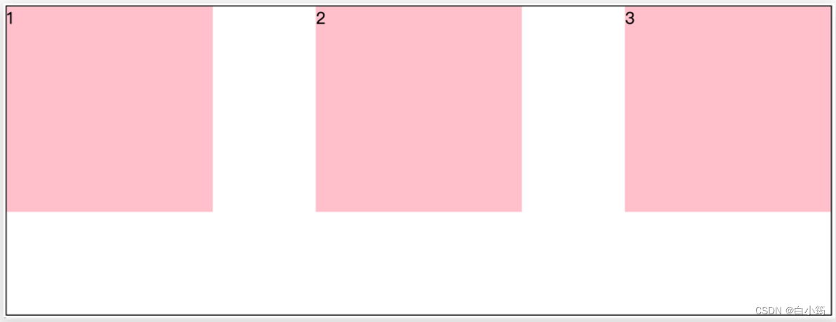
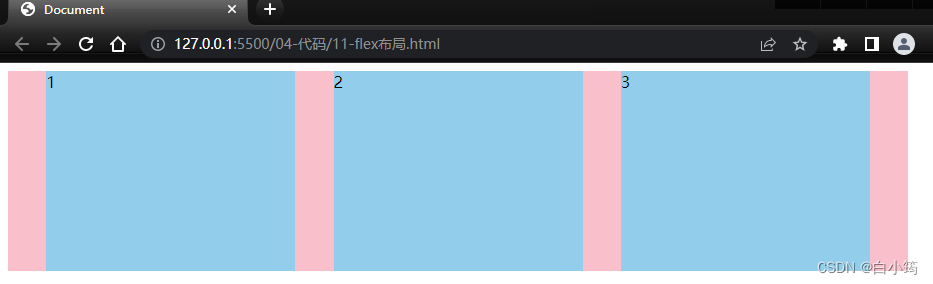
justify-content: space-between;
显示效果:两侧没缝隙
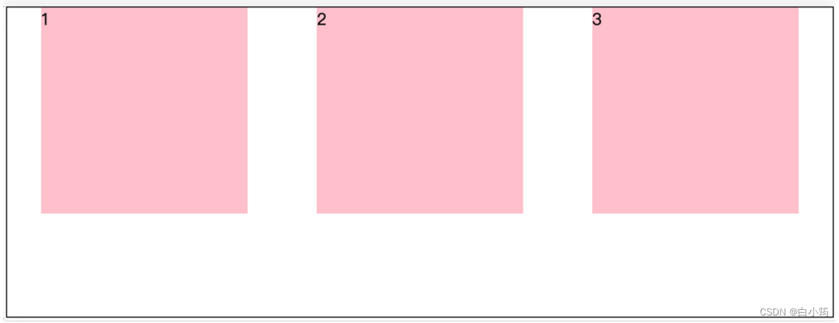
justify-content: space-around;
效果如下: **记住2倍缝隙 **
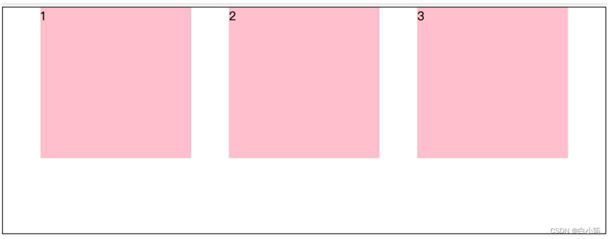
justify-content: space-evenly;
效果如下: 记住空隙一样大(evenly)
justify-content: center;
效果如下: 经常用于让一个盒子水平居中

记忆:
两侧没缝隙是 between- 缝隙一样大是 evenly
- 2倍缝隙是 around
<!DOCTYPE html>
<html lang="en">
<head>
    <meta charset="UTF-8">
    <meta name="viewport" content="width=device-width, initial-scale=1.0">
    <title>Document</title>
    <style>
        .box{
            height: 200px;
            width: 900px;
            background-color: skyblue;
            display: flex;
            /* justify-content: flex-start; 从左开始排列(默认) */
            /* justify-content: flex-end;  从右开始排列*/
            /* justify-content: space-between; 两边没有缝隙,周围有缝隙 */
            /* justify-content: space-around;  两边有缝隙 */
            /* justify-content: space-evenly;  两边也有缝隙,缝隙一样大*/
            /* justify-content: center; 居中的 */
        }
        .box div{
        width: 198px;
        height: 200px;
        background-color: pink;
    }

    </style>

</head>
<body>
    <div class="box">
        <div>1</div>
        <div>2</div>
        <div>3</div>
    </div>
</body>
</html>
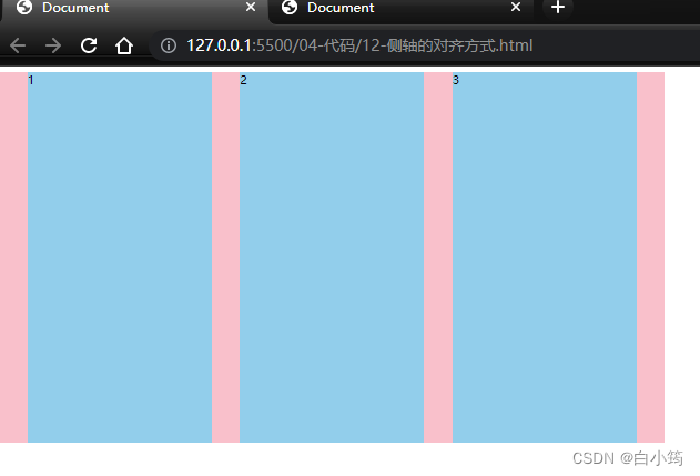
侧轴对齐方式
- align-items:当前弹性容器内所有弹性盒子的侧轴对齐方式(给弹性容器设置)
- align-self:单独控制某个弹性盒子的侧轴对齐方式(给弹性盒子设置)
若子盒子没给heigth,则子盒子的侧轴排列方式是stretch(子盒子的高和父盒子一样)
<!DOCTYPE html>
<html lang="en">

<head>
  <meta charset="UTF-8">
  <meta http-equiv="X-UA-Compatible" content="IE=edge">
  <meta name="viewport" content="width=device-width, initial-scale=1.0">
  <title>Document</title>
  <style>
    .box {
      /* 给父亲添加 flex */
      display: flex;
      /* 主轴的排列方式 */
      /* justify-content: flex-start; */
      /* justify-content: flex-end; */
      /* 让子盒子居中对齐 */
      /* justify-content: center; */
      /* between  */
      /* 两侧没缝隙 */
      /* justify-content: space-between; */
      /* 两倍缝隙 */
      /* justify-content: space-around; */
      justify-content: space-evenly;

      /* 侧轴的对齐方式 */
      /* 顶部对齐 */
      /* align-items: flex-start; */
      /* 底部对齐 */
      /* align-items: flex-end; */
      /* 居中对齐 */
      /* align-items: center; */
      /* 默认的 拉伸和父亲一样 */
      align-items: stretch;
      width: 900px;
      height: 500px;
      background-color: pink;
    }

    .box div {
      width: 249px;
      /* height: 200px; */
      background-color: skyblue;
    }
  </style>
</head>

<body>
  <div class="box">
    <div>1</div>
    <div>2</div>
    <div>3</div>
  </div>
</body>

</html>
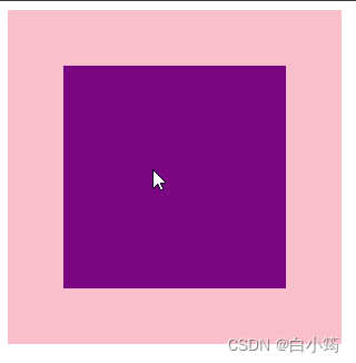
盒子水平和垂直居中的写法
<!DOCTYPE html>
<html lang="en">
<head>
    <meta charset="UTF-8">
    <meta name="viewport" content="width=device-width, initial-scale=1.0">
    <title>Document</title>
    <style>
        .father{
            height: 500px;
            width: 500px;
            background-color: skyblue;
            display: flex;

            justify-content: center;
            align-items: center;
        }
        .son{
            height: 250px;
            width: 250px;
            background-color: pink;
        }
    </style>
</head>
<body>
    <div class="father">
        <div class="son">

        </div>
    </div>
</body>
</html>
注意:一定要给亲爸爸加上display:flex
自动换行
弹性盒子可以自动挤压或拉伸,默认情况下,所有弹性盒子都在一行显示。
属性名:flex-wrap
属性值
•wrap:换行
•nowrap:不换行(默认)
小米flex布局
<!DOCTYPE html>
<html lang="en">

<head>
  <meta charset="UTF-8">
  <meta http-equiv="X-UA-Compatible" content="IE=edge">
  <meta name="viewport" content="width=device-width, initial-scale=1.0">
  <title>Document</title>

  <style>
    * {
      margin: 0;
      padding: 0;
      box-sizing: border-box;
    }

    .mi {
      /* 父控子 */
      display: flex;
      justify-content: space-between;
      width: 1226px;
      height: 614px;
      /* background-color: pink; */
      margin: 100px auto;
    }

    .left {
      width: 234px;
      height: 614px;
      background-color: skyblue;
    }

    .right {
      width: 978px;
      height: 614px;
      background-color: purple;
    }

    .right ul {
      display: flex;
      /* 让li 自动换行 */
      flex-wrap: wrap;
      /* 主轴两侧对齐 */
      justify-content: space-between;

    }

    .right li {
      width: 234px;
      height: 300px;
      background-color: orange;
      list-style: none;
      margin-bottom: 14px;
    }
  </style>
</head>

<body>
  <div class="mi">
    <div class="left"></div>
    <div class="right">
      <ul>
        <li>1</li>
        <li>2</li>
        <li>3</li>
        <li>4</li>
        <li>1</li>
        <li>2</li>
        <li>3</li>
        <li>4</li>
      </ul>
    </div>
  </div>
</body>

</html>
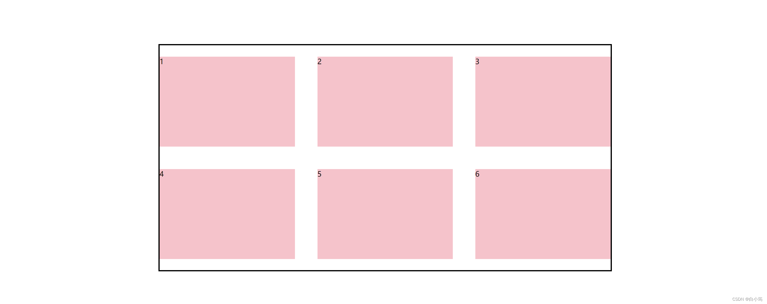
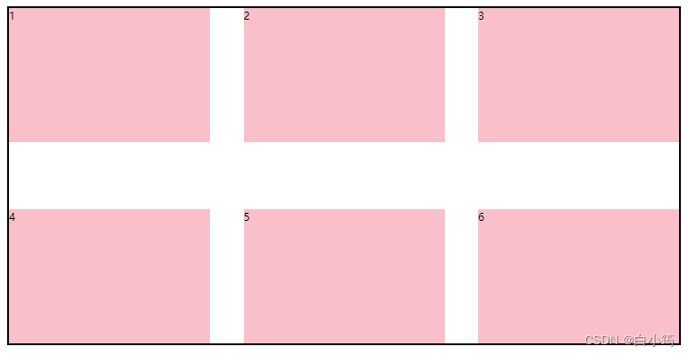
多行对齐方式
如果有多行侧轴对齐,则去找align-content
如果是单行侧轴对齐,则去找 align-items
属性名:align-content
注意:该属性对单行弹性盒子模型无效,使用时父盒子必须有高度
居中
align-content: center;
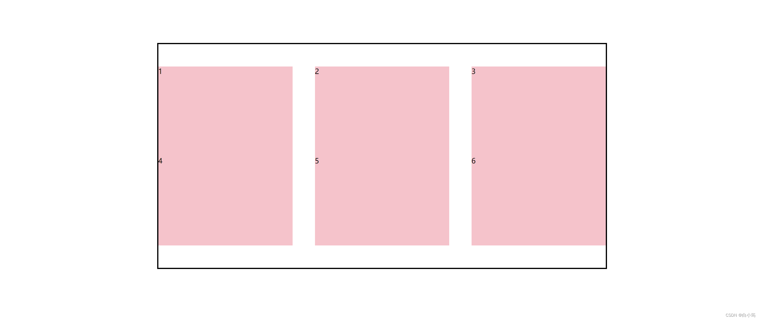
对比单行aligin-items:center
中间留空,同justify-content在侧轴上的对齐方式
align-content: space-between;
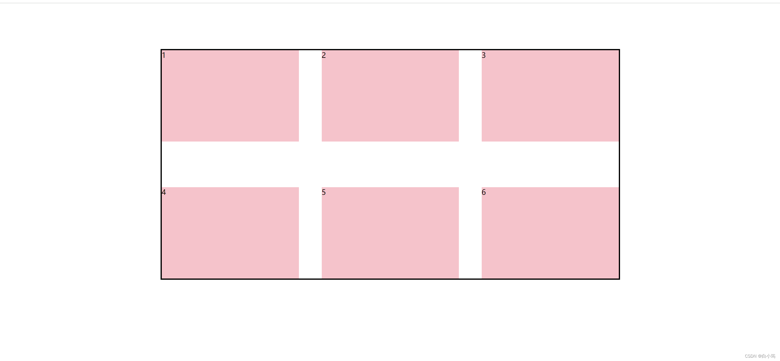
align-content: flex-end;

对比align-items:flex-end

<!DOCTYPE html>
<html lang="en">

<head>
  <meta charset="UTF-8">
  <meta http-equiv="X-UA-Compatible" content="IE=edge">
  <meta name="viewport" content="width=device-width, initial-scale=1.0">
  <title>Document</title>
  <style>
    .box {
      display: flex;
      /* 换行 */
      flex-wrap: wrap;
      /* 主轴对齐 */
      justify-content: space-between;
      /* 侧轴单行控制 */
      /* align-items: center; */
      /* 侧轴多行对齐 */

      /* align-content: center; */
      align-content: space-between;
      width: 1000px;
      /* 亲父亲得有高度 */
      height: 500px;
      border: 3px solid #000;
      margin: 100px auto;
    }

    .box div {
      width: 300px;
      height: 200px;
      background-color: pink;
    }
  </style>
</head>

<body>
  <div class="box">
    <div>1</div>
    <div>2</div>
    <div>3</div>
    <div>4</div>
    <div>5</div>
    <div>6</div>
  </div>
</body>

</html>
单个盒子移动
属性名:align-self
给需要移动的盒子加上的属性
<!DOCTYPE html>
<html lang="en">
<head>
    <meta charset="UTF-8">
    <meta name="viewport" content="width=device-width, initial-scale=1.0">
    <title>Document</title>
    <style>
        .box{
            width: 1000px;
            height: 800px;
            border: 1px solid black;
            display: flex;
            justify-content: space-between;
        }
        .box div{
            height: 100px;
            width: 100px;
            border-radius: 50%;
            background-color: pink;
        }
        .box div:nth-child(2){
            align-self: center;
        }
        .box div:nth-child(3){
            align-self:flex-end;
        }
    </style>
</head>
<body>
    <div class="box">
        <div></div>
        <div></div>
        <div></div>
    </div>
</body>
</html>
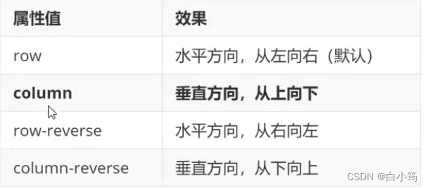
修改主轴方向
为什么要修改主轴? 只要父亲添加了display: flex, 所有的子盒子都会一行显示(水平显示) →
但是, 我们很多情况下,需要 盒子垂直竖着显示,此时就需要把主轴修改一下。修改为 竖着 ↓
主轴默认在水平方向,侧轴默认在垂直方向**
属性名:flex-direction
想要如下效果:

代码:
<!DOCTYPE html>
<html lang="en">
<head>
    <meta charset="UTF-8">
    <meta name="viewport" content="width=device-width, initial-scale=1.0">
    <title>Document</title>
    <style>
        .box{
            height: 300px;
            width: 300px;
            border: solid 1px black;
            display: flex;
            flex-direction: column;
            /* 主轴居中  */
            justify-content: center;
            /* 侧轴居中 */
            align-items: center;

        }
        .box div{
            height: 100px;
            width: 100px;
            background-color: pink;

        }
    </style>
</head>
<body>
    <div class="box">
        <div></div>
        <div></div>
    </div>
</body>
</html>
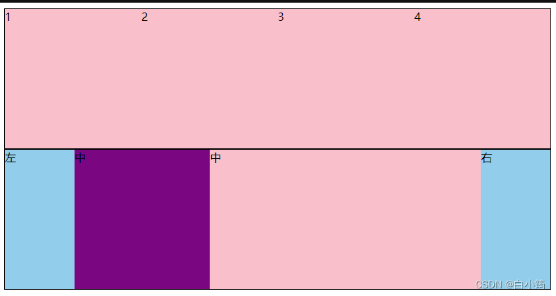
弹性伸缩比
作用:控制弹性盒子的主轴方向的尺寸。
属性名:flex
属性值:整数数字,表示占用父级剩余尺寸的份数,子盒子中设置即可
<!DOCTYPE html>
<html lang="en">

<head>
  <meta charset="UTF-8">
  <meta http-equiv="X-UA-Compatible" content="IE=edge">
  <meta name="viewport" content="width=device-width, initial-scale=1.0">
  <title>Document</title>
  <style>
    .box {
      display: flex;
      width: 80%;
      height: 200px;
      border: 1px solid #000;
    }

    .box span {
      /* 不会区分原来属于什么模式 */
      /* width: 100px;
      height: 100px;
      background-color: pink; */
      flex: 1;
      background-color: pink;
    }

    /* 圣杯布局:
      两侧固定,中间自适应 */
    .left,
    .right {
      width: 100px;
      background-color: skyblue;
    }

    .center {
      flex: 1;
      background-color: purple;
    }

    .center1 {
      flex: 2;
      background-color: pink;
    }
  </style>
</head>

<body>
  <div class="box">
    <span>1</span>
    <span>2</span>
    <span>3</span>
    <span>4</span>
  </div>

  <div class="box">
    <div class="left">左</div>
    <div class="center">中</div>
    <div class="center1">中</div>
    <div class="right">右</div>
  </div>
</body>

</html>


 1429
1429


 被折叠的 条评论
为什么被折叠?
被折叠的 条评论
为什么被折叠?
 到【灌水乐园】发言


