


css文本外观属性设置
1.color:文本颜色
color 属性用于定义文本的颜色,其取值方式有如下3种:
* 预定义的颜色,如: red, green, blue 等。
* 十六进制,如 #FF6600, #29D794 等。实际中,十六进制是最常用的定义颜色方式。
十六进制中分别又六个数字两两用于调节红绿蓝三色的比例如:(#FF6600)可以改变数值颜色就不一样了。
* RGB 代码,如红色可以表示为 rgb(255,0,0) 或 rgb(100%,0%,0%)(如果使用百分比颜色值,取值为0时也不能省略百分号,必须写为0%)。
语法:
color:red;  /*红色*/
color:#000;   /*设置黑色*/
rgb(255,0,0) /*红色*/ 
2.letter-spacing:字间距
letter-spacing 属性用于定义字间距,所谓字间距就是字符与字符之间的空白。其属性值可为不同单位的数值,允许使用负值,默认为 normal。
语法:
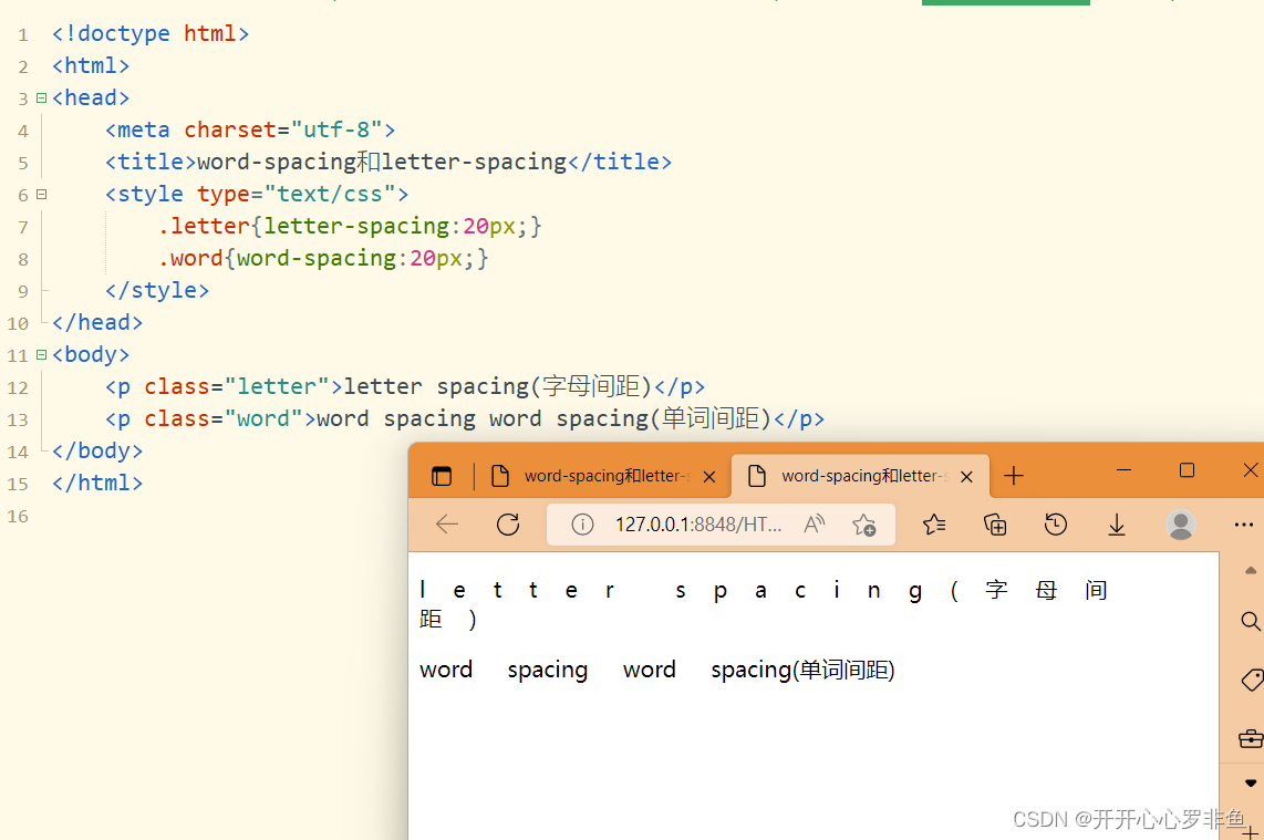
letter-spacing:20px;用类标签标记一下等会整体代码用的上
.letter{letter-spacing:20px;}3.word-spacing:单词间距
word-spacing 属性用于定义英文单词之间的间距,对中文字符无效。和 letter-spacing 一样,其属性值可为不同单位的数值,允许使用负值,默认为normal。
语法:
word-spacing:20px; 用类标签标记一下
.word{word-spacing:20px;}演示字间距与单词间距:
<!doctype html>
<html>
<head>
	<meta charset="utf-8">
	<title>word-spacing和letter-spacing</title>
	<style type="text/css">
		.letter{letter-spacing:20px;}
		.word{word-spacing:20px;}
	</style>
</head>
<body>
	<p class="letter">letter spacing(字母间距)</p>
	<p class="word">word spacing word spacing(单词间距)</p>
</body>
</html>
4.line-height:行间距
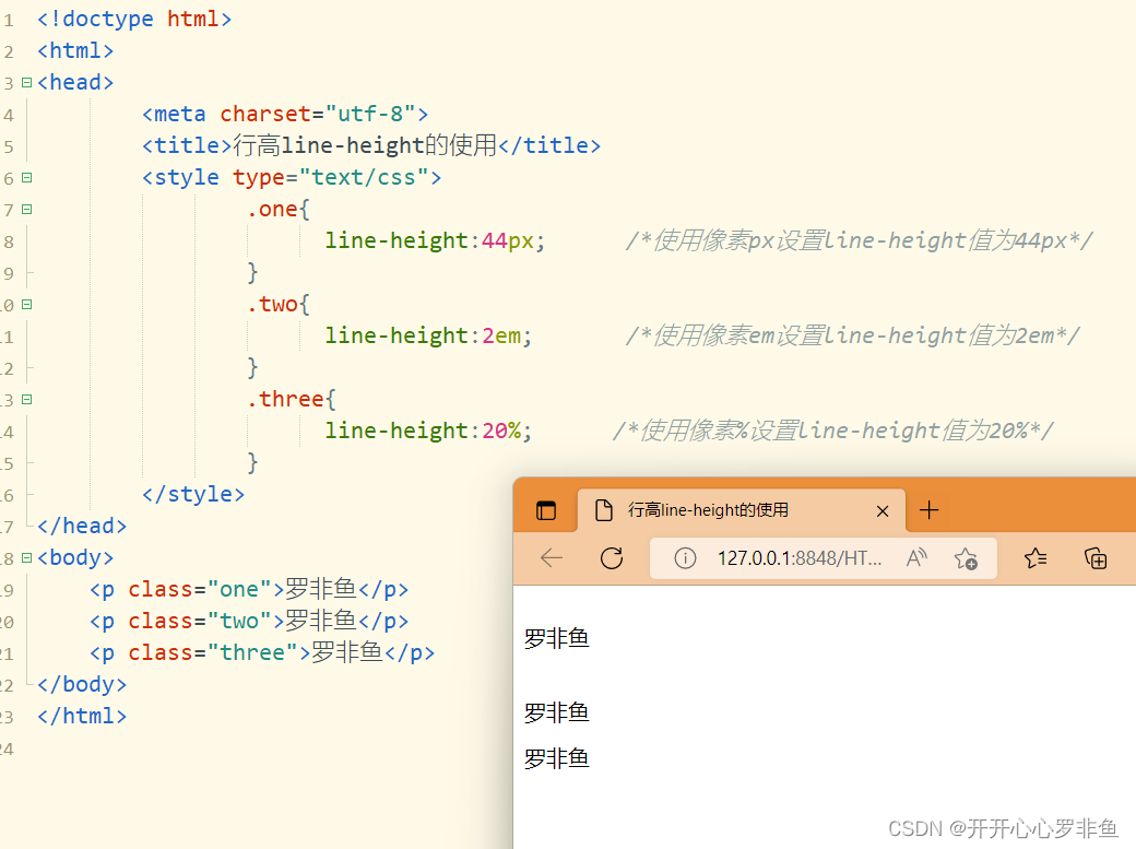
line-height 属性用于设置行间距,所谓行间距就是行与行之间的距离,即字符的垂直间距,一般称之为行高。其常用的属性单位有3种,分别为像素px,相对值em和百分比%,实际中使用最多的是像素px。
语法:
line-height:18px;三种设置的格式:
<!doctype html>
<html>
<head>
		<meta charset="utf-8">
		<title>行高line-height的使用</title>
		<style type="text/css">
				.one{
				      line-height:44px;      /*使用像素px设置line-height值为44px*/
				}
				.two{
				      line-height:2em;       /*使用像素em设置line-height值为2em*/
				}
				.three{
				      line-height:20%;      /*使用像素%设置line-height值为20%*/
				}
		</style>
</head>
<body>
	<p class="one">罗非鱼</p>
	<p class="two">罗非鱼</p>
	<p class="three">罗非鱼</p>
</body>
</html>
结果
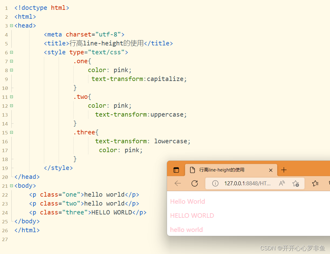
5.text-transform:文本转换
text-transform 属性用于控制英文字符的大小写,其可用属性值:
* none:不转换(默认值)
* capitalize:首字母大写
* uppercase:全部字符转换为大写
* lowercase:全部字符转换为小写
语法:
text-transform:capitalize;演示
<!doctype html>
<html>
<head>
		<meta charset="utf-8">
		<title>行高line-height的使用</title>
		<style type="text/css">
				.one{
					color: pink;
				     text-transform:capitalize;
				}
				.two{
					color: pink;
				      text-transform:uppercase;
				}
				.three{
				      text-transform: lowercase;
					   color: pink;
				}
		</style>
</head>
<body>
	<p class="one">hello world</p>
	<p class="two">hello world</p>
	<p class="three">HELLO WORLD</p>
</body>
</html>
结果
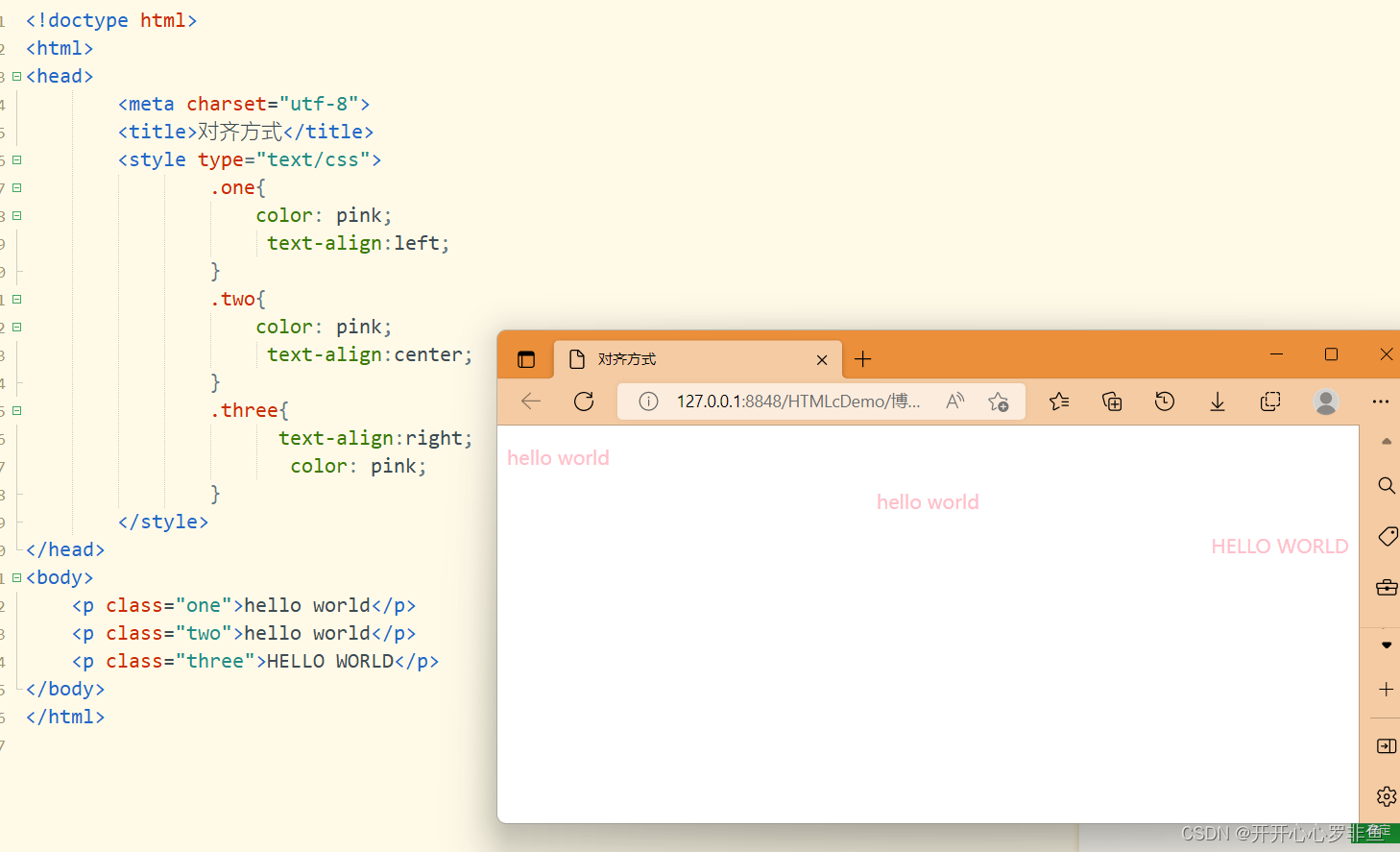
6. text-align属性用于设置文本内容水平对齐,相当于html中的align对齐属性。
*其可用属性值如下:
*left: 左对齐(默认值)
*right:右对齐。
*center:居中对齐。
语法:
text-align:left演示:
<!doctype html>
<html>
<head>
		<meta charset="utf-8">
		<title>对齐方式</title>
		<style type="text/css">
				.one{
					color: pink;
				     text-align:left;
				}
				.two{
					color: pink;
				     text-align:center;
				}
				.three{
				      text-align:right;
					   color: pink;
				}
		</style>
</head>
<body>
	<p class="one">hello world</p>
	<p class="two">hello world</p>
	<p class="three">HELLO WORLD</p>
</body>
</html>
结果
7.text-decoration:文本装饰
text-decoration 属性用于设置文本的下划线、上划线、删除线等装饰效果,其可用属性如下:
* none:没有装饰(正常文本默认值)
* underline:下划线
* overline:上划线
* line-through:删除线
text-decoration 后可以赋多个值,用于给文本添加多种显示效果。
语法:
text-decoration:underline;演示:
<!doctype html>
<html>
<head>
	<meta charset="utf-8">
	<title>文本装饰text-decoration</title>
	<style type="text/css">
		p{
			color: aquamarine;
		}
		.one{text-decoration:underline;}
		.two{text-decoration:overline;}
		.three{text-decoration:line-through;}
		.four{text-decoration:underline line-through;}
	</style>
</head>
<body>
	<p class="one">设置下画线(underline)</p>
	<p class="two">设置上画线(overline)</p>
	<p class="three">设置删除线(line-through)</p>
	<p class="four">同时设置下画线和删除线(underline line-through)</p>
</body>
</html>
结果: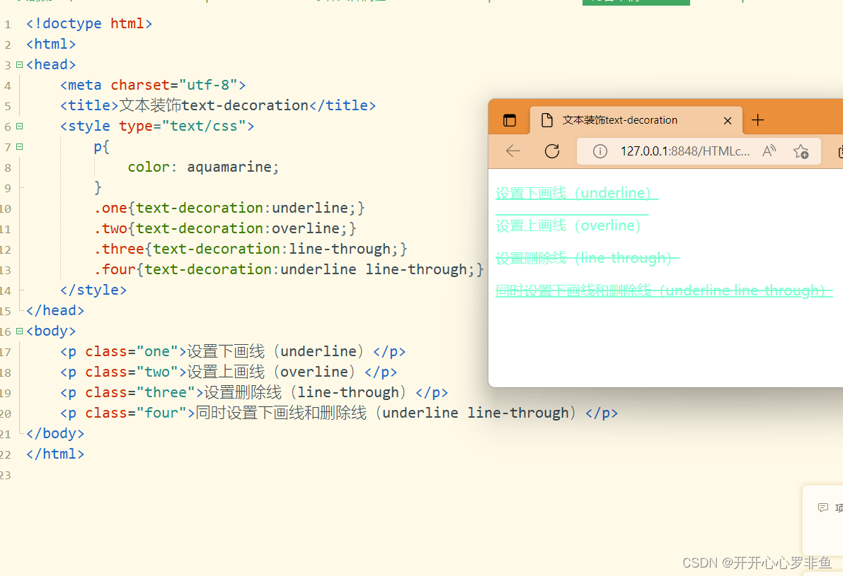
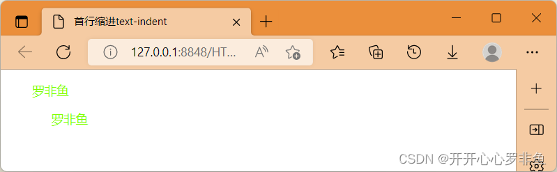
8.text-indent:首行缩进
text-indent 属性用于设置首行文本的缩进,其属性值可为不同单位的数组、em 字符宽度的倍数,或相对于浏览器窗口宽度的百分比%,允许使用负值,建议使用 em 作为设置单位。
语法:
text-indent:20em;用em,px演示
<!doctype html>
<html>
<head>
	<meta charset="utf-8">
	<title>首行缩进text-indent</title>
	<style type="text/css">
		p{font-size:14px;
			color: chartreuse;
		}
		.one{text-indent:2em;}      /*text-indent属性可以对段落文本设置首行缩进效果,段落1使用text-indent:2em;*/
		.two{text-indent:50px;}    /*text-indent属性可以对段落文本设置首行缩进效果,段落2使用text-indent:50px;*/
	</style>
</head>
<body>
	<p class="one">罗非鱼</p>
	<p class="two">罗非鱼</p>
</body>
</html>
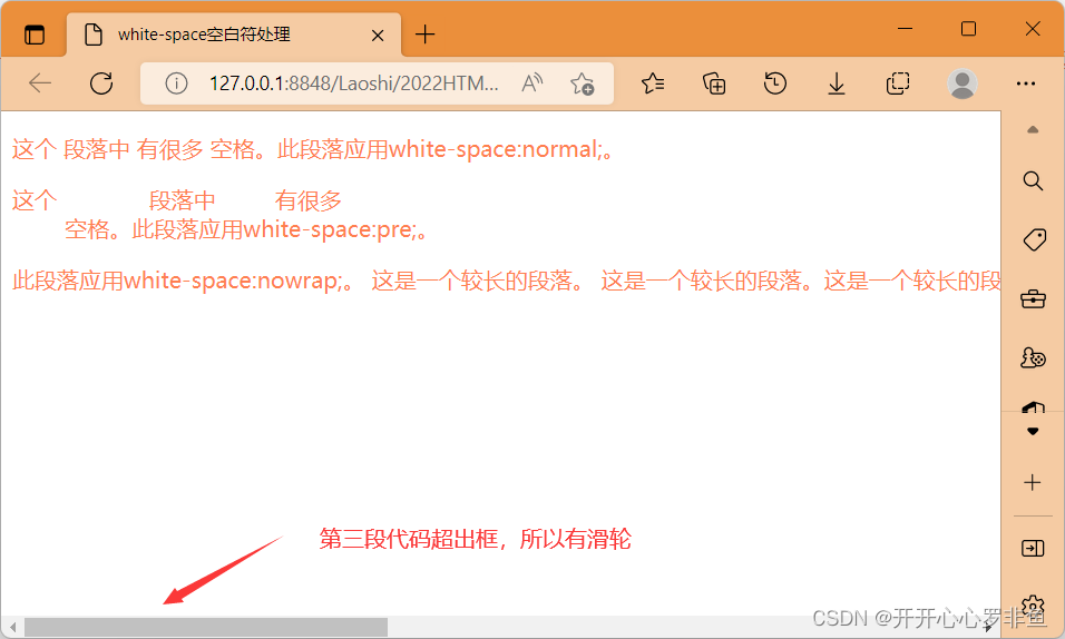
9.white-space:空白符处理
使用 html 制作网页时,不论源代码中有多少空格,在浏览器中只会显示一个字符的空白。在CSS中,使用 white-space 属性可设置空白符的处理方式,其属性如下:
* normal:常规(默认值),文本中的空格、空行无效,满行(到达区域边界)后自动换行
* pre:预格式化,按文档的书写格式保留空格、空行原样显示
* nowrap:空格空行 无效,强制文本不能换行,除非遇到换行标记<br />。内容超出元素的边界也不换行,若超出浏览器页面则会自动增加滚动条
语法:
white-space:normal;演示:
<!doctype html>
<html>
<head>
	<meta charset="utf-8">
	<title>white-space空白符处理</title>
	<style type="text/css">
        p{
		color: coral;
		 }
		.one{white-space:normal;}
		.two{white-space:pre;}
		.three{white-space:nowrap;}
	</style>
</head>
<body>
	<p class="one">这个              段落中         有很多
	空格。此段落应用white-space:normal;。</p>
	<p class="two">这个              段落中         有很多
	空格。此段落应用white-space:pre;。</p>
	<p class="three">此段落应用white-space:nowrap;。   这是一个较长的段落。
		这是一个较长的段落。这是一个较长的段落。这是一个较长的段落。这是一
		个较长的段落。这是一个较长的段落。这是一个较长的段落。这是一个较长
		的段落。这是一个较长的段落。这是一个较长的段落。</p>
</body>
</html>
结果
10.text-shadow:阴影效果
在CSS中,使用 text-shadow 属性可以为页面中的文本添加阴影效果,其基本语法格式为:
选择器{text-shadow:h-shadow v-shadow blur color;}
h-shadow用于设置水平阴影的距离,v-shadow用于设置垂直阴影的距离,blur用于设置模
i糊半径, color用于设置阴影颜色。
text-shadow:10px 10px 10px cornflowerblue;演示:
<!doctype html>
<html>
<head>
	<meta charset="utf-8">
	<title>text-shadow属性</title>
	<style type="text/css">
		P{
			font-size: 50px;
			text-shadow:10px 10px 10px cornflowerblue; /*设置文字阴影的距离、模糊半径、和颜色*/
		}
	</style>
</head>
<body>
	<p>Hello 罗非鱼</p>
</body>
</html>
结果:

11.text-overflow:标示对象内溢出文本
其基本语法格式:
选择器{text-overflow: 属性值;}
在上面的语法格式中,text-overflow 属性的常用取值有两个:
* clip:修剪溢出文本,不显示省略标记 “...”
* ellipsis:用省略标记 “...” 标示被修剪文本,省略标记插入的位置是最后一个字符
语法:
text-overflow:ellipsis演示
<!doctype html>
<html>
<head>
	<meta charset="utf-8">
	<title>text-overflow属性</title>
	<style type="text/css">
		P{
			color: cornflowerblue;
			width:200px;          		/*设置文本框,宽200像素,高100像素*/
			height:100px;
			border:1px solid #349910;      /*边框像素设置,颜色设置*/
			white-space:nowrap;        /*强制文本不能换行*/
			overflow:hidden;           /*修剪溢出文本*/
			text-overflow:ellipsis;    /*用省略标签标示被修剪的文本*/
		}
	</style>
</head>
<body>
	<p>罗非鱼罗非鱼罗非鱼罗非鱼罗非鱼罗非鱼</p>
</body>
</html>
结果:
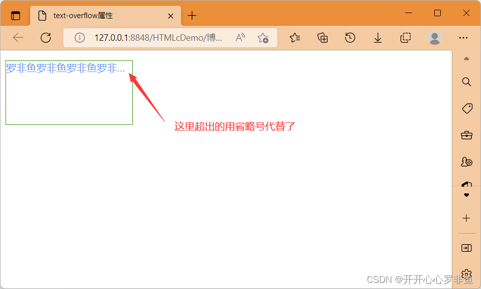
不显示省略号可以将ellipsis替换为 clip。
案列
你若安好便是晴天
<!DOCTYPE html>
<html>
	<head>
		<meta charset="utf-8">
		<title>你若安好便是晴天</title>
		<style type="text/css">
			#all{
				width: 800px;
				font-family: "宋体";
				font-size: 14px;
			}
			h1{
				color: #f0f;
				font-size: 18px;
				text-align:center;
				text-decoration: underline;
			}
			.part1{
				text-align: center;
				color: red;
			}
			.part2{
				color: #00f;
				text-indent: 2em;
				letter-spacing: 16px;
				white-space: nowrap;       /*强行文本不能换行*/
				overflow: hidden;         /*修剪文本溢出*/
				text-overflow: ellipsis;  /*用省略标记表示修剪文本*/

			}                                  /**/
			.part3{
				color: #090;
				font-weight: bold;
				font-style: italic;
			}
			.part4{
				color: #f0f;
				text-decoration: line-through;
			}
		</style>
	</head>
	<body>
		<div id ="all">
			<h1>你若安好,便是晴天</h1>
			<p class="part1">一个人,一本书,一杯茶,一帘梦。</p>
			<p class="part2">站在时光的十字路口,回望过去的种种单纯与美好,欣慰而悲凉</p>
			<p class="part3">花开花落,风卷云舒。青春如同沙流般从指缝溜走,过去的倔强与轻狂,原来如此荒诞不羁。
			俗世的喧嚣,总会想在空灵停滞的时空内,独倚幽窗,品一壶清茶,细细题为光阴如梭,年华老去。</p>
			<p class="part4">时光轮回,生命交替红尘无尽。</p>
	</body>
</html>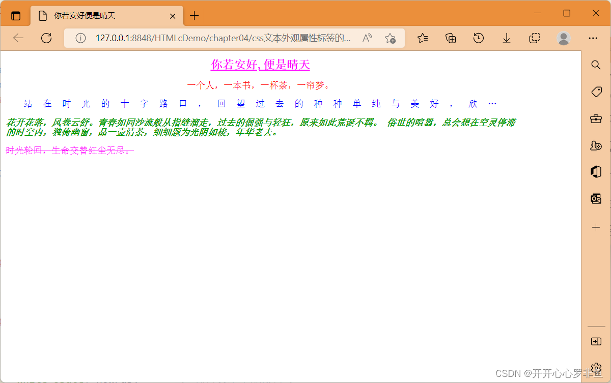


 637
637


 被折叠的 条评论
为什么被折叠?
被折叠的 条评论
为什么被折叠?
 到【灌水乐园】发言


