


参考书上的文件在链接里,打开下载即可。
json文件:
链接:https://pan.baidu.com/s/1S48IATL89YI7GUSMB5bq_Q
提取码:1234
csv文件:
链接:https://pan.baidu.com/s/1Y4ev0hk8azRkcGtPm0zYWQ
提取码:1234
csv格式文件
1.定义:将数据作为一系列以逗号分隔的值写入文件。
例如:(“USN00025333”,“SITKA AIRPORT, AK US”,“2018-01-01”,“0.45”,“48”,“38”)是一行CSV格式的天气数据
2.reader()阅读器,读取csv文件数据。
next(reader)读取一行的数据。
enumerate()将一行数据每个元素都以二元组的形式打印出来。

3.绘制图表


4.添加x坐标,日期
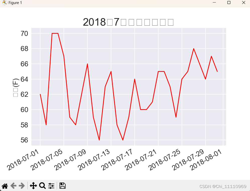
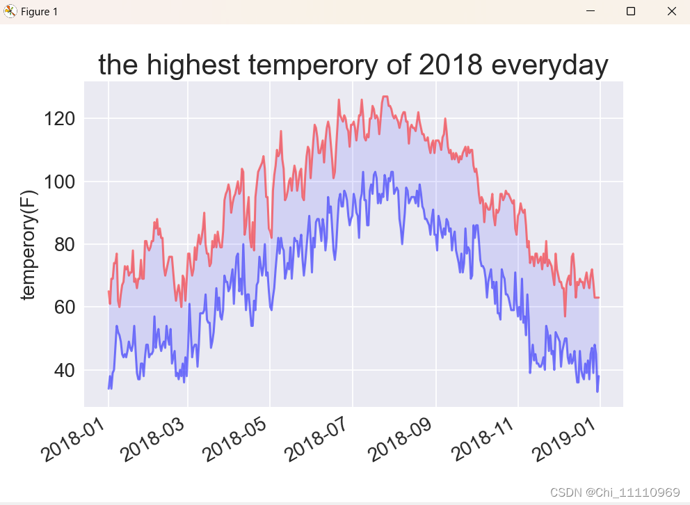
5.每日最高温度图

6.每日最低温度和最高温度图
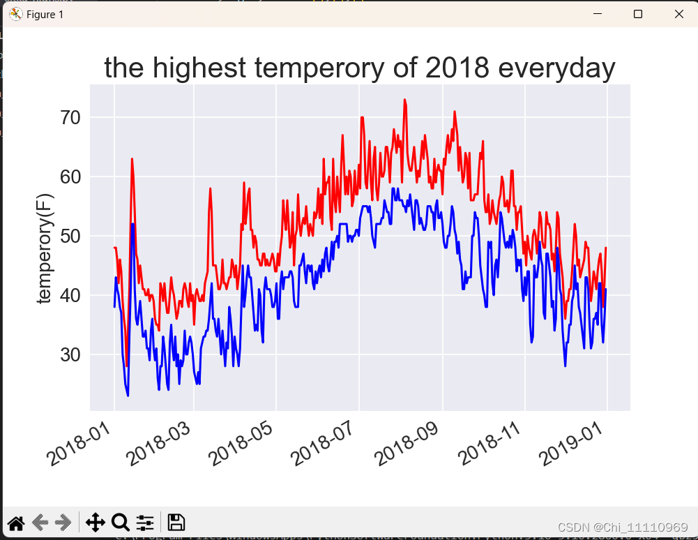
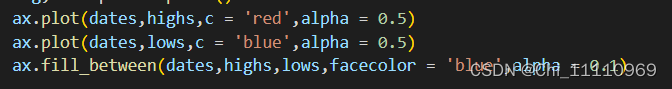
7.着色
设置alpha的值调整线条的颜色深浅,fill_between()方法在两线段之间填充颜色

8.添加容错
例如,当数据为空时则不进行绘图。

以下是完整代码
import csv
import matplotlib.pyplot as plt
from datetime import datetime

filename = 'sitka_weather_2018_simple.csv'
with open(filename) as f:
    reader = csv.reader(f)#读取csv文件
    header_row = next(reader)#获得列表对象,包含标题行的信息;读取第一行数据,将每项数据都作为一个元素存储在列表中
    #print(header_row)
    # for index,column_header in enumerate(header_row):
    #     print(index,column_header)

    #从文件中获取最高温度
    dates,highs,lows = [],[],[]
    for row in reader:
        high = int(row[5])#定位到文件中的位置
        highs.append(high)
        date = datetime.strptime(row[2],'%Y-%m-%d')
        dates.append(date)
        low = int(row[6])
        lows.append(low)

#根据最高温度绘制图形
plt.style.use('seaborn')
fig,ax = plt.subplots()
ax.plot(dates,highs,c = 'red',alpha = 0.5)
ax.plot(dates,lows,c = 'blue',alpha = 0.5)
ax.fill_between(dates,highs,lows,facecolor = 'blue',alpha = 0.1)

#设置图形的格式
ax.set_title("the highest temperory of 2018 everyday",fontsize = 24)
ax.set_xlabel('',fontsize = 16)
fig.autofmt_xdate()
ax.set_ylabel('temperory(F)',fontsize = 16)
ax.tick_params(axis='both',which='major',labelsize = 16)
plt.show()
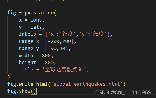
import csv
from datetime import datetime
import matplotlib.pyplot as plt

filename = "death_valley_2018_simple.csv"
with open(filename) as f:
    reader = csv.reader(f)
    header_row = next(reader)

    highs,lows,dates = [],[],[]
    for row in reader:
        date = datetime.strptime(row[2],'%Y-%m-%d')
        try:
            high = int(row[4])
            low = int(row[5])
        except ValueError:
            print(f"Missing data for{date}")
        else:
            dates.append(date)
            highs.append(high)
            lows.append(low)

#根据最高温度绘制图形
plt.style.use('seaborn')
fig,ax = plt.subplots()
ax.plot(dates,highs,c = 'red',alpha = 0.5)
ax.plot(dates,lows,c = 'blue',alpha = 0.5)
ax.fill_between(dates,highs,lows,facecolor = 'blue',alpha = 0.1)

#设置图形的格式
ax.set_title("the highest temperory of 2018 everyday",fontsize = 24)
ax.set_xlabel('',fontsize = 16)
fig.autofmt_xdate()
ax.set_ylabel('temperory(F)',fontsize = 16)
ax.tick_params(axis='both',which='major',labelsize = 16)
plt.show()
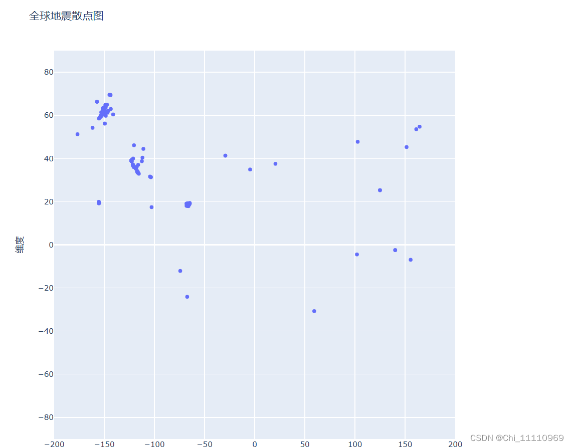
json格式文件
1.利用load()方法将数据格式转换

2.通过标签定位数据

3.绘制散点图
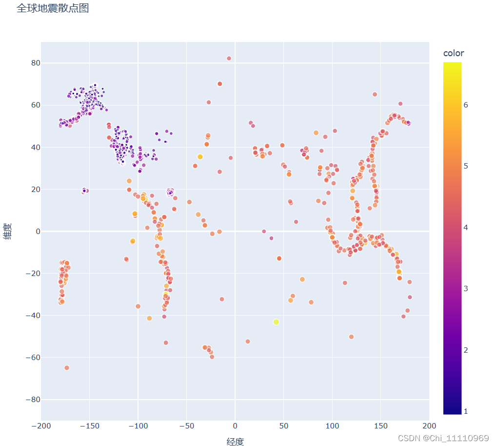
4.精细化制图。加上颜色、自适应圆点的大小更直观地反映出震感,同时鼠标悬停在圆点上会标识出相关数据和地名。

import plotly.express as px
import json

filename = 'data/eq_data_30_day_m1.json'
with open(filename) as f:
    all_eq_data = json.load(f)#将数据转换为Python能处理的格式

all_eq_dicts = all_eq_data['features']

mags,titles,lons,lats = [],[],[],[]
for eq_dict in all_eq_dicts:
    lon = eq_dict['geometry']['coordinates'][0]
    lons.append(lon)
    lat = eq_dict['geometry']['coordinates'][1]
    lats.append(lat)
    mag = eq_dict['properties']['mag']
    mags.append(mag)
    title = eq_dict['properties']['title']
    titles.append(title)

fig = px.scatter(
    x = lons,
    y = lats,
    labels = {'x':'经度','y':'维度'},
    range_x =[-200,200],
    range_y =[-90,90],
    width = 800,
    height = 800,
    title = '全球地震散点图',
    size=mags,
    size_max=10,
    color=mags,
    hover_name=titles,
)
fig.write_html('global_earthquakes.html')
fig.show()


 966
966


 被折叠的 条评论
为什么被折叠?
被折叠的 条评论
为什么被折叠?
 到【灌水乐园】发言


