


子组件
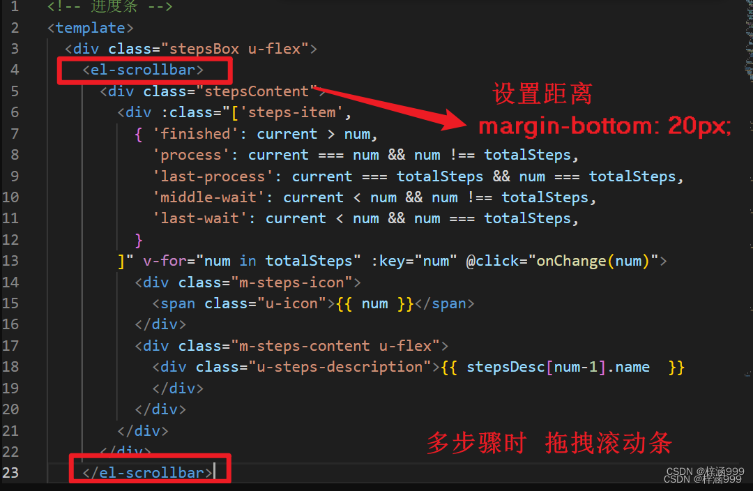
<!-- 进度条 -->
<template>
<div class="stepsBox u-flex">
<div class="stepsContent">
<div :class="['steps-item',
{ 'finished': current > num,
'process': current === num && num !== totalSteps,
'last-process': current === totalSteps && num === totalSteps,
'middle-wait': current < num && num !== totalSteps,
'last-wait': current < num && num === totalSteps,
}
]" v-for="num in totalSteps" :key="num" @click="onChange(num)">
<div class="m-steps-icon">
<span class="u-icon">{{ num }}</span>
</div>
<div class="m-steps-content u-flex">
<div class="u-steps-description">{{ stepsDesc[num-1].name }}
</div>
</div>
</div>
</div>
</div>
</template>
<script>
export default {
name: "Steps",
props: {
stepsDesc: {
type: Array, // 步骤描述数组
default: () => {
return [];
},
},
totalSteps: {
type: Number,// 总的步骤数
default: 3,
},
currentStep: {
type: Number, // 当前选中的步骤
default: 1,
},
},
data () {
return {
// 若当前选中步骤超过总步骤数,则默认选择步骤1
current: this.currentStep > this.totalSteps ? 1 : this.currentStep,
};
},
watch: {
currentStep: {
handler (val) {
if (val) {
this.current = val;
}
},
deep: true,
immediate: true,
},
},
methods: {
onChange (index) {
// 点击切换选择步骤
if (this.current !== index) {
this.current = index;
this.$emit("changeStep", index);
}
},
},
};
</script>
<style lang="scss" scoped>
.stepsBox {
margin: 15px auto;
height: 60px;
.stepsContent {
display: flex;
padding: 0 30px;
align-items: center;
.steps-item {
display: flex;
align-items: center;
overflow: hidden;
font-size: 16px;
height: 60px;
background: #f9fafc;
clip-path: polygon(0% 0%, 92% 0%, 100% 50%, 92% 100%, 0% 100%, 8% 50%);
flex: 1;
justify-content: center;
min-width: 250px;
.m-steps-icon {
margin-right: 8px;
width: 28px !important;
height: 28px;
line-height: 28px;
border-radius: 50%;
text-align: center;
}
.m-steps-content {
vertical-align: top;
.u-steps-description {
font-size: 16px;
font-weight: 600;
white-space: nowrap;
}
}
}
.m-steps-item:nth-child(1) {
clip-path: polygon(0% 0%, 92% 0%, 100% 50%, 92% 100%, 0% 100%, 0% 100%);
}
.finished {
cursor: pointer;
&:hover {
.m-steps-content {
.u-steps-title {
color: #1890ff;
}
.u-steps-description {
color: #1890ff;
}
}
}
.m-steps-icon {
background: #fff;
border: 1px solid #1677ff;
.u-icon {
color: #1677ff;
}
}
.m-steps-content {
color: rgba(0, 0, 0, 0.65);
.u-steps-title {
color: rgba(0, 0, 0, 0.65);
}
.u-steps-description {
color: #1677ff;
}
}
}
.process {
background: #1677ff;
.m-steps-icon {
background: #fff;
border-color: #1890ff;
.u-icon {
color: rgba(0, 0, 0, 0.65);
}
}
.m-steps-content {
.u-steps-title {
color: rgba(0, 0, 0, 0.85);
}
.u-steps-description {
color: #fff;
}
}
}
.last-process {
background: #1677ff;
clip-path: polygon(0% 0%, 100% 0%, 100% 100%, 100% 100%, 0% 100%, 8% 50%);
.m-steps-icon {
background: #fff;
border-color: #1890ff;
.u-icon {
color: rgba(0, 0, 0, 0.65);
}
}
.m-steps-content {
.u-steps-title {
color: rgba(0, 0, 0, 0.85);
}
.u-steps-description {
color: #fff;
position: relative;
}
}
}
.middle-wait {
cursor: pointer;
&:hover {
.m-steps-icon {
border: 1px solid #1890ff;
.u-icon {
color: #1890ff;
}
}
.m-steps-content {
.u-steps-title {
color: #1890ff;
}
.u-steps-description {
color: #1890ff;
}
}
}
.m-steps-icon {
background: #fff;
border: 1px solid rgba(0, 0, 0, 0.25);
.u-icon {
color: rgba(0, 0, 0, 0.25);
}
}
.m-steps-content {
color: rgba(0, 0, 0, 0.65);
.u-steps-title {
color: rgba(0, 0, 0, 0.45);
}
.u-steps-description {
color: rgba(0, 0, 0, 0.45);
}
}
}
.last-wait {
cursor: pointer;
clip-path: polygon(0% 0%, 100% 0%, 100% 100%, 100% 100%, 0% 100%, 8% 50%);
&:hover {
.m-steps-icon {
border: 1px solid #1890ff;
.u-icon {
color: #1890ff;
}
}
.m-steps-content {
.u-steps-title {
color: #1890ff;
}
.u-steps-description {
color: #1890ff;
}
}
}
.m-steps-icon {
background: #fff;
border: 1px solid rgba(0, 0, 0, 0.25);
.u-icon {
color: rgba(0, 0, 0, 0.25);
}
}
.m-steps-content {
color: rgba(0, 0, 0, 0.65);
.u-steps-title {
color: rgba(0, 0, 0, 0.45);
}
.u-steps-description {
color: rgba(0, 0, 0, 0.45);
}
}
}
}
}
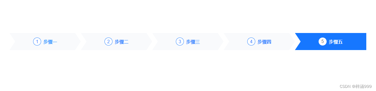
</style>父组件
<template>
<div>
<steps class="pt50" :totalSteps="totalStep" :stepsDesc="stepsDesc" :currentStep="currentStep" />
</div>
</template>
<script>
export default {
data () {
return {
currentStep: 1,
totalStep: 5,
stepsDesc: [
{ name: "步骤一" },
{ name: "步骤二" },
{ name: "步骤三" },
{ name: "步骤四" },
{ name: "步骤五" },
],
}
},
components: {
steps: () => import('组件地址')
}
}
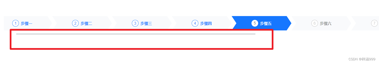
</script>多个步骤条时
方法一:拖拽滚动条


 2838
2838


 被折叠的 条评论
为什么被折叠?
被折叠的 条评论
为什么被折叠?
 到【灌水乐园】发言


