


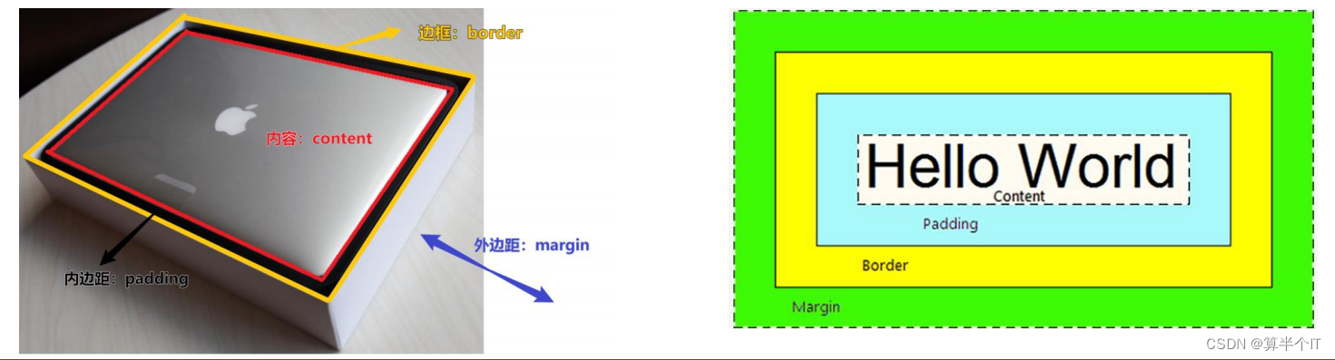
一、组成
概念
- 页面中的每一个标签,都可看做是一个 “盒子”,通过盒子的视角更方便的进行布局
- 浏览器在渲染(显示)网页时,会将网页中的元素看做是一个个的矩形区域,我们也形象的称之为盒子
<!DOCTYPE html>
<html lang="en">
<head>
<meta charset="UTF-8">
<meta http-equiv="X-UA-Compatible" content="IE=edge">
<meta name="viewport" content="width=device-width, initial-scale=1.0">
<title>Document</title>
<Style>
/* 纸箱子,填充泡沫 */
div{
width: 300px;
height: 300px;
background-color: pink;
/* 边框线==纸箱子 */
border: 1px solid #000;
/* 内边距==填充泡沫 */
padding: 20px;
/* 外边距:两个盒子之间距离 */
margin: 50px;
}
</Style>
</head>
<body>
<div>内容:电脑</div>
<div>内容:电脑</div>
</body>
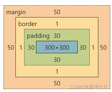
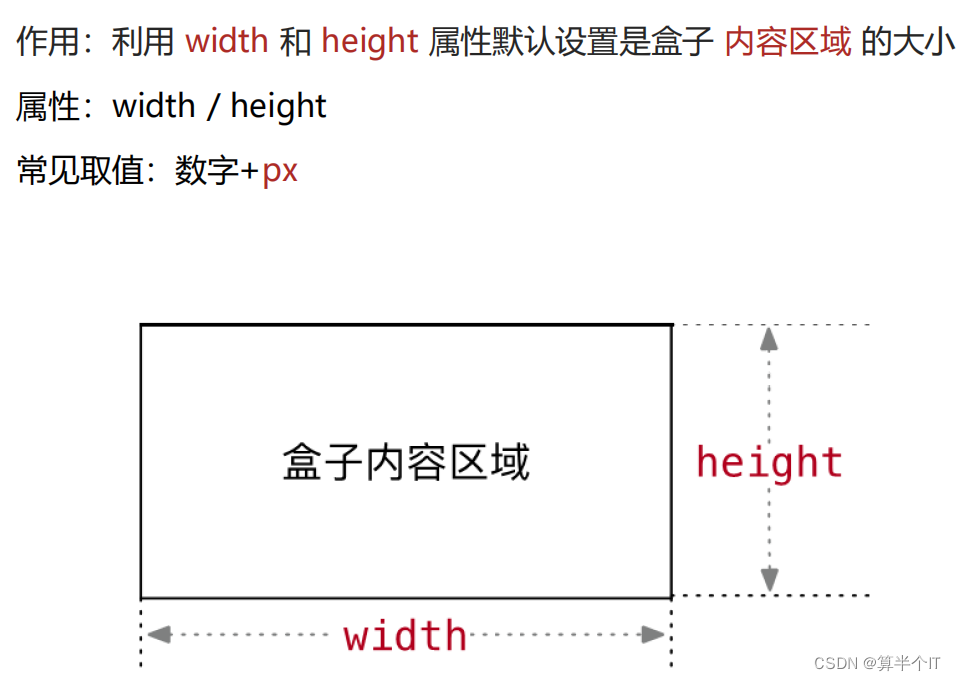
</html>二、内容区域的宽度和高度
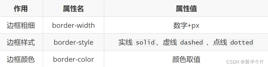
三、边框(boder)
属性值:单个取值的连写,取值之间以空格隔开(粗细、颜色、线条种类)
如:border : 10px solid red;
快捷键:bd + ta
<!DOCTYPE html>
<html lang="en">
<head>
<meta charset="UTF-8">
<meta http-equiv="X-UA-Compatible" content="IE=edge">
<meta name="viewport" content="width=device-width, initial-scale=1.0">
<title>Document</title>
<style>
div{
width: 200px;
height: 200px;
background-color: pink;
/* 粗细 线的类型 线的颜色 */
/* border: 1px solid #000; */
/* solid 实线 */
/* dashed 虚线 */
/* dotted 点虚线 */
/* border: 5px dashed #000; */
/* 可以进行单方向加边框 */
border-top: 5px solid #000;
}
</style>
</head>
<body>
<div>
盒子内容
</div>
</body>
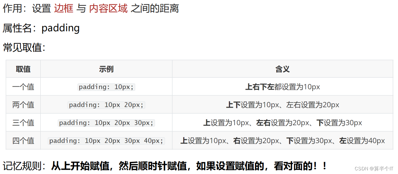
</html>四、内边框(padding)
五、案例(新浪导航)
<!DOCTYPE html>
<html lang="en">
<head>
    <meta charset="UTF-8">
    <meta http-equiv="X-UA-Compatible" content="IE=edge">
    <meta name="viewport" content="width=device-width, initial-scale=1.0">
    <title>Document</title>
    <!-- 布局从外到内,先宽高再内容,调节内容的位置,控制粗细 -->
    <style>
        .one{
            height: 40px;
            border-top: 5px solid #ff8500;
            border-bottom: 1px solid #edeef0;
        }
        .one a{
            /* width: 80px; */
            padding: 0 16px;
            height: 40px;
            /* 行内块 */
            display: inline-block;
            /* 水平居中/垂直居中 */
            text-align: center;
            line-height: 40px;
            /*文字(把框架搞起来,再去弄文字)  */
            color: #4c4c4c;
            text-decoration: none;
        }
        /* 鼠标悬停时放的颜色,背景 */
        .one a:hover{
            background-color: #edeef0;
            color: #ff8400;
        }
    </style>
</head>
<body>
   <div class="one">
    <a href="#">新浪导航</a>
    <a href="#">新浪导航新浪导航</a>
    <a href="#">新浪</a>
    <a href="#">新浪导航</a>
   </div>
</body>
</html>
六、内减模式 (防止撑大盒子)
box-sizing : border-box ;
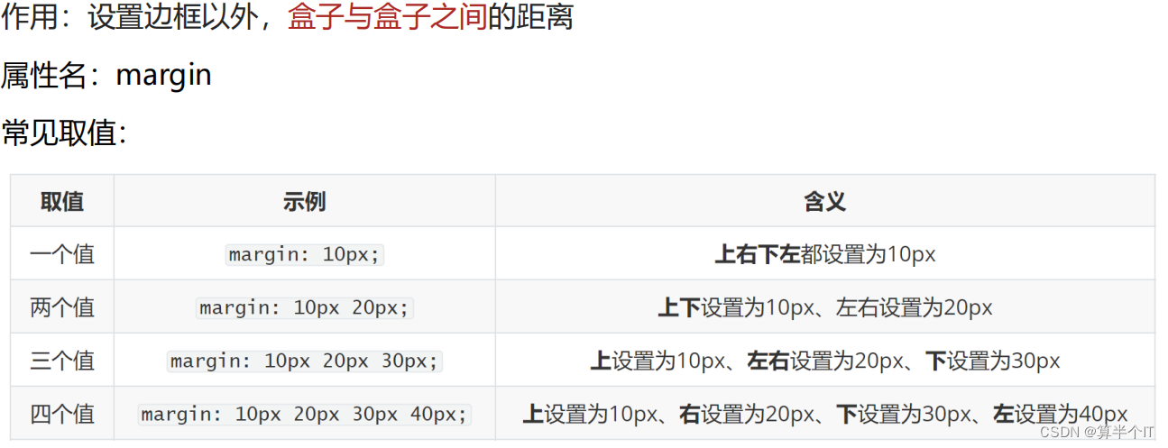
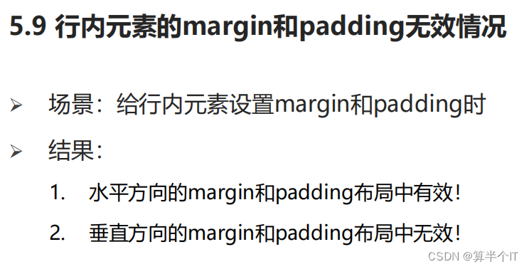
七、外边距
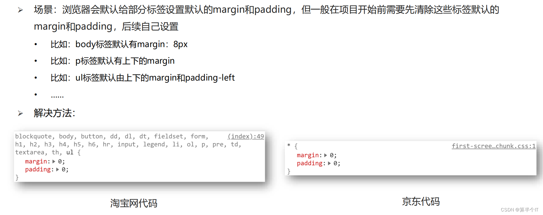
清除默认内外边距
八、版心居中 (水平居中)
与文字居中区别开哦~
margin: 0 auto;
九、案例(新闻列表)
待更新
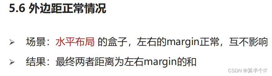
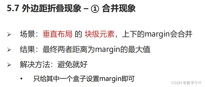
十、外边距问题
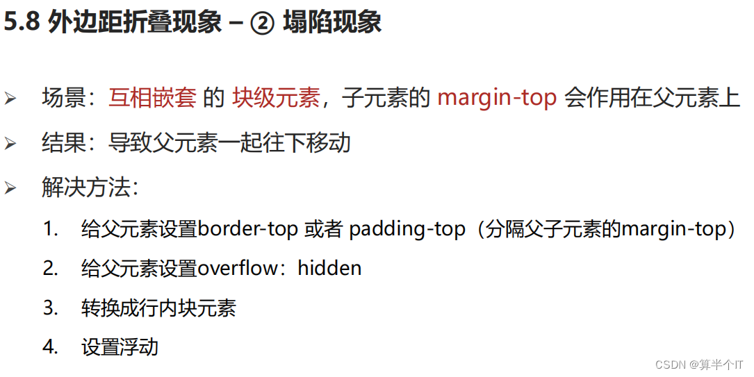
overflow:hidden


 2051
2051


 被折叠的 条评论
为什么被折叠?
被折叠的 条评论
为什么被折叠?
 到【灌水乐园】发言


