


| android:layout_width | 用来设置布局宽度。 |
| android:layout_height | 用来设置布局高度。以上两个属性在布局管理器中一般设置为match_parent,即与父容器相同。 |
| android:paddingBotton | 设置底内边距。 |
| android:paddingLeft | 设置左内边距。 |
| android:paddingRight | 设置右内边距。 |
| android:paddingTop | 设置顶内边距。以上四个属性可以设置为具体数值,比如16dp;也可以使用尺寸资源进行定义 |
一. RelativeLayout相对布局
RelativeLayout 是一个以相对位置显示子视图的视图组。每个视图的位置可以指定为相对于同级元素的位置(例如,在另一个视图的左侧或下方)或相对于父级 RelativeLayout 区域的位置(例如在底部、左侧或中心对齐)。
RelativeLayout 是一个功能非常强大的界面设计实用工具,因为它可以消除嵌套视图组并使布局层次结构保持扁平化,从而提高性能。如果您发现自己使用了多个嵌套的 LinearLayout 组,只需用一个 RelativeLayout 就可以替换它们。
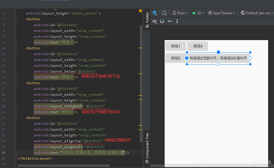
1、xml文件编写
| 属性 | 功能 |
| android:layout_above | 将该控件的底部置于给定ID的控件之上 |
| android:layout_below | 将该控件的底部置于给定ID的控件之下 |
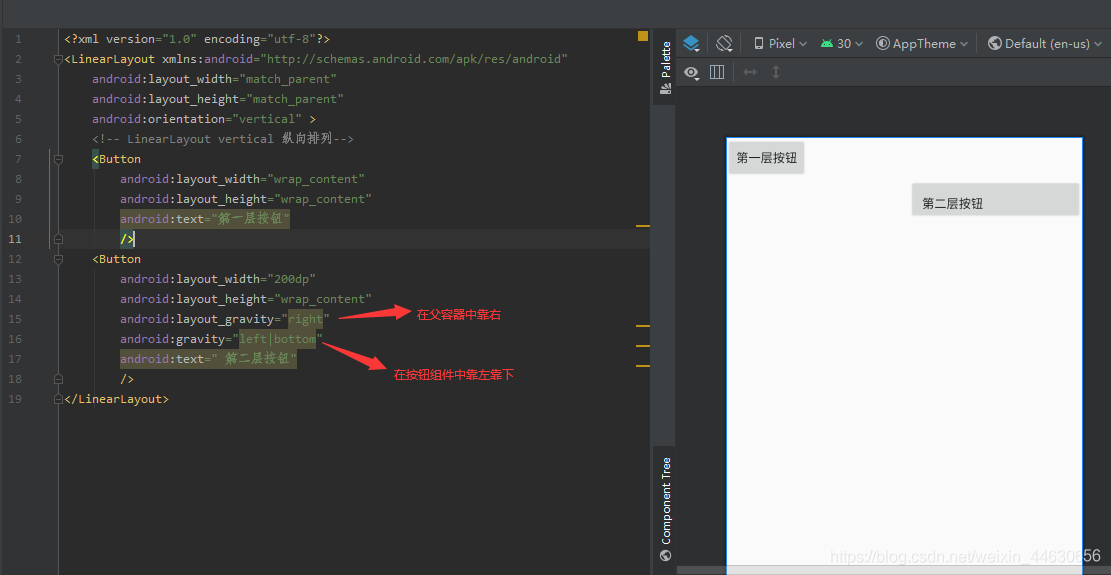
| android:layout_toLeftOf | 将该控件的右边缘与给定ID的控件左边缘对齐,将该组件放在其他某个组件左边 |
| android:layout_toRightOf | 将该控件的左边缘与给定ID的控件右边缘对齐,将该组件放在其他某个组件右边 |
| android:layout_alignTop | 将该控件的顶部边缘与给定ID的顶部边缘对齐 |
| android:layout_alignBottom | 将该控件的底部边缘与给定ID的底部边缘对齐 |
| android:layout_alignLeft | 将该控件的左边缘与给定ID的左边缘对齐 |
| android:layout_alignRight | 将该控件的右边缘与给定ID的右边缘对齐 |
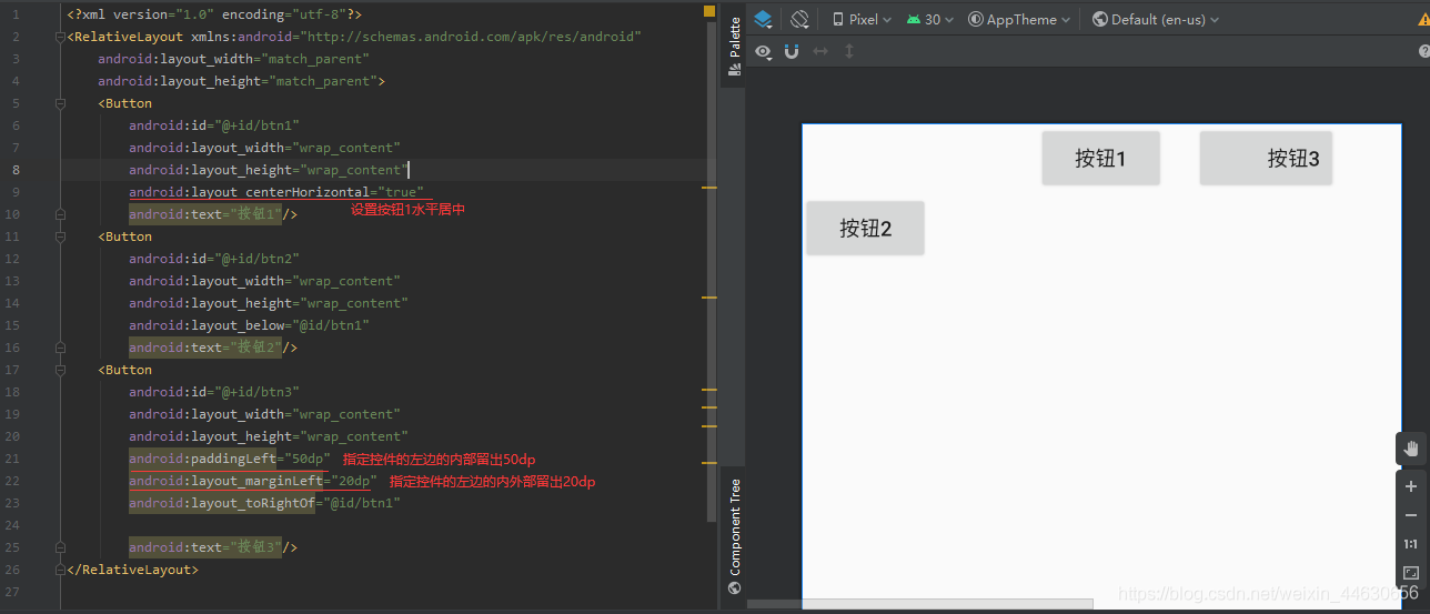
对于参数值为true,相对于父组件
| 属性 | 功能 |
| android:layout_alignParentTop | 如果为true,将该控件的顶部与其父控件的顶部对齐 |
| android:layout_alignParentBottom | 如果为true,将该控件的底部与其父控件的底部对齐 |
| android:layout_alignParentLeft | 如果为true,将该控件的左部与其父控件的左部对齐 |
| android:layout_alignParentRight | 如果为true,将该控件的右部与其父控件的右部对齐 |
和居中有关的一些属性
| 属性 | 功能 |
| android:layout_centerHorizontal | 如果为true,将该控件的置于水平居中 |
| android:layout_centerVertical | 如果为true,将该控件的置于垂直居中 |
| android:layout_centerInParent | 如果为true,将该控件的置于父控件的中央 |
Margin和Padding属性:
-
Margin:设置组件与父容器(通常是布局)的边距
| 属性 | 功能 |
| android:layout_margin: | 指定控件的四周的外部留出一定的边距 |
| android:layout_marginLeft: | 指定控件的左边的外部留出一定的边距 |
| android:layout_marginTop: | 指定控件的上边的外部留出一定的边距 |
| android:layout_marginRight: | 指定控件的右边的外部留出一定的边距 |
| android:layout_marginBottom: | 指定控件的下边的外部留出一定的边距 |
-
Padding:设置组件内部元素间的边距(可以理解为填充)
| 属性 | 功能 |
| android:padding : | 指定控件的四周的内部留出一定的边距 |
| android:paddingLeft: | 指定控件的左边的内部留出一定的边距 |
| android:paddingTop: | 指定控件的上边的内部留出一定的边距 |
| android:paddingRight: | 指定控件的右边的内部留出一定的边距 |
| android:paddingBottom: | 指定控件的下边的内部留出一定的边距 |
这两个后面都跟着一个参数,通常用dp作为单位,eg:android:margin = “10dp”
2、java文件编写
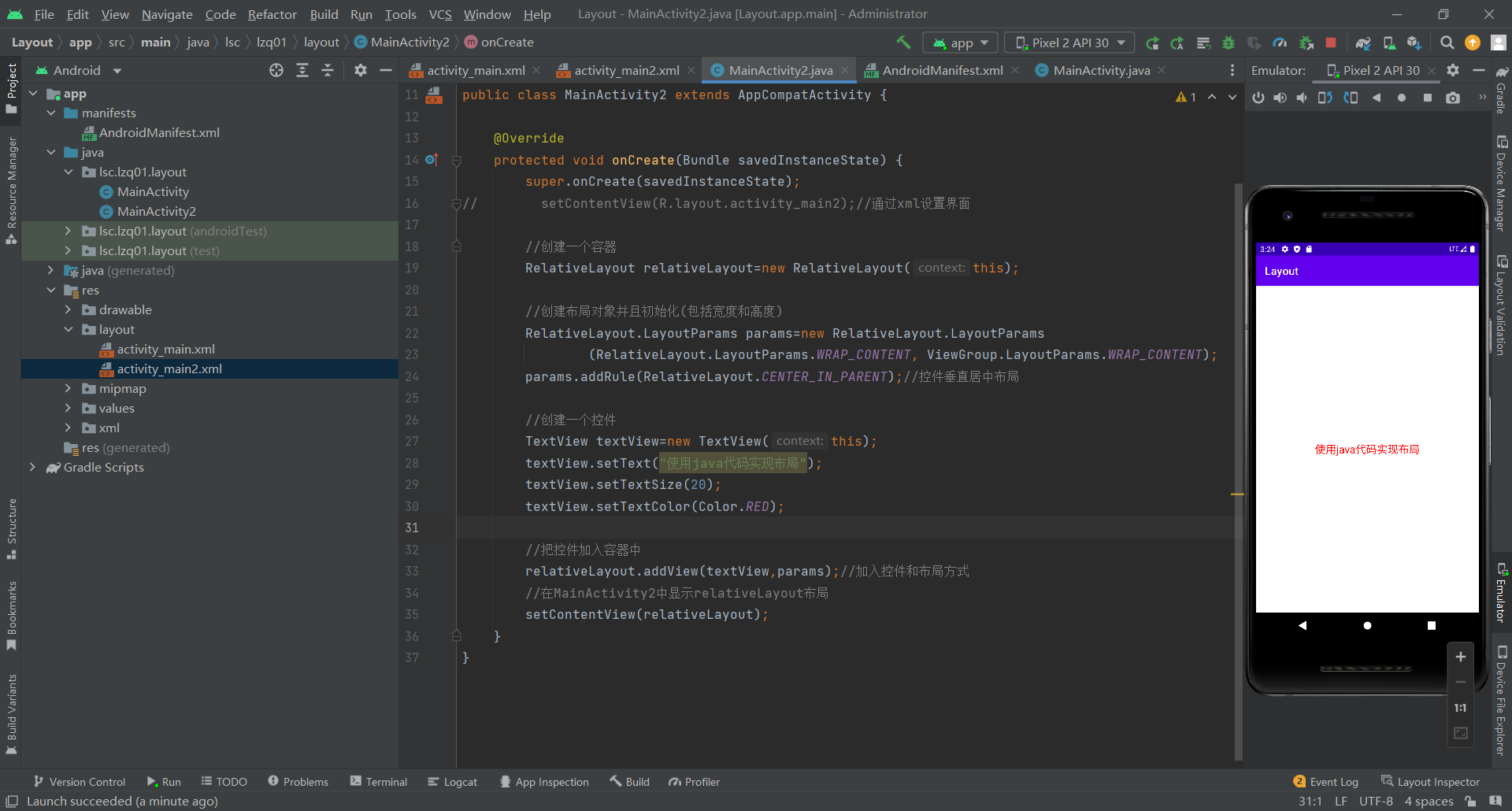
代码
    protected void onCreate(Bundle savedInstanceState) {
        super.onCreate(savedInstanceState);
//        setContentView(R.layout.activity_main2);//通过xml设置界面

        //创建一个容器
        RelativeLayout relativeLayout=new RelativeLayout(this);

        //创建布局对象并且初始化(包括宽度和高度)
        RelativeLayout.LayoutParams params=new RelativeLayout.LayoutParams
                (RelativeLayout.LayoutParams.WRAP_CONTENT, ViewGroup.LayoutParams.WRAP_CONTENT);
        params.addRule(RelativeLayout.CENTER_IN_PARENT);//控件垂直居中布局

        //创建一个控件
        TextView textView=new TextView(this);
        textView.setText("使用java代码实现布局");
        textView.setTextSize(20);
        textView.setTextColor(Color.RED);

        //把控件加入容器中
        relativeLayout.addView(textView,params);//加入控件和布局方式
        //在MainActivity2中显示relativeLayout布局
        setContentView(relativeLayout);
    }
二. LinearLayout线性布局
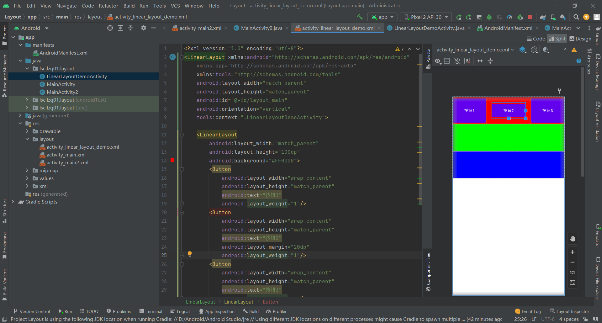
LinearLayout 是一个视图组,用于使所有子视图在单个方向(垂直或水平)保持对齐。您可以使用 android:orientation 属性指定布局方向。
线性布局内的控件不换行or换列,组件依次排列,超出容器的控件则不会被显示
1、属性说明
| 属性 | 功能 |
| android:orientation | 取值为horizontal(水平)或vertical(竖直) |
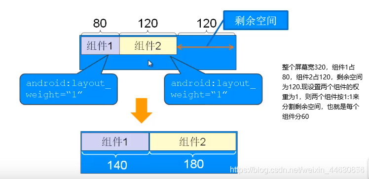
| android:layout_weight | 为容器内的组件设置权重,表示当所有控件全部排列完毕后,该被设置的组件占父容器剩余空白部分的多少比重 |
| android:layout_gravity | 为容器内的控件设置该控件在父容器中的对齐方式 (当父容器线性设置为 vertical 纵向时,则只有设置与左右相关的值才起作用,ex:left、right当父容器线性设置为 horizontal 横向时,则只有设置与上下相关的值才起作用,ex:top、bottom) |
| android:gravity | 设置控件上面的文字在该组件里面的对齐方式 |
代码
<?xml version="1.0" encoding="utf-8"?>
<LinearLayout xmlns:android="http://schemas.android.com/apk/res/android"
    xmlns:app="http://schemas.android.com/apk/res-auto"
    xmlns:tools="http://schemas.android.com/tools"
    android:layout_width="match_parent"
    android:layout_height="match_parent"
    android:id="@+id/layout_main"
    android:orientation="vertical"
    tools:context=".LinearLayoutDemoActivity">

    <LinearLayout
        android:layout_width="match_parent"
        android:layout_height="100dp"
        android:background="#FF0000">
        <Button
            android:layout_width="wrap_content"
            android:layout_height="match_parent"
            android:text="按钮1"
            android:layout_weight="1"/>
        <Button
            android:layout_width="wrap_content"
            android:layout_height="match_parent"
            android:text="按钮2"
            android:layout_margin="20dp"
            android:layout_weight="1"/>
        <Button
            android:layout_width="wrap_content"
            android:layout_height="match_parent"
            android:text="按钮3"
            android:layout_weight="1"/>
    </LinearLayout>

    <LinearLayout
        android:layout_width="match_parent"
        android:layout_height="100dp"
        android:background="#00FF00"/>

    <LinearLayout
        android:layout_width="match_parent"
        android:layout_height="100dp"
        android:background="#0000FF"/>
</LinearLayout>
三. FrameLayout帧布局管理器
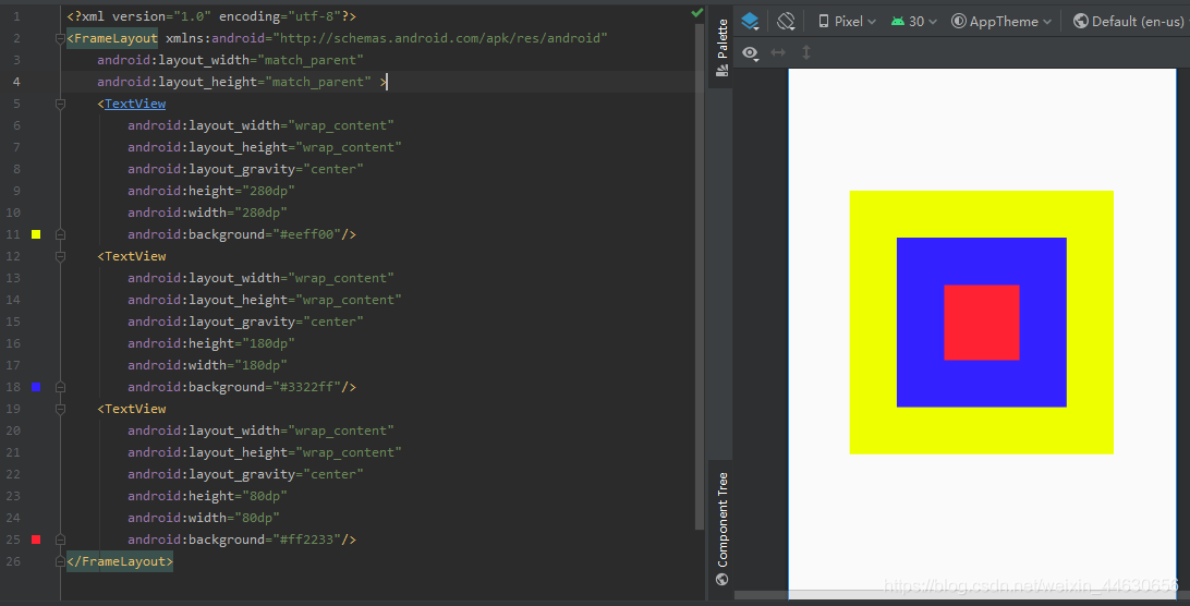
帧布局管理器为每一个放入其中的组件创建一个空白的区域,这些组件按照先后顺序层叠放置,后面的组件会覆盖前面的组件。
在activity_main.xml文件中用FrameLayout标签来定义帧布局管理器。
四. TableLayout表格布局管理器
1、表格布局属性
| 布局属性 | 功能 |
| android:stretchColumns | 设置该列被拉伸 |
| android:shrinkColumns | 设置该列被收缩 |
| android:collapseColumns | 设置该列被隐藏 |
| 控件属性 | |
| android:layout_column | 设置该单元显示位置 |
| android:layout_span | 设置该单元占据几行,默认为1行 |
表格布局有TableLayout所代表,TableLayout继承了LinearLayout,因此他的本质依然是LinearLayout。
表格布局采用行、列的形式来进行管理,在使用的时候不需要声明多少行、多少列,而是通过添加TableRow、其他组件来控制表格的行数和列数
android:collapseColumns="",隐藏某列。可隐藏多列(多列序号间用英文逗号 , 连接),取值为数字,第几列就取几(注意:列的索引从0开始)

android:stretchColumns="",表示 被设置的这些列 可拉伸 (注意:TableLayout中列的索引从0开始)

android:shrinkColumns=""用于:设置某列可收缩(当一行中的内容超出屏幕宽度时,缩小该列的空间使这行的内容展示出来),可多行设置
<?xml version="1.0" encoding="utf-8"?>
<LinearLayout xmlns:android="http://schemas.android.com/apk/res/android"
xmlns:app="http://schemas.android.com/apk/res-auto"
xmlns:tools="http://schemas.android.com/tools"
android:layout_width="match_parent"
android:layout_height="match_parent"
tools:context=".MainActivity"
android:orientation="vertical">
<!-- 第一个TableLayout,指定第二列隐藏 -->
<TableLayout
android:id="@+id/tableLayout_one"
android:layout_width="fill_parent"
android:layout_height="wrap_content"
android:collapseColumns="1"
>
<TableRow>
<Button
android:layout_width="wrap_content"
android:layout_height="wrap_content"
android:text="普通按钮"/>
<Button
android:layout_width="wrap_content"
android:layout_height="wrap_content"
android:text="隐藏按钮"/>
<Button
android:layout_width="wrap_content"
android:layout_height="wrap_content"
android:text="普通按钮"/>
</TableRow>
<Button
android:layout_width="wrap_content"
android:layout_height="wrap_content"
android:text="独自一行的按钮"/>
</TableLayout>
<!-- 第二个TableLayout,指定第三列允许拉伸 -->
<TableLayout
android:id="@+id/tableLayout_two"
android:layout_width="fill_parent"
android:layout_height="wrap_content"
android:stretchColumns="2">
<TableRow>
<Button
android:layout_width="wrap_content"
android:layout_height="wrap_content"
android:text="普通按钮"/>
<Button
android:layout_width="wrap_content"
android:layout_height="wrap_content"
android:text="普通按钮"/>
<Button
android:layout_width="wrap_content"
android:layout_height="wrap_content"
android:text="拉伸按钮"/>
</TableRow>
</TableLayout>
<TableLayout
android:id="@+id/tableLayout_three"
android:layout_width="fill_parent"
android:layout_height="wrap_content"
>
<TableRow>
<Button
android:layout_width="wrap_content"
android:layout_height="wrap_content"
android:text="普通按钮111111111111111111111111"/>
<Button
android:layout_width="wrap_content"
android:layout_height="wrap_content"
android:text="拉伸按钮"/>
<Button
android:layout_width="wrap_content"
android:layout_height="wrap_content"
android:text="拉伸按钮"/>
</TableRow>
</TableLayout>
<!-- 第四个TableLayout,指定第二列,第三列允许收缩 -->
<TableLayout
android:id="@+id/tableLayout_four"
android:layout_width="fill_parent"
android:layout_height="wrap_content"
android:shrinkColumns="1,2"
>
<TableRow>
<Button
android:layout_width="wrap_content"
android:layout_height="wrap_content"
android:text="普通按钮111111111111111111111111"/>
<Button
android:layout_width="wrap_content"
android:layout_height="wrap_content"
android:text="收缩按钮"/>
<Button
android:layout_width="wrap_content"
android:layout_height="wrap_content"
android:text="收缩按钮"/>
</TableRow>
</TableLayout>
</LinearLayout>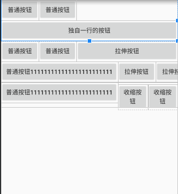
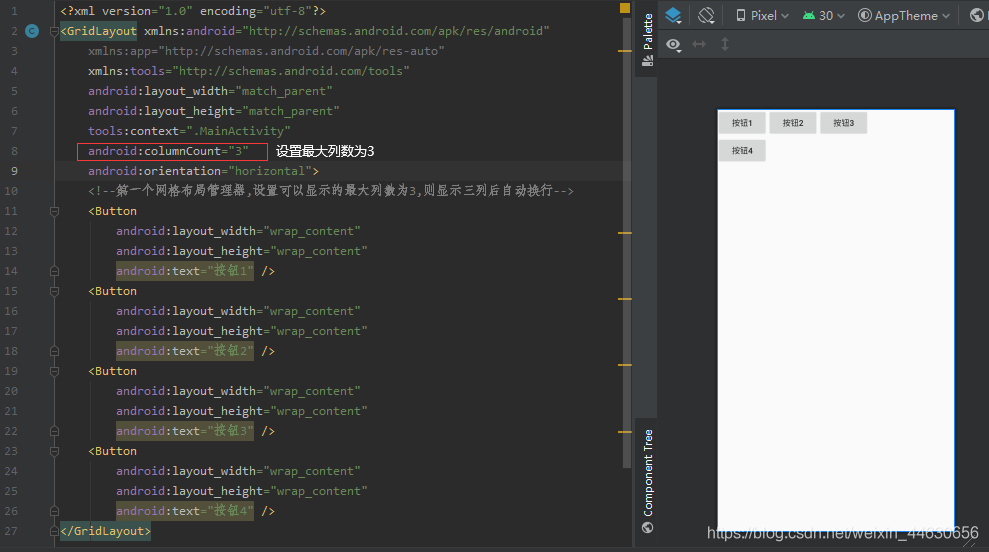
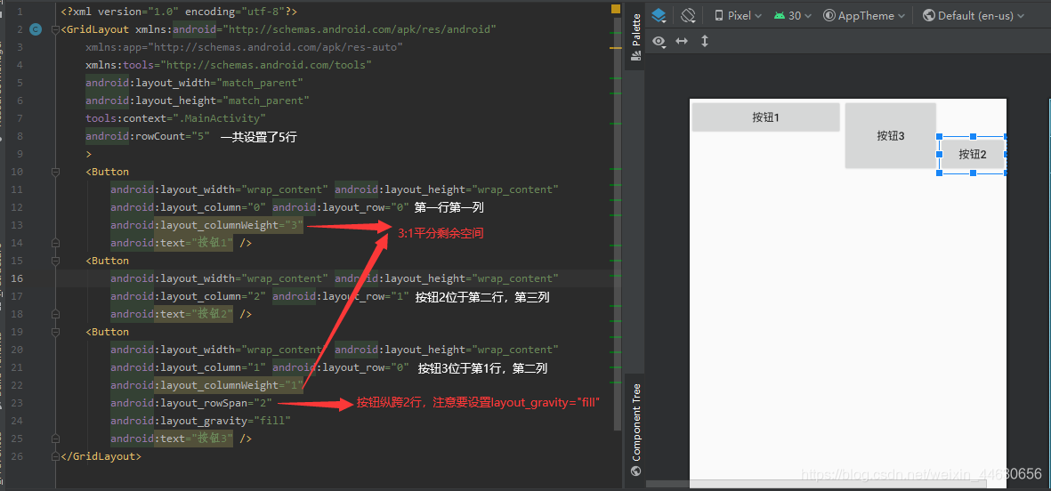
五. GridLayout网格布局管理器
GridLayout网格布局管理器是android 4.0 以后才增加的布局管理器
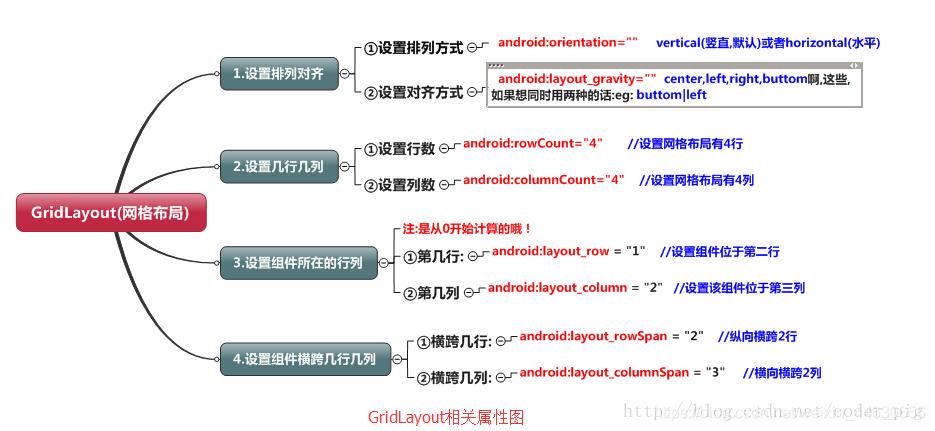
1.android:columnCount :设置网格的最大列数
2.android:orientation:设置网格中组件的排列方式
3.android:rowCount :设置网格的最大行数
GridLayout中的内部类LayoutParams——用来控制各子组件的分布
1.android:layout_column :用来指定子组件位于网格布局管理器的第几列。从第0列算起。
2.android:layout_columnSpan :设置子组件横跨几列。
3.android:layout_columnWeight:设置子组件在水平方向的权重,用来分配水平方向剩余空间
4.android:layout_gravity :用来设置子组件以什么方式占据网格空间
5.android:layout_row :指定子组件位于第几行。
6.android:layout_rowSpan :指定子组件纵向跨几行。
7.android:layout_rowWeight :指定子组件在垂直方向的权重
六. ConstraintLayout约束布局
1、介绍
约束布局ConstraintLayout 是一个ViewGroup,可以在Api9以上的Android系统使用它,它的出现主要是为了解决布局嵌套过多的问题,以灵活的方式定位和调整小部件。从 Android Studio 2.3 起,官方的模板默认使用 ConstraintLayout。
2、为什么要用ConstraintLayout
在开发过程中经常能遇到一些复杂的UI,可能会出现布局嵌套过多的问题,嵌套得越多,设备绘制视图所需的时间和计算功耗也就越多。简单举个例子:
假设现在要写一个这样的布局,可能有人会这么写:
首先是一个垂直的LinearLayout,里面放两个水平的LinearLayout,然后在水平的LinearLayout里面放TextView。这样的写法就嵌套了两层LinearLayout。
有些人考虑到了嵌套布局带来的风险,所以用一个RelativeLayout来装下所有的控件。那么问题来了,既然用RelativeLayout可以解决问题,为什么还要使用ConstraintLayout呢?因为ConstraintLayout使用起来比RelativeLayout更灵活,性能更出色!还有一点就是ConstraintLayout可以按照比例约束控件位置和尺寸,能够更好地适配屏幕大小不同的机型。
3、示例
例1
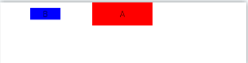
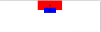
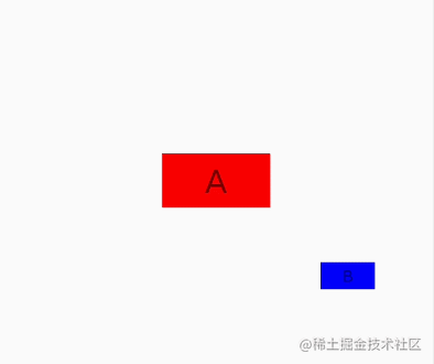
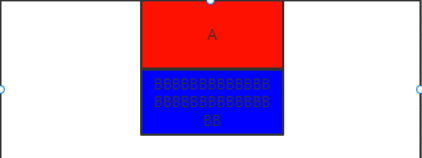
如图下图所示,我们分别用RelativeLayout和ConstraintLayout去实现它:
使用RelativeLayout实现如下
<RelativeLayout...>
<TextView
android:id="@+id/txt_a"
android:layout_centerHorizontal="true"
.../>
<RelativeLayout
android:layout_alignTop="@+id/txt_a"
android:layout_toLeftOf="@+id/txt_a"
android:layout_alignBottom="@+id/txt_a"
...>
<TextView
android:layout_centerInParent="true"
android:id="@+id/txt_b"
.../>
</RelativeLayout>
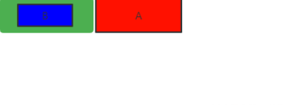
</RelativeLayout>这里使用了伪代码,把无关紧要的属性去掉了。相信懂的人都明白。这里用图层表示下,如下:
-
最外层是 RelativeLayout(根布局)
-
红色TextView_A 在顶部且横向居中。
-
使用绿色 RelativeLayout上边和下边和A齐平,从而保证绿色RelativeLayout高度和A一样。且宽度满屏,在A左边
-
蓝色TextView_B 在绿色RelativeLayout里居中。
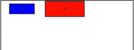
使用ConstraintLayout实现如下
<androidx.constraintlayout.widget.ConstraintLayout...>

    <TextView
        android:id="@+id/txt_a"
        app:layout_constraintRight_toRightOf="parent"
        app:layout_constraintLeft_toLeftOf="parent"
        .../>

    <TextView
        app:layout_constraintRight_toLeftOf="@+id/txt_a"
        app:layout_constraintLeft_toLeftOf="parent"
        app:layout_constraintTop_toTopOf="@+id/txt_a"
        app:layout_constraintBottom_toBottomOf="@+id/txt_a"
        android:id="@+id/txt_b"
        .../>

</androidx.constraintlayout.widget.ConstraintLayout>
我们继续看下,他的图层关系,真的简洁。
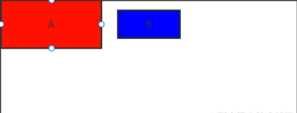
例2
如图下图所示,我们分别用RelativeLayout和ConstraintLayout去实现它:
在xml里。我们无法用RelativeLayout去实现,如下分析
B在A下方,通过 android:layout_below="@+id/txt_a"实现
B要在A底部边框上,垂直居中。那么我们要知道B的height。B再使用marginTop="-height/2"才能达到效果。所以在xml里无法实现,只能去代码里动态计算。
使用ConstraintLayout则可轻松完成:
<androidx.constraintlayout.widget.ConstraintLayout ...>


    <TextView
        android:id="@+id/txt_a"
        app:layout_constraintRight_toRightOf="parent"
        app:layout_constraintLeft_toLeftOf="parent"
        .../>

    <TextView
        app:layout_constraintRight_toRightOf="@+id/txt_a"
        app:layout_constraintLeft_toLeftOf="@+id/txt_a"
        app:layout_constraintTop_toBottomOf="@+id/txt_a"
        app:layout_constraintBottom_toBottomOf="@+id/txt_a"
        android:id="@+id/txt_b"
        .../>

</androidx.constraintlayout.widget.ConstraintLayout>
上面只是简单的2个小例子,实战上在复杂布局里,真的有太多好处。接下我们具体说说把。
4、ConstraintLayout各属性介绍
-
相对定位
下面来看看相对定位的常用属性:
-
layout_constraintLeft_toLeftOf
-
layout_constraintLeft_toRightOf
-
layout_constraintRight_toLeftOf
-
layout_constraintRight_toRightOf
-
layout_constraintTop_toTopOf
-
layout_constraintTop_toBottomOf
-
layout_constraintBottom_toTopOf
-
layout_constraintBottom_toBottomOf
-
layout_constraintBaseline_toBaselineOf
-
layout_constraintStart_toEndOf
-
layout_constraintStart_toStartOf
-
layout_constraintEnd_toStartOf
-
layout_constraintEnd_toEndOf
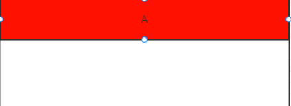
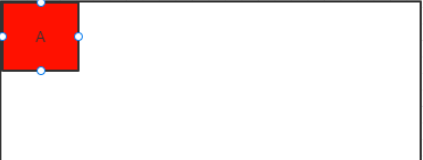
例1,如图:靠右边
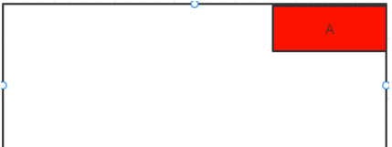
实现如图功能:
<TextView
    ...
    app:layout_constraintRight_toRightOf="parent"
    />
ayout_constraintRight_toRightOf 属性还有left、right、top、bottom、start、end等搭配使用。什么意思呢?
-
第一个Right代表 本控件的右边
-
第二个Right代表 要位于目标控件右边。
-
所以app:layout_constraintRight_toRightOf=“parent”; 红色A的右边位于父容器的右边
注意start、end是因为很多国家阅读习惯不一样,比如我们是习惯从左往右阅读。所以start对于我们来说就是left,end就是right。
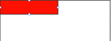
例2,如图:居中
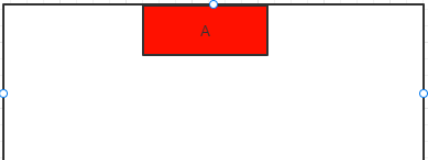
实现如图功能:
<TextView
    ...
    app:layout_constraintRight_toRightOf="parent"
    app:layout_constraintLeft_toLeftOf="parent"
    />
右边和父控件右边对齐,左边和父控件左边对齐。这样就可以达到横向居中,同理竖直。
注意这里居中了。同样还可以用margin进行偏移。也可以利用属性app:layout_constraintHorizontal_bias=“0.5”,进行横向偏移,0.5意思也还算居中。同理竖直的属性。
例3,如图:充满屏幕
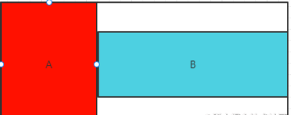
比如B要在A的右边,且相对A上下居中,而且B要充满剩余横屏:
<TextView
    app:layout_constraintLeft_toRightOf="@+id/txt_a"
    app:layout_constraintRight_toRightOf="parent"
    app:layout_constraintTop_toTopOf="@+id/txt_a"
    app:layout_constraintBottom_toBottomOf="@id/txt_a"
    android:layout_width="0dp"
    ...
    />
要想充满全屏把宽度设置为0dp。然后通过以下代码:
-
app:layout_constraintLeft_toRightOf="@+id/txt_a";B的左边和A的右边对齐
-
app:layout_constraintRight_toRightOf=“parent”;B的右边和父容器的右边对齐
这样B就在A的右边,且横向充满屏。注意:在约束布局里match_parent是不生效的。
要想B竖直方向与A平行的话,通过如下代码:
-
app:layout_constraintTop_toTopOf="@+id/txt_a";B的上边和A的上边对齐
-
app:layout_constraintBottom_toBottomOf="@id/txt_a";B的下边和A的下边对齐
这样就可以让B在A右边,上下居中。
例4,如图:不嵌套居中
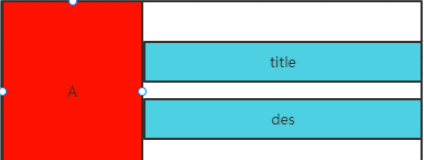
在列表里我们经常会遇到这样的需求,A是一张图片,title是标题,des是描述。用RelativeLayout的做法是:继续用一个layout布局包裹title和des,居中然后放在A的右边。
用ConstraintLayout的话不用嵌套,3个view就搞定了。如下:
<ImageView
    ...
    />


<TextView
    app:layout_constraintTop_toTopOf="@+id/image"
    app:layout_constraintBottom_toTopOf="@+id/txt_des"
    android:id="@+id/txt_title"
    ...
    />

<TextView
    app:layout_constraintTop_toBottomOf="@+id/txt_title"
    app:layout_constraintBottom_toBottomOf="@+id/image"

   * 这个时候你会发现还没有居中因为还缺了一条约束,title在des上边;
    android:id="@+id/txt_des"
    ...
    />
因为例3,已经讲过如何全屏了,这里主要讲title和des如何居中:
-
des 在title下面;app:layout_constraintTop_toBottomOf="@+id/txt_title"
-
title上边和图片A上边对齐;app:layout_constraintTop_toTopOf="@+id/image"
-
des下边和图片A下边对齐;app:layout_constraintBottom_toBottomOf="@+id/image"
-
这个时候你会发现还没有居中因为还缺了一条约束,title在des上边; app:layout_constraintBottom_toTopOf="@+id/txt_des",这和RelativeLayout有些区别
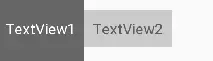
例5,如图:控件大小不一样时根据文本对齐
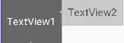
如图所示,两个TextView的高度不一致,但是又希望他们文本对齐,这个时候就可以使用layout_constraintBaseline_toBaselineOf,代码如下:
<TextView
    android:id="@+id/TextView1"
    .../>

<TextView
    android:id="@+id/TextView2"
    ...
    app:layout_constraintLeft_toRightOf="@+id/TextView1"
    app:layout_constraintBaseline_toBaselineOf="@+id/TextView1"/>
效果如下:
2、角度定位
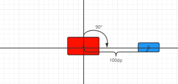
实现代码如下:
<TextView
    android:id="@+id/txt_a"
    ...
     />

<TextView
    app:layout_constraintCircle="@+id/txt_a";
    app:layout_constraintCircleAngle="90"
    app:layout_constraintCircleRadius="100dp"
    android:id="@+id/txt_b"
    ...
/>-
app:layout_constraintCircle="@+id/txt_a";B相对于A角度定位
-
app:layout_constraintCircleAngle=“90”;角度定位角度为90°
-
app:layout_constraintCircleRadius=“100dp”;B中心与A中心相差100dp
这个时候我也在想有什么用呢?我觉得可以用在某些自定义view上。比如圆形menu、实现时钟更简单了。我用属性动画,实现一个效果你就明白了。录制有点卡顿,真机不会…
3、边距
3.1、margin
ConstraintLayout的边距常用属性如下:
-
android:layout_marginStart
-
android:layout_marginEnd
-
android:layout_marginLeft
-
android:layout_marginTop
-
android:layout_marginRight
-
android:layout_marginBottom
margin 值要生效,一定是伴随约束属性的。什么意思呢,要实现如图功能:
代码实现如下:
<TextView
    android:id="@+id/txt_a"
    ...
     />

<TextView
    android:layout_marginLeft="20dp"
    app:layout_constraintLeft_toRightOf="@+id/txt_a"
    android:id="@+id/txt_b"
    ...
/>-
比如B左边和A的右边对齐app:layout_constraintLeft_toRightOf="@+id/txt_a",此时在B上加上margin值生效
-
如果这个时候在A上加上android:layout_marginRight=“50dp”,是不生效的。谨记
3.2、goneMargin
goneMargin主要用于约束的控件可见性被设置为gone的时候使用的margin值,属性如下:
-
layout_goneMarginStart
-
layout_goneMarginEnd
-
layout_goneMarginLeft
-
layout_goneMarginTop
-
layout_goneMarginRight
-
layout_goneMarginBottom
比如要实现如下功能,从图1–>图2:
图1如下:
图2如下:
隐藏A的时候B要置顶排布。在RelativeLayout里,我们只需要在A里使用Margin_Bottom=“20dp”,然后对A进行隐藏就可以实现了。但是在ConstraintLayout里,因为margin生效必须要有约束,所以这个时候B就要使用goneMargin属性,实现代码如下:
<TextView
    android:id="@+id/txt_a"
    android:visibility="gone"
    ...
     />

//意思就是当有约束的控件隐藏时,goneMargin就会生效,那么B就会置顶排布。
<TextView
    android:id="@+id/txt_b"
    app:layout_constraintTop_toBottomOf="@+id/txt_a"
    android:layout_marginTop="20dp"
    app:layout_goneMarginTop="0dp"
    ...
     />
4、尺寸
在ConstraintLayout里,设置尺寸大小的有3个:
-
设置固定的dp值
-
wrap_content
-
0dp(MATCH_CONSTRAINT),前面讲过match_parent是不生效的。如果想达到match_parent的效果只能通过0dp和约束来达到。
4.1、满屏
比如控件A满屏(在2.1.3一样),如下效果:
则通过如下代码实现:
<TextView
    android:layout_width="0dp"
    app:layout_constraintLeft_toLeftOf="parent"
    app:layout_constraintRight_toRightOf="parent"
    ...
    />
4.2、layout_constraintWidth_max
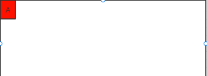
属性 layout_constraintWidth_max 在使用dp固定值的时候和 android:maxWidth=“100dp” 用法是一致的。
但是layout_constraintWidth_max可以搭配属性 app:layout_constraintWidth_percent=“0.5” 使用,什么意思呢。
比如我们要实现红色区域占父容器宽度的一半:
实现代码如下:
<TextView
    app:layout_constraintLeft_toLeftOf="parent"
    android:layout_width="0dp"
    android:text=""
    app:layout_constraintWidth_max="wrap"
    app:layout_constraintWidth_percent="0.5"
    ...
     />
这里这样设置的时候,意思最大宽度是父容器的一半。注意这里text=""空的时候,会像图中直接展示父容器的一半,假设我们给text="A"设置上值后,如下图,那么只会展示A的宽度,但最大宽度是父容器一半。
4.3、app:layout_constrainedWidth
app:layout_constrainedWidth=“true” 属性,是按约束去限制宽度,什么意思呢?我们先不加上这条属性,实现如下图效果是这样的:
代码是这样的:
<TextView
    android:id="@+id/txt_a"
    ...
     />


<TextView
    app:layout_constraintLeft_toLeftOf="@id/txt_a"
    app:layout_constraintRight_toRightOf="@id/txt_a"
    app:layout_constraintTop_toBottomOf="@+id/txt_a"
    android:id="@+id/txt_b"
    android:layout_width="wrap_content"
    android:text="BBBBBBBBBBBBBBBBBBBBBBBBBBBBBBBBBBBB"
    ...
     />
给txt_b加上 app:layout_constrainedWidth=“true” 属性后,就会实现下面的效果:
意思就是B的最大宽度按照A的宽度来约束,这里要注意的是,B的宽度是wrap_content。假设这里是0dp的话,那这里就另外一种情况了,意思就是B的宽度和A的宽度一样宽。
4.4、layout_constraintDimensionRatio 宽高比
app:layout_constraintDimensionRatio=“1:1”,宽高比,注意这一条属性要生效的话要达到2个条件:
-
其中一条边为0dp
-
其中一条边为固定值或wrap_content
比如要实现如下,一个正方形的A:
代码如下:
<TextView
    android:id="@+id/txt_a"
    android:layout_width="0dp"
    android:layout_height="50dp"
    app:layout_constraintDimensionRatio="1:1"
    ...
    />
5、链/约束.
指多个控件在一条方向上相互约束,形成一条链子似的。(这里还不算是线性布局, 因为还没加权重)
比如实现如下:
代码如下:
<TextView
    android:id="@+id/txt_1"
    app:layout_constraintLeft_toLeftOf="parent"
    app:layout_constraintRight_toLeftOf="@+id/txt_2"
    ...
    />

<TextView
    android:id="@+id/txt_2"
    app:layout_constraintLeft_toRightOf="@+id/txt_1"
    app:layout_constraintRight_toLeftOf="@id/txt_3"
    ...
    />

<TextView
    android:id="@+id/txt_3"
    app:layout_constraintLeft_toRightOf="@id/txt_2"
    app:layout_constraintRight_toRightOf="parent"
    ...
    />
这样就在横向方向形成一条链子了(同理纵向),在一条链子的第一个控件也就是链头,我们可以加上layout_constraintHorizontal_chainStyle来改变整条链的样式,有3中
-
spread就是上面的样子
-
spread_inside
-
packed
上面的降的宽度都是wrap_content,如果我们把宽度设置为0do然后通过属性layout_constraintHorizontal_weight(同理纵向),加上权重后,就是我们的线性布局。比如实现如下:
代码:
<TextView
    android:id="@+id/txt_1"
    android:layout_width="0dp"
    app:layout_constraintHorizontal_weight="2"
    app:layout_constraintLeft_toLeftOf="parent"
    app:layout_constraintRight_toLeftOf="@+id/txt_2"
    ...
    />

<TextView
    android:id="@+id/txt_2"
    android:layout_width="0dp"
    app:layout_constraintHorizontal_weight="1"
    app:layout_constraintLeft_toRightOf="@+id/txt_1"
    app:layout_constraintRight_toLeftOf="@id/txt_3"
    ...
    />

<TextView
    android:id="@+id/txt_3"
    android:layout_width="0dp"
    app:layout_constraintHorizontal_weight="1"
    app:layout_constraintLeft_toRightOf="@id/txt_2"
    app:layout_constraintRight_toRightOf="parent"
    ...
    />
6、辅助工具
6.1、Guideline
guideline和辅助先一样,运行项目的时候,不会显示在界面上。也不用担心会消耗性能,因为在其onDraw方法里,没有具体的实现。guideline属性具体如下:
-
android:orientation=“vertical” 纵向辅助线,同理横向
-
然后就是确定辅助线的位置,通过下面3个属性,多个出现时只会有一个生效,权重是百分比 > begin > end
app:layout_constraintGuide_percent=“0.5” 在父布局的百分比位置
app:layout_constraintGuide_begin=“10dp” 距离父布局开始位置,横向为左,纵向为顶部
app:layout_constraintGuide_end=“10dp” 距离父布局末尾位置
比如我们之前经常会写 时间轴 类似的控件。就可以用这个guideline辅助完成。
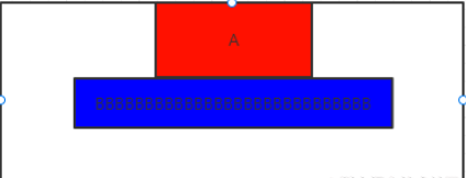
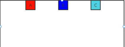
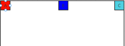
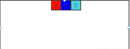
6.2、Barrier
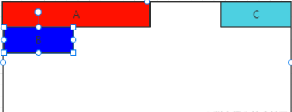
假设有3个控件A、B、C,如果我们A,B的宽度不固定,同时又希望C在A,B的右边。如果用一个布局把A,B包裹起来,然后让C在A,B右边可以实现,如果不像嵌套就要通过Barrier了,如下图:
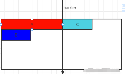
实现代码如下:
<TextView
    android:id="@+id/txt_1"
    ...
    />

<TextView
    android:id="@+id/txt_2"
    app:layout_constraintTop_toBottomOf="@+id/txt_1"
    ...
    />

<androidx.constraintlayout.widget.Barrier
    android:id="@+id/barrier"
    android:layout_width="wrap_content"
    android:layout_height="wrap_content"
    app:barrierDirection="right"
    app:constraint_referenced_ids="txt_1,txt_2" />

<TextView
    android:id="@+id/txt_3"
    app:layout_constraintLeft_toRightOf="@+id/barrier"
    ...
    />
Barrier属性有:
-
app:barrierDirection=“right” 为屏障时,哪个方向的屏障,图中是A和B的右边
-
app:constraint_referenced_ids=“txt_1,txt_2” 为屏障引用的id,用逗号隔开
注意,这里是为减少布局嵌套。必要时我觉得可以灵活运用嵌套。
6.3、Group
Group可以把多个控件归为一组,方便隐藏或显示一组控件。被布局Layout嵌套的控件A,B,我们要隐藏他只需要隐藏这个嵌套布局Layout即可。在ConstraintLayout里,没有了布局嵌套隐藏A,B就通过Group实现:
<androidx.constraintlayout.widget.Group
    android:visibility="gone"
    android:id="@+id/group"
    android:layout_width="wrap_content"
    android:layout_height="wrap_content"
    app:constraint_referenced_ids="txt_1,txt_2"
    />
6.4、Placeholder:小重点。
网上很多资料对这Placeholder都一比带过。看了我这里的介绍,你会更清楚怎么使用Placeholder。
Placeholder从名字看,就是占位的意思。你可以在一个页面设置多个不同位置的占位。然后通过代码setContentId直接可以改变某个view移动到我们的占位图里。什么意思呢。请看下图:
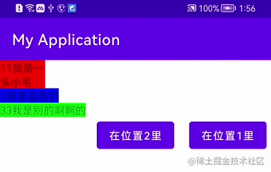
我在界面上设置了2个Placeholder。通过2个按钮,控制蓝色TextView处于在哪个PlaceHolder里。
-
首先通过app:content="@+id/txt_blue",让蓝色textView默认在placeholder_1的位置。
-
注意蓝色textView还是需要在xml里的。
<TextView
    android:id="@+id/txt_red"
    ...
     />


<androidx.constraintlayout.widget.Placeholder
    android:id="@+id/placeholder_1"
    android:layout_width="wrap_content"
    android:layout_height="wrap_content"
    app:layout_constraintLeft_toLeftOf="parent"
    app:layout_constraintTop_toBottomOf="@+id/txt_1"
    app:content="@+id/txt_blue"
    />

<TextView
    android:id="@+id/txt_green"
    app:layout_constraintLeft_toLeftOf="parent"
    app:layout_constraintTop_toBottomOf="@+id/placeholder_1"
    ...
    />

<androidx.constraintlayout.widget.Placeholder
    android:id="@+id/placeholder_2"
    android:layout_width="wrap_content"
    android:layout_height="wrap_content"
    app:layout_constraintRight_toRightOf="parent"
    app:layout_constraintTop_toTopOf="parent" />


<TextView
    android:id="@+id/txt_blue"
    android:layout_width="wrap_content"
    android:layout_height="wrap_content"
    ...
     />
2个按钮我没写上去懂的都懂,那2个按钮上的代码呢?注意看了。这可能是google还没有解决这话bug。下面我来说下
-
当点击按钮“在位置2里”,把蓝色textView放进placeholde_2,通过placeholde_2.setContentId(R.id.txt_2);
-
注意此时placeholde_1还是占据着蓝色textView的高度。
-
当点击“在位置1里”,我们首先要把placeholde_2里蓝色TextView的引用清空掉,用placeholde_2.setContentId(-1);
-
因为placeholde_1有之前蓝色TextView的引用,虽然是同一个东西,但是设置会不生效。必须清楚掉之前的引用(看源码得出来的结果)。通过placeholde_1.setContentId(-1);
-
最后通过placeholde_1.setContentId(R.id.txt_2);就可以使蓝色textView又回到了placeholde_1身上了
具体代码如下:
findViewById(R.id.buttonPanel).setOnClickListener(v ->{
    placeholde_2.setContentId(R.id.txt_2);
});


findViewById(R.id.buttonPane2).setOnClickListener(v ->{
    placeholde_2.setContentId(-1);
    placeholde_1.setContentId(-1);
    placeholde_1.setContentId(R.id.txt_2);
});
如果这个时候,我们想只要Placeholder移除了蓝色TextView。我们就让Placeholder也隐藏不可见。其实是有办法的。
-
步骤1:给Placeholder加上属性app:placeholder_emptyVisibility=“gone”。
-
步骤2:除了以上步骤,我们还要搭配setContentId(-1),才可以实现效果。
看效果:
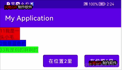
代码实现如下:
findViewById(R.id.buttonPanel).setOnClickListener(v ->{
    placeholde_1.setContentId(-1);
    placeholde_2.setContentId(R.id.txt_2);
});


findViewById(R.id.buttonPane2).setOnClickListener(v ->{
    placeholde_2.setContentId(-1);
    placeholde_1.setContentId(R.id.txt_2);
});
6.5、Layer
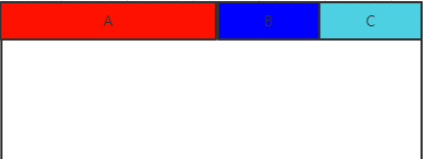
Layer什么效果呢。比如A B C在如图排布,想在想要有一个黑色背景包裹A,B,C,达到如图效果:
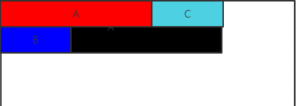
实现如下:
<androidx.constraintlayout.helper.widget.Layer
    android:id="@+id/layer"
    android:background="#000"
    app:constraint_referenced_ids="txt_a,txt_b,txt_c"
    android:padding="15dp"
    ...
    />


<TextView
    android:id="@+id/txt_a"
    ...
    />


<TextView
    android:id="@+id/txt_b"
    ...
    />


<TextView
    android:id="@+id/txt_c"
    ...
    />
经过我实际测试,其实Layer能完全代替的了2.6.3的Group,但是不能实现Barrier的功能。
6.6、Flow
直接看图把,简单实现这种网格布局:
代码如下:
<androidx.constraintlayout.helper.widget.Flow
    android:layout_width="0dp"
    android:layout_height="wrap_content"
    app:layout_constraintLeft_toLeftOf="parent"
    app:layout_constraintRight_toRightOf="parent"
    app:layout_constraintTop_toTopOf="parent"
    app:flow_verticalGap="10dp"
    app:flow_wrapMode="aligned"
    app:flow_maxElementsWrap="4"
    app:constraint_referenced_ids="txt_1,txt_2,txt_3,txt_4,txt_5,txt_6" />

<TextView
    android:id="@+id/txt_1"
    ...
    />

<TextView
    android:id="@+id/txt_2"
    ...
    />

<TextView
    android:id="@+id/txt_3"
    ...
    />

<TextView
    android:id="@+id/txt_4"
    ...
    />

<TextView
    android:id="@+id/txt_5"
    ...
    />

<TextView
    android:id="@+id/txt_6"
    ...
    />


<TextView
    android:id="@+id/txt_7"
    android:layout_width="0dp"
    android:layout_height="0dp"
    android:text="7"
    app:layout_constraintLeft_toLeftOf="@+id/txt_3"
    app:layout_constraintRight_toRightOf="@+id/txt_4"
    app:layout_constraintBottom_toBottomOf="@+id/txt_6"
    app:layout_constraintTop_toTopOf="@+id/txt_6"
    ...
    />
没有约束就可以实现这种效果了。而且因为不是嵌套txt_7可以根据Flow里的元素进行约束实现自己想要的样式,这里就不过多介绍了,感兴趣的朋友可以自己去试试,介绍下属性把:
-
app:flow_wrapMode=“aligned” 有3个值。
| aligned | none | chain | chain2 |
| 绝对对齐(也就是网格对齐的方式) | 默认方式,会排成一排,屏幕宽度不够放时,2边出去 | 和绝对对齐有点出入的是,比如6个元素,第一排4个,第二排是2个,这2个元素会平分横屏宽度 | 和none类似,区别是,不够放时,会换行其他 |
-
app:flow_maxElementsWrap=“4” 一行几个元素
-
app:flow_verticalGap=“10dp” 竖直间距
-
app:flow_horizontalGap=“10dp” 横向间距
-
android:orientation=“horizontal” 水平方向的流式还是竖直方向的流式
-
app:flow_verticalAlign =“top” 值有top,bottom,center,baseline。每一行元素的对齐方式
-
app:flow_horizontalStyle = “ spread | spread_inside | packed ” 当wrapMode为chain或ALIGNED时生效
-
app:flow_horizontalBias = “ float " low的bias偏移,只在style为packed时生效
6.7、ImageFilterButton/ImageFilterView
功能很强大控件,包括圆角,图片滤镜等。
ImageFilterButton/ImageFilterView
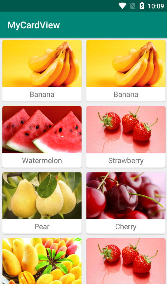
七. CardView实现卡片式布局效果
CardView是用于实现卡片式布局效果的重要控件,实际上也是一个frameLayout,只是额外提供了圆角和阴影,看上去有立体效果。
效果如下:
<?xml version="1.0" encoding="utf-8"?>
<androidx.cardview.widget.CardView
    xmlns:android="http://schemas.android.com/apk/res/android"
    xmlns:app="http://schemas.android.com/apk/res-auto"
    android:layout_width="match_parent"
    android:layout_height="wrap_content"
    android:layout_margin="5dp"
    app:cardCornerRadius="4dp">

    <LinearLayout
        android:orientation="vertical"
        android:layout_width="match_parent"
        android:layout_height="wrap_content">

        <ImageView
            android:id="@+id/fruit_image"
            android:layout_width="match_parent"
            android:layout_height="100dp"
            android:scaleType="centerCrop" />

        <TextView
            android:id="@+id/fruit_name"
            android:layout_width="wrap_content"
            android:layout_height="wrap_content"
            android:layout_gravity="center_horizontal"
            android:layout_margin="5dp"
            android:textSize="16sp" />
    </LinearLayout>

</androidx.cardview.widget.CardView>


 492
492

 被折叠的 条评论
为什么被折叠?
被折叠的 条评论
为什么被折叠?
 到【灌水乐园】发言


