


 本文详细介绍了如何使用CSS创建一个带有渐变、伪元素和动画的闪亮霓虹按钮,包括HTML与CSS代码实现,适合初学者理解CSS高级特性。
今天,我们来学习闪亮霓虹按钮,代码中使用了CSS动画,CSS渐变以及CSS伪类等等属性,让我们来看看吧!
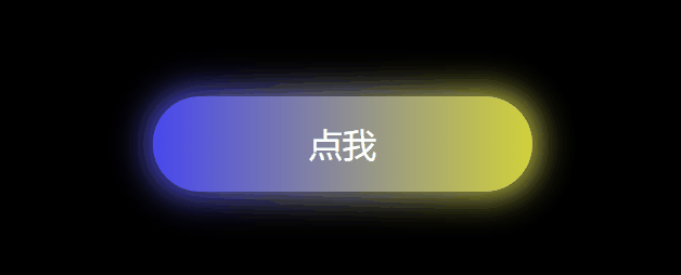
具体效果
HTML代码如下:
<!DOCTYPE html>
<html>
    <head>
        <title>命中不缺狗————</title>
        <meta charset="utf-8">
        <link rel="stylesheet" href="HTML与CSS——闪亮霓虹按钮(你值得拥有).css">
    </head>
    <body>
        <div class="button">
           <p>点我</p>
        </div>
    </body>
</html>
CSS代码如下:
* {
  padding: 0 0;
  margin: 0 0;
}
body {
  display: flex;
  //页面背景颜色
  background-color: rgb(0, 0, 0);
}
.button {
  //相对位置
  position: relative;
  margin: 0 auto;
  margin-top: 300px;
  width: 280px;
  height: 70px;
  text-align: center;
  border-radius: 35px;
  //渐变颜色背景
  background-image: linear-gradient(
    to right,
    rgb(72, 72, 240),
    yellow,
    rgb(255, 34, 237),
    rgb(78, 78, 248)
  );
  //将颜色条的长度拉伸为原来的400%
  background-size: 400%;
  cursor: pointer;
  //显示在上面
  z-index: 1;
}
.button::before {
  content: "";
  //绝对位置
  position: absolute;
  //上下左右向外扩展4px
  top: -4px;
  right: -4px;
  bottom: -4px;
  left: -4px;
  border-radius: 35px;
  //渐变颜色条
  background-image: linear-gradient(
    to right,
    rgb(72, 72, 240),
    yellow,
    rgb(255, 34, 237),
    rgb(78, 78, 248)
  );
  //将颜色条拉伸为原来的400%
  background-size: 400%;
  //设置模糊
  filter: blur(12px);
  //显示在下面
  z-index: -1;
}

//按钮层动画
.button:hover {
  //动画名为light,持续时间为8s,infinite 循环播放
  animation: light 8s infinite;
}

//发光层动画
.button:hover::before {
  animation: light 8s infinite;
}

//控制动画效果
@keyframes light {
  100% {

    background-position: -400% 0;
  }
}
p {
  margin: 0 auto;
  line-height: 70px;
  font-size: 25px;
  color: white;
}


 扫一扫
扫一扫


 被折叠的 条评论
为什么被折叠?
被折叠的 条评论
为什么被折叠?
 到【灌水乐园】发言


