


文档参考
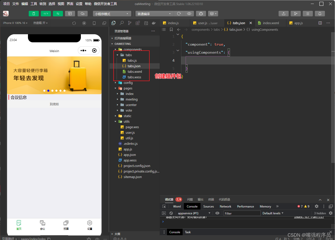
- tabs.json
{ "component": true, "usingComponents": {}}- tabs.wxml
<view class="tabs">
<view class="tabs_title">
<view wx:for="{{tabList}}" wx:key="id" class="title_item {{index==tabIndex?'item_active':''}}" bindtap="handleItemTap" data-index="{{index}}">
<view style="margin-bottom:5rpx">{{item}}</view>
<view style="width:30px" class="{{index==tabIndex?'item_active1':''}}"></view>
</view>
</view>
<view class="tabs_content">
<slot></slot>
</view>
</view>
- tabs.wxss
.tabs {
position: fixed;
top: 0;
width: 100%;
background-color: #fff;
z-index: 99;
border-bottom: 1px solid #efefef;
padding-bottom: 20rpx;
}
.tabs_title {
/* width: 400rpx; */
width: 90%;
display: flex;
font-size: 9pt;
padding: 0 20rpx;
}
.title_item {
color: #999;
padding: 15rpx 0;
display: flex;
flex: 1;
flex-flow: column nowrap;
justify-content: center;
align-items: center;
}
.item_active {
/* color:#ED8137; */
color: #000000;
font-size: 11pt;
font-weight: 800;
}
.item_active1 {
/* color:#ED8137; */
color: #000000;
font-size: 11pt;
font-weight: 800;
border-bottom: 6rpx solid #333;
border-radius: 2px;
}- tabs.js
var App = getApp();
Component({
/**
* 组件的属性列表
*/
properties: {
tabList:Object
},
/**
* 组件的初始数据
*/
data: {
tabIndex:0
},
/**
* 组件的方法列表
*/
methods: {
handleItemTap(e){
// 获取索引
const {index} = e.currentTarget.dataset;
// 触发 父组件的事件
this.triggerEvent("tabsItemChange",{index})
this.setData({
tabIndex:index
})
}
}
})
使用组件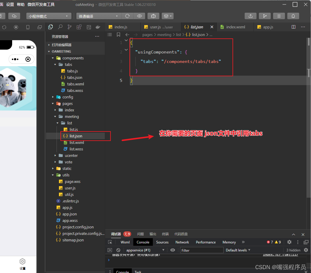
- list.json
{
    "usingComponents": {
      "tabs":"/components/tabs/tabs"
    }
}- list.wxml
<tabs tabList="{{tabs}}"  bindtabsItemChange="tabsItemChange">
</tabs>
此名称 tabs与 json文件中的名称对应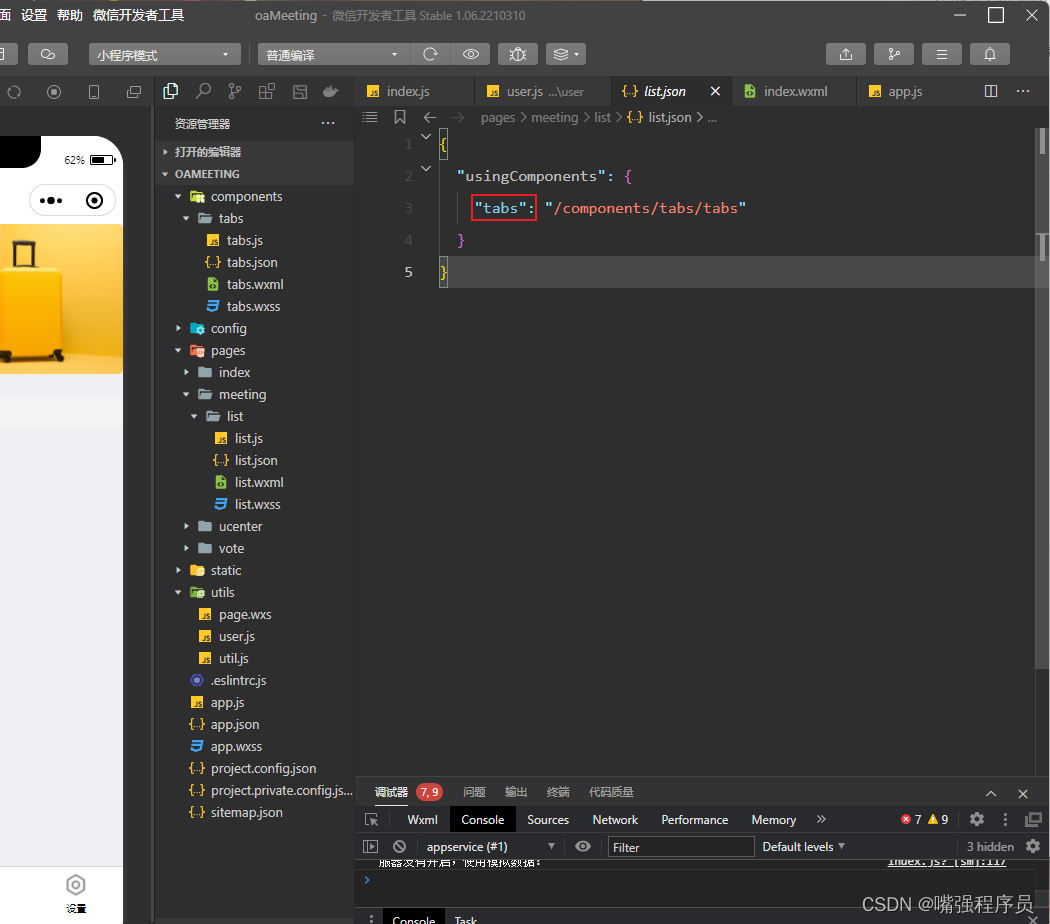
- list.js
// pages/meeting/list/list.js
Page({
/**
* 页面的初始数据
*/
data: {
tabs:['会议中','已完成','已取消','全部会议'], //定义组件 的类容
},
/**
* 生命周期函数--监听页面加载
*/
onLoad(options) {
},
/**
* 生命周期函数--监听页面显示
*/
onShow() {
},
tabsItemChange(e){
// e.detail.index 获取taba组件中传过来的 index
let tolists;
if(e.detail.index==1){
// 点击第二个菜单操作
}else if(e.detail.index==2){
}else if(e.detail.index==3){
}else{
}
}
})实现效果


 714
714


 被折叠的 条评论
为什么被折叠?
被折叠的 条评论
为什么被折叠?
 到【灌水乐园】发言


