


自定义TabButton组件(小程序+Vue)
最近由于写小程序的哥们儿没有时间,拖了一个月说基本还没开写,当时就决定不能再拖了,自己上吧。于是一边学习小程序,一边开发项目,然后顺便举一反三学习一下Vue(感觉小程序在某种程度上跟Vue还是挺像的)。我真的是太难了…
本篇博客是记录一下TabButton,模块化开发嘛,下次可以自己抄自己了
因为项目里有这两种样式的需求,所以设置的参数多了点,比如左边距,右边距,宽高等等,当然也有一个默认的值,默认的样式是第二种。考虑到一个App/小程序就一种风格,所以颜色这些是在组件的css里面写好的,有需要的朋友可以自己修改
tab-button.wxml
<view class="tab_button" style="height:{{h}}px;line-height:{{h}}px;display:{{display}};margin-left:{{margin_left}}px;">
  <ul>
    <li wx:for='{{options}}' wx:key='this' wx:for-index='index' wx:for-item='item' bindtap="tab_button_select" data-id='{{index}}' class='{{index == tab_button_active ? "tab_button_active" : "tab_button_normal"}}' style="margin-right: {{margin_right}}px;width:{{w}}px">{{item.value}}</li>
  </ul>
</view>
tab-button.wxss
/*条件筛选*/

.tab_button {
  align-items: center;
  justify-content: center;
  width: 100%;
  height: 100%;
  /* height: 30px; */
  /* line-height: 30px; */
}

.tab_button ul {
  list-style: none;
}

.tab_button_normal {
  color: rgb(0, 0, 0);
  float: left;
  background: rgb(239, 240, 241);
  /* margin-right: 15px; */
  /* line-height: 30px; */
  /* width: 50px; */
  font-size: 13px;
  text-align: center;
}

.tab_button_active {
  color: white;
  float: left;
  background: #169bd5;
  /* margin-right: 15px; */
  /* line-height: 30px; */
  /* width: 50px; */
  font-size: 13px;
  text-align: center;
}
tab-button.js
Component({
  properties: {
    margin_right: {
      type: Number,
      value: 15
    },
    h: {
      type: Number,
      value: 30
    },
    w: {
      type: Number,
      value: 50
    },
    display: {
      type: String,
      value: 'block'
    },
    margin_left: {
      type: Number,
      value: 15
    },
    options: {
      type: [],
      value: [{
        value: '全部'
      },
      {
        value: '未发布'
      },
      {
        value: '已发布'
      }
      ],
    }
  },

  data: {
    tab_button_active: 0,
  },

  methods: {
    tab_button_select: function (event) {
      //this.setData()将数据从逻辑层更新到视图层,带动样式的改变
      this.setData({
        tab_button_active: event.currentTarget.dataset.id
      })
      this.triggerEvent('tab_button_select', event.currentTarget.dataset.id)
    },
  }
})
tab-button.json
{
  "component": true,
  "usingComponents": {}
}
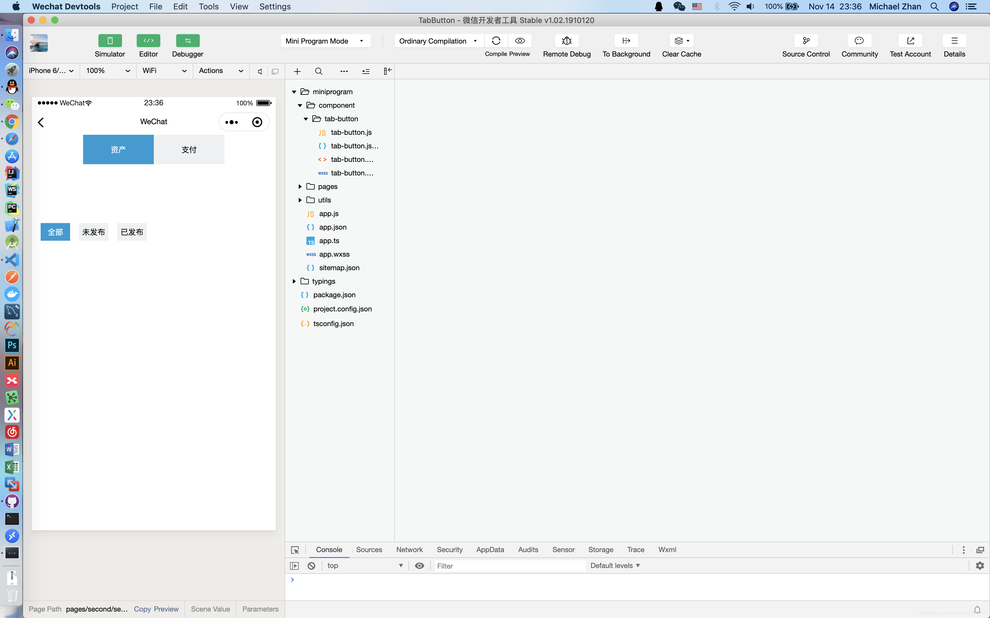
使用组件
second.json
{
  "usingComponents": {
    "tab-button": "../../component/tab-button/tab-button"
  }
}
second.js
Page({
  data: {
    option1: [{
        value: '资产'
      },
      {
        value: '支付'
      }
    ],
    option2: [{
        value: '全部'
      },
      {
        value: '未发布'
      },
      {
        value: '已发布'
      }
    ],
  },

  onLoad: function(options) {

  },

  onShow: function() {

  },

  onPullDownRefresh: function() {

  },

  tab_button_select1: function(event) {
    console.log(event.detail)
  },

  tab_button_select2: function(event) {
    console.log(event.detail)
  },
})
second.wxml
<tab-button margin_right="0" bindtab_button_select="tab_button_select1" w="120" h="50" display="flex" margin_left="0" options="{{option1}}"></tab-button>

<view class="mid"></view>

<tab-button bindtab_button_select="tab_button_select2" w="50" h="30" options="{{option2}}"></tab-button>
second.wxss
.mid{
  width: 100%;
  height: 100px;
}
tabButton.vue
<template>
  <div
    class="tab_button"
    :style="{
      height: h + 'px',
      lineHeight: h + 'px',
      display: dsp,
      marginLeft: ml + 'px'
    }"
  >
    <ul>
      <li
        v-for="(item, index) in options"
        :key="this"
        @click="tab_button_select"
        :data-id="index"
        :class="
          index == tabButtonActive ? 'tab_button_active' : 'tab_button_normal'
        "
        :style="{ marginRight: mr + 'px', width: w + 'px' }"
      >
        {{ item.value }}
      </li>
    </ul>
  </div>
</template>

<script>
export default {
  name: "tab-button",
  data() {
    return {
      tabButtonActive: 0
    };
  },
  props: {
    mr: {
      type: [Number, String],
      default: 15
    },
    h: {
      type: [Number, String],
      default: 30
    },
    w: {
      type: [Number, String],
      default: 50
    },
    dsp: {
      type: String,
      default: "block"
    },
    ml: {
      type: [Number, String],
      default: 15
    },
    options: {
      type: Array,
      default: [
        {
          value: "全部"
        },
        {
          value: "未发布"
        },
        {
          value: "已发布"
        }
      ]
    }
  },
  methods: {
    tab_button_select: function(event) {
      this.tabButtonActive = event.currentTarget.dataset.id;
      this.$forceUpdate(); //将数据从逻辑层更新到视图层,带动样式的改变
      this.$emit("tab_button_select", event.currentTarget.dataset.id);
    }
  }
};
</script>

<style scoped>
.tab_button {
  align-items: center;
  justify-content: center;
  width: 100%;
  height: 100%;
  /* height: 30px; */
  /* line-height: 30px; */
}

.tab_button ul {
  list-style: none;
}

.tab_button_normal {
  color: rgb(0, 0, 0);
  float: left;
  background: rgb(239, 240, 241);
  /* margin-right: 15px; */
  /* line-height: 30px; */
  /* width: 50px; */
  font-size: 13px;
  text-align: center;
}

.tab_button_active {
  color: white;
  float: left;
  background: #169bd5;
  /* margin-right: 15px; */
  /* line-height: 30px; */
  /* width: 50px; */
  font-size: 13px;
  text-align: center;
}
</style>
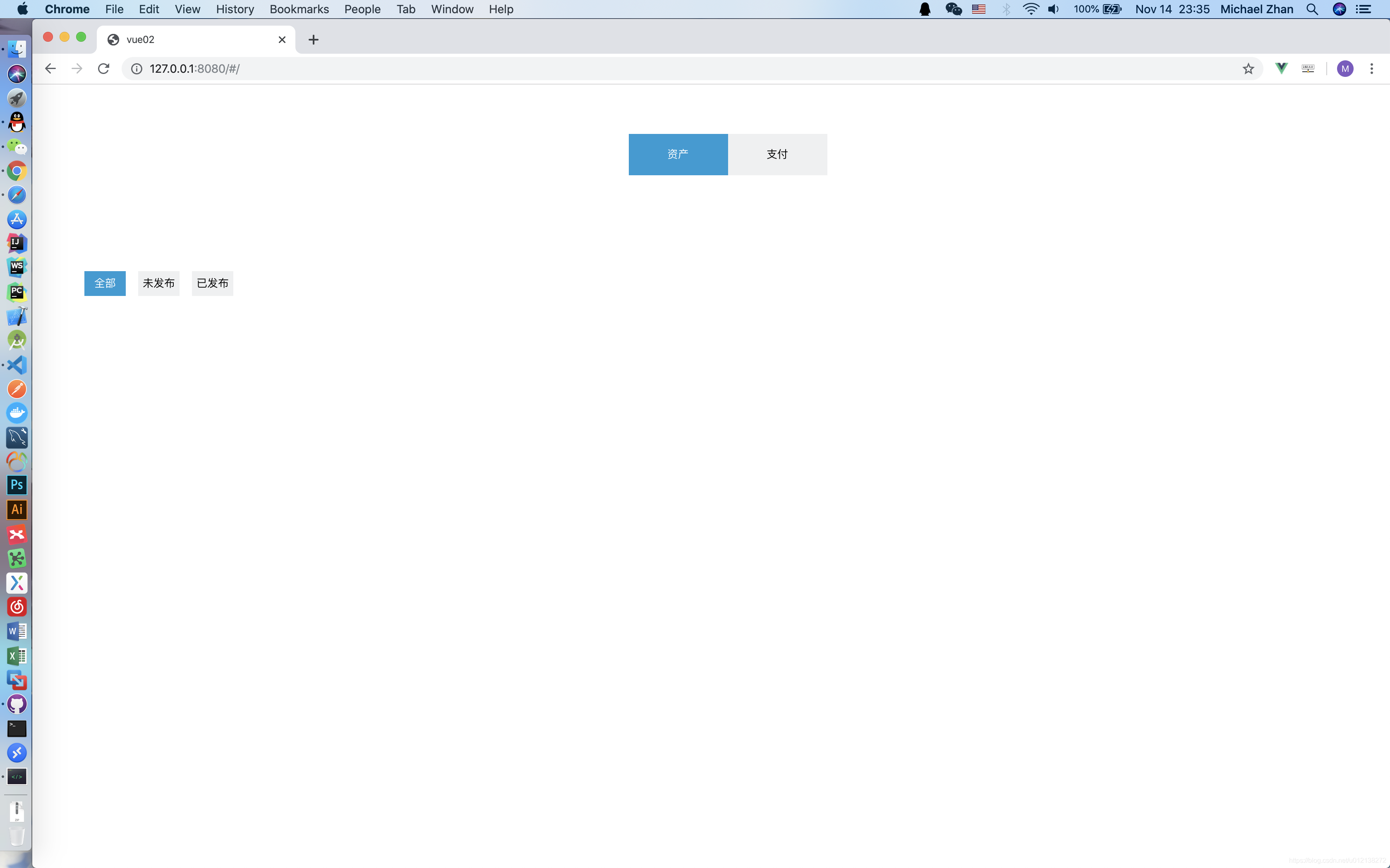
使用组件
HelloWorld.vue
<template>
  <div>
    <tabButton
      @tab_button_select="tab_button_select1"
      mr="0"
      w="120"
      h="50"
      dsp="flex"
      ml="0"
      :options="option1"
    ></tabButton>

    <div class="mid"></div>

    <tabButton
      @tab_button_select="tab_button_select2"
      w="50"
      h="30"
      :options="option2"
    ></tabButton>
  </div>
</template>

<script>
import tabButton from "./tabButton";
export default {
  name: "HelloWorld",
  components: {
    tabButton
  },
  data() {
    return {
      option1: [
        {
          value: "资产"
        },
        {
          value: "支付"
        }
      ],
      option2: [
        {
          value: "全部"
        },
        {
          value: "未发布"
        },
        {
          value: "已发布"
        }
      ]
    };
  },
  created() {},
  methods: {
    tab_button_select1: function(index) {
      console.log(index);
    },

    tab_button_select2: function(index) {
      console.log(index);
    }
  }
};
</script>

<style scoped>
.mid {
  width: 100%;
  height: 100px;
}
</style>
新人学习前端,有不足的地方还请指教。感谢!


 2912
2912


 被折叠的 条评论
为什么被折叠?
被折叠的 条评论
为什么被折叠?
 到【灌水乐园】发言


