


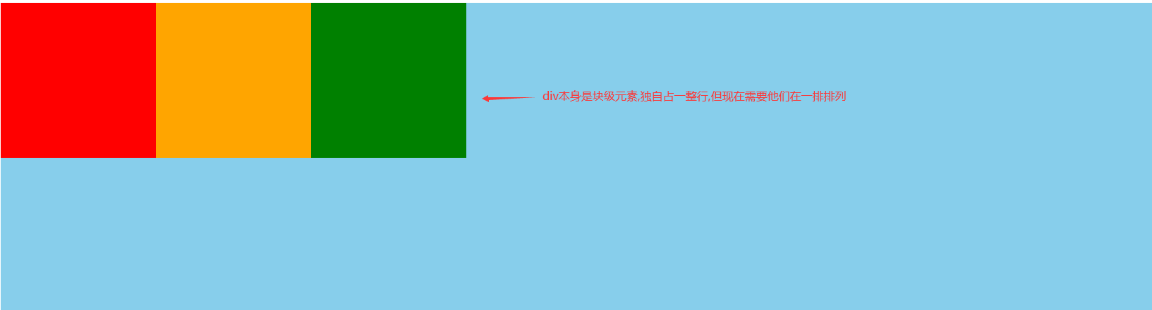
实现上图效果,我们需要输入以下代码:
上面的代码:
三个块元素设置大小以及背景色,在父容器中添加flex。
技术点的解释:
1、设置display: flex属性可以把块级元素在一排显示。
2、flex需要添加在父元素上,改变子元素的排列顺序。
3、默认为从左往右依次排列,且和父元素左边没有间隙。
横轴
flex-start:交叉轴的起点对齐
 .box {
        background: blue;
        display: flex;
        justify-content: flex-start;
    }
实现效果:

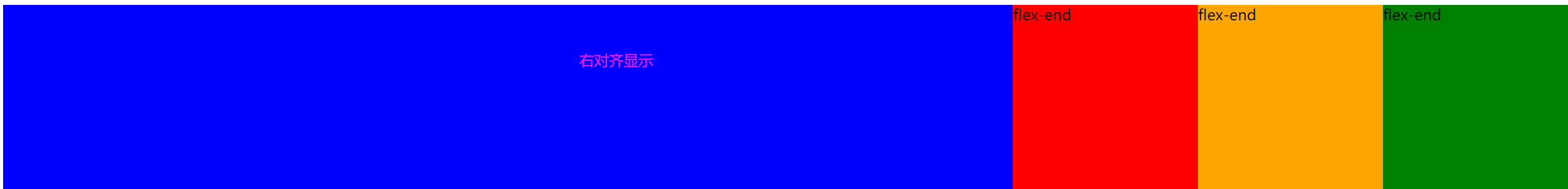
flex-end:右对齐
 .box {
        background: blue;
        display: flex;
        justify-content: flex-end;
    }
实现效果:
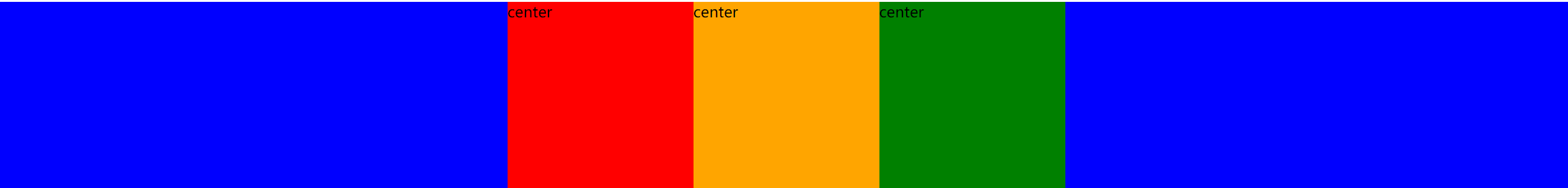
center: 居中
 .box {
        background: blue;
        display: flex;
        justify-content: center;
    }
实现效果:
space-between:两端对齐,项目之间的间隔都相等。
 .box {
        background: blue;
        display: flex;
        justify-content: space-between;
    }
实现效果:

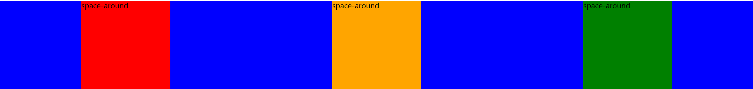
space-around:每个项目两侧的间隔相等。所以,项目之间的间隔比项目与边框的间隔大一倍。
.box {
        background: blue;
        display: flex;
        justify-content: space-around;
    }
实现效果:
竖轴
align-items: flex-start | flex-end | center | baseline | stretch;flex-start:默认值,左对齐
   .box {
        height: 700px;
        background: blue;
        display: flex;
        align-items: flex-start;
    }
实现效果:

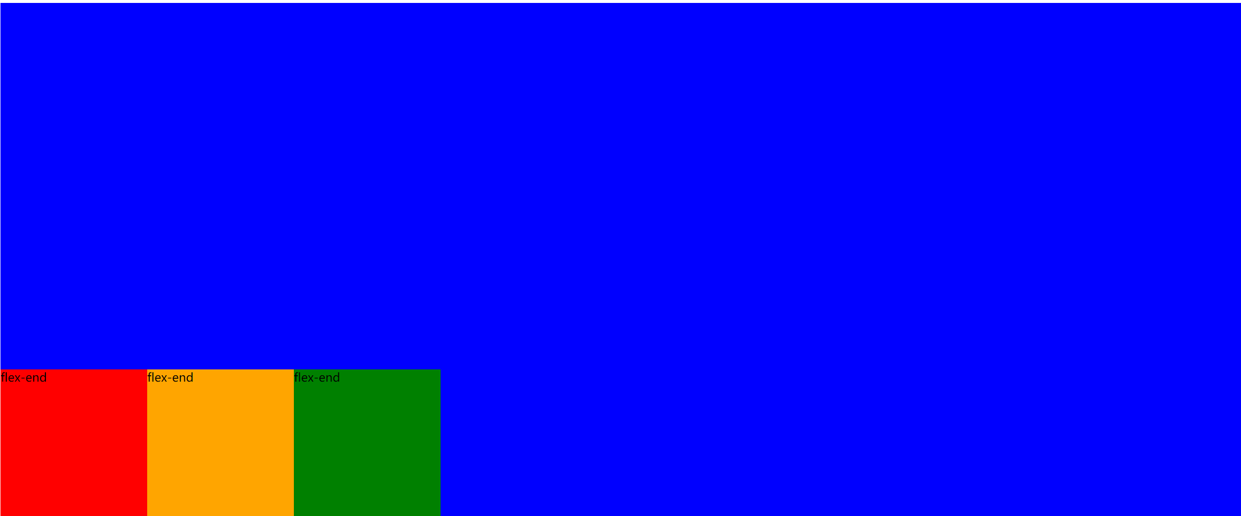
flex-end:交叉轴的终点对齐
 .box {
        height: 700px;
        background: blue;
        display: flex;
        align-items: flex-end;
    }
实现效果:
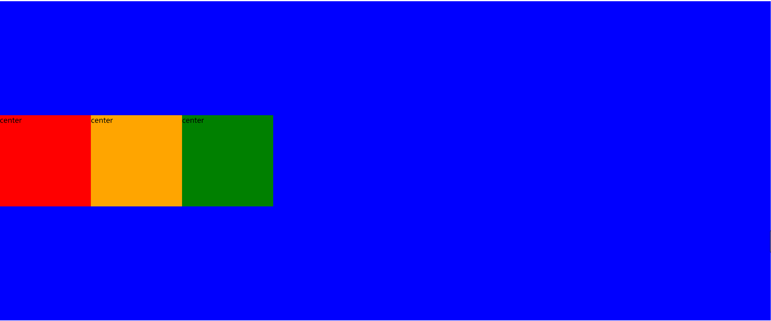
center: 交叉轴的中点对齐
.box {
        height: 700px;
        background: blue;
        display: flex;
        align-items: center;
    }
实现效果:
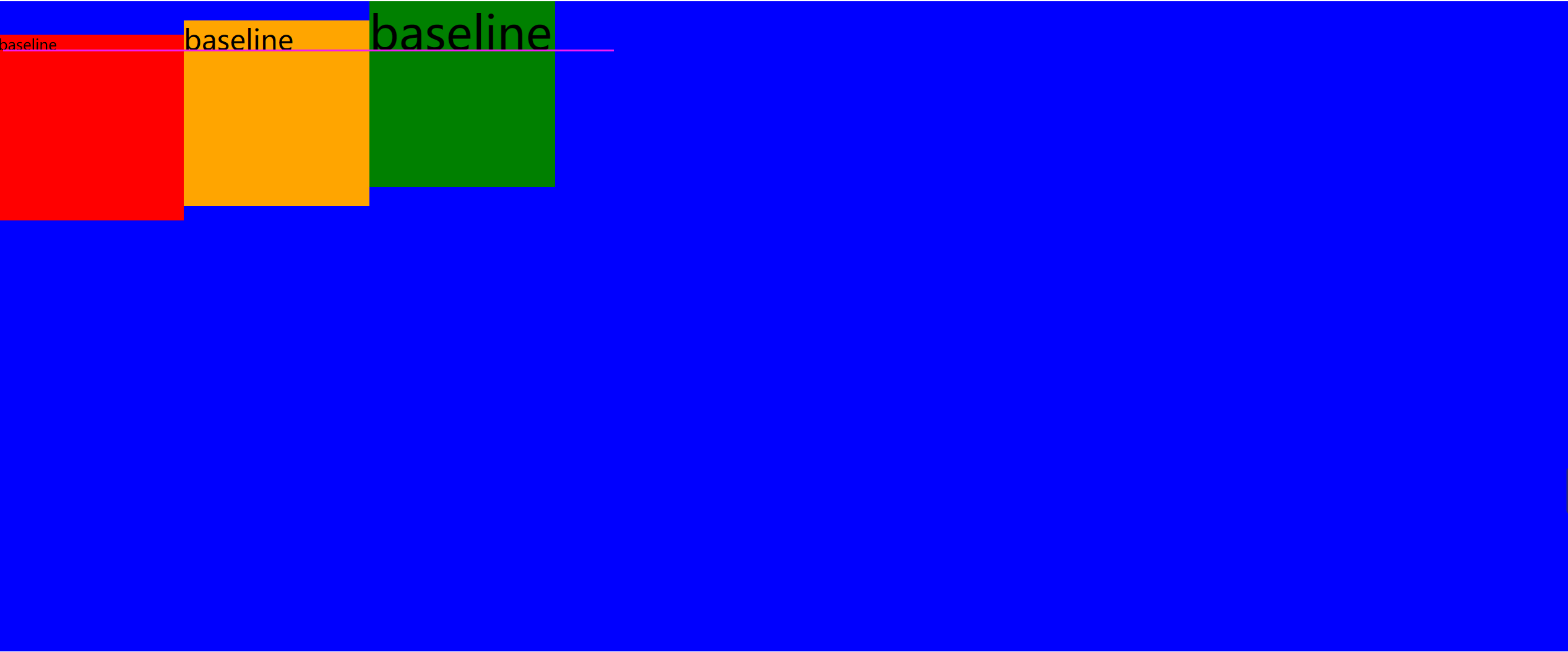
baseline:项目的第一行文字的基线对齐。
.box {
        height: 700px;
        background: blue;
        display: flex;
        align-items: baseline;
    }
三个盒子中设置不同的字体大小,可以参考右侧编辑器中的代码进行测试。
实现效果:
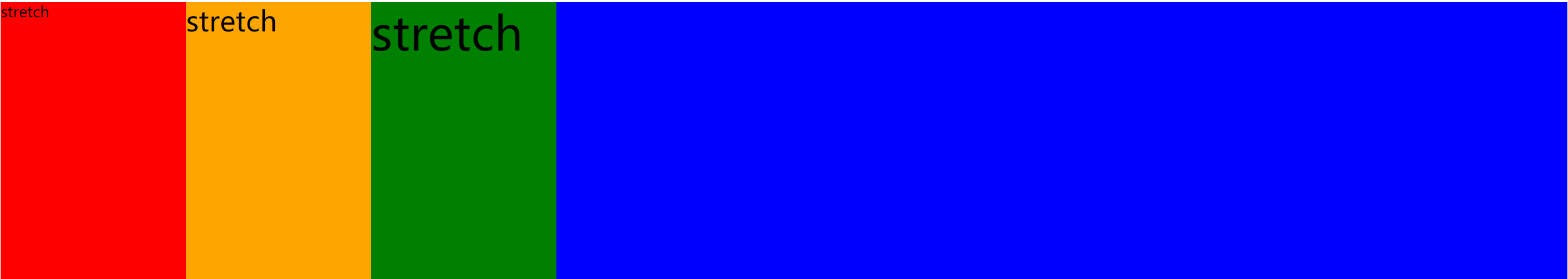
stretch(默认值):如果项目未设置高度或设为auto,将占满整个容器的高度。
 .box {
        height: 300px;
        background: blue;
        display: flex;
        align-items: stretch;
    }

    .box div {
        /*不设置高度,元素在垂直方向上铺满父容器*/
        width: 200px;
    }
实现效果:
占比例大小
1、给子元素设置flex属性,可以设置子元素相对于父元素的占比。
2、flex属性的值只能是正整数,表示占比多少。
3、给子元素设置了flex之后,其宽度属性会失效。
.box {
        height: 300px;
        background: blue;
        display: flex;
    }

    .box div {
        width: 200px;
        height: 200px;
    }

    .box1 {
        flex: 1;
        background: red;
    }

    .box2 {
        flex: 3;
        background: orange;
    }

    .box3 {
        flex: 2;
        background: green;
    }
效果如下:


 1601
1601


 被折叠的 条评论
为什么被折叠?
被折叠的 条评论
为什么被折叠?
 到【灌水乐园】发言


