


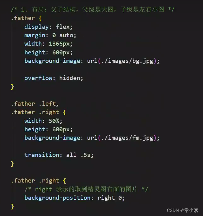
平面转换transform
作用:为元素添加动态效果,一般与过渡配合使用
概念:改变盒子在平面内的形态(位移,旋转,缩放,倾斜)
平面转换又叫2d转换
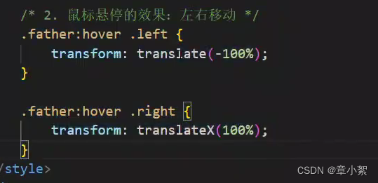
平面转换-平移
- 属性:
transform:translate(x轴移动距离,y轴移动距离)
- 取值:
像素单位数值
百分比(参照盒子自身尺寸计算结果)
正负均可
- 技巧:
translate()只写一个值,表示沿着x轴转动
单独设置x或y轴移动距离:translatex()或者translatey()
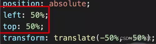
平移实现居中效果
方法一:

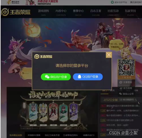
方法二:百分比参照盒子自身尺寸计算结果
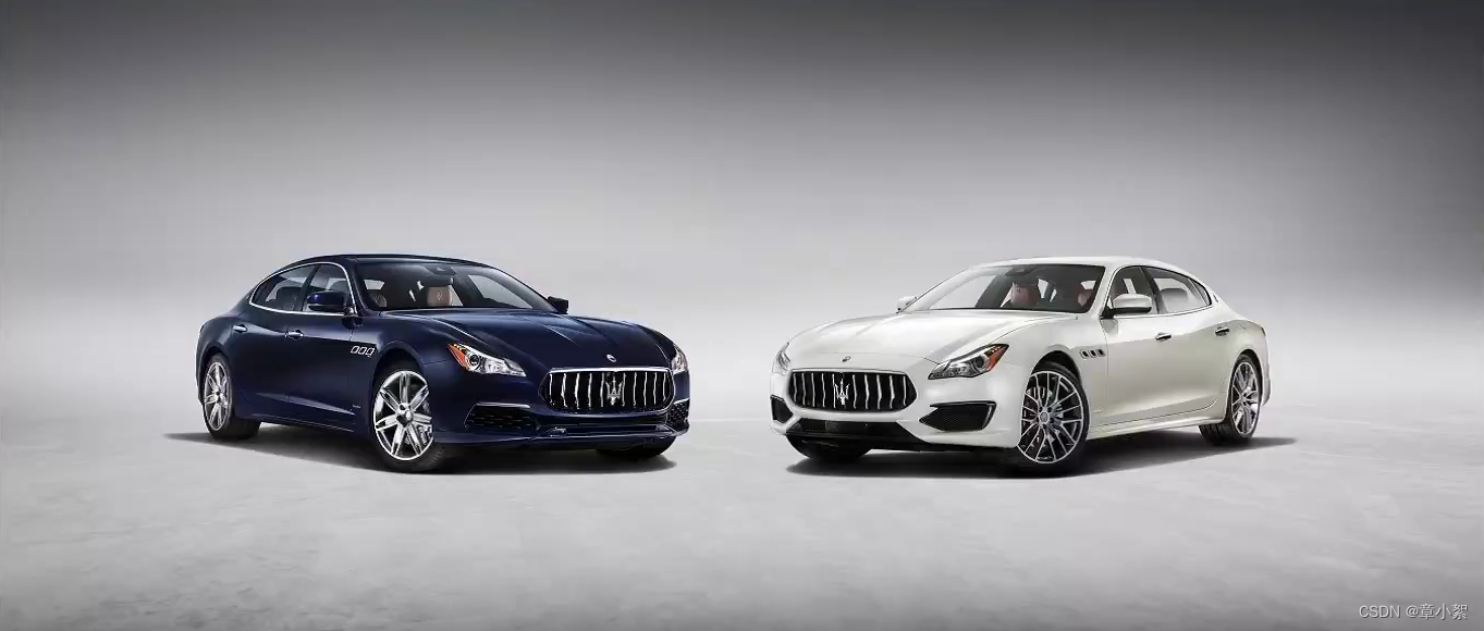
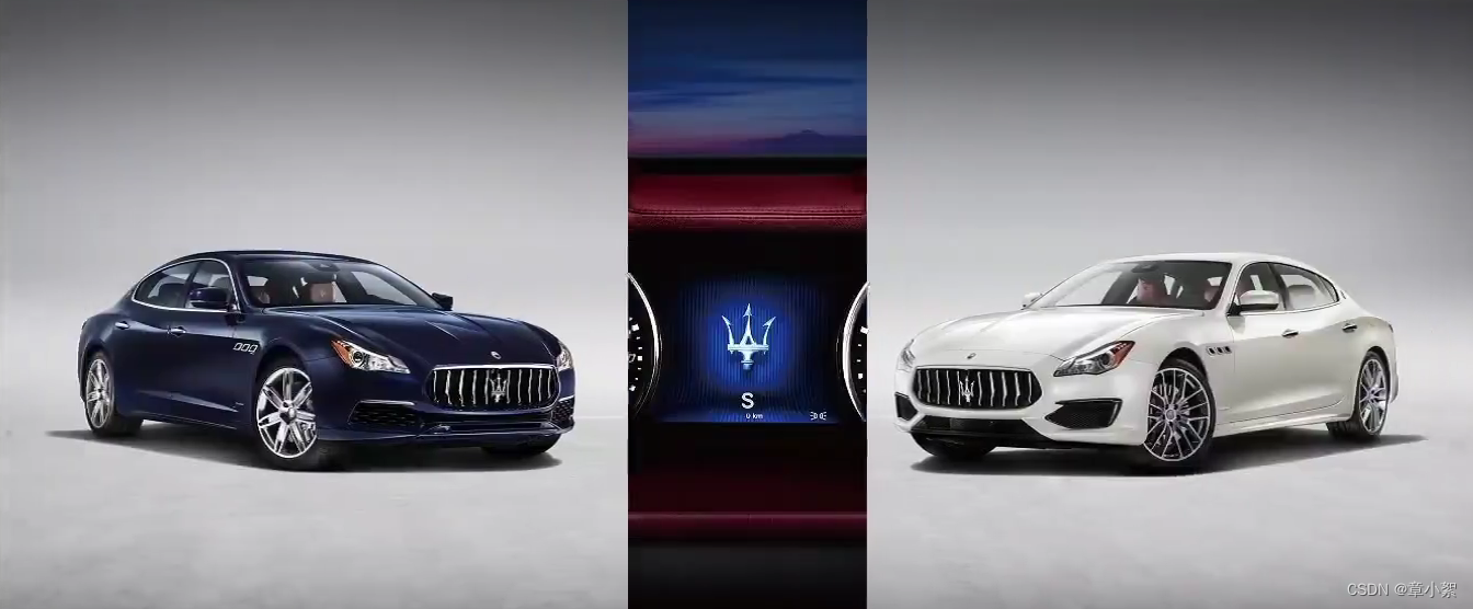
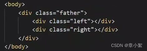
双开门效果
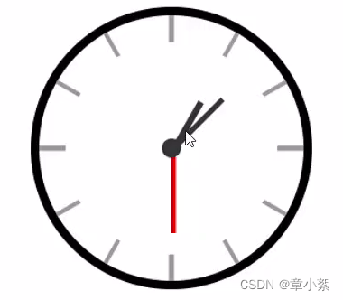
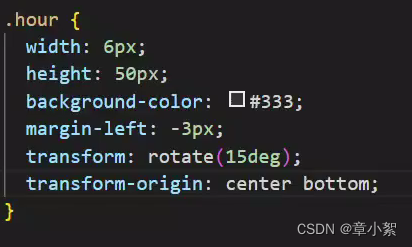
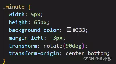
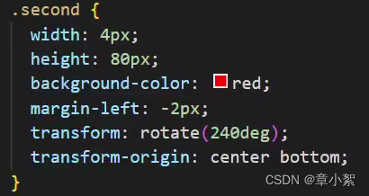
平面转换-旋转
- 属性:
transform:rotate(旋转角度);
角度单位是deg
- 技巧:
取值正负均可
取值为正,顺时针旋转
取值为负,逆时针旋转
平面转换-改变转换原点
默认情况下,转换原点是盒子中心点
- 属性: transform-origin:水平原点位置 垂直原点位置;
- 取值:
方位名词(left,right,bottom,center,top)
像素单位数值
百分比
时钟案例
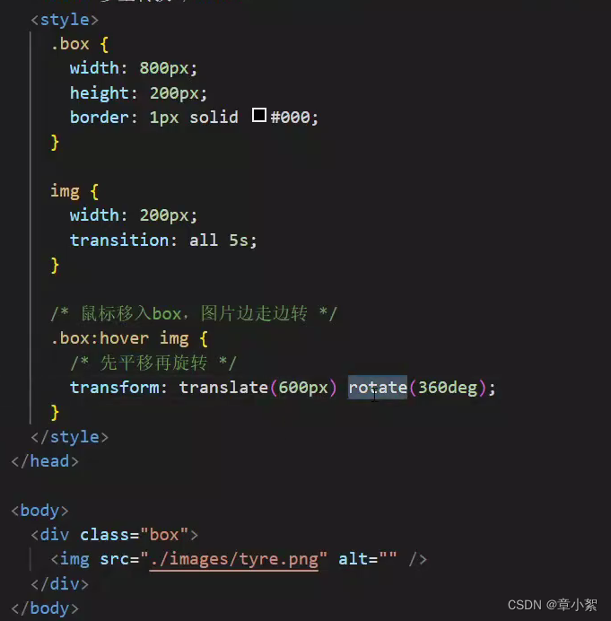
平面转换-多重转换
一个标签同时具备了多个形态的变换
必须用复合属性,如果分开使用,由于相同的属性会发生层叠,导致后面的生效,前面的不生效
技巧:先平移再旋转 transform:translate() rotate();
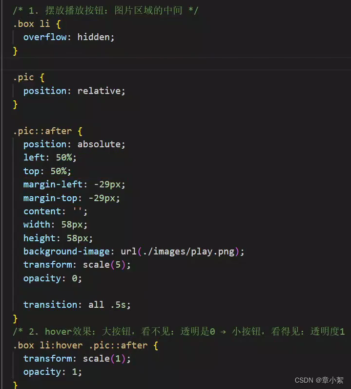
平面转换-缩放
- 属性:
transform:scale(缩放倍数)
transform:scale(x轴缩放倍数,y轴缩放倍数)
- 技巧
通常,只为scale()设置一个值,表示x轴和y轴等比例缩放
取值大于1表示放大,小于1表示缩小
案例播放按钮
平面转换-倾斜
亮光倾斜效果

属性:transform:skew()
取值:角度度数deg
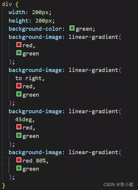
渐变
是多个颜色逐渐变化的效果,一般用于设置盒子背景
线性渐变

- 属性:
background-image:linear-gradient(渐变方向,颜色1 终点位置,颜色2 终点位置,...);
- 取值:
渐变方向:可选
to方位名词
角度度数
终点位置:可选
百分比
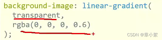
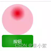
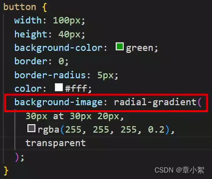
径向渐变
- 作用:给按钮添加高光效果
- 属性:

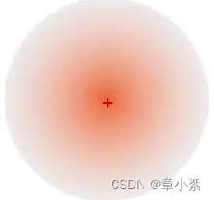
- 取值:
半径可以是2条,则为椭圆
圆心位置取值:像素单位数值/百分比/方位名词
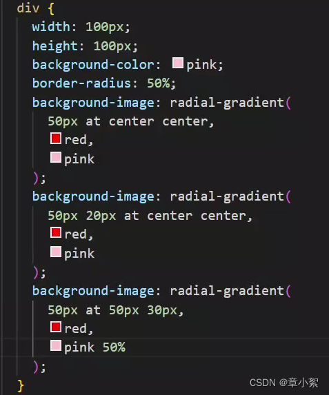
按钮颜色由白色半透明到透明
喜马拉雅综合案例

<!DOCTYPE html>
<html lang="en">
<head>
<meta charset="UTF-8" />
<meta http-equiv="X-UA-Compatible" content="IE=edge" />
<meta name="viewport" content="width=device-width, initial-scale=1.0" />
<title>喜马拉雅</title>
<link rel="stylesheet" href="./css/font.css">
<link rel="stylesheet" href="./css/index.css" />
</head>
<body>
<header class="x-header">
<div class="container">
<a href="#" class="x-header-logo">喜马拉雅</a>
<nav class="x-header-nav">
<a href="#" class="nav-item">发现</a>
<a href="#" class="nav-item">
频道<span class="iconfont icon-down"></span>
<div class="channel-layer">
所有频道<br>
所有频道<br>
所有频道<br>
所有频道<br>
</div>
</a>
<a href="#" class="nav-item">电台</a>
</nav>
<div class="x-header-search">
<form action="#">
<input type="text" placeholder="专辑/声音/主播" />
<a href="#" class="btn">
<span class="iconfont icon-search"></span>
</a>
</form>
</div>
<div class="x-header-icons">
<a href="#" class="icons-item">
<span class="iconfont icon-cloud-upload"></span>
<span class="tit">上传</span>
</a>
<a href="#" class="icons-item">
<span class="iconfont icon-pic-left"></span>
<span class="tit">创作中心</span>
</a>
<a href="#" class="icons-item">
<span class="iconfont icon-sound"></span>
<span class="tit">有声出版</span>
</a>
<a href="#" class="icons-item">
<span class="iconfont icon-desktop"></span>
<span class="tit">客户端</span>
</a>
<a href="#" class="icons-item">
<img src="./assets/avatar.png" alt="" />
</a>
</div>
</div>
</header>
<main class="x-main">
<div class="container">
<!-- banner -->
<div class="banner">
<ul class="banner-list">
<li class="banner-item left">
<a href="#">
<img src="./assets/banner01.jpg" alt="" />
</a>
</li>
<li class="banner-item">
<a href="#">
<img src="./assets/banner02.jpg" alt="" />
</a>
</li>
<li class="banner-item right">
<a href="#">
<img src="./assets/banner03.jpg" alt="" />
</a>
</li>
</ul>
</div>
<!-- category -->
<nav class="category">
<div class="category-top">
<a href="#" class="top-item">
<span class="iconfont icon-block top-item-icon"></span>
<span>频道</span>
</a>
<a href="#" class="top-item">
<span class="iconfont icon-appstore top-item-icon"></span>
<span>分类</span>
</a>
<a href="#" class="top-item">
<span class="iconfont icon-crown top-item-icon"></span>
<span>排行</span>
</a>
</div>
<div class="category-sub">
<div class="category-sub-item">
<a href="#" class="start">小说</a>
<a href="#">男频</a>
<a href="#">女频</a>
</div>
<div class="category-sub-item">
<a href="#" class="start">相声</a>
<a href="#">郭麒麟</a>
<a href="#">岳云鹏</a>
</div>
<div class="category-sub-item">
<a href="#" class="start">音乐</a>
<a href="#">电音</a>
<a href="#">流行</a>
</div>
<div class="category-sub-item">
<a href="#" class="start">商业</a>
<a href="#">市场营销</a>
<a href="#">管理</a>
</div>
<div class="category-sub-item">
<a href="#" class="start">健康</a>
<a href="#">饮食</a>
<a href="#">科普</a>
</div>
<div class="category-sub-item">
<a href="#" class="start">科技</a>
<a href="#">互联</a>
<a href="#">无人驾驶</a>
</div>
<div class="category-sub-item">
<a href="#" class="start">英语</a>
<a href="#">听力</a>
<a href="#">实用</a>
</div>
<div class="category-sub-item">
<a href="#" class="start">头条</a>
<a href="#">实时快讯</a>
<a href="#">民生</a>
</div>
</div>
</nav>
<!-- layout -->
<section class="layout">
<!-- 主体内容 -->
<div class="layout-main">
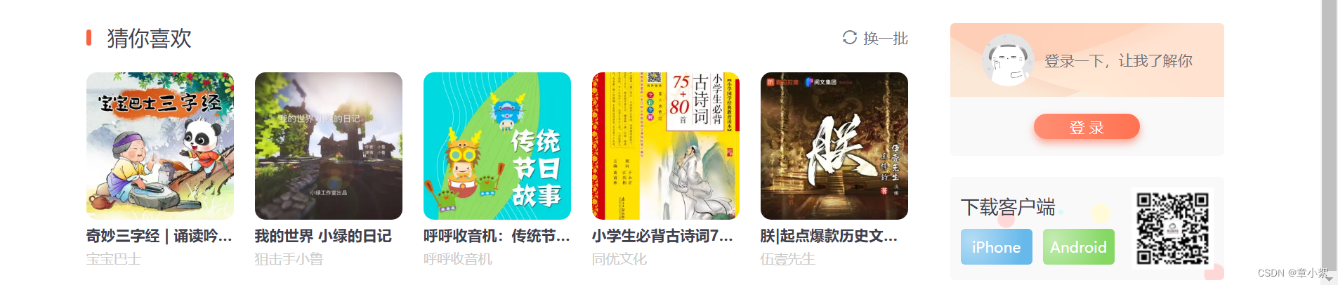
<div class="panel">
<div class="panel-head">
<h3 class="panel-head-tit">猜你喜欢</h3>
<a class="panel-head-toggle" href="#">
<span class="iconfont icon-sync"></span>
<span>换一批</span>
</a>
</div>
<div class="panel-body">
<ul>
<li>
<a href="#" class="album-item">
<div class="album-item-box">
<img class="img" src="./assets/img01.jpg" alt="" />
</div>
<p class="album-item-tit">奇妙三字经 | 诵读吟唱经典磨耳朵 | 宝宝巴士国学</p>
<p class="album-item-aut">宝宝巴士</p>
</a>
</li>
<li>
<a href="#" class="album-item">
<div class="album-item-box">
<img class="img" src="./assets/img02.jpg" alt="" />
</div>
<p class="album-item-tit">我的世界 小绿的日记</p>
<p class="album-item-aut">狙击手小鲁</p>
</a>
</li>
<li>
<a href="#" class="album-item">
<div class="album-item-box">
<img class="img" src="./assets/img03.jpg" alt="" />
</div>
<p class="album-item-tit">呼呼收音机:传统节日故事</p>
<p class="album-item-aut">呼呼收音机</p>
</a>
</li>
<li>
<a href="#" class="album-item">
<div class="album-item-box">
<img class="img" src="./assets/img04.jpg" alt="" />
</div>
<p class="album-item-tit">小学生必背古诗词75+80首</p>
<p class="album-item-aut">同优文化</p>
</a>
</li>
<li>
<a href="#" class="album-item">
<div class="album-item-box">
<img class="img" src="./assets/img05.jpg" alt="" />
</div>
<p class="album-item-tit">朕|起点爆款历史文|架空权谋&逆袭成帝|VIP免费有声小说</p>
<p class="album-item-aut">伍壹先生</p>
</a>
</li>
</ul>
</div>
</div>
</div>
<!-- 侧边栏 -->
<div class="layout-aside">
<div class="card">
<div class="card-head">
<img class="avatar" src="./assets/avatar.png" alt="" />
<p class="text">登录一下,让我了解你</p>
</div>
<div class="card-info">
<a href="#" class="login">登 录</a>
</div>
</div>
<div class="download">
<div class="dl">
<p class="dl-tit">下载客户端</p>
<a href="#" class="dl-btn">iPhone</a>
<a href="#" class="dl-btn">Android</a>
</div>
<img src="./assets/hm.jpg" alt="">
</div>
</div>
</section>
</div>
</main>
</body>
</html>
css代码 :
*,
::after,
::before {
  box-sizing: border-box;
}

body {
  margin: 0;
  font-family:
    -apple-system,
    BlinkMacSystemFont,
    PingFangSC-Regular,
    "PingFang SC",
    "Microsoft YaHei",
    "Helvetica Neue",
    Helvetica,
    Arial,
    sans-serif;
  font-size: 14px;
  color: #40404c;
}

a {
  color: #40404c;
  text-decoration: none;
}

a:hover {
  color: #fc5832;
}

ul {
  list-style: none;
}

h1,
h2,
h3,
h4,
h5,
h6,
ul,
ol,
p {
  padding: 0;
  margin: 0;
}

.container {
  width: 1080px;
  margin: 0 auto;
}

/* 头部 */
.x-header {
  position: relative;
  z-index: 9;
  height: 60px;
}

.x-header::after {
  position: absolute;
  bottom: 0;
  left: 0;
  z-index: -1;
  width: 100%;
  height: 60px;
  content: "";
  box-shadow: 0 2px 2px 0 rgb(0 0 0 / 10%);
}

.x-header .container {
  display: flex;
  align-items: center;
  background-color: #fff;
}

.x-header-logo {
  position: relative;
  z-index: 9;
  width: 290px;
  height: 60px;
  font-size: 0;
}

.x-header-logo::before {
  position: absolute;
  top: 0;
  right: 0;
  bottom: 0;
  left: 0;
  background: url("../assets/logo.png") no-repeat center / contain;
  content: "";
}

.x-header-nav {
  display: flex;
  width: 180px;
  margin: 5px;
}

.x-header-nav .nav-item {
  flex: 1;
  font-size: 16px;
  color: #72727b;
  text-align: center;
}

.x-header-nav .nav-item:hover {
  color: #40404c;
}

/* TODO 1. 箭头旋转 */
.x-header-nav .nav-item .icon-down {
  display: inline-block;
  height: 16px;
  color: #ccc;
  transition: all 0.5s;
}

.x-header-nav .nav-item:hover .icon-down {
  transform: rotate(-180deg);
}

.channel-layer {
  position: absolute;
  top: 60px;
  left: 50%;
  z-index: -2;
  width: 1080px;
  height: 120px;
  padding: 10px;
  margin-left: -540px;
  color: #72727b;
  background-color: #f5f5f5;
  border: 1px solid #e4e4e4;
  border-top: none;
  transition: all 0.5s;
  transform: translateY(-120px);
}

/* TODO 2. 弹窗频道 */
.x-header-nav .nav-item:hover .channel-layer {
  transform: translateY(0);
}

.x-header-search {
  width: 300px;
}

.x-header-search form {
  position: relative;
  width: 100%;
}

.x-header-search form input {
  width: 100%;
  height: 40px;
  padding: 0 20px;
  border: 1px solid #f86442;
  border-radius: 20px;
  outline: none;
}

.x-header-search form input::placeholder {
  color: #ccc;
}

/* TODO 3. 渐变按钮 */
.x-header-search form .btn {
  position: absolute;
  top: 0;
  right: 0;
  width: 60px;
  height: 40px;
  line-height: 40px;
  text-align: center;
  background-color: #f86442;
  border-top-right-radius: 20px;
  border-bottom-right-radius: 20px;
  background-image: linear-gradient(
    to right,
    rgba(255, 255, 255, 0.3),
    #f86442
  );
}

.x-header-search form .btn span {
  font-size: 24px;
  color: #fff;
}

.x-header-icons {
  display: flex;
  width: 300px;
  align-items: center;
}

.x-header-icons .icons-item {
  flex: 1;
  text-align: center;
}

.x-header-icons .icons-item .iconfont {
  font-size: 20px;
  color: #ccc;
}

.x-header-icons .icons-item:hover .iconfont {
  color: #f86442;
}

.x-header-icons .icons-item .tit {
  display: block;
  font-size: 12px;
  color: #72727b;
}

.x-header-icons .icons-item img {
  width: 40px;
  height: 40px;
  vertical-align: bottom;
  border-radius: 20px;
}

.x-main {
  padding-top: 20px;
}

.banner {
  position: relative;
  width: 100%;
  height: 300px;
  margin-bottom: 20px;
}

.banner .banner-list {
  position: relative;
  z-index: 8;
  width: 100%;
  height: 100%;
}

.banner .banner-list .banner-item {
  position: absolute;
  top: 0;
  left: 165px;
  z-index: 1;
  width: 750px;
  height: 300px;
  overflow: hidden;
  border-radius: 10px;
  transition: all 0.5s;
}

/* TODO 4. 摆放图片 */
.banner .banner-list .banner-item.left {
  z-index: 0;
  transform: translate(-160px) scale(0.8);
  transform-origin: left center;
}

.banner .banner-list .banner-item.right {
  z-index: 0;
  transform: translate(160px) scale(0.8);
  transform-origin: right center;
}

.banner .banner-list .banner-item a img {
  width: 100%;
  height: 100%;
  vertical-align: bottom;
}

.category {
  display: flex;
  width: 100%;
  padding: 20px 0;
  align-items: center;
}

.category-top {
  display: flex;
  width: 240px;
}

.category-top .top-item {
  color: #72727b;
  text-align: center;
  flex: 1;
}

.category-top .top-item:hover {
  color: #f86442;
}

.category-top .top-item .top-item-icon {
  display: block;
  font-size: 20px;
}

.category-sub {
  display: flex;
  width: 840px;
  flex-wrap: wrap;
}

.category-sub-item {
  width: 210px;
  padding-left: 30px;
}

.category-sub-item a {
  padding: 0 10px;
  font-size: 13px;
  color: #72727b;
}

.category-sub-item a.start {
  position: relative;
  font-size: 14px;
  color: #40404c;
}

.category-sub-item a.start::after {
  position: absolute;
  top: 3px;
  right: -1px;
  width: 2px;
  height: 10px;
  background-color: #f86442;
  content: "";
}

.layout {
  display: flex;
  width: 100%;
  padding-top: 20px;
}

.layout-main {
  width: 780px;
}

.layout-aside {
  width: 260px;
  margin-left: 40px;
}

.panel {
  margin-bottom: 20px;
}

.panel-head {
  display: flex;
  margin-bottom: 20px;
  justify-content: space-between;
}

.panel-head .panel-head-tit {
  position: relative;
  padding-left: 20px;
  font-size: 20px;
  font-weight: normal;
}

.panel-head .panel-head-tit::before {
  position: absolute;
  top: 6px;
  left: 0;
  width: 5px;
  height: 15px;
  background-color: #f86442;
  border-radius: 6px;
  content: "";
}

.panel-head .panel-head-toggle {
  display: flex;
  align-items: center;
  color: #72727b;
}

.panel-head .panel-head-toggle .icon-sync {
  margin-right: 5px;
}

.panel-body ul {
  display: flex;
  justify-content: space-between;
}

.panel-body ul li {
  width: 140px;
}

.album-item {
  width: 100%;
}

.album-item .album-item-box {
  position: relative;
  width: 100%;
  overflow: hidden;
  border-radius: 10px;
}

.album-item .album-item-box .img {
  width: 100%;
  vertical-align: bottom;
  transition: all 0.5s;
}

.album-item .album-item-tit {
  padding: 5px 0;
  overflow: hidden;
  font-weight: 700;
  text-overflow: ellipsis;
  white-space: nowrap;
}

.album-item .album-item-aut {
  font-size: 13px;
  color: #ccc;
}


/* TODO 5. 播放按钮和遮罩 */
.album-item .album-item-box::after {
  position: absolute;
  left: 0;
  top: 0;
  content: '';
  width: 100%;
  height: 100%;
  background: rgba(0,0,0,.5) url(../assets/play.png) no-repeat center / 20px;
  opacity: 0;
  transition: all .5s;
}

.album-item .album-item-box:hover::after {
  opacity: 1;
  background-size: 50px;
}


/* TODO 6. 图片缩放 */
.album-item .album-item-box:hover img {
  transform: scale(1.1);
}


.card {
  margin-bottom: 20px;
  overflow: hidden;
  background-color: #f9f9fa;
  border-radius: 4px;
}

.card .card-head {
  display: flex;
  height: 70px;
  background: url("../assets/bg01.png") no-repeat center / cover;
  align-items: center;
  justify-content: center;
}

.card .card-head .avatar {
  width: 50px;
  height: 50px;
  vertical-align: bottom;
  border-radius: 50%;
}

.card .card-head .text {
  margin-left: 10px;
  color: #72727b;
}

.card .card-info {
  display: flex;
  height: 56px;
  align-items: center;
  justify-content: center;
}

/* TODO 7. 渐变按钮 */
.card .card-info .login {
  padding: 3px 34px;
  color: #fff;
  background-color: #ff7251;
  border-radius: 30px;
  box-shadow: 0 4px 8px 0 rgb(252 88 50 / 50%);
  background-image: linear-gradient(
    to right,
    rgba(255, 255, 255, 0.2),
    #ff7251
  );
}

.download {
  display: flex;
  padding: 10px;
  overflow: hidden;
  background-color: pink;
  background: #f9f9fa url("../assets/bg02.png") no-repeat 4px 25px / 100%;
  border-radius: 4px;
  justify-content: space-between;
  align-items: center;
}

.download .dl {
  display: flex;
  flex-wrap: wrap;
}

.download .dl .dl-tit {
  width: 100%;
  margin-bottom: 10px;
  font-size: 18px;
}

/* TODO 8. 径向渐变 */
.download .dl .dl-btn {
  width: 68px;
  height: 34px;
  line-height: 34px;
  color: #fff;
  text-align: center;
  border-radius: 4px;
  background-image: radial-gradient(
    50px at 10px 10px,
    rgba(255, 255, 255, 0.5),
    transparent
  );
}

.download .dl .dl-btn:nth-of-type(1) {
  background-color: #67b9eb;
}

.download .dl .dl-btn:nth-of-type(2) {
  margin-left: 10px;
  background-color: #86d864;
}


 1299
1299


 被折叠的 条评论
为什么被折叠?
被折叠的 条评论
为什么被折叠?
 到【灌水乐园】发言


