


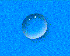
使用css写出水滴效果要用到css的阴影和动画效果
1.那就开始第一步
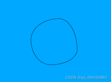
首先要一个div盒子放小水滴
<div class="box"></div>然后在css中设置一个背景颜色以便于更好显示水滴的效果,所以直接在body中设置宽高颜色
body {
          width: 100vw;
          height: 100vh;
          display: flex;
          background-color: #00a8ff
     }
设置完成后整个视口窗会是水蓝色的更好显示效果
2.用给box添加宽度和边框,并添加圆角查看效果
.box {
            width: 150px;
            height: 150px;
            border: 1px solid #000;
            margin: 80px auto;
            border-radius: 61% 39% 57% 43% / 46% 67% 33% 54%;
}
效果如下
3.这一步是在box中添加阴影让图片显得更加的立体
分别是一个黑色一个白色阴影
 box-shadow: inset 10px 20px 30px rgba(0, 0, 0, 0.5),
                              10px 10px 20px rgba(0, 0, 0, 0.3),
                              15px 15px 30px rgba(0, 0, 0, 0.05),
                              inset -10px -20px 30px rgba(255,255,255,0.8);
4.完成阴影后我们添加两个水滴上的高光,以显示的更加立体和生动(要删除边框)
就是两个白色的小点
 .box:before{
            content: '';
            width: 10px;
            height: 10px;
            position: absolute;
            top: 94px;
            left: 50%;
            background-color: rgba(255,255,255,0.8);
            border-radius: 46% 54% 36% 64% / 46% 43% 57% 54% ;
}
5.最后就是添加动画效果了
@keyframes a{
            25%{
                border-radius: 58% 42% 59% 41% / 52% 46% 54% 48%  ;
            }
            50%{
                border-radius: 46% 54% 40% 60% / 52% 33% 67% 48%  ;
            }
            75%{
                border-radius:  65% 35% 71% 29% / 31% 60% 40% 69% ;
            }
            100%{
                border-radius:60% 40% 43% 57% / 45% 51% 49% 55%   ;
            }
        }
//然后将动画效果引入box中
.box{
         animation: a 4s linear  infinite alternate;
}
完成这些后水滴就会动起来了
小水滴
<!DOCTYPE html>
<html lang="en">

<head>
    <meta charset="UTF-8">
    <meta http-equiv="X-UA-Compatible" content="IE=edge">
    <meta name="viewport" content="width=device-width, initial-scale=1.0">
    <title>Document</title>
    <style>
        * {
            margin: 0;
            padding: 0;
        }

        body {
            /* box-sizing: border-box; */
            width: 100vw;
            height: 100vh;
            display: flex;
            background-color: #00a8ff
        }
        .box {
            width: 150px;
            height: 150px;
            /* border: 1px solid #000; */
            margin: 80px auto;
            border-radius: 61% 39% 57% 43% / 46% 67% 33% 54%;
            box-shadow: inset 10px 20px 30px rgba(0, 0, 0, 0.5),
                              10px 10px 20px rgba(0, 0, 0, 0.3),
                              15px 15px 30px rgba(0, 0, 0, 0.05),
                              inset -10px -20px 30px rgba(255,255,255,0.8);
         animation: a 4s linear  infinite alternate;
        }
        .box:before{
            content: '';
            width: 10px;
            height: 10px;
            position: absolute;
            top: 94px;
            left: 50%;
            background-color: rgba(255,255,255,0.8);
            border-radius: 46% 54% 36% 64% / 46% 43% 57% 54% ;
            animation: b 2s linear  infinite alternate;
        }
        .box::after{
            content: '';
            width: 6px;
            height: 6px;
            position: absolute;
            top: 112px;
            left: 48%;
            background-color: rgba(255,255,255,0.8);
            border-radius: 46% 54% 36% 64% / 46% 43% 57% 54% ;

        }
        @keyframes a{
            25%{
                border-radius: 58% 42% 59% 41% / 52% 46% 54% 48%  ;
            }
            50%{
                border-radius: 46% 54% 40% 60% / 52% 33% 67% 48%  ;
            }
            75%{
                border-radius:  65% 35% 71% 29% / 31% 60% 40% 69% ;
            }
            100%{
                border-radius:60% 40% 43% 57% / 45% 51% 49% 55%   ;
            }
        }
        @keyframes b{
            25%{
                top: 96px;
                left: 50%;
            }
            50%{
                top: 98px;
                left: 50%;
            }

            100%{
                top: 100px;
                left: 50%;
            }
        }
    </style>
</head>
<body>
    <div class="box">
    </div>
</body>
</html>


 678
678


 被折叠的 条评论
为什么被折叠?
被折叠的 条评论
为什么被折叠?
 到【灌水乐园】发言


