Flutter 自定义今日头条版本的组件,及底部按钮切换静态样式


自用 无商业用途!!!!

屏幕录制2023-03-06 14.57.56

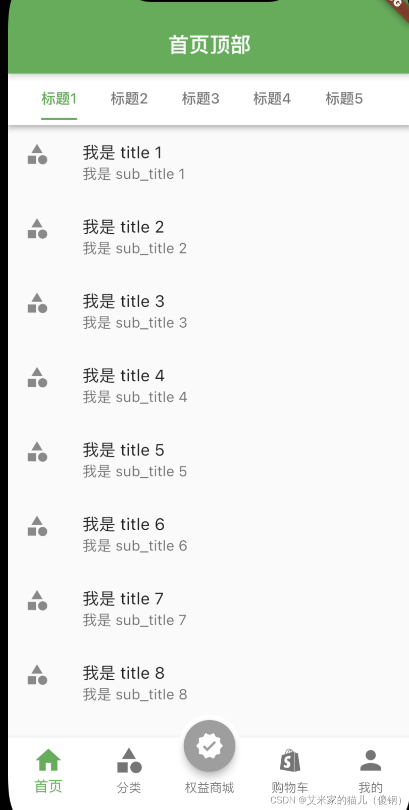
1. 左右滑动实现标题切换,点击标题也可实现切换;

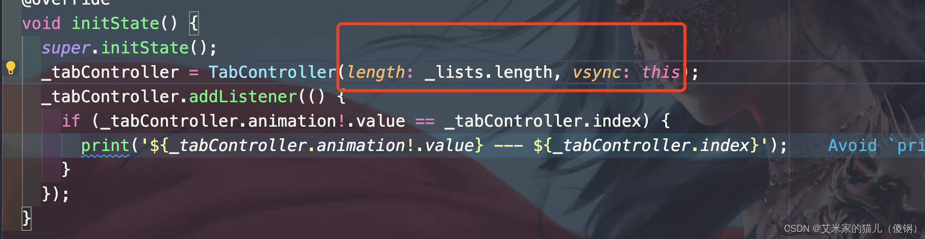
注意:点击顶部按钮时候会触犯_tabController.index会触发两次,普通左右滑动触发一次,所以为了避免触发两次,需要加如下判断

if (_tabController.animation!.value == _tabController.index) {
  print('${_tabController.animation!.value} --- ${_tabController.index}');
}

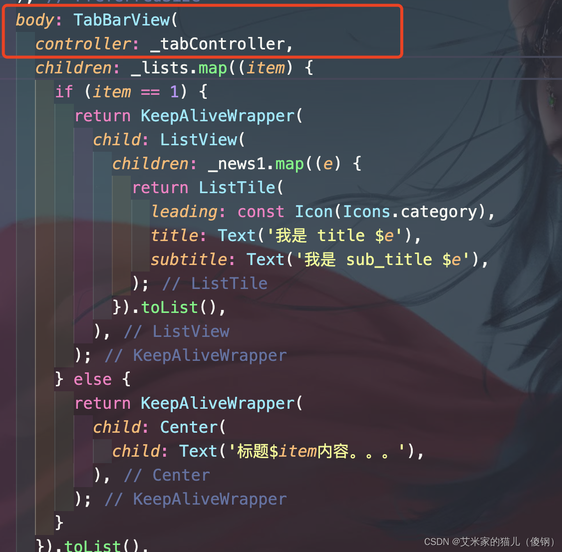
2. 自定义KeepAliveWrapper 缓存页面;

2.1 定义keepAliveWrapper.dart 文件;

import 'package:flutter/material.dart';

class KeepAliveWrapper extends StatefulWidget {
  const KeepAliveWrapper(
      {Key? key,  this.child, this.keepAlive = true})
      : super(key: key);
  final Widget? child;
  final bool keepAlive;
  
  State<KeepAliveWrapper> createState() => _KeepAliveWrapperState();
}

class _KeepAliveWrapperState extends State<KeepAliveWrapper>
    with AutomaticKeepAliveClientMixin {
  
  Widget build(BuildContext context) {
    return widget.child!;
  }

  
  bool get wantKeepAlive => widget.keepAlive;
  
  void didUpdateWidget(covariant KeepAliveWrapper oldWidget) {
    if (oldWidget.keepAlive != widget.keepAlive) {
      // keepAlive 状态需要更新,实现在 AutomaticKeepAliveClientMixin 中
      updateKeepAlive();
      super.didUpdateWidget(oldWidget);
    }
  }
}

2.2 使用

// 引入你自己的路径 记得替换

import '../../util/keepAliveWrapper.dart'; // 引入你自己的路径  记得替换

// 要缓存数据的组件包起来

KeepAliveWrapper(
  child: Center(
    child: Text('标题$item内容。。。'),
  ),
)

3. 底部导航切换;

4. 自定义中间大导航;

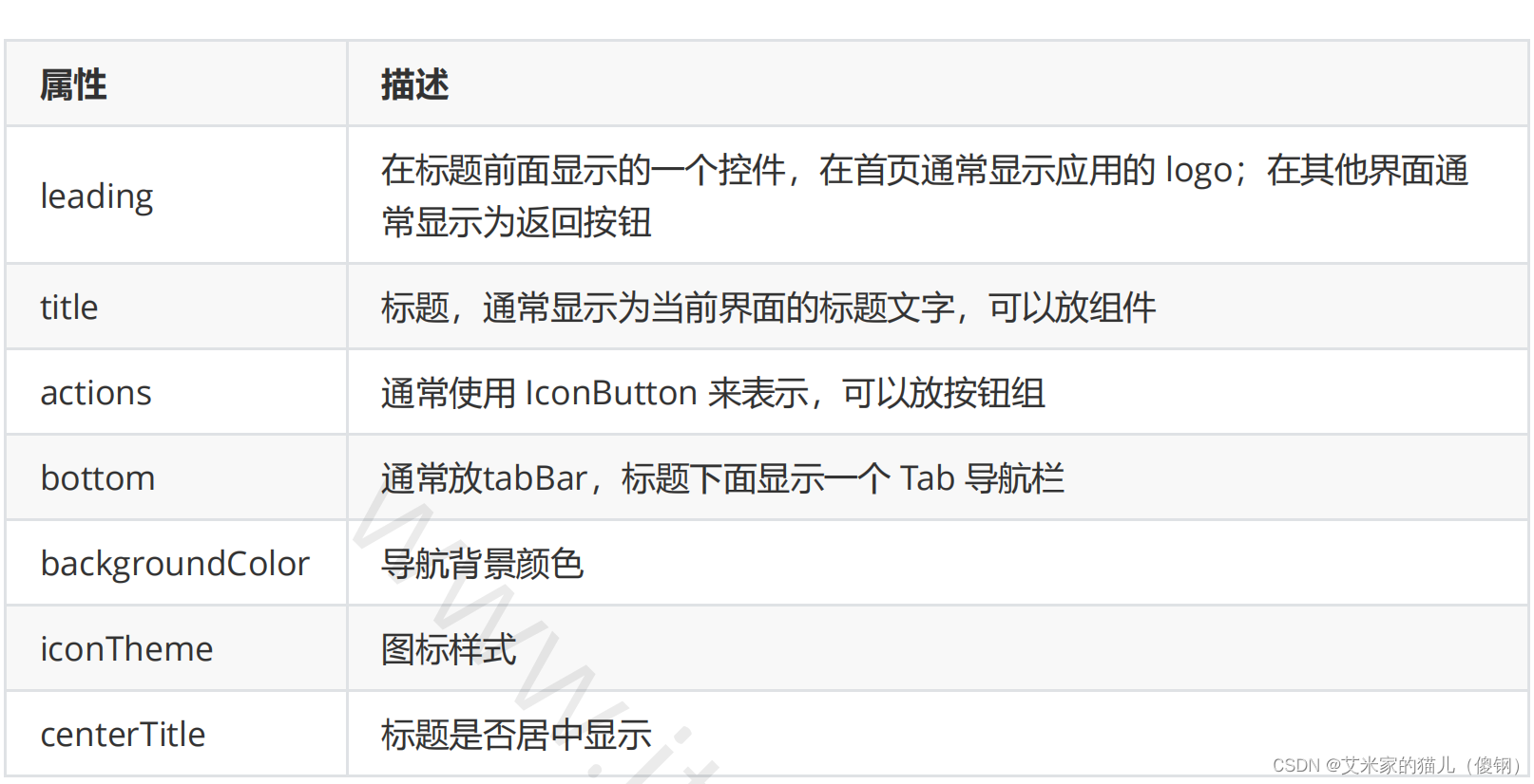
5.AppBar自定义顶部按钮图标、颜色

在这里插入图片描述

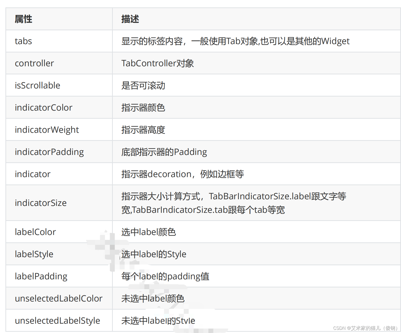
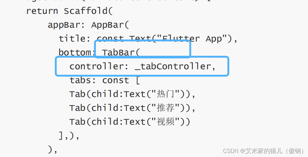
6. Tabbar TabBarView实现类似头条顶部导航

在这里插入图片描述

6. 1.混入SingleTickerProviderStateMixin

class _HomePageState extends State<HomePage> with SingleTickerProviderStateMixin{}

6.2.定义TabController

late TabController _tabController;

  void initState() {
    super.initState();
    _tabController = TabController(length: _lists.length, vsync: this); // 初始化长度
    _tabController.addListener(() {
      if (_tabController.animation!.value == _tabController.index) {
        print('${_tabController.animation!.value} --- ${_tabController.index}');
      }
    });
  }

6.3、配置TabBar和TabBarView 都需要配置 controller(自查别漏了)

在这里插入图片描述
在这里插入图片描述
在这里插入图片描述

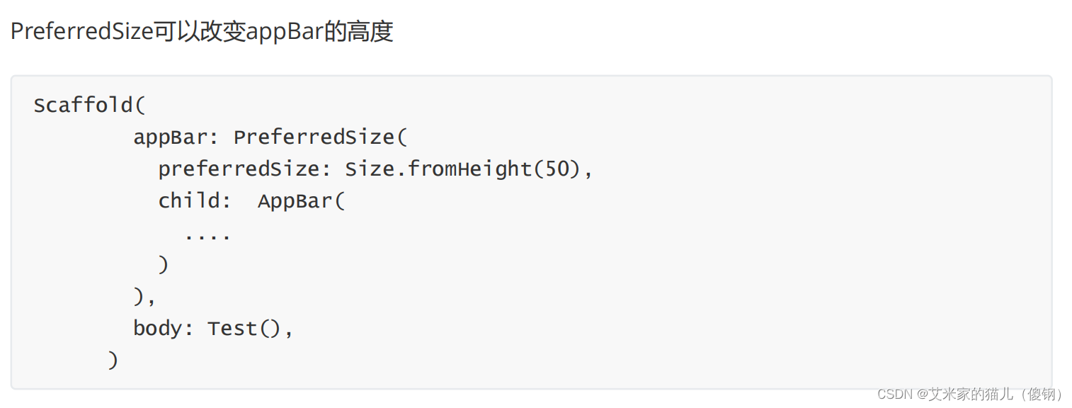
7.Scaffold 中可以使用Scaffold 如何重新自定义第二个Scaffold

7.1 PreferredSize可以改变appBar的高度,再给TabBar 包一个 sizebox 即可!

在这里插入图片描述

在这里插入图片描述
git地址

  • 0
    点赞
  • 2
    收藏
    觉得还不错? 一键收藏
  • 0
    评论
Flutter中,可以通过自定义Widget来创建一个自定义的Tab组件。首先,我们可以创建一个自定义的Tab类,继承自StatefulWidget,并实现它的build方法。 ```dart class CustomTab extends StatefulWidget { final String title; final bool isSelected; final Function onTap; CustomTab({required this.title, required this.isSelected, required this.onTap}); @override _CustomTabState createState() => _CustomTabState(); } class _CustomTabState extends State<CustomTab> { @override Widget build(BuildContext context) { return GestureDetector( onTap: widget.onTap, child: Container( color: widget.isSelected ? Colors.blue : Colors.transparent, child: Text( widget.title, style: TextStyle( fontSize: 16, color: widget.isSelected ? Colors.white : Colors.black, ), ), ), ); } } ``` 在这个自定义Tab类中,我们需要传入三个参数:title(标签的标题),isSelected(标签是否被选中),onTap(点击标签的回调方法)。 接下来,我们可以在TabBar中使用这个自定义Tab组件。 ```dart class MyHomePage extends StatefulWidget { @override _MyHomePageState createState() => _MyHomePageState(); } class _MyHomePageState extends State<MyHomePage> with SingleTickerProviderStateMixin { late TabController _tabController; @override void initState() { super.initState(); _tabController = TabController(length: 3, vsync: this); } @override Widget build(BuildContext context) { return Scaffold( appBar: AppBar( title: Text('Custom Tab'), ), body: Column( children: [ TabBar( controller: _tabController, tabs: [ CustomTab( title: 'Tab 1', isSelected: _tabController.index == 0, onTap: () { _tabController.animateTo(0); }, ), CustomTab( title: 'Tab 2', isSelected: _tabController.index == 1, onTap: () { _tabController.animateTo(1); }, ), CustomTab( title: 'Tab 3', isSelected: _tabController.index == 2, onTap: () { _tabController.animateTo(2); }, ), ], ), Expanded( child: TabBarView( controller: _tabController, children: [ Center(child: Text('Content 1')), Center(child: Text('Content 2')), Center(child: Text('Content 3')), ], ), ), ], ), ); } } ``` 在这个例子中,我们使用TabBar和TabBarView来显示标签和对应的内容。自定义的Tab组件被作为TabBar的child组件传入。TabBar接收一个TabController来管理标签的切换。每个自定义Tab组件通过传入isSelected参数来判断自身是否被选中,并通过onTap回调方法来触发点击事件并切换标签。

“相关推荐”对你有帮助么?

  • 非常没帮助
  • 没帮助
  • 一般
  • 有帮助
  • 非常有帮助
提交
评论
添加红包

请填写红包祝福语或标题

红包个数最小为10个

红包金额最低5元

当前余额3.43前往充值 >
需支付:10.00
成就一亿技术人!
领取后你会自动成为博主和红包主的粉丝 规则
hope_wisdom
发出的红包
实付
使用余额支付
点击重新获取
扫码支付
钱包余额 0

抵扣说明:

1.余额是钱包充值的虚拟货币,按照1:1的比例进行支付金额的抵扣。
2.余额无法直接购买下载,可以购买VIP、付费专栏及课程。

余额充值