


第四十六课 CSS选择器
一,标签选择器:(TAG选择器)
使用的场景:
a, 去掉某些标签的默认样式时
b,复杂的选择器中,如层次选择器
二,群组选择器(分组选择器)
可以通过逗号的方式,给多个不同的选择器添加统一的css样式,来达到代码的复用
三,通配选择器
<!DOCTYPE html>
<html lang="en">
<head>
    <meta charset="UTF-8">
    <meta http-equiv="X-UA-Compatible" content="IE=edge">
    <meta name="viewport" content="width=device-width, initial-scale=1.0">
    <title>Document</title>
<style>
        *{ border:1px red solid;}
</style>
</head>
<body>
    <h1>标题</h1>
    <h2>第一段</h2>
    <div>这是第二段</div>
</body>
</html>

第四十七课 层次选择器
后代:M N
父子:M>N
兄弟:M~N
相邻:M+N
<!DOCTYPE html>
<html lang="en">
<head>
    <meta charset="UTF-8">
    <meta http-equiv="X-UA-Compatible" content="IE=edge">
    <meta name="viewport" content="width=device-width, initial-scale=1.0">
    <title>Document</title>
<style>
      div h4 {border: 1px; color: red;}
</style>
</head>
<body>
    <div>第一段</div>
    <p>第二段</p>
    <h2>第三段</h2>
    <h3>
        <h4>第四段</h4>
        <h4>第五段</h4>
        <h4>第六段</h4>
    </h3>
    <div>
        <h4>第七段</h4>
        <h4>第八段</h4>
        <h4>第九段</h4>
    </div>
    <h4>第十段</h4>
</body>
</html>
例如

层次选择器基本样式:
标签(如div,p,h标签,span)
符号(如后代类的空格,>,+,~)
标签(同1)
{}(花括号)里面即为所需添加的样式
基本样式写法即为标签,符号,标签{}
示例: div h4 {border: 1px; color: red;}
第四十八课 CSS选择器 属性选择器
基本语言
M [attr] {}
例如
div[class*=search]{background: red;}
其中
=:完全匹配
*=:部分匹配
^=起始匹配
$=结束匹配
[][][][]:组合属性 例如div[class="" id=""]{background: red;}
属性选择器基本样式
标签
[选择(例如class*=search)]
{所需添加的样式}
示例: div[class*=search]{background: red;}
第四十九课 CSS选择器 伪类选择器
:link ————→访问前的样式 (只能添加给a标签)
:visited————→访问后的样式 (只能添加给a标签)
:hover————→鼠标移入时的样式 (可以添加给所有的标签)
:active————→鼠标按下时的样式 (可以添加给所有的标签)
注:
一般网站都只设置如下
a{} (link visited active)a:hover{}
<!DOCTYPE html>
<html lang="en">
<head>
    <meta charset="UTF-8">
    <meta http-equiv="X-UA-Compatible" content="IE=edge">
    <meta name="viewport" content="width=device-width, initial-scale=1.0">
    <title>Document</title>
    <style>
a{color: gray;}
a:hover{color: blue; }

    </style>
</head>
<body>
   <a href="https://cet-bm.neea.edu.cn/">英语四级报名</a>

</body>
</html>

第五十课 CSS选择器 after等伪类选择器
一,after before
:after :before:通过伪类的方式给元素添加一段文本内容,使用content属性
<!DOCTYPE html>
<html lang="en">
<head>
    <meta charset="UTF-8">
    <meta http-equiv="X-UA-Compatible" content="IE=edge">
    <meta name="viewport" content="width=device-width, initial-scale=1.0">
    <title>Document</title>
    <style>
div:after{ content:"world";color:red}
    </style>
</head>
<body>
<div>hello</div>

</body>
</html>
如下

二,checked,disabled,focus
针对表单元素
<!DOCTYPE html>
<html lang="en">
<head>
<meta charset="UTF-8">
<meta http-equiv="X-UA-Compatible" content="IE=edge">
<meta name="viewport" content="width=device-width, initial-scale=1.0">
<title>Document</title>
<style>
:checked{width: 100px;height: 100px;}
</style>
</head>
<body>
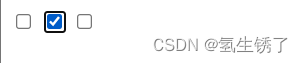
<input type="checkbox" >
<input type="checkbox" >
<input type="checkbox" >
</body>
</html>
如图所示,选择之后的复选框变成了css中被加上checked的css语言的样式

第五十一课 结构性伪类选择器
一,基本语言
:nth-of-type()    :nth-child()   括号中含有角标,角标例如:nth-of-type(3),表示第三行
:first-of-type    :first-child   表示第一行
:last-of-type    :last-child   表示最后一行
:only-of-type    :only-child   当只有一行时才会显示效果
区别:
type:类型(例如一个项目中某一类项目的第几个)
child:子项(一个项目中第几项)
伪类选择器基本样式
标签(如div,h2,p)
伪类选择器
{所需添加样式}
示例
a:hover{color: blue; }
div:after{ content:“world”;color:red}
li:nth-of-type(3){background-color: red;}
第五十二课 CSS样式继承
文字相关的样式可以被继承
布局相关的样式不能被继承
<!DOCTYPE html>
<html lang="en">
<head>
    <meta charset="UTF-8">
    <meta http-equiv="X-UA-Compatible" content="IE=edge">
    <meta name="viewport" content="width=device-width, initial-scale=1.0">
    <title>Document</title>
    <style>
div{ width: 200px; height:200px ;border: 3px red solid;color:red;font-size: 30px;}
    </style>
</head>
<body>
<div>
    <p>这是一个段落</p>
</div>
</body>
</html>
效果如下

此时<p>标签继承了<div>标签的文字样式,而没有继承布局样式,如果需要让<p>标签再继承布局样式,则在css区块的div标签下加入如下段落
<style>
div{ width: 200px; height:200px ;border: 3px red solid;color:red;font-size: 30px;}
 </style>
p{ border:inherit;}
第五十三课 CSS优先级
一,相同样式优先级
当设置相同样式时,后面的优先级较高,但不建议出现重复设置样式的情况
<!DOCTYPE html>
<html lang="en">
<head>
    <meta charset="UTF-8">
    <meta http-equiv="X-UA-Compatible" content="IE=edge">
     <meta name="viewport" content="width=device-width, initial-scale=1.0">
    <title>Document</title>
    <style>
        div{color: green;}
        div{color: red;}

    </style>
</head>
<body>
    <div>这是一个段落</div>
</body>
</html>

二,内部样式与外部样式
内部样式与外部样式优先级相同,如果都设置了相同样式,那么后写的引入方式优先级高
三,单一样式优先级
style>id>class>tag>*>继承
第五十四课 CSS优先级
一,!important
提升样式优先级,非规范方式,、不建议使用(不能针对继承的属性进行优先级的提升)
二,标签+类与单类
标签+类>单类
群组优先级
群组选择器与单一选择器优先级相同,靠后的优先级高
第五十五课 CSS优先级
一,层次优先级
1,权重比较
ul li .box p input{} 1+1+10+1+1
.hello span #elem{} 10+1+100
权重不能相加,只是比较的一种方式:100*1<10
2,约分比较
同级标签互相约去比较级别高低
第五十六课 CSS盒子模型
一,组成:content→padding→border→margin
1,content:内容区域 width和height组成的
2,padding:内边距(内填充)
只写一个值:30px(上下左右)
写两个值:30px 40px( 上下 左右)
写四个值:20px 30px 40px 50px(上 下 左 右)单一样式只能写一个值
padding-left
padding-right
padding-top
padding-bottom
3,margin:外边距(外填充)
只写一个值:30px(上下左右)
写两个值:30px 40px( 上下 左右)
写四个值:20px 30px 40px 50px(上 下 左 右)单一样式只能写一个值
margin-left
margin-right
margin-top
margin-bottom
注:
1,背景色填充到margin以内的区域(不包含margin区域)
2,文字在content区域添加
3,padding不能为负数,而margin可以为负数
二,盒子模型写法
此类属性在css语句中{}内部 例如#box{width: 300px;height: 500px;background-color: red;border: 5px blue solid; padding :10px 100px 500px 50px;}
第五十七课 CSS盒模型基本大小
box-sizing
盒尺寸,可以改变盒子模型的展示形态
正常:width,height作用于→content
border-box:width,height作用于→content padding border
当使用border-box时,设置的width或者height值的效果同时作用于content padding border,即content padding border的width或者height值相加是设置的值
box-sizing使用样式
此类属性在css语句中{}内部 例如#box{width: 300px;height: 500px;background-color: red;border: 5px blue solid; padding :10px ;box-sizing:content-box}
其中(box-sizing:content-box)中的content-box可以与border-box替换
第五十八课 盒模型之margin叠加问题
一,margin叠加问题,出现在上下
margin同时存在的时候,会取上下中值较大的作为叠加的值
<!DOCTYPE html>
<html lang="en">
<head>
    <meta charset="UTF-8">
    <meta http-equiv="X-UA-Compatible" content="IE=edge">
    <meta name="viewport" content="width=device-width, initial-scale=1.0">
    <title>Document</title>
    <style>
        #box1{ width: 300px; height: 200px; background-color: red; margin-bottom: 30px;}
        #box2{ width: 300px; height: 200px; background-color: blue;margin-bottom: 50px;}
    </style>
</head>
<body>
    <div id="box1"></div>
    <div id="box2"></div>
</body>
</html>
如下

二,解决方案
1,BFC规范
2,想办法只给一个元素添加间距
第五十九课 盒模型之margin的传递问题
一,,叠加问题:出现在嵌套的结构中,只是针对margin-top的问题
<!DOCTYPE html>
<html lang="en">
<head>
<meta charset="UTF-8">
<meta http-equiv="X-UA-Compatible" content="IE=edge">
<meta name="viewport" content="width=device-width, initial-scale=1.0">
<title>Document</title>
<style>
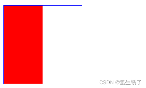
#box1{ width: 300px; height: 200px; background-color: red; }
#box2{ width: 100px; height: 100px; background-color: blue;margin-top: 100px;}
</style>
</head>
<body>
<div id="box1">
<div id="box2"></div>
</div>
</body>
</html>
问题示例如下

如图所示,代码中希望蓝色区块向下移动100px,而当蓝色区块移动的同时,红色区块也向下移动了。这种现象在margin-right ,left,bottom均不会出现。
二,解决方案
1,BFC规范
2,给父容器加边框
      #box1{ width: 300px; height: 200px; background-color: red;border: 5px black solid;}
        #box2{ width: 100px; height: 100px; background-color: blue;margin-top: 100px;}
3,将margin换成padding
 #box1{ width: 300px; height: 200px; background-color: red; padding-top: 100px;}
        #box2{ width: 100px; height: 100px; background-color: blue;}
第六十课 CSS盒模型margin盒子模型扩展
一,margin左右自适应是可以的,但是上下自适应是不行的。(如果想要实现上下自适应,需要在第二部分学习)
二,width,height不设置的时候,对盒子模型的影响,会自动去计算容器的大小,节省代码
第六十一课 CSS盒子模型示例
<!DOCTYPE html>
<html lang="en">
<head>
    <meta charset="UTF-8">
    <meta http-equiv="X-UA-Compatible" content="IE=edge">
    <meta name="viewport" content="width=device-width, initial-scale=1.0">
    <title>Document</title>
    <style>
        #box1{ width: 500px; height: 500px; background-color: red;border: 5px black solid;padding: 30px 40px 60px 70px;}
        #box3{ width: 400px; height: 400px; background-color: blue;border: 4px yellow dashed;padding: 70px 60px 40px 30px}
        #box4{ width: 300px; height: 300px; background-color: green;border: 3px chocolate dotted;padding: 60px 70px 40px 30px}
        #box5{ width: 200px; height: 200px; background-color: khaki;border: 2px silver solid;padding: 70px 30px 40px 60px}
        #box6{ width: 100px; height: 100px; background-color: blueviolet;border: 1px lightcoral dotted;padding: 50px}
        #box7{ width: 10px; height: 10px; background-color: lightpink;border: 1px lightcoral dashed;padding: 50px}
    </style>
</head>
<body>
    <div id="box1">
        <div id="box2">
            <div id="box3">
                <div id="box4">
                    <div id="box5">
                        <div id="box7"></div>
                    </div>
                </div>
            </div>
        </div>
    </div>

</body>
</html>
示例如下

第六十二课 标签分类 按类型
一,类型
A,block:块
div p ul li h1…
a,块的特性:独占一行
b,支持所有样式
c,不写宽的时候更父元素的宽度相同
d,所占区域是一个矩形
<!DOCTYPE html>
<html lang="en">
<head>
    <meta charset="UTF-8">
    <meta http-equiv="X-UA-Compatible" content="IE=edge">
    <meta name="viewport" content="width=device-width, initial-scale=1.0">
    <title>Document</title>
<style>
    #box1,#box2{width: 100px;height: 100px;background-color: red;}
</style>
</head>
<body>
    <div id="box1">块1</div>
    <div id="box2">块2</div>

</body>
</html>

B,inline:内联
span a em strong img…
a,挨在一起的
b,有些样式不支持,例如width,height ,margin,padding
c,不写宽的时候,宽由内容绝定
d,所占区域不一定是矩形(自动转行时)
e,内联标签之间会有空隙,原因:换行产生的
<!DOCTYPE html>
<html lang="en">
<head>
    <meta charset="UTF-8">
    <meta http-equiv="X-UA-Compatible" content="IE=edge">
    <meta name="viewport" content="width=device-width, initial-scale=1.0">
    <title>Document</title>
<style>
    #box1,#box2{width: 100px;height: 100px;background-color: red;}
</style>
</head>
<body>
    <span id="box1">内联1</span>
    <span id="box2">内联2</span>

</body>
</html>
示例如下

经观察发现width,height 在该标签中不支持
C,inline-block:内联块
input select…
a,挨在一起,但支持宽高。
<!DOCTYPE html>
<html lang="en">
<head>
    <meta charset="UTF-8">
    <meta http-equiv="X-UA-Compatible" content="IE=edge">
    <meta name="viewport" content="width=device-width, initial-scale=1.0">
    <title>Document</title>
<style>
    #content1,#content2{width: 100px;height: 100px;background-color: red;}
    input{width: 100px;height: 100px;}
</style>
</head>
<body>
    <span id="content1">内联1</span>
    <span id="content2">内联2</span>
    <input type="text">
    <input type="text">

</body>
</html>
示例如下

二,注
布局一般用块标签,修饰文本用内联标签
第六十三课 标签分类 按内容
Flow:流内容
Metadata:元数据
Secioning:分区
Heading:标题
Phrasing:措辞
Embedded:嵌入的
Interactive: 互动的
详情查看网址:https://www.w3.org/TR/html5/dom.html
第六十四课 标签分类 按显示
一,替换与非替换元素
替换元素:浏览器根据元素的标签和属性,来决定元素的具体显示内容。
img ,input。。。
非替换元素:将内容直接告诉浏览器,将其显示出来。
div,h1,p。。。
第六十五课 显示框类型
一,display
1,block
2,inline
3,inline-block
4,none
<!DOCTYPE html>
<html lang="en">
<head>
    <meta charset="UTF-8">
    <meta http-equiv="X-UA-Compatible" content="IE=edge">
    <meta name="viewport" content="width=device-width, initial-scale=1.0">
    <title>Document</title>
    <style>
        div{width: 100px;height: 100px;background-color: red;display: inline;}
    </style>
</head>
<body>
    <div>块1 </div>
    <div>块2 </div>

</body>
</html>

这本来是一个block块状类型的,但是在div{}添加display,使其变成内联式的
二,使用方法
div{width: 100px;height: 100px;background-color: red;display: inline;
其中
二,注意
隐藏样式
display:none:不占空间的隐藏
visibility:hidden:占空间的隐藏
第六十六课 标签嵌套规范
一,块标签可以嵌套内联标签
  <div>
        <span></span>
        <a href=""></a>
    </div>
二,块嵌套块
 <div>
     <div>  </div>
</div>
特殊:错误的写法
<p>
      <div></div>
</p>
三,内联不能嵌套块 (a标签是一个例外)
错误的写法:
<span>
   <div></div>
</span>
特殊:
正确的写法:<a href="a"> <div></div> </a>
四,一些固定的嵌套
ul li
dl dt dd
table tr td
第六十七课 溢出隐藏
一,基本语言
overflow:
visible:默认
hidden:直接隐藏
scroll:会设置出x和y轴
auto:根据内容多少自动设置出x与y轴
<!DOCTYPE html>
<html lang="en">
<head>
    <meta charset="UTF-8">
    <meta http-equiv="X-UA-Compatible" content="IE=edge">
    <meta name="viewport" content="width=device-width, initial-scale=1.0">
    <title>Document</title>
    <style>
        div{width: 150px;height:    150px;color: red;overflow:scroll;}
    </style>
</head>
<body>
    <div>溢出隐藏 溢出隐藏 溢出隐藏 溢出隐藏 溢出隐藏 溢出隐藏 溢出隐藏 溢出隐藏 溢出隐藏 溢出隐藏 溢出隐藏 溢出隐藏 溢出隐藏 溢出隐藏 溢出隐藏 溢出隐藏 溢出隐藏 溢出隐藏 溢出隐藏 溢出隐藏 溢出隐藏 溢出隐藏 溢出隐藏 溢出隐藏 溢出隐藏 溢出隐藏 溢出隐藏 溢出隐藏 溢出隐藏 溢出隐藏 溢出隐藏 溢出隐藏 溢出隐藏 溢出隐藏 溢出隐藏 溢出隐藏 溢出隐藏 溢出隐藏 溢出隐藏 溢出隐藏 溢出隐藏 溢出隐藏 溢出隐藏 溢出隐藏 溢出隐藏 溢出隐藏 溢出隐藏 溢出隐藏 溢出隐藏 溢出隐藏 溢出隐藏 溢出隐藏 溢出隐藏 溢出隐藏 溢出隐藏 溢出隐藏 溢出隐藏 溢出隐藏 溢出隐藏 溢出隐藏 溢出隐藏 溢出隐藏 溢出隐藏 溢出隐藏 溢出隐藏 溢出隐藏 溢出隐藏 溢出隐藏 </div>
</body>
</html>

二,基本样式
div{width: 150px;height: 150px;color: red;overflow:scroll;}
其中 scroll可以替换成visible hidden auto
第六十八课 透明度与手势
一,基本语言
1, opacity:o(透明)~1(半透明) 0.5(半透明)
<!DOCTYPE html>
<html lang="en">
<head>
    <meta charset="UTF-8">
    <meta http-equiv="X-UA-Compatible" content="IE=edge">
    <meta name="viewport" content="width=device-width, initial-scale=1.0">
    <title>Document</title>
    <style>
        div{width: 150px;height:    150px;background-color: red;opacity: 0.5;}
    </style>
</head>
<body>
    <div>这是一个块</div>

</body>
</html>

注:占空间,所有的子内容也会透明
2,rgba() :o(透明)~1(半透明) 0.5(半透明)
<!DOCTYPE html>
<html lang="en">
<head>
    <meta charset="UTF-8">
    <meta http-equiv="X-UA-Compatible" content="IE=edge">
    <meta name="viewport" content="width=device-width, initial-scale=1.0">
    <title>Document</title>
    <style>
        div{width: 150px;height:    150px;background-color: rgba(255,0,0,0.5);}
    </style>
</head>
<body>
    <div>这是一个块</div>

</body>
</html>

3,鼠标指针样式(手势)
A,默认样式
default :默认箭头
pointer:手形
move:移动型指针
help:帮助型指针
B,自定义样式
准备图片、
准备的图片必须是
.cur或者是.ico格式
二,基本样式
1,opacity的基本样式
div{width: 150px;height: 150px;background-color: red;opacity: 0.5;}
其中 opacity: 0.5;中的0.5可以在0~1之间改变, 调节透明度
2,rgba的基本样式
div{width: 150px;height: 150px;background-color: rgba(255,0,0,0.5);}
其中,rgba(255,0,0,0.5);中最后一个维度可以改变(最后一个维度即为最后一个数字0.5)可以在0~1之间改变, 调节透明度
3 ,手势样式
手势样式与div标签平行,也在style标签里面手势标签的样式如下
cursor:pointer
其中,pointer可以与default move help互换,也可以换成
cursor:url( ./img/文件名.ico)
这里的文件名.ico也可以是文件名.cur
第六十九课 最小,最大宽高
一,容器的最小,最大宽高
min-width,max-width
min-height,max-height
注;强化对百分比单位的理解
<!DOCTYPE html>
<html lang="en">
<head>
    <meta charset="UTF-8">
    <meta http-equiv="X-UA-Compatible" content="IE=edge">
    <meta name="viewport" content="width=device-width, initial-scale=1.0">
    <title>Document</title>
    <style>
        div{ width: 200px; max-height: 50px;border: 5px red solid; }
    </style>
</head>
<body>
    <div>
        最大高度最大高度
        最大高度最大高度
        最大高度最大高度
        最大高度最大高度
        最大高度最大高度
        最大高度最大高度
        最大高度最大高度
        最大高度最大高度
        最大高度最大高度
        最大高度最大高度
    </div>
</body>
</html>
如下所示,如果文本超过了设定的宽高,那么文本内容会溢出,但当文本未超过设定的值时,div的框会自适应文本大小并改变框的高度与宽度

二,如果想让容器适应屏幕的高
给div的父容器(body)添加宽与高,给body的父容器(html)添加宽与高
{都是为100%}如下
        html{width: 100%; height: 100%; }
        body{width: 100%; height: 100%;}
        div{ width: 100%; min-height: 100% ;border: 5px red solid;background-color: blue; }
之后便可得到覆盖全屏幕的网页,如下

第七十课 CSS默认样式
有些标签有默认样式,有些标签没有默认样式
一,没有默认样式
span,div
二,有默认样式
body:
有margin 8px
h1:
有margin :上下21.44px
font-weight:boldp:
有margin :上下16px
ul:
margin:上下16px
padding:左40px 默认点
默认点:list-style:disca
text-decoration:underline
第七十一课 CSS默认样式(CSS reset)
去除默认样式方法
1,*{margin:0;padding:0;}
优点:不用考虑那些标签有默认的margin和padding
缺点:稍微的影响性能
解决方案:以含有margin,padding的标签为例
body,p,h1,ul{margin:0;padding:0}
2,ul{list-style:none;}
删去列表前面的点
3,a{text-decotation:none;color;#666}
删除a标签下面的下划线,
4,img{display:block;}
问题的现象:图片跟容器底部有一些空隙。
内联元素的对齐方式是按照文字基线对齐的,而不是文字底线
解决方式
1,
img{vertical-align:baseline;}:基线对齐方式,默认值
2,img{vertical-align;bottom;}
3,转换成块`img{display:block;}
第七十八课 float流动 概念及原理
一,文档流
文档流是文档中可显示对象在排列时所占用的位置。
float特性:加浮动的元素,会脱离文档流,会延迟父容器靠左或靠右排列,如果之前已经有浮动的元素,会挨着浮动的元素进行排列
float取值
left
right
none(默认)
二,使用样式及示例
<!DOCTYPE html>
<html lang="en">
<head>
    <meta charset="UTF-8">
    <meta http-equiv="X-UA-Compatible" content="IE=edge">
    <meta name="viewport" content="width=device-width, initial-scale=1.0">
    <title>Document</title>
    <style>
    #box1{width: 100px;height: 100px;background: red; float: left;}
    #box2{width: 200px;height: 200px;
    background: blue;}
    </style>
</head>
<body>
    <div id="box1" ></div>
    <div id="box2" ></div>
</body>
</html>
注意观察#box1{width: 100px;height: 100px;background: red; float: left;}
可以发现,代码 float: left;,表示悬浮于左侧
如图

第七十九课 float流动
一,float注意点
1,只会影响后面的元素。
2,内容默认提升半层。
3,默认宽根据内容决定
<!DOCTYPE html>
<html lang="en">
<head>
    <meta charset="UTF-8">
    <meta http-equiv="X-UA-Compatible" content="IE=edge">
    <meta name="viewport" content="width=device-width, initial-scale=1.0">
    <title>Document</title>
    <style>
     #box1{width: 50px;height: 50px; background-color: yellow;}
    #box2{width: 100px;height: 100px;background: red; float: left;}
    #box3{width: 200px;height: 200px;
    background: blue;}
    #box4{background-color: green;float: left;}
    </style>
</head>
<body>
    <div id="box1"></div>
    <div id="box2">浮动只会影响后面的元素,会漂浮在蓝色盒子是上面,而不会漂浮到前面的黄色盒子上</div>
    <div id="box3">内容默认提升半层,因此内容在蓝色的上面而不会漂浮到红色的上面</div>
    <div id="box4" >默认宽根据内容决定</div>
</body>
</html>
1~3 示例

4,换行排列
5,主要给块元素添加,但也可以给内联元素添加
下面示例中span也可以添加浮动样式
<!DOCTYPE html>
<html lang="en">
<head>
    <meta charset="UTF-8">
    <meta http-equiv="X-UA-Compatible" content="IE=edge">
    <meta name="viewport" content="width=device-width, initial-scale=1.0">
    <title>Document</title>
    <style>
ul{margin: 0; padding:0; list-style:none; width: 300px;height: 300px; background-color: royalblue;}
li{width: 100px;height: 100px; list-style:none;background-color: red;float: left;}
span:last-of-type{float: right;}
    </style>
</head>
<body>
<ul>
<li>四块红色的块都使用了漂浮样式</li>
<li>红色的块都是按顺序排列的</li>
<li>漂浮排列的块都满足换行排列</li>
<li>4</li>
</ul>
<span>1</span>
<span>2</span>
</body>
</html>
如下所示

第八十课与八十一课 清除float流动
一,浮动的清除类型
1,上下排列的清除
使用clear属性,表示清除浮动的语言如下
left:清除左浮动
right:清除右浮动
both:清除所有的浮动
2,嵌套排列
a,固定宽高:不推荐,不能把高度固定死,不适合做自适应的效果
b,父元素浮动:不推荐,因为父元素浮动也会影响到后面的元素
c,overflow:hidden(BFC)规范,如果有子元素想溢出,那么会受到影响
d,display:inline-block(BFC)规范,不推荐,父容器会影响到后面的元素。
e,设置空标签:不推荐,会多添加一个标签。
f,after伪类:推荐,是空标签的加强版,目前各大公司的做法。
二,浮动的清除的表达样式
1,上下排列clear清除
  #box1{width: 100px;height: 100px;background-color: red;float: left;}
  #box2{width: 200px;height: 200px;background: blue;clear: both;}
2,嵌套排列
a,固定宽高
 #box1{ width: 200px;border: 5px black solid;}
 #box2{ width: 100px;height: 200px;background: red;}
 <div id="box1">
         <div id="box2"></div>
    </div>
如下所示,在此类情况下,外层的box1的高度是由内层决定的

b,给父元素添加浮动
 #box1{ width: 200px;border: 5px black solid; float: left;}
 #box2{ width: 100px;height: 200px;background: red; float: left;}
  <div id="box1">
        <div id="box2"></div>
    </div>
父容器浮动之前

父容器浮动后

c d,overflow:hidden与display:inline-block
#box2{width: 100px;height: 200px;background: red;overflow:hidden}
其中,overflow:hidden与display:inline-block可以互换
e,设置空标签
 #box1{width: 200px;border: 1px blue solid;}
        #box2{width: 100px;height: 200px;background: red;float: left;}
        .clear{clear: both;}
<div id="box1">
        <div id="box2"></div>
        <div class="clear"></div>
    </div>

f,after伪类
  #box1{width: 200px;border: 1px blue solid;}
        #box2{width: 100px;height: 200px;background: red;float: left;}
        .clear:after{`content:''`; clear: both; display: block;}
<div id="box1" class="clear">
        <div id="box2"></div>
    </div>
content: ' '表示下面的内容是空的
clear: both;:表示清除浮动样式
display: block;:表示将内联样式转化成块


 4075
4075


 被折叠的 条评论
为什么被折叠?
被折叠的 条评论
为什么被折叠?
 到【灌水乐园】发言


