


位移 translate
translate可以让盒子沿着x轴或者y轴来移动。
语法:
transform: translate(x, y);
transform: translateX(x);
transform: translateY(y);
问题:
-
他和margin的区别:
-
margin移动盒子会影响其余的盒子。把其他人挤走。
-
位移translate移动盒子不会影响其他的盒子。不脱标。
-
位移经常需要的场景:
-
比如 盒子上下移动不影响其他盒子
-
盒子水平和垂直居中,写法简单
-
轮播图的动画效果
-
-
注意:
移动的时候可以写百分比,如果使用的百分比,移动的是盒子自身的宽度
transform: translateX(100%);
应用- 盒子水平和垂直
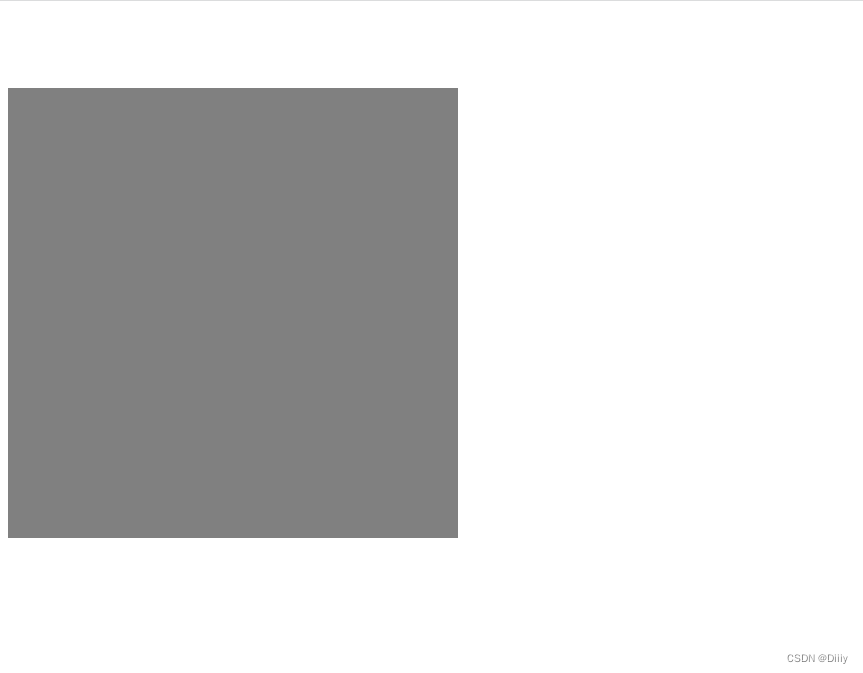
<!DOCTYPE html>
<html lang="en">

<head>
    <meta charset="UTF-8">
    <meta http-equiv="X-UA-Compatible" content="IE=edge">
    <meta name="viewport" content="width=device-width, initial-scale=1.0">
    <title>Document</title>
    <style>
        div {
            width: 300px;
            height: 300px;
            background-color: gray;

            /* margin会影响盒子下面的元素  translate不会影响,类似于相对定位  */
            transform: translateY(50px);
        }
    </style>
</head>

<body>
    <div></div>
    123
</body>

</html>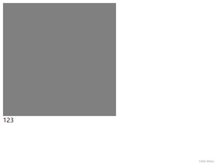
旋转 rotate
旋转可以让盒子旋转角度。
语法:
transform: rotate(45deg); 一定写单位
如果是正度数,则是顺时针旋转
如果是负度数,则是逆时针旋转
设置中心点 transform-origin
/* 设置旋转的中心点位置 */
transform-origin: right bottom;
注意: 如果有移动和旋转,记得先写移动再写旋转,属性不按顺序会影响代码执行.
transform: translate(-50%, -50%) rotate(360deg);
缩放 scale
语法:
transform: scale(1.5);
它比这宽度和高度最大的优势: 他是用中心点来进行缩放的,同样他不会影响其他的盒子。
线性渐变(了解)
<!DOCTYPE html>
<html lang="en">

<head>
    <meta charset="UTF-8">
    <meta http-equiv="X-UA-Compatible" content="IE=edge">
    <meta name="viewport" content="width=device-width, initial-scale=1.0">
    <title>Document</title>
    <style>
        div {
            width: 300px;
            height: 300px;
            margin: 0 auto;
            /* 透明渐变黑色半透明 */
            background-image: -webkit-linear-gradient(left top, transparent, rgba(0, 0, 0, .5));
            /* 透明渐变白色半透明 */
            background: linear-gradient(transparent, rgba(255, 255, 255, .5));
        }
    </style>
</head>

<body>
    <div></div>
</body>

</html>
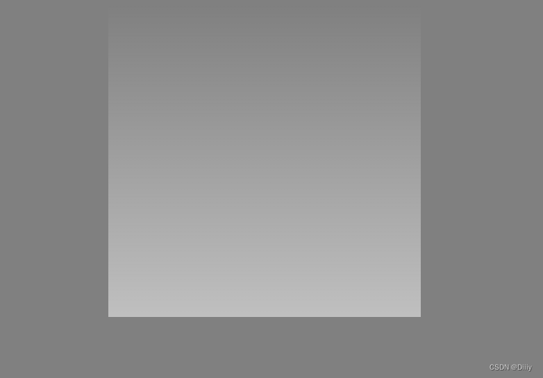
注意: 渐变色的属性值是背景图不是背景颜色
是background-image 不是background-color 切勿混淆
最后利用transform知识完成一项王者荣耀案例
<!DOCTYPE html>
<html lang="en">

<head>
    <meta charset="UTF-8">
    <meta http-equiv="X-UA-Compatible" content="IE=edge">
    <meta name="viewport" content="width=device-width, initial-scale=1.0">
    <title>Document</title>
    <style>
        * {
            margin: 0;
            padding: 0;
            box-sizing: border-box;
        }

        /* 摆盒子 */
        .box {
            display: flex;
            width: 1300px;
            height: 171px;
            margin: 200px auto;
        }

        .box li {
            position: relative;
            overflow: hidden;
            flex: 1;
            float: left;
            list-style: none;
            margin: 0 10px;
            border: 2px solid transparent;
        }

        .box li img {
            width: 100%;
            transition: all 0.5s;
        }

        /* 鼠标经过li盒子添加金色边框 */
        .box li:hover {
            border: 2px solid gold;
        }

        /* 鼠标经过li盒子图片放大,且父盒子溢出隐藏 */
        .box li:hover img {
            transform: scale(1.2);
        }

        /* 鼠标未经过li盒子时盒子里文字利用定位水平居中显示 */
        .box li span {
            position: absolute;
            left: 50%;
            bottom: 0;
            transform: translateX(-50%);
            margin-bottom: 10px;
            color: #fff;
            font-size: 14px;
        }

        /* info模块,且鼠标未经过时不显示 */
        .info {
            display: none;
            position: absolute;
            left: 0;
            top: 0;
            width: 100%;
            height: 100%;
            padding-top: 45px;
            background-color: rgba(0, 0, 0, 0.3);
            text-align: center;
        }

        .info h3 {
            font-weight: 400;
            color: gold;
            line-height: 33px;
        }

        .info p {
            font-size: 12px;
            color: #fff;
            line-height: 18px;
        }

        /* 鼠标经过li盒子时info盒子显示 */
        .box li:hover .info {
            display: block;
        }

        /* 鼠标经过li盒子时盒子里文字不显示 */
        .box li:hover span {
            display: none;
        }
    </style>
</head>

<body>
    <ul class="box">
        <li><a href="">
                <img src="./作业素材/1.jpg" alt="">
                <span>高山流水-庄周</span>
                <div class="info">
                    <h3>高山流水-庄周</h3>
                    <p>辅助</p>
                    <p>上线时间: 2021.10.21</p>
                </div>
            </a></li>
        <li><a href="">
                <img src="./作业素材/2.jpg" alt="">
                <span>高山流水-庄周</span>
                <div class="info">
                    <h3>高山流水-庄周</h3>
                    <p>辅助</p>
                    <p>上线时间: 2021.10.21</p>
                </div>
            </a></li>
        <li><a href="">
                <img src="./作业素材/3.webp" alt="">
                <span>高山流水-庄周</span>
                <div class="info">
                    <h3>高山流水-庄周</h3>
                    <p>辅助</p>
                    <p>上线时间: 2021.10.21</p>
                </div>
            </a></li>
        <li><a href="">
                <img src="./作业素材/4.webp" alt="">
                <span>高山流水-庄周</span>
                <div class="info">
                    <h3>高山流水-庄周</h3>
                    <p>辅助</p>
                    <p>上线时间: 2021.10.21</p>
                </div>
            </a></li>
    </ul>
</body>

</html>


 2166
2166


 被折叠的 条评论
为什么被折叠?
被折叠的 条评论
为什么被折叠?
 到【灌水乐园】发言


