


文章目录
01-体验平面转换
<!DOCTYPE html>
<html lang="en">
<head>
    <meta charset="UTF-8">
    <meta name="viewport" content="width=device-width, initial-scale=1.0">
    <title>Document</title>
    <style>
        div{
            width: 100px;
            height: 100px;
            background-color: pink;
            /* :转变 过度 */
            transition: all 1s;
        }
        div:hover{
            /* 变压器 */
            transform: translate(800px) rotate(360deg) scale(2) skew(180deg);
        }
    </style>
</head>
<body>
    <div></div>
</body>
</html>
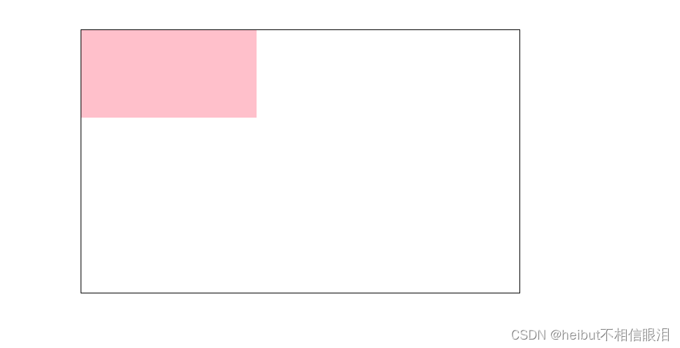
02-平移效果
<!DOCTYPE html>
<html lang="en">
<head>
    <meta charset="UTF-8">
    <meta name="viewport" content="width=device-width, initial-scale=1.0">
    <title>Document</title>
    <style>
        .father{
            width: 500px;
            height: 300px;
            margin: 50px auto;
            border: 1px solid #000;
        }
        .son{
            width: 200px;
            height: 100px;
            background-color: pink;
            transition: all 1s;
        }
        /* 鼠标移入到父盒子,son改变位置 */
        .father:hover .son{
            transform: translate(200px,100px);

            /* 百分比参照盒子自身尺寸改变位置 */
            transform: translate(50%,100%);

            /* 只写一个数 只移动x方向 */
            transform: translate(100px);

            /* 可以单独移动Y方向的 */
            transform: translateY(100px);
        }
    </style>
</head>
<body>
    <div class="father">
        <div class="son"></div>
    </div>
</body>
</html>
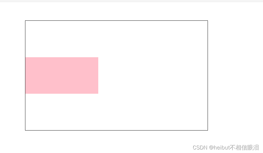
03-绝对定位元素居中
<!DOCTYPE html>
<html lang="en">
<head>
    <meta charset="UTF-8">
    <meta name="viewport" content="width=device-width, initial-scale=1.0">
    <title>Document</title>
    <style>
        .box{
            position: absolute;
            left: 50%;
            top: 50%;


            /* 向左向上移动自身尺寸的一半 */
            transform: translate(-50%,-50%);


            width: 200px;
            height: 100px;
            background-color: pink;
        }
    </style>
</head>
<body>
    <div class="box"></div>
</body>
</html>
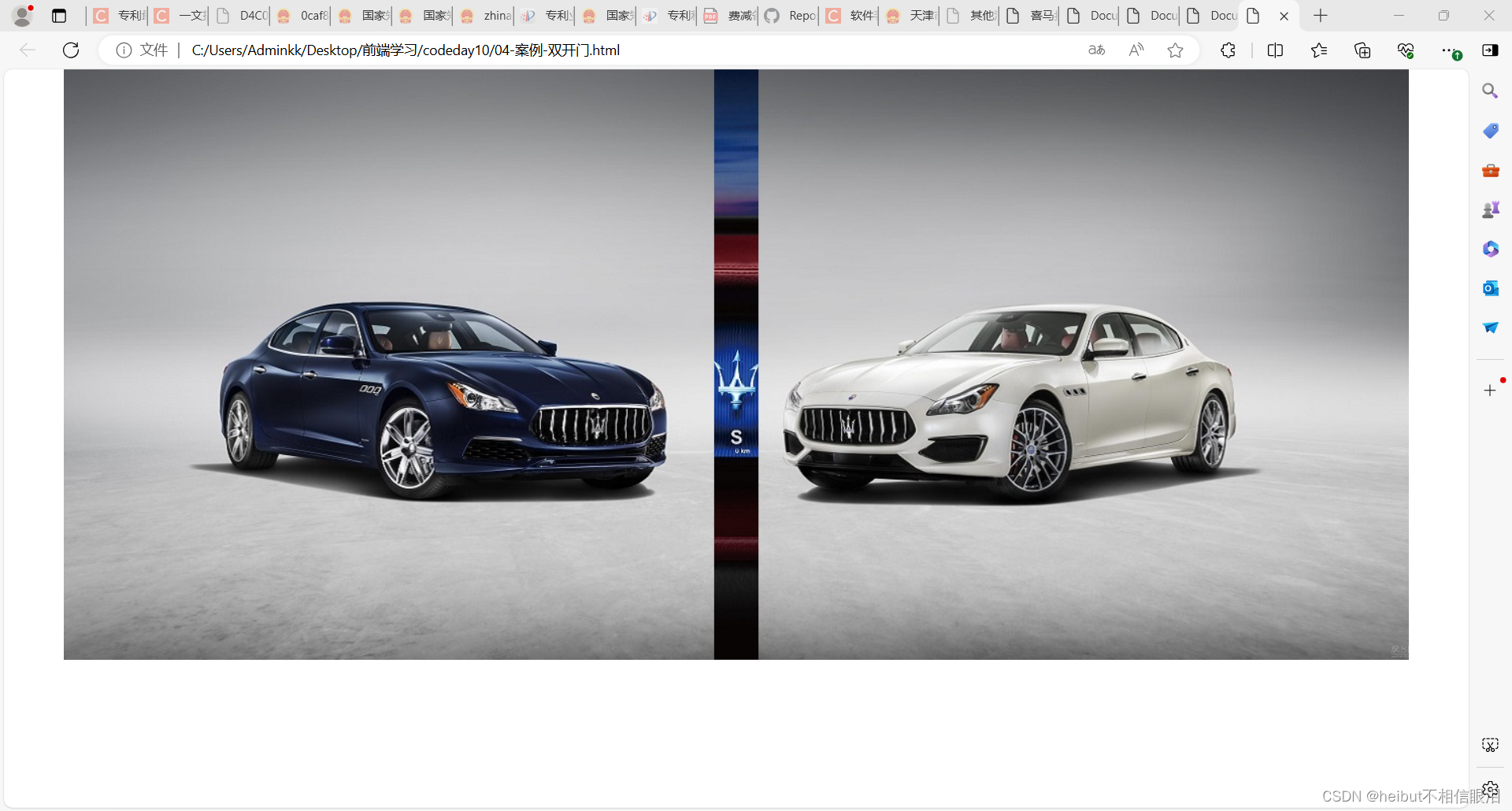
04-案例-双开门
<!DOCTYPE html>
<html lang="en">
<head>
    <meta charset="UTF-8">
    <meta name="viewport" content="width=device-width, initial-scale=1.0">
    <title>Document</title>
    <style>
        *{
            margin: 0;
            padding: 0;
        }
        /* 1.布局:父子结构,父级是大图,子级是左右小图 */
        .father{
            display: flex;
            margin: 0 auto;
            width: 1366px;
            height: 600px;
            background-image: url(./images/bg.jpg);
            overflow: hidden;
        }
        .father .left,
        .father .right{
            width: 50%;
            height: 600px;
            background-image: url(./images/fm.jpg);
            transition: all 1s;
        }
        .father .right{
            /* background-position是对当前区域的背景进行移动 */
            background-position: right 0;
        }

        /* 2.鼠标悬停的效果:左右移动 */
        .father:hover .left{
            transform: translate(-100%);
        }
        .father:hover .right{
            transform: translate(100%);
        }

    </style>
</head>
<body>
    <div class="father">
        <div class="left"></div>
        <div class="right"></div>
    </div>
</body>
</html>
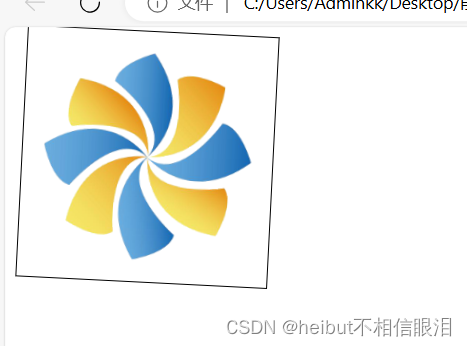
06-转换旋转中心点
<!DOCTYPE html>
<html lang="en">
<head>
    <meta charset="UTF-8">
    <meta name="viewport" content="width=device-width, initial-scale=1.0">
    <title>Document</title>
    <style>
        img{
            width: 200px;
            border: 1px solid #000;
            transition: all 1s;
            /* 转换原点 */
            transform-origin: right bottom;
        }
        img:hover{
            transform: rotate(360deg);
        }
    </style>
</head>
<body>
    <img src="./images/rotate.png" alt="">
</body>
</html>
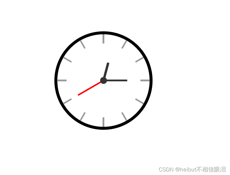
07-案例-时钟-转换原点
<!DOCTYPE html>
<html lang="en">
  <head>
    <meta charset="UTF-8" />
    <meta name="viewport" content="width=device-width, initial-scale=1.0" />
    <title>Document</title>
    <style>
      .clock {
        width: 250px;
        height: 250px;
        border: 8px solid #000;
        border-radius: 50%;
        margin: 100px auto;
        position: relative;
      }

      .line {
        /* 1.定位 */
        position: absolute;
        width: 4px;
        height: 250px;
        background-color: #999;
        left: 50%;
        transform: translate(-50%);
      }

      /* 线2: 旋转, 每条线旋转角度不同, 单独选中不同的line, 写rotate代码 */
      /* 一圈是360度, 等分成  xx 份 */
      .line:nth-child(2) {
        transform: translate(-50%) rotate(30deg);
      }

      .line:nth-child(3) {
        transform: translate(-50%) rotate(60deg);
      }

      .line:nth-child(4) {
        transform: translate(-50%) rotate(90deg);
      }

      .line:nth-child(5) {
        transform: translate(-50%) rotate(120deg);
      }

      .line:nth-child(6) {
        transform: translate(-50%) rotate(150deg);
      }

      /* 第一根和第四跟宽度大一些 */
      .line:nth-child(1),
      .line:nth-child(4) {
        width: 5px;
      }

      /* 遮罩圆形 */
      .cover {
        position: absolute;
        left: 50%;
        top: 50%;
        transform: translate(-50%, -50%);
        width: 200px;
        height: 200px;
        background-color: #fff;
        border-radius: 50%;
      }

      /* 表针 */
      /* 并集选择器放在单独选择器的上面, 避免transform属性的层叠 */
      .hour,
      .minute,
      .second {
        position: absolute;
        left: 50%;
        /* 盒子底部在盒子中间 */
        bottom: 50%;


        /* 使三个指针围绕底部定点旋转 */
        transform-origin: center bottom;
      }

      .hour {
        width: 6px;
        height: 50px;
        background-color: #333;
        margin-left: -3px;
        /* 这是设置的旋转度数 */
        transform: rotate(15deg);
      }

      .minute {
        width: 5px;
        height: 65px;
        background-color: #333;
        margin-left: -3px;
        transform: rotate(90deg);
      }

      .second {
        width: 4px;
        height: 80px;
        background-color: red;
        margin-left: -2px;
        transform: rotate(240deg);

      }

      /* 螺丝 */
      .dotted {
        position: absolute;
        left: 50%;
        top: 50%;
        transform: translate(-50%, -50%);
        width: 18px;
        height: 18px;
        background-color: #333;
        border-radius: 50%;
      }
    </style>
  </head>

  <body>
    <div class="clock">
      <!-- 刻度线 -->
      <div class="line"></div>
      <div class="line"></div>
      <div class="line"></div>
      <div class="line"></div>
      <div class="line"></div>
      <div class="line"></div>

      <!-- 遮罩圆形 -->
      <div class="cover"></div>
      <!-- 表针 -->
      <div class="hour"></div>
      <div class="minute"></div>
      <div class="second"></div>

      <!-- 螺丝 -->
      <div class="dotted"></div>
    </div>
  </body>
</html>
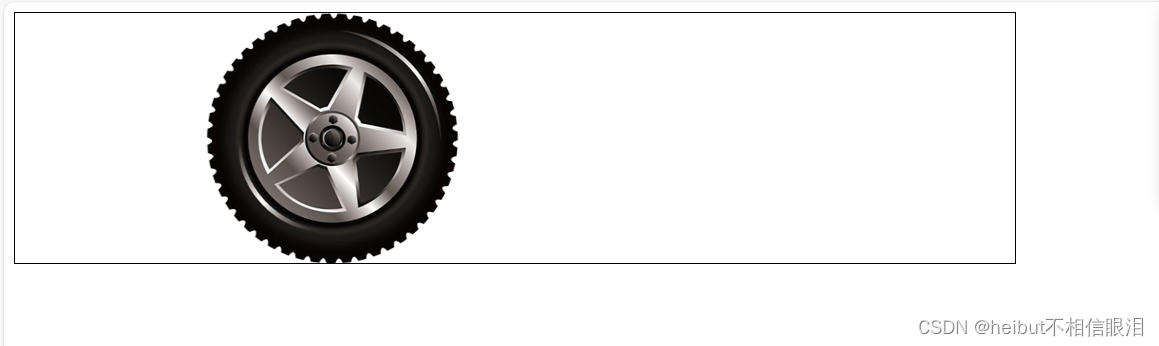
08-平面转换-多重转换
<!DOCTYPE html>
<html lang="en">
<head>
    <meta charset="UTF-8">
    <meta name="viewport" content="width=device-width, initial-scale=1.0">
    <title>Document</title>
    <style>
        .box{
            width: 800px;
            height: 200px;
            border: 1px solid #000;
        }
        img{
            width: 200px;
            transition: all 1s;
        }
        .box:hover img{
            /* 先平移后旋转 */
            transform: translate(600px) rotate(360deg);
            /* 多重转换会以第一种转换形态的坐标轴为准 */
            /* transform: rotate(360deg) translate(600px); */


            /* 层叠性 */
            /* transform: translate(600px); */
            /* transform: rotate(360deg); */
        }
    </style>
</head>
<body>
    <div class="box">
        <img src="./images/tyre.png" alt="">
    </div>
</body>
</html>
09-缩放效果
<!DOCTYPE html>
<html lang="en">
<head>
    <meta charset="UTF-8">
    <meta name="viewport" content="width=device-width, initial-scale=1.0">
    <title>Document</title>
</head>
<style>
    .box{
        width: 300px;
        height: 210px;
        margin: 100px auto;
    }
    .box img{
        width: 100%;
        transition: all 0.5s;
    }
    .box:hover img{
        /* 只设置宽高的效果是从左上角发生改变 */
        /* width: 500px; */
        /* height: 400px; */


        /* 沿着中心点向四周放大 */
        /* 大于1 :放大   小于1:缩小   等于1 :不变 */
        transform: scale(2);
        transform: scale(0.2);
        transform: scale(1);


    }
</style>
<body>
    <div class="box">
        <img src="./images/product.jpeg" alt="">
    </div>
</body>
</html>
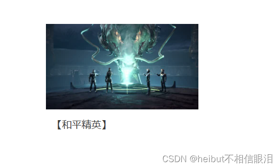
10-案例-按钮缩放
<!DOCTYPE html>
<html lang="en">
<head>
<meta charset="UTF-8">
<meta name="viewport" content="width=device-width, initial-scale=1.0">
<title>Document</title>
<style>
*{
margin: 0;
padding: 0;
}
li{
list-style: none;
}
img{
width: 100%;
}
.box{
width: 249px;
height: 210px;
margin: 50px auto;
}
.box p{
color: #3b3b3b;
padding: 10px 10px 0 10px;
}
li{
overflow: hidden;
}
/* 1.摆放播放的按钮——>放到图片区域的中间 */
.box .pic{
position: relative;
}
.pic::after{
/* 2. after是行内元素,宽高不生效,但是加了position 变成行内块,宽高就生效了 */
position: absolute;
/* 1.after 不加content 不生效 */
top: 50%;
left: 50%;
/* transform: translate(-50%,-50%); */
/* margin-left: -28px; */
/* margin-top: -28px; */
content: '';
width: 58px;
height: 58px;
background-image: url(./images/play.png);
/* 变成复合属性,防止标签层叠 */
transform: translate(-50%,-50%) scale(5);
opacity: 0;
transition: all .5s;
}
/* 2.设置鼠标悬停状态 */
li:hover .pic::after{
opacity: 1;
transform: translate(-50%,-50%) scale(1);
}
</style>
</head>
<body>
<div class="box">
<ul>
<li>
<div class="pic">
<img src="./images/party.jpeg" alt="">
</div>
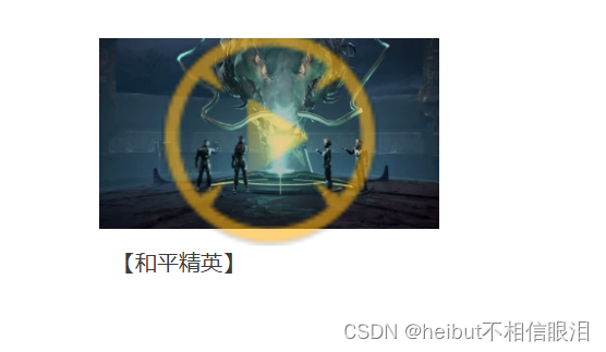
<p>【和平精英】</p>
</li>
</ul>
</div>
</body>
</html>
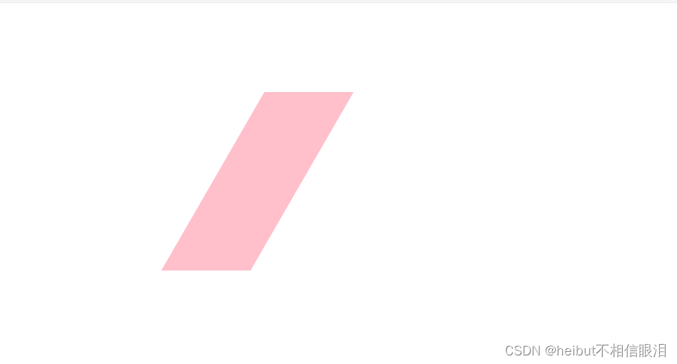
11-倾斜效果
<!DOCTYPE html>
<html lang="en">
<head>
    <meta charset="UTF-8">
    <meta name="viewport" content="width=device-width, initial-scale=1.0">
    <title>Document</title>
    <style>
        div{
            margin: 100px auto;
            width: 100px;
            height: 200px;
            background-color: pink;
            transition: all 1s;
        }
        div:hover{
            transform: skew(30deg);
            transform: skew(-30deg);
        }
    </style>
</head>
<body>
    <div></div>
</body>
</html>
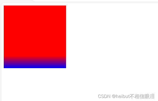
12-渐变-线性
<!DOCTYPE html>
<html lang="en">
<head>
    <meta charset="UTF-8">
    <meta name="viewport" content="width=device-width, initial-scale=1.0">
    <title>Document</title>
    <style>
        div{
            width: 200px;
            height: 200px;
            background-color: blue;
            background-image: linear-gradient(
                red,
                blue
            );
            background-image: linear-gradient(
                to right,
                red,
                blue
            );
            background-image: linear-gradient(
                45deg,
                red,
                blue
            );
            background-image: linear-gradient(
                red 80%,
                blue
            );
        }
    </style>
</head>
<body>
    <div></div>
</body>
</html>
13-案例-产品展示
<!DOCTYPE html>
<html lang="en">
<head>
    <meta charset="UTF-8">
    <meta name="viewport" content="width=device-width, initial-scale=1.0">
    <title>Document</title>
    <style>
        .box{
            position: relative;
            width: 300px;
            height: 212px;
        }
        .box img{
            width: 300px;
        }
        .box .title{
            position: absolute;
            left: 15px;
            bottom: 20px;

            /* 堆叠顺序: 谁的index属性值大,就不会被盖住  */
            z-index: 2;
            width: 260px;
            color: #fff;
            font-size: 20px;
            font-weight: 700px;
        }
        .mask{
            position: absolute;
            top: 0;
            width: 300px;
            height: 212px;
            background-image: linear-gradient(
                transparent,
                rgba(0,0,0,0.5)
            );
            opacity: 0;
            transition: all .5s;
        }
        .box:hover .mask{
            opacity: 1;
        }
    </style>
</head>
<body>
    <div class="box">
        <img src="./images/product.jpeg" alt="">
        <div class="title">和代表参加答辩首都机场难道你</div>
        <div class="mask"></div>
    </div>
</body>
</html>


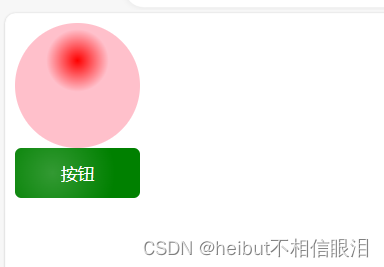
14-渐变-径向
<!DOCTYPE html>
<html lang="en">
<head>
    <meta charset="UTF-8">
    <meta name="viewport" content="width=device-width, initial-scale=1.0">
    <title>Document</title>
    <style>
        div{
            width: 100px;
            height: 100px;
            background-color: pink;
            border-radius: 50%;
            /* 正圆 */
            background-image: radial-gradient(
                50px at center center,
                red,
                pink
            );

            /* 椭圆 */
            background-image: radial-gradient(
                50px 20px at center center,
                red,
                pink
            );

            background-image: radial-gradient(
                50px at 50px 30px,
                red,
                pink 50%
                /* 半径的50%前是渐变  50%后是pink颜色 */
            );

        }
        button{
            width: 100px;
            height: 40px;
            background-color: green;
            border: 0;
            border-radius: 5px;
            color: #fff;
            background-image: radial-gradient(
                50px at 30px 20px,
                rgba(255,255,255,0.2),
                transparent
            );
        }
    </style>
</head>
<body>
    <div></div>
    <button>按钮</button>
</body>
</html>


 3974
3974

 被折叠的 条评论
为什么被折叠?
被折叠的 条评论
为什么被折叠?
 到【灌水乐园】发言


