


文章目录
http、html
介绍http2,优点及存在的问题?
参考文章:
http1.0+http1.1+http2.0
http与https的区别
https加密过程
XSS+CSRF
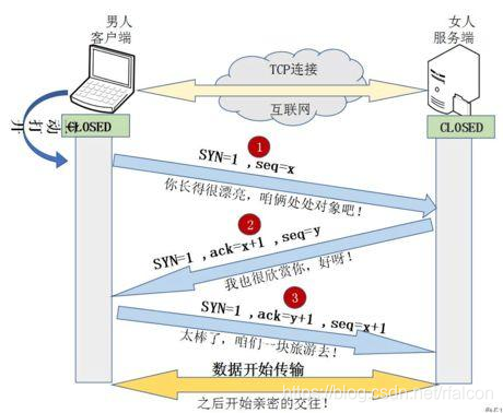
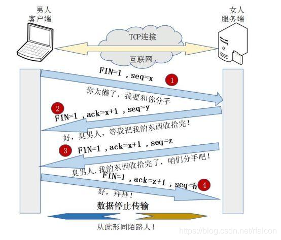
TCP三次握手+四次挥手
tcp拥塞控制+流量控制
http1.0和http1.1的区别
- 缓存处理
- 带宽优化及网络连接的使用
- 错误通知管理
- host头处理
- 长连接
http与https的区别
- HTTPS协议需要到CA申请证书,一般免费证书很少,需要交费。
- HTTP协议运行在TCP之上,所有传输的内容都是明文,HTTPS运行在SSL/TLS之上,SSL/TLS运行在TCP之上,所有传输的内容都经过加密的。
- HTTP和HTTPS使用的是完全不同的连接方式,用的端口也不一样,前者是80,后者是443。
- HTTPS可以有效的防止运营商劫持,解决了防劫持的一个大问题。
http1.1存在的问题
- 线头阻塞。TCP连接上只能发送一个请求,前面的请求未完成前,后续的请求都在排队等待。
- 多个TCP连接。虽然HTTP/1.1管线化可以支持请求并发,但是浏览器很难实现,chrome、firefox等都禁用了管线化。所以1.1版本请求并发依赖于多个TCP连接,建立TCP连接成本很高,还会存在慢启动的问题。
- 头部冗余,采用文本格式。HTTP/1.X版本是采用文本格式,首部未压缩,而且每一个请求都会带上cookie、user-agent等完全相同的首部。
- 客户端需要主动请求
http2.0相对于http1.1的优势
- 二进制分帧层。HTTP2是二进制协议,他采用二进制格式传输数据而不是1.x的文本格式。
- 多路复用。HTTP2让所有的通信都在一个TCP连接上完成,真正实现了请求的并发。
- 头部压缩。
- 流量控制。
- 请求优先级。服务器可以根据流的优先级,控制资源分配(CPU、内存、带宽),而在响应数据准备好之后,优先将最高优先级的帧发送给客户端。
- 服务器端推送。服务器端推送使得服务器可以预测客户端需要的资源,主动推送到客户端。
http2.0的多路复用和http1.x中的长连接有什么区别
- HTTP/1.* 一次请求-响应,建立一个连接,用完关闭;每一个请求都要建立一个连接;
- HTTP/1.1 Pipeling解决方式为,若干个请求排队串行化单线程处理,后面的请求等待前面请求的返回才能获得执行机会,一旦有某请求超时等,后续请求只能被阻塞,毫无办法,也就是人们常说的线头阻塞;
- HTTP/2多个请求可同时在一个连接上并行执行。某个请求任务耗时严重,不会影响到其它连接的正常执行;
https加密过程

XSS和CSRF
- XSS:跨站脚本攻击 – 不需要登录,web 页面注入脚本并执行
- CSRF:跨站请求伪造 – 需要登录,冒充用户进行站内操作
TCP三次握手和四次挥手
TCP流量控制和拥塞控制
HTTP报文的请求和返回会有几个部分(请求行、请求头、请求体);每部分具体都有什么(常见的请求头)
参考文章:
http常见请求头
- 请求报文
- 请求行 - 请求方法(GET\POST\PUT\OPTIONS\DELETE\TRACK\HEAD\CONNECT)、统一资源标识符(url 字段)、http 协议版本号
- 请求头 - key value 格式(User-Agent、Accept、Host)
- 空行 - 传送回车和换行,告诉服务器以下不在是请求头部分
- 请求体 - post 请求的参数,key value 格式
- 响应报文
- 状态行 - http 版本号+状态码+状态码描述
- 响应头 - 服务器类型、日期、长度、内容类型等内容
- 空行 - 同请求
- 响应体 - 一般返回 json 数据
GET和POST区别
参考文章:
get和post区别
再来一篇区别
状态码
参考文章:
http常见状态码
- 1XX - 通知
- 100 – 客户端继续发送请求
- 101 – 切换协议
- 2XX - 成功
- 200 – 请求成功,一般应用与 get 或 post 请求
- 201 – 请求成功并创建新的资源,
- 3XX - 重定向
- 301 – 永久移动,请求的资源已被永久移动到新的 url,返回信息包括新的 url,浏览器会自动定向到新的 url,今后所有的请求都是新的 url
- 302 – 临时移动,资源只是临时移动,客户端应继续使用旧的 url
- 304 – 所请求的资源未修改,不会返回任何资源。浏览器请求的时候,会先访问强缓存,没有则访问协商缓存,协商缓存命中,资源未修改,返回 304
- 4XX - 客户端错误
- 400 – 客户端请求的语法错误,服务器无法理解(z 字段类型,或对应的值类型不一致;或者没有进行 JSON.toStringfy 的转换)
- 401 – 请求需要用户的认证
- 403 – 服务期理解客户端请求,但是拒绝执行
- 404 – 服务器无法根据客户端的请求找到资源
- 5XX - 服务器端错误
- 500 – 服务器内部错误,无法完成资源的请求
- 501 – 服务器不支持请求功能,无法完成资源请求
- 502 – 网关或代理服务器向远程服务器发送请求返回无效
HTTP缓存控制,强缓存vs协商缓存
参考文章:
http缓存控制
对跨域的了解,跨域怎么解决
从输入url到页面加载的全过程
参考文章:
从输入url到页面加载的全过程
再来一篇
localStorage、sessionStorage、session、cookie 区别
前端性能优化问题
CSS
盒模型
参考文章:
盒子模型种类及设置
- 盒子 content+padding+border+margin
- 标准盒子 高度=content
- IE盒子 高度=content+padding+border
- box-sizig: border-box(IE 盒子) content-box(标准盒子) inherit(继承父盒子)
position(值+定位标准)
参考文章:
position取值定位
- static(默认,元素生成时正常显示)
- relative(相对,不脱离文档流,相对原来的位置)
- absolute(绝对,脱离文档流,相对 static 外的第一个父元素定位)
- fixed(固定定位,脱离文档流,相对于浏览器窗口定位)
- inherit(继承父元素的定位属性)
- initial(设置 css 属性为其默认值)
- unset(不继承,同 initial 不设置值;继承,同 inherit)
- sticky(relative+fiexed 的结合)
注意 - position:sticky(不到阈值 relative,到阈值 fixed,相对就近元素,可以设置滑动固定导航条)
- 必须设置一个阈值(top right bottom left),top left 优先级高
- 设置 sticky 的父节点必须是 overflow:visible,否则无效
栅格布局的原理
参考文章:
栅格布局
布局:垂直居中、水平居中、水平垂直居中、上中下布局,中间自适应、左中右布局,中间自适应、单列布局、两栏布局、三列布局、圣杯布局、双飞翼布局
水平居中
- 行内 – text-align:center
- 块级 – margin:0 auto
- 块级,定宽度 – absolute + left(50%) + margin-left[宽度一半] | transform:translateX(-50%)
- 块级,不定宽度 – absolute + left(50%) + transform:translateX(-50%)
- 块级,不定宽度 – 子元素:display:inline | display:inline-blok ; 父元素:text-align:center
- 块级/行内,定不定宽高均可 – display:flex;justify-content: center
<!DOCTYPE html>
<html lang="en">
  <head>
    <meta charset="UTF-8" />
    <meta http-equiv="X-UA-Compatible" content="IE=edge" />
    <meta name="viewport" content="width=device-width, initial-scale=1.0" />
    <title>Document</title>
    <style>
      * {
        margin: 0;
        padding: 0;
      }

      /* 若父元素不是块级元素,先用display:block 变为块级元素,在进行居中操作 */
      .container {
        width: 80%;
        margin: 10px auto;
        text-align: center;
      }

      span {
        width: 100%;
        height: 50px;
        line-height: 50px;
      }
    </style>
  </head>

  <body>
    <!-- 水平居中 -->
    <div class="container">
      <!-- 行内元素 -- text-align:center -->
      <span>文字描述</span>
    </div>
  </body>
</html>
<!DOCTYPE html>
<html lang="en">
  <head>
    <meta charset="UTF-8" />
    <meta http-equiv="X-UA-Compatible" content="IE=edge" />
    <meta name="viewport" content="width=device-width, initial-scale=1.0" />
    <title>Document</title>
    <style>
      * {
        margin: 0;
        padding: 0;
      }

      .container {
        width: 200px;
        height: 200px;
        border: 1px solid #ccc;
      }

      .item {
        width: 50px;
        height: 50px;
        background: chocolate;
        margin: 0 auto;
      }
    </style>
  </head>

  <body>
    <!-- 水平居中 -->
    <div class="container">
      <!-- 块级元素,定宽高:margin:0 auto; -->
      <div class="item"></div>
    </div>
  </body>
</html>
<!DOCTYPE html>
<html lang="en">
  <head>
    <meta charset="UTF-8" />
    <meta http-equiv="X-UA-Compatible" content="IE=edge" />
    <meta name="viewport" content="width=device-width, initial-scale=1.0" />
    <title>Document</title>
    <style>
      * {
        margin: 0;
        padding: 0;
      }

      .container {
        width: 200px;
        height: 200px;
        border: 1px solid #ccc;
        position: relative;
      }

      .item {
        width: 50px;
        height: 50px;
        background: chocolate;
        position: absolute;
        left: 50%;
        margin-left: -25px;
        /* transform: translateX(-50%); */
      }
    </style>
  </head>

  <body>
    <!-- 水平居中 -->
    <div class="container">
      <!-- 块级元素,定宽度 -->
      <div class="item"></div>
    </div>
  </body>
</html>
<!DOCTYPE html>
<html lang="en">
  <head>
    <meta charset="UTF-8" />
    <meta http-equiv="X-UA-Compatible" content="IE=edge" />
    <meta name="viewport" content="width=device-width, initial-scale=1.0" />
    <title>Document</title>
    <style>
      * {
        margin: 0;
        padding: 0;
      }

      .container {
        width: 200px;
        height: 200px;
        border: 1px solid #ccc;
        text-align: center;
      }

      .item {
        display: inline;
        background: chocolate;
      }
    </style>
  </head>

  <body>
    <!-- 水平居中 -->
    <div class="container">
      <!-- 块级元素,不定宽高;设置子元素为display: inline-block; 或 display: inline;即将其转换成行内块级/行内元素,给父元素设置 text-align: center;  -->
      <div class="item">子元素</div>
    </div>
  </body>
</html>
<!DOCTYPE html>
<html lang="en">
  <head>
    <meta charset="UTF-8" />
    <meta http-equiv="X-UA-Compatible" content="IE=edge" />
    <meta name="viewport" content="width=device-width, initial-scale=1.0" />
    <title>Document</title>
    <style>
      * {
        margin: 0;
        padding: 0;
      }

      .container {
        width: 200px;
        height: 200px;
        border: 1px solid #ccc;
        position: relative;
      }

      .item {
        height: 50px;
        background: chocolate;
        position: absolute;
        left: 50%;
        transform: translateX(-50%);
      }
    </style>
  </head>

  <body>
    <!-- 水平居中 -->
    <div class="container">
      <!-- 块级元素,不定宽度 -->
      <div class="item">子元素</div>
    </div>
  </body>
</html>
<!DOCTYPE html>
<html lang="en">
  <head>
    <meta charset="UTF-8" />
    <meta http-equiv="X-UA-Compatible" content="IE=edge" />
    <meta name="viewport" content="width=device-width, initial-scale=1.0" />
    <title>Document</title>
    <style>
      * {
        margin: 0;
        padding: 0;
      }

      .container {
        width: 200px;
        height: 200px;
        border: 1px solid #ccc;
        display: flex;
        justify-content: center;
      }

      .item {
        /* width: 50px; */
        height: 50px;
        background: chocolate;
      }
    </style>
  </head>

  <body>
    <!-- 水平居中 -->
    <div class="container">
      <!-- 块级元素,定不定宽度都ok,flex -->
      <div class="item">子元素</div>
    </div>
  </body>
</html>
垂直居中
- 单行行内元素 – 当前元素 line-height = height
- 多行行内元素 – 父元素 display:table-cell;vertical-align: middle;
- 块级元素、定高度\不定高度 – absolute + top(50%) + margin-top(高度一半) | transform:translateY(-50%)
- 定不定高度均可 – display:flex;align-items:center
<!DOCTYPE html>
<html lang="en">
  <head>
    <meta charset="UTF-8" />
    <meta http-equiv="X-UA-Compatible" content="IE=edge" />
    <meta name="viewport" content="width=device-width, initial-scale=1.0" />
    <title>Document</title>
    <style>
      .container {
        width: 100%;
        height: 300px;
        border: 1px solid #ccc;
      }

      span {
        line-height: 300px;
      }
    </style>
  </head>

  <body>
    <div class="container">
      <!-- 单行的行内元素 -->
      <span>这是一行文字</span>
    </div>
  </body>
</html>
<!DOCTYPE html>
<html lang="en">
  <head>
    <meta charset="UTF-8" />
    <meta http-equiv="X-UA-Compatible" content="IE=edge" />
    <meta name="viewport" content="width=device-width, initial-scale=1.0" />
    <title>Document</title>
    <style>
      .container {
        width: 100%;
        height: 300px;
        border: 1px solid #ccc;
        display: table-cell;
        vertical-align: middle;
      }
    </style>
  </head>

  <body>
    <div class="container">
      <!-- 多行的行内元素 -->
      <span
        >这是一行文字这是一行文字这是一行文字这是一行文字这是一行文字这是一行文字这是一行文字这是一行文字这是一行文字这是一行文字这是一行文字这是一行文字这是一行文字这是一行文字</span
      >
    </div>
  </body>
</html>
<!DOCTYPE html>
<html lang="en">
  <head>
    <meta charset="UTF-8" />
    <meta http-equiv="X-UA-Compatible" content="IE=edge" />
    <meta name="viewport" content="width=device-width, initial-scale=1.0" />
    <title>Document</title>
    <style>
      .container {
        width: 100%;
        height: 300px;
        border: 1px solid #ccc;
        position: relative;
      }

      .item {
        width: 100px;
        height: 100px;
        background: chocolate;
        position: absolute;
        top: 50%;
        /* 定高度可以使用下面两种方法,不定高度只能使用transform的translateY属性 */
        margin-top: -50px;
        /* transform: translateY(-50%); */
      }
    </style>
  </head>

  <body>
    <div class="container">
      <!-- 块级元素,定高度、不定高度 -->
      <div class="item">子元素</div>
    </div>
  </body>
</html>
<!DOCTYPE html>
<html lang="en">
  <head>
    <meta charset="UTF-8" />
    <meta http-equiv="X-UA-Compatible" content="IE=edge" />
    <meta name="viewport" content="width=device-width, initial-scale=1.0" />
    <title>Document</title>
    <style>
      .container {
        width: 100%;
        height: 300px;
        border: 1px solid #ccc;
        display: flex;
        align-items: center;
      }

      .item {
        /* width: 100px; */
        height: 100px;
        background: chocolate;
      }
    </style>
  </head>

  <body>
    <div class="container">
      <!-- 块级元素,定不定高度都ok:flex -->
      <div class="item">子元素</div>
    </div>
  </body>
</html>
垂直水平居中
- absolute + top:0;right:0;bottom:0;left:0;margin:0 auto;
- 定宽高、不定宽高:absolute + top/left(50%) + margin-left/margin-top(宽高一半) | transform:translate(-50%,-50%)
- 定不定宽高都行:display:flex;justify-content:center;align-item:center;
<!DOCTYPE html>
<html lang="en">
  <head>
    <meta charset="UTF-8" />
    <meta http-equiv="X-UA-Compatible" content="IE=edge" />
    <meta name="viewport" content="width=device-width, initial-scale=1.0" />
    <title>Document</title>
    <style>
      .container {
        width: 100%;
        height: 300px;
        border: 1px solid #ccc;
        position: relative;
      }

      .item {
        width: 100px;
        height: 100px;
        background: chocolate;
        position: absolute;
        top: 0;
        right: 0;
        bottom: 0;
        left: 0;
        margin: auto;
      }
    </style>
  </head>

  <body>
    <div class="container">
      <!-- 垂直水平居中 -->
      <div class="item">子元素</div>
    </div>
  </body>
</html>
<!DOCTYPE html>
<html lang="en">
  <head>
    <meta charset="UTF-8" />
    <meta http-equiv="X-UA-Compatible" content="IE=edge" />
    <meta name="viewport" content="width=device-width, initial-scale=1.0" />
    <title>Document</title>
    <style>
      .container {
        width: 100%;
        height: 300px;
        border: 1px solid #ccc;
        position: relative;
      }

      .item {
        width: 100px;
        height: 100px;
        background: chocolate;
        position: absolute;
        left: 50%;
        top: 50%;
        /* 元素定宽高可以使用margin和transform两种形式,不定宽高只能使用transform一种形式 */
        margin-left: -50px;
        margin-top: -50px;
        /* transform: translate(-50%, -50%); */
      }
    </style>
  </head>

  <body>
    <div class="container">
      <!-- 垂直水平居中:定宽高、不定宽高 -->
      <div class="item">子元素</div>
    </div>
  </body>
</html>
<!DOCTYPE html>
<html lang="en">
  <head>
    <meta charset="UTF-8" />
    <meta http-equiv="X-UA-Compatible" content="IE=edge" />
    <meta name="viewport" content="width=device-width, initial-scale=1.0" />
    <title>Document</title>
    <style>
      .container {
        width: 100%;
        height: 300px;
        border: 1px solid #ccc;
        display: flex;
        align-items: center;
        justify-content: center;
      }

      .item {
        width: 100px;
        height: 100px;
        background: chocolate;
      }
    </style>
  </head>

  <body>
    <div class="container">
      <!-- 垂直水平居中:定不定宽高都ok,flex -->
      <div class="item">子元素</div>
    </div>
  </body>
</html>
单列布局
- height:100vh; | height:100%; – 表示的是当前可见屏的高度;两者的区别就是当没有内容的是 100%为 0,而 100vh 可以把屏幕撑开
<!DOCTYPE html>
<html lang="en">
  <head>
    <meta charset="UTF-8" />
    <meta http-equiv="X-UA-Compatible" content="IE=edge" />
    <meta name="viewport" content="width=device-width, initial-scale=1.0" />
    <title>Document</title>
    <style>
      * {
        margin: 0;
        padding: 0;
      }

      .container {
        width: 100%;
        height: 100vh;
        margin: 0 auto;
      }

      header,
      main,
      footer {
        width: 100%;
        background: #f1f1f1;
        border-bottom: 5px solid #fff;
      }

      header,
      footer {
        height: 10%;
      }

      main {
        height: 80%;
      }
    </style>
  </head>

  <body>
    <div class="container">
      <!-- 单列布局 -->
      <header>header</header>
      <main>main</main>
      <footer>footer</footer>
    </div>
  </body>
</html>
两栏布局
- 左侧宽度固定、右侧自适应 – left(width + float) + right
- 左侧宽度固定、右侧自适应 – left(width + absolute) + right(margin-left>left.width)
- 左侧宽度固定、右侧自适应 – main(display:table) + left(width + display:table-cell) + right(display:table-cell)
- 左侧宽度固定、右侧自适应 – main(overflow:hidden) + left(width + float:left) + right(float:left;width:calc(100% - width.left))
- 左侧宽度固定、右侧自适应 – main(display:flex) + left(width) + right(flex:1)
<!DOCTYPE html>
<html lang="en">
  <head>
    <meta charset="UTF-8" />
    <meta http-equiv="X-UA-Compatible" content="IE=edge" />
    <meta name="viewport" content="width=device-width, initial-scale=1.0" />
    <title>Document</title>
    <style>
      * {
        margin: 0;
        padding: 0;
      }

      .warp {
        border: 1px solid #ccc;
      }

      header,
      footer {
        width: 100%;
        height: 50px;
        background: #666;
      }

      .main {
        overflow: hidden;
        margin: 2px 0;
      }

      .left {
        width: 200px;
        height: 500px;
        background: rosybrown;
        float: left;
      }

      .right {
        height: 500px;
        background: royalblue;
        margin-left: 202px;
      }
    </style>
  </head>

  <body>
    <div class="warp">
      <!-- 两栏布局:左侧宽度固定,右侧宽度自适应 -- 使用float实现 -->
      <header>header</header>
      <div class="main">
        <div class="left">left</div>
        <div class="right">right</div>
      </div>
      <footer>footer</footer>
    </div>
  </body>
</html>
<!DOCTYPE html>
<html lang="en">
  <head>
    <meta charset="UTF-8" />
    <meta http-equiv="X-UA-Compatible" content="IE=edge" />
    <meta name="viewport" content="width=device-width, initial-scale=1.0" />
    <title>Document</title>
    <style>
      * {
        margin: 0;
        padding: 0;
      }

      .warp {
        border: 1px solid #ccc;
      }

      header,
      footer {
        width: 100%;
        height: 50px;
        background: #666;
      }

      .main {
        margin: 2px 0;
        position: relative;
      }

      .left {
        width: 200px;
        height: 500px;
        background: rosybrown;
        position: absolute;
        top: 0;
        left: 0;
      }

      .right {
        height: 500px;
        background: royalblue;
        margin-left: 202px;
      }
    </style>
  </head>

  <body>
    <div class="warp">
      <!-- 两栏布局:左侧宽度固定,右侧宽度自适应 -- 使用absolute实现 -->
      <header>header</header>
      <div class="main">
        <div class="left">left</div>
        <div class="right">right</div>
      </div>
      <footer>footer</footer>
    </div>
  </body>
</html>
<!DOCTYPE html>
<html lang="en">
  <head>
    <meta charset="UTF-8" />
    <meta http-equiv="X-UA-Compatible" content="IE=edge" />
    <meta name="viewport" content="width=device-width, initial-scale=1.0" />
    <title>Document</title>
    <style>
      * {
        margin: 0;
        padding: 0;
      }

      .warp {
        border: 1px solid #ccc;
      }

      header,
      footer {
        width: 100%;
        height: 50px;
        background: #666;
      }

      .main {
        margin: 2px 0;
        display: table;
        border-collapse: separate;
        border-spacing: 2px 0;
        /* 水平间距 垂直间距 */
      }

      .left {
        width: 200px;
        height: 500px;
        background: rosybrown;
        display: table-cell;
      }

      .right {
        height: 500px;
        background: royalblue;
        display: table-cell;
      }
    </style>
  </head>

  <body>
    <div class="warp">
      <!-- 两栏布局:左侧宽度固定,右侧宽度自适应 -- 使用table实现 -->
      <header>header</header>
      <div class="main">
        <div class="left">left</div>
        <div class="right">right.........内容</div>
      </div>
      <footer>footer</footer>
    </div>
  </body>
</html>
<!DOCTYPE html>
<html lang="en">
  <head>
    <meta charset="UTF-8" />
    <meta http-equiv="X-UA-Compatible" content="IE=edge" />
    <meta name="viewport" content="width=device-width, initial-scale=1.0" />
    <title>Document</title>
    <style>
      * {
        margin: 0;
        padding: 0;
      }

      .warp {
        border: 1px solid #ccc;
      }

      header,
      footer {
        width: 100%;
        height: 50px;
        background: #666;
      }

      .main {
        margin: 2px 0;
        overflow: hidden;
      }

      .left {
        width: 200px;
        height: 500px;
        background: rosybrown;
        float: left;
      }

      .right {
        height: 500px;
        background: royalblue;
        margin-left: 2px;
        float: left;
        width: calc(100% - 202px);
      }
    </style>
  </head>

  <body>
    <div class="warp">
      <!-- 两栏布局:左侧宽度固定,右侧宽度自适应 -- 使用calc函数 -->
      <header>header</header>
      <div class="main">
        <div class="left">left</div>
        <div class="right">right.........内容</div>
      </div>
      <footer>footer</footer>
    </div>
  </body>
</html>
<!DOCTYPE html>
<html lang="en">
  <head>
    <meta charset="UTF-8" />
    <meta http-equiv="X-UA-Compatible" content="IE=edge" />
    <meta name="viewport" content="width=device-width, initial-scale=1.0" />
    <title>Document</title>
    <style>
      * {
        margin: 0;
        padding: 0;
      }

      .warp {
        border: 1px solid #ccc;
      }

      header,
      footer {
        width: 100%;
        height: 50px;
        background: #666;
      }

      .main {
        margin: 2px 0;
        display: flex;
      }

      .left {
        width: 200px;
        height: 500px;
        background: rosybrown;
        flex: 0 0 200px;
      }

      .right {
        height: 500px;
        background: royalblue;
        margin-left: 2px;
        flex: 1;
      }
    </style>
  </head>

  <body>
    <div class="warp">
      <!-- 两栏布局:左侧宽度固定,右侧宽度自适应 -- 使用flex布局 -->
      <header>header</header>
      <div class="main">
        <div class="left">left</div>
        <div class="right">right.........内容</div>
      </div>
      <footer>footer</footer>
    </div>
  </body>
</html>
三列布局
- 左右宽度固定、中间自适应 – left(absolute + left:0 + top:0) + middle(margin-left>left.width;margin-right>right.width) + right(absolute + right:0 + top:0)
- 左右宽度固定、中间自适应 – main(overflow:hidden) + left(float:left) + middle + right(float:right)
- 左右宽度固定、中间自适应 – main(display:table) + left(display:table-cell) + middle + right(display:table-cell)
- 左右宽度固定、中间自适应 – main(display:flex) + left(width) + middle(flex:1) + right(width)
- 左右宽度固定、中间自适应 – main(display:grid;) + left(width) + middle + right(width)
- 圣杯布局(flex + float)
- 双飞翼布局(float)
<!DOCTYPE html>
<html lang="en">
  <head>
    <meta charset="UTF-8" />
    <meta http-equiv="X-UA-Compatible" content="IE=edge" />
    <meta name="viewport" content="width=device-width, initial-scale=1.0" />
    <title>Document</title>
    <style>
      * {
        margin: 0;
        padding: 0;
      }

      .warp {
        border: 1px solid #ccc;
      }

      header,
      footer {
        width: 100%;
        height: 50px;
        background: #666;
      }

      .main {
        margin: 2px 0;
        position: relative;
      }

      .left {
        width: 50px;
        height: 500px;
        background: rosybrown;
        position: absolute;
        left: 0;
        top: 0;
      }

      .right {
        width: 100px;
        height: 500px;
        background: royalblue;
        position: absolute;
        top: 0;
        right: 0;
      }

      .middle {
        height: 500px;
        background: forestgreen;
        margin-left: 52px;
        margin-right: 102px;
      }
    </style>
  </head>

  <body>
    <div class="warp">
      <!-- 三列布局:左右宽度固定,中间宽度自适应 -- 使用absolute -->
      <!-- 缺点:当出现滚动条时,内容区在滚动条后边显示,而且内容区仍旧被压缩(不推荐使用) -->
      <header>header</header>
      <div class="main">
        <div class="left">left</div>
        <div class="middle">middle</div>
        <div class="right">right</div>
      </div>
      <footer>footer</footer>
    </div>
  </body>
</html>
<!DOCTYPE html>
<html lang="en">
  <head>
    <meta charset="UTF-8" />
    <meta http-equiv="X-UA-Compatible" content="IE=edge" />
    <meta name="viewport" content="width=device-width, initial-scale=1.0" />
    <title>Document</title>
    <style>
      * {
        margin: 0;
        padding: 0;
      }

      .warp {
        border: 1px solid #ccc;
      }

      header,
      footer {
        width: 100%;
        height: 50px;
        background: #666;
      }

      .main {
        margin: 2px 0;
        min-width: 300px;
        overflow: hidden;
      }

      .left {
        width: 50px;
        height: 500px;
        background: rosybrown;
        float: left;
      }

      .right {
        width: 100px;
        height: 500px;
        background: royalblue;
        float: right;
      }

      .middle {
        height: 500px;
        background: forestgreen;
      }
    </style>
  </head>

  <body>
    <div class="warp">
      <!-- 三列布局:左右宽度固定,中间宽度自适应 -- 使用float -->
      <!-- 缺点:如果有文字出现,布局就会错乱,导致扩展性不好 -->
      <header>header</header>
      <div class="main">
        <!-- middle一定要写在left和right后面 -->
        <div class="left">left</div>
        <div class="right">right</div>
        <div class="middle">middle</div>
      </div>
      <footer>footer</footer>
    </div>
  </body>
</html>
<!DOCTYPE html>
<html lang="en">
  <head>
    <meta charset="UTF-8" />
    <meta http-equiv="X-UA-Compatible" content="IE=edge" />
    <meta name="viewport" content="width=device-width, initial-scale=1.0" />
    <title>Document</title>
    <style>
      header,
      footer {
        width: 100%;
        height: 40px;
        background: #f1f1f1;
      }

      .container {
        width: 100%;
        display: table;
      }

      .left,
      .right {
        display: table-cell;
      }

      .left {
        width: 50px;
        height: 500px;
        background: turquoise;
      }

      .right {
        width: 100px;
        height: 500px;
        background: violet;
      }

      .middle {
        height: 500px;
        background: yellowgreen;
      }
    </style>
  </head>

  <body>
    <header>header</header>
    <!-- 三栏布局的实现 -- table布局 -->
    <div class="container">
      <div class="left">left</div>
      <div class="middle">middle</div>
      <div class="right">right</div>
    </div>
    <footer>footer</footer>
  </body>
</html>
<!DOCTYPE html>
<html lang="en">
  <head>
    <meta charset="UTF-8" />
    <meta http-equiv="X-UA-Compatible" content="IE=edge" />
    <meta name="viewport" content="width=device-width, initial-scale=1.0" />
    <title>Document</title>
    <style>
      header,
      footer {
        width: 100%;
        height: 40px;
        background: #f1f1f1;
      }

      .container {
        width: 100%;
        display: flex;
      }

      .left {
        width: 50px;
        height: 500px;
        background: turquoise;
      }

      .right {
        width: 100px;
        height: 500px;
        background: violet;
      }

      .middle {
        height: 500px;
        flex: 1;
        background: yellowgreen;
      }
    </style>
  </head>

  <body>
    <header>header</header>
    <!-- 三栏布局的实现 -- flex布局 -->
    <div class="container">
      <div class="left">left</div>
      <div class="middle">middle</div>
      <div class="right">right</div>
    </div>
    <footer>footer</footer>
  </body>
</html>
<!DOCTYPE html>
<html lang="en">
  <head>
    <meta charset="UTF-8" />
    <meta http-equiv="X-UA-Compatible" content="IE=edge" />
    <meta name="viewport" content="width=device-width, initial-scale=1.0" />
    <title>Document</title>
    <style>
      .container {
        display: grid;
        width: 100%;
        grid-template-rows: 500px;
        grid-template-columns: 50px auto 100px;
      }

      .left {
        background: red;
      }

      .middle {
        background: yellow;
      }

      .right {
        background: blue;
      }
    </style>
  </head>

  <body>
    <div class="wrap">
      <!-- 三栏布局:gird网格实现 -->
      <div class="container">
        <div class="left">left</div>
        <div class="middle">middle</div>
        <div class="right">right</div>
      </div>
    </div>
  </body>
</html>
<!DOCTYPE html>
<html lang="en">
  <head>
    <meta charset="UTF-8" />
    <meta http-equiv="X-UA-Compatible" content="IE=edge" />
    <meta name="viewport" content="width=device-width, initial-scale=1.0" />
    <title>Document</title>
    <style>
      .header,
      .footer {
        height: 40px;
        width: 100%;
        background: #f1f1f1;
      }

      .footer {
        clear: both;
      }

      .container {
        padding-left: 20px;
        padding-right: 30px;
      }

      .container div {
        height: 300px;
        position: relative;
        float: left;
      }

      .middle {
        width: 100%;
        background: yellow;
      }

      .left {
        width: 20px;
        background: pink;
        margin-left: -100%;
        right: 20px;
      }

      .right {
        width: 30px;
        background: aqua;
        margin-right: -30px;
      }
    </style>
  </head>

  <body>
    <div class="header">这里是头部</div>
    <!-- 圣杯布局:左右宽度固定,中间自适应 -- 使用float实现 -->
    <div class="container">
      <div class="middle">中间部分</div>
      <div class="left">左边</div>
      <div class="right">右边</div>
    </div>
    <div class="footer">这里是底部</div>
  </body>
</html>
<!DOCTYPE html>
<html lang="en">
  <head>
    <meta charset="UTF-8" />
    <meta http-equiv="X-UA-Compatible" content="IE=edge" />
    <meta name="viewport" content="width=device-width, initial-scale=1.0" />
    <title>Document</title>
    <style>
      header,
      footer {
        width: 100%;
        height: 40px;
        background: #f1f1f1;
      }

      footer {
        clear: both;
      }

      .main {
        margin: 2px auto;
        display: flex;
      }

      .main div {
        height: 400px;
      }

      .middle {
        /* width: calc(100% - 150px); */
        background: red;
        flex: 1;
      }

      .left {
        width: 50px;
        background: yellow;
      }

      .right {
        width: 100px;
        background: turquoise;
      }
    </style>
  </head>

  <body>
    <header>header</header>
    <!-- 圣杯布局:左右宽度固定,中间自适应 -- 使用flex实现 -->
    <div class="main">
      <div class="left">left</div>
      <div class="middle">middle</div>
      <div class="right">right</div>
    </div>
    <footer>footer</footer>
  </body>
</html>
<!DOCTYPE html>
<html>
  <head>
    <meta charset="utf-8" />
    <title>css</title>
  </head>
  <style type="text/css">
    * {
      margin: 0;
      padding: 0;
    }

    .main > div {
      float: left;
    }

    .left {
      width: 200px;
      background: red;
      margin-left: -100%;
    }

    .right {
      width: 200px;
      background: blue;
      margin-left: -200px;
    }

    .middle {
      width: 100%;
      background: yellow;
    }

    .content {
      margin-left: 200px;
      margin-right: 200px;
    }
  </style>

  <body>
    <div class="main">
      <!-- 双飞翼布局 -->
      <div class="middle">
        <div class="content">中间</div>
      </div>
      <div class="left">左边</div>
      <div class="right">右边</div>
    </div>
  </body>
</html>
重绘和回流
参考文章:
重绘和回流
动画相关问题
C3 动画
- 过渡 – transition:all 1s(执行) linear 0.2s(延迟);
- 线性渐变 – background/background-image:linear-gradient(角度[0deg |to right | 不写默认 180deg],颜色[#fff] 范围[50%],颜色[#fff] 范围[30%],…)
- 径向渐变 – background/background-image:radial-gradient(100px[半径] at 100px 100px[圆心位置 X Y],red[颜色] 50%[范围],red[颜色] 50%[范围],…)
- 2D 动画 – 位移+旋转+缩放
移动:transform:translate(x,y)[像素 | 百分比]
缩放:transform:scale(x,y) [整数 | 小数]
旋转:transform:rotate(45deg) [+deg 顺 | -deg 逆]
斜切:transform:skew(x,y) [deg] - 3D 动画 – 平移+旋转+透视
平移:transform:translateX(px) | translateY(px) | translateZ(px) | translate3d(px,px,px)
旋转:transform:rotateX(deg) | rotateY(deg) | rotateZ(deg) | rotate3d(x,y,z,deg)
透视:perspective:px
transform-style:transform-style:perserve-3d。给父盒子添加,让子盒子呈现 3d,一定要有 - animation 动画:复合属性 先由@keyframes 定义,在由 animation 使用
移动端适配方案
参考文章:
移动端适配方案
移动端适配1px解决方案
参考文章:
移动端1px解决方案
lineheight属性1.5和150%区别
参考文章:
区别
em和rem的区别
参考文章:
em和rem区别
js
判断数组的方法
var arr = []
// instanceof -- 原理是判断操作符左边对象的原型链上是否有右边构造函数的prototype属性
console.log(arr instanceof Array) //true
console.log(arr.constructor == Array) //true
// isArray()
console.log(Array.isArray(arr)) //true
数组方法(去重,注意NaN)
Object.assign和Object.create
/**
 * Object.assign() - 将所有可枚举属性的值从一个或多个源对象复制的目标对象,并返回目标对象
 * Object.assign(target,...sources)
 * Object.create(protoObj,[propertiesObj]) - 创建新的对象并定义其原型对象以及新对象的一些属性
 */
// Object.assign() - 为浅拷贝
let a = {
  name: 'falcon',
  age: 18,
}
let b = {
  name: 'alice',
  book: {
    title: 'love and peace',
    price: 48,
  },
}
let c = Object.assign(a, b)
console.log(c) //存在的属性,后面的覆盖前面的,不存在的合并添加
console.log(a === c) //true
b.name = 'change'
b.book.price = 88
console.log(b) //name price修改
console.log(a) //name未动,price修改 - 因为Object.assign() 拷贝的是基本类型的值;引用类型的地址
// symbol类型和string类型会被拷贝,值为null或undefined的属性也正常拷贝
let i = {
  name: 'lily',
  age: 20,
}
let j = {
  name: Symbol('jerry'),
  x: null,
  y: undefined,
}
let k = Object.assign(i, j)
console.log(k) //{ name: Symbol(jerry), age: 20, x: null, y: undefined }
console.log(k == i) //true

// Object.create() 实现原理
function object(o) {
  function F() {}
  F.prototype = o
  return new F()
}
var person = {
  name: 'alice',
  friends: ['jerry', 'jenny', 'jeck'],
}
var anotherPerson = object(person)
console.log(anotherPerson)
var anotherPerson1 = Object.create(person)
console.log(anotherPerson1) //参数同anotherPerson
// create,两个参数,创建新对象的同时定义其原型对象以及对象的一些新的属性
var anotherPerson2 = Object.create(person, {
  name: {
    value: 'Duck',
  },
})
console.log(anotherPerson2.name) //Duck
console.log(anotherPerson2.__proto__) //{ name: 'alice', friends: [ 'jerry', 'jenny', 'jeck' ] }
参考文章:
Object.assign()和Object.create()
深拷贝和浅拷贝
参考文章:
深拷贝和浅拷贝及实现
/**
 * 浅拷贝 - 复制一层对象属性,基本类型拷贝值,引用类型拷贝地址;当拷贝对象中引用类型的值改变时,原对象也会改变
 * 深拷贝 - 开辟一个内存空间,递归拷贝对象中的引用,直到子属性都是基本类型
 * 基本类型 - 存储栈中,直接访问
 * 引用类型 - 存储堆中,访问指针,通过指针去堆中获取数据
 */
// 浅拷贝实现 - 简单的引用复制
var shallow = {
  a: 1,
  b: [2, 3],
}

function shallowCopy(obj) {
  var res = {}
  for (let prop in obj) {
    // if (obj.hasOwnProperty(prop)) {
    //   res[prop] = obj[prop]
    // }
    res[prop] = obj[prop]
  }
  return res
}

var result = shallowCopy(shallow)
console.log(result) //{ a: 1, b: [ 2, 3 ] }
result.b[1] = 6
console.log(shallow.b[1]) //6

// 浅拷贝实现 - Object.assign()
var result1 = Object.assign(shallow)
console.log(result1)

// 误区
/**
 * Array的slice和concat
 * - 看似深拷贝,实则浅拷贝
 * - 基本类型值复制,引用类型复制地址,一个改变,另一个跟着改变
 */
var arr1 = [1, 2, 3]
var test1 = arr1.slice(0)
var test2 = arr1.concat()
var test3 = arr1
console.log(test1 === arr1) //false
console.log(test2 === arr1) //false
console.log(test3 === arr1) //true
var arr2 = [1, [2, 3, 4], { name: 'falcon' }]
var t1 = arr2.slice(0)
var t2 = arr2.concat()
t1[1][0] = 5
console.log(arr2) //[ 1, [ 5, 3, 4 ], false ]
console.log(t2) //[ 1, [ 5, 3, 4 ], false ]
t2[2].name = 'alice'
console.log(t1[2].name) //alice
console.log(arr2[2].name) //alice

// 深拷贝实现 - ES5 JSON对象的parse和stringify
/**
 * 缺点:
 * 对正则表达式类型、函数类型等无法进行深拷贝
 * 抛弃原对象的constructor
 * 如果原对象存在循环引用也无法正确理解
 */
var obj1 = { name: 'falcon', lesson: { title: 'Chinese' } }
var target1 = JSON.parse(JSON.stringify(obj1))
target1.lesson.title = 'love and peace'
console.log(obj1.lesson.title) //Chinese
console.log(target1.lesson.title) //love and peace
var obj2 = {
  show: function () {
    console.log('hello world')
  },
  regexp: new RegExp('e'),
}
var target2 = JSON.parse(JSON.stringify(obj2))
console.log(target2.show) // undefined
console.log(target2.regexp) // {} object

// 深拷贝实现 - 自定义一个函数
function deepCopy(newObj, oldObj) {
  for (let v in oldObj) {
    let item = oldObj[v]
    if (item instanceof Array) {
      newObj[v] = []
      deepCopy(newObj[v], item)
    } else if (item instanceof Object) {
      newObj[v] = {}
      deepCopy(newObj[v], item)
    } else {
      newObj[v] = item
    }
  }
  return newObj
}
var target3 = deepCopy(obj2)
target3.show() //hello world
console.log(target3.regexp) // 正则/e/
let、const和var的区别
- var 函数作用域,存在变量提升;可跨块访问,不能跨函数访问:可重复定义
- let 块作用域,不存在变量提升;存在暂时性死区;不能重复定义;只能在块内访问
- const 块作用域,定义常量,不存在变量提升;必须初始化;不能修改;只能在块内访问
- 同一种变量只能用一种方式声明
基本类型和引用类型
this指向,bind, call, apply
/**
 * this指向理解两个重要变形:
 *    foo() -- foo.call(window,...arguments)
 *    obj.foo() -- obj.foo.cal(obj,...arguments)
 * 箭头函数中的this
 *    箭头函数没有自己的this,其this来自于函数作用域链
 *    除了Object.method()调用使用普通函数,有明确this;其他都使用箭头函数
 */
// 1 - 普通函数调用,this指向全局对象
var x = 1
function test() {
  console.log(x)
}
test() //1
// 2 - 作为对象的方法调用,this指向这个对象
var obj = {
  name: 'falcon',
  show: function () {
    console.log(this.name)
  },
}
obj.show() //falcon
// 2 - 对象方法调用的变形
var val = 20
var changeVal = {
  val: 10,
  f: function () {
    console.log(this)
    console.log(val)
    console.log(this.val)
  },
}
// changeVal.f() //changeVal 20 10
var func = changeVal.f
func() //window 20 20

// 3 - 作为构造函数调用,this指向这个新的对象
var y = 5
function yFun() {
  this.y = 6
}
var res = new yFun()
console.log(res.y) //6
// 4 - call、bind、apply调用,this指向第一个参数
// 普通函数 vs 构造函数
function foo() {
  var f2 = new foo2()
  console.log(f2) //{ a:3}
  console.log(this) //window
  return true
}
function foo2() {
  console.log(this) //foo2(){}
  this.age = 30
  return { a: 3 }
}
var f1 = foo()
console.log(f1) //true
// 普通函数 vs 箭头函数(指向定义时的this、而不是执行时的this)
function person() {
  this.age = 0
  setTimeout(() => {
    this.age++
    console.log(this)
    console.log(this.age)
  }, 1000)
}
var p = new person()
console.log(p)

var b = 5
function test2() {
  this.b = 6
  let func = () => {
    console.log(this) //window
    console.log(this.b) //6
  }
  func()
}
test2()
箭头函数和普通函数
构造函数和普通函数
bind+call+apply
手写实现bind、call、apply:
Function.prototype.myCall = function (context, ...args) {
  if (typeof this !== 'function') {
    throw new TypeError('It must be a function')
  }

  if (!context) {
    context = window
  }

  const fn = Symbol()
  context[fn] = this
  const result = context[fn](...args)
  delete context[fn]
  return result
}

let foo = {
  a: 1,
}
function bar(b) {
  console.log(this.a + b)
}
bar.myCall(foo, 5) //6
Function.prototype.myApply = function (context, args = []) {
  if (typeof this !== 'function') {
    throw new TypeError('It must be a function')
  }

  if (!context) {
    context = window
  }

  const fn = Symbol()
  context[fn] = this
  const result = context[fn](...args)
  delete context[fn]
  return result
}

let arr = [4, 3, 2, 5, 1, 6]
console.log(Math.min.myApply(null, arr)) //1
Function.prototype.myBind = function (context, ...args) {
  const fn = this
  if (typeof fn !== 'function') {
    throw new TypeError('It must be a function')
  }

  if (!context) {
    context = window
  }

  return function (...otherArgs) {
    return fn.apply(context, [...args, ...otherArgs])
  }
}

let aa = {
  m: 6,
}
function bb(n) {
  console.log(this.m + n)
}
bb.myBind(aa, 2)() //8
js事件循环
- 由于 js 是单线程脚本语言,js 执行同步任务和异步任务会进入不同的执行“场所”
- 同步任务会进入主线程顺序执行,异步任务则会进入 Event Table 并注册函数
- 当指定的事件(例如计时器计时)完成时,Event Table 会将这个函数移入 Event Queue
- 当主线程为空的时候,先去微任务队列看是否为空,不为空执行微任务,为空则执行新的宏任务
- 这个过程不断往复,构成 Event Loop
- 宏任务:包括整体 script、setTimeout、setInterval、setImmediate、I/O、UI rendering
- 微任务:Promise.then、process.nextTick、MutationObserver
- 定时器为什么不准(有可能会让你实现一个倒计时):由于 js 的执行机制,异步事件在计时结束会把回调函数放入消息队列中,主线程宏任务执行完毕依次执行消息队列的微任务,微任务执行完在循环回来执行宏任务,由于消息队列中存在大量的任务,其他任务执行时间会造成定时器回调函数的延迟,如果不处理会一直进行延迟叠加
原型和原型链
什么是构造函数
构造函数的本质是一个普通函数,特点是需要通过 new 关键字来调用,用来创建对象的实例。所有的引用类型,数组、对象、函数、等都是由构造函数实例化来的。构造函数一般首字母大写
构造函数和普通函数的区别
- 通过 new 关键字调用;直接函数名调用
- 构造函数内部会创建一个新的对象;调用函数的内部不会创建新的对象
- 函数内部的 this 指向新创建的实例;函数内部的 this 指向调用函数的对象,没有则指向 window
- 默认的返回值是新的实例。手动返回值:返回值是基本类型,真正的返回值还是新创建的对象实例。返回值是复杂数据类型,真正的返回值是这个对象;返回由 return 语句决定
什么是原型和原型链
原型:
原型模式是 js 实现继承的一种方式。
- 所有的函数都有一个 propotype 属性,通过 new 生成一个对象时,prototype 会被实例化为对象属性
- 所有的引用类型都有一个
__proto__指向其构造函数的 prototype
原型链: - 当访问一个引用类型的时候,如果本身没有这种属性或方法,就会通过
__proto__属性在父级的原型中找,一级一级往上找,直到最顶层为止;最顶层为 Object.propotype.__proto__=== null
如何理解constructor属性: - 所有函数的原型对象都有一个 constructor 属性指向其本身
function F() {}
var newf = new F()
console.log(newf.__proto__.constructor === F) //true
描述new操作符的执行过程:
- 创建一个空对象
- 将这个空对象的
__proto__指向其构造函数的 prototype - 将构造函数的 this 指向这个对象
- 执行构造函数中的代码
继承方法(手写实现)
继承常见的方式:
- 原型链继承(new)
- 构造函数继承(call)
- 组合式继承(new+call)
- 原型式继承(Object.create())
- 寄生式继承(封装继承过程)
- 寄生组合式继承(call + 继承过程封装) - 修改 constructor【每次重写函数的 prototype 都应修正一下 constructor】
- ES6 的 extends 继承(封装原理同上)
/**
 * 原型链继承(new)
 */
function father() {
  this.name = 'falcon'
  this.arr = [1, 2, 3]
}
function son() {}
son.prototype = new father()
var s1 = new son()
var s2 = new son()
s1.arr.push(4)
console.log(s1.arr) //[1,2,3,4]
console.log(s2.arr) //[1,2,3,4]
/**
 * 构造函数继承(call)
 */
function Father() {
  this.name = 'falcon'
  this.age = 20
}
function Son() {
  Father.call(this)
}
var s1 = new Son()
console.log(s1.name) //falcon
console.log(s1.age) //20
/**
 * 组合继承(new+call)
 */
function Father() {
  this.name = 'falcon'
  this.age = 20
}
Father.prototype.sayHi = function () {
  console.log(this.name + ',' + this.age)
}
function Son() {
  Father.call(this)
}
Son.prototype = new Father()
var s1 = new Son()
console.log(s1.name)
console.log(s1.age)
s1.sayHi()
/**
 * 原型式继承(Object.create())
 */
function obj(o) {
  function F() {}
  F.prototype = o
  return new F()
}
var test = {
  name: 'falcon',
  list: ['one', 'two'],
}
var res = obj(test)
console.log(res)
/**
 * 寄生式继承(继承封装过程)
 */
function cloneObj(o) {
  function F() {}
  F.prototype = o
  return new F()
}
function cloneAnother(testObj) {
  var clone = cloneObj(testObj)
  clone.lesson = 'Chinese'
  clone.num = 24
  return clone
}
var test = {
  name: 'alice',
  id: 666,
}
var res = cloneAnother(test)
console.log(res)
/**
 * 寄生组合式继承(call+封装继承过程)
 */
function Father(...params) {
  this.name = 'father'
  this.params = params
}
Father.prototype.showHi = function () {
  console.log(this.name + ',,,' + this.params)
}
function Son() {
  this.sonName = 'son'
  Father.call(this, '这是参数列表')
}
function createObj(son, father) {
  var fpro = Object.create(father.prototype)
  son.prototype = fpro
  son.prototype.constructor = son
}
createObj(Son, Father)
Son.prototype.showSonHi = function () {
  console.log(this.sonName + ',,,')
}
var res = new Son()
console.log(res)
res.showHi()
res.showSonHi()
/**
 * ES6 extends 继承
 */
function inheritObj(son, father) {
  son.prototype = Object.create(father && father.prototype)
  son.prototype.constructor = son
  if (father) {
    Object.setPrototypeOf
      ? Object.setPrototypeOf(son, father)
      : (son.__proto__ = father)
  }
}

function Father() {
  this.name = 'father'
  this.age = 20
}
Father.prototype.showFn = function () {
  console.log('Father:' + this.name + ',' + this.age)
}
function Son() {
  this.name = 'son'
  this.lesson = 'English'
  // Father.call(this)
}
inheritObj(Son, Father)
Son.prototype.showSonFn = function () {
  console.log('Son:' + this.name + ',' + this.lesson)
}
var res = new Son()
console.log(res)
闭包介绍及作用
满足条件:
- 函数的嵌套
- 内部函数使用外部函数的变量(使用的是引用的方式,而不是嵌套)
- 将内部函数返回在外部函数的外部,接收且执行。相当于执行了内部函数
作用: - 可以读取其他函数的变量
- 可以将这些变量保存在内存中直到闭包不存在
注意: - 闭包将变量保存在内存中,消耗空间,降低性能,IE 可能造成内存泄漏
- 保存的是变量对象,而不是某个特殊对象
- 闭包可以在函数之外修改父函数的变量,不建议
/**
 * 手写一个简易的闭包
 */
function outer() {
  var value = 10
  function inner() {
    value = value * 10
    return value
  }
  return inner
}
var f = outer()
console.log(f()) //100
console.log(f()) //1000
console.log(f()) //10000
防抖和节流
防抖:
- 触发高频事件后 n 秒内函数只会执行一次,如果 n 秒内高频事件再次被触发,则需要重新计算时间
用处: - 将一段时间内连续的多次触发转化为一次触发
- 一般用在用户输入停止一段时间后再去获取数据
/**
 * 手写一个防抖函数
 */
function debounce(func, delay) {
  var timer = null
  return function (...args) {
    if (timer) clearInterval(timer)
    timer = setTimeout(() => {
      func.apply(this, args)
    }, delay)
  }
}
节流:
- 高频函数触发后,但在 n 秒内只会执行一次,节流会稀释函数的执行频率
用处: - 减少一段时间内触发的频率
- 应用:懒加载监听计算滚动条位置;做商品预览图的放大效果(不必每次都计算更新)
/**
 * 手写一个节流函数
 */
function throttle(func, delay) {
  var timer = Date.now()
  return function (...args) {
    var now = Date.now()
    if (now - timer > delay) {
      func.apply(this, args)
      timer = Date.now()
    }
  }
}
数组扁平化、函数柯里化
- 扁平化:将一个嵌套多层的数组,转化成只有一层的数组
// 扁平化
function flatten1(arr) {
  var temp = []
  arr &&
    arr.forEach((item) => {
      if (Array.isArray(item)) {
        temp = temp.concat(flatten(item))
      } else {
        temp.push(item)
      }
    })
  return temp
}

function flatten2(arr) {
  var temp = []
  for (let i = 0; i < arr.length; i++) {
    if (Array.isArray(arr[i])) {
      temp = temp.concat(flatten2(arr[i]))
    } else {
      temp.push(arr[i])
    }
  }
  return temp
}

function flatten3(arr) {
  return arr.reduce(
    (prev, item) => prev.concat(Array.isArray(item) ? flatten3(item) : item),
    []
  )
}
// 如果元素都为数字
function flatten4(arr) {
  var newArr = arr.toString().split(',')
  return newArr.map((item) => {
    return +item
  })
}

var arr = [1, 2, 3, [4, 3, [2, 7], 2], 5, [5, 9, 10], 7]
console.log(flatten4(arr))
- 柯里化:将一个多参数的函数拆分成一系列函数,每个函数都只接收一个参数
- 用途:参数复用、提前确认、延迟运行
// 函数柯里化
function add(x, y) {
  return x + y
}
function curryingAdd(x) {
  return function (y) {
    return x + y
  }
}
console.log(add(1, 2)) //3
console.log(curryingAdd(1)(2)) //3
/**
 * add(1)(2)() = 3
 * add(2)() = 2
 * add(2)(3)(5)() = 10
 */
function add(num) {
  return function (num1) {
    if (num1) {
      return add(num1 + num)
    } else {
      return num
    }
  }
}
console.log(add(1)(2)(3)())
/**
 * add(1,2,3)=6
 * add(1)(2,3)=6
 * add(1)(2)(3)=6
 */
function currying(fn, length) {
  return function (...args) {
    if (args.length >= length) {
      return fn(...args)
    }
    // bind()函数既保留了上一个调用的参数,又返回一个新函数
    return currying(fn.bind(null, ...args), length - args.length)
  }
}
function add(...args) {
  return args.reduce((a, b) => a + b)
}
add = currying(add, 5) // 一共有几项length就是几
console.log(add(1)(2)(3)(4, 5)) // 15


 9165
9165


 被折叠的 条评论
为什么被折叠?
被折叠的 条评论
为什么被折叠?
 到【灌水乐园】发言


