


声明:本篇博客是基于Google官方文档ConstraintLayout,按照我的理解总结而来。(如果有条件、英文还不错的,Google官方推出的控件可以直接看官方API,都有比较详细的介绍)
ConstraintLayout 约束布局是在16年Google I/O大会上提出的新的布局方式。相较于之前的布局,使用ConstraintLayout可以极大的减少View嵌套层级,优化系统渲染性能。同时ConstraintLayout集RelativeLayout、LinearLayout和百分比布局的特长于一身,比之前的任何一种布局都强大且灵活。他还有一个最大的优势:适合拖拽编辑,虽然之前的布局方式也同样可以拖拽编辑,但总是惨不忍睹的。所以在ConstraintLayout出现之前,几乎所有的Android教学、博客全部都不建议你在实际开发中进行拖拽编辑UI。但是ConstrainitLayout的出现完全扭转了这种局面,从此Android也可以很好的支持拖拽编辑UI了。
开始
ConstraintLayout是目前Android Studio(3.2)中默认的布局方式,如果你新建项目Android Studio会自动使用ConstraintLayout作为你的默认根布局,如果不是请添加最新的ConstraintLayout依赖(目前是1.1.3)
implementation 'com.android.support.constraint:constraint-layout:1.1.3'
创建布局:
<?xml version="1.0" encoding="utf-8"?>
<android.support.constraint.ConstraintLayout xmlns:android="http://schemas.android.com/apk/res/android"
    xmlns:app="http://schemas.android.com/apk/res-auto"
    xmlns:tools="http://schemas.android.com/tools"
    android:layout_width="match_parent"
    android:layout_height="match_parent"
    tools:context=".MainActivity">
</android.support.constraint.ConstraintLayout>
Relative positioning
一个控件基于另一个控件的相对位置进行约束,基本的属性方法有:
layout_constraintLeft_toLeftOf
layout_constraintLeft_toRightOf
layout_constraintRight_toLeftOf
layout_constraintRight_toRightOf
layout_constraintTop_toTopOf
layout_constraintTop_toBottomOf
layout_constraintBottom_toTopOf
layout_constraintBottom_toBottomOf
//带文字的控件
layout_constraintBaseline_toBaselineOf
layout_constraintStart_toEndOf
layout_constraintStart_toStartOf
layout_constraintEnd_toStartOf
layout_constraintEnd_toEndOf
位置说明
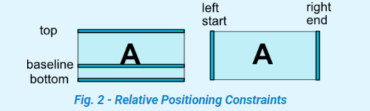
可以看到其格式基本为:
layout_constraintAAAA_toBBBBOf="@id/btn_a"意思是设置该属性的控件的AAAA方向置于btn_a的BBBB方向。

    <Button
        android:id="@+id/button1"
        android:layout_width="wrap_content"
        android:layout_height="wrap_content"
        android:layout_marginStart="8dp"
        android:layout_marginTop="8dp"
        android:layout_marginEnd="8dp"
        android:layout_marginBottom="8dp"
        android:text="Button"
        app:layout_constraintBottom_toBottomOf="parent"
        app:layout_constraintEnd_toEndOf="parent"
        app:layout_constraintStart_toStartOf="parent"
        app:layout_constraintTop_toTopOf="parent" />
gif图和布局已经很清楚了,Button的上下左右分别与其父控件的上下左右对齐,并默认添加了上下左右分别8dp的margin。需要说明的是,当控件A相对方向(上下或左右)都基于其他位置对齐,那么控件A会默认置于剩余空间的中间位置(如上图)。
Margins和GONE Margins
margin的使用与其他布局中的使用方法没有不同,但ConstraintLayout新添加了goneMargin属性。我们知道在RelativeLayout、LinearLayout布局中当控件A依赖与控件B,当控件B的可见性设置为GONE时,那么控件A的依赖关系是无效的,但是在ContraintLayout中情况稍有不同,当控件B可见性为GONE时,他们的依赖关系依旧存在,可以看做是空间B变为长宽为0的不可见控件了,但他的相对位置还是固定的。但是由于控件B的长宽变为0,控件A的相对位置还是会发生变化(相当于移动了原控件B长(宽)的距离)。
layout_goneMarginStart
layout_goneMarginEnd
layout_goneMarginLeft
layout_goneMarginTop
layout_goneMarginRight
layout_goneMarginBottom
gongMargin的作用就是有且仅当约束目标控件可见性为GONE时,以上属性才会生效。

因为设置了goneMarginTop=“30dp”,当Button A设为gone时,Button B的位置完全没有变化。
Centering positioning and bias
上面提到了当控件设置上下边的约束之后,控件会默认置于其上下约束边的中间位置(如下图),那么为什么是居中而不是贴近其中一个约束边呢,因为bias默认为0.5。Bias偏差属性,就是修改控件的相对位置使之可以偏向一侧或偏向另一侧,取值一般为0——1,特殊情况可以大于1。
layout_constraintHorizontal_bias	//基于最左侧
layout_constraintVertical_bias		//基于最上方

app:layout_constraintVertical_bias="0.5"
Dimension constraints
尺寸约束主要就是设置layout_width和layout_height,分三种情况:
- 具体数值,123dp
- wrap_content,自适应
- 并不是match_parent,在constraintLayout中不推荐使用match_parent,而是提出了MATCH_CONSTRAINT的概念。
前两种情况不多说了,跟其他控件没区别。但是需要注意的是,当控件尺寸设置为wrap_content时,如果控件内容过长时会导致约束失效(如下图)。

可以看到Button B的左右约束超出了原有范围失效了。这时候需要设置constrainedWidth要求控件必须遵循约束条件。
app:layout_constrainedWidth="true"
app:layout_constrainedHeight="true"
主要说一下第三种情况MATCH_CONSTRAINT:
MATCH_CONSTRAINT是用来代替match_parent的设置方法,设置尺寸为0dp,会默认填充满约束可用空间。

系统还提供了一下方法来进行约束:
//最小尺寸
layout_constraintWidth_min
layout_constraintHeight_min
//最大尺寸
layout_constraintWidth_max
layout_constraintHeight_max
//以下两个方法是指示占其父控件的百分比,不是约束可用空间
layout_constraintWidth_percent
layout_constraintHeight_percent
需要注意percent属性是占其父布局的百分比。
Ratio
使用layout_constraintDimensionRatio属性可以指定控件的宽高比
- width或height至少其中一个设置为0dp
- 设置layout_constraintDimensionRatio=“1:2”,width:height = 1:2
- H,1:2 或 W,1:2可以指定width:height或者height:width
app:layout_constraintDimensionRatio="H,1:3"
使用时注意如果使用H,1:2则height需要设置为0dp,使用W,1:2时同理。
Chains
同一方向(水平或竖直)多个控件首尾相连并且其第一个和最后一个控件的单边也需要进行约束组成Chain。

Chain的第一个控件(最左或最上)成为链头,可以为链头设置layout_constraintHorizontal_chainStyle属性来影响整个链的分布。

对应的设置如下,layout_constraintHorizontal_chainStyle属性设置在链头:
- spread
app:layout_constraintHorizontal_chainStyle="spread"
- spread_inside
app:layout_constraintHorizontal_chainStyle="spread_inside"
- spread
app:layout_constraintHorizontal_chainStyle="spread"
//非链头控件,设置为MATCH_CONSTRAINT
android:layout_width="0dp"
- packed
app:layout_constraintHorizontal_chainStyle="packed"
- packed
app:layout_constraintHorizontal_chainStyle="packed"
//为链头设置
app:layout_constraintHorizontal_bias="0.2"
乍一看第三种情况是不是很眼熟,当我们在使用LinearLayout时可以很容易的通过权重weight实现(1:2:2),我们一开始说了ConstraintLayout是集成了之前的布局特别与一身,所有ConstraintLayout同样也支持设置权重。第三种情况的另一种实现:
//三个控件分别设置
//第一个控件
android:layout_width="0dp"
android:layout_height="wrap_content"
app:layout_constraintHorizontal_weight="1"
//第二个控件
android:layout_width="0dp"
android:layout_height="wrap_content"
app:layout_constraintHorizontal_weight="2"
//第三个控件
android:layout_width="0dp"
android:layout_height="wrap_content"
app:layout_constraintHorizontal_weight="2"
Guideline、Barrier和Group
这三个组件都是为了辅助定位的,在实际UI中他们都是不可见的。
- Guideline
水平或竖直辅助线,可以很方便的实现如下效果:

可以很方便的实现两个按钮居中显示(当然上面说的Chain也可以实现这样的效果),动图已经很清楚了,不过多解释了。
- Barrier和Group这两个太简单了,不介绍了
拖拽编辑
- Turn On Autoconnect

根据你对控件的拖放状态自动判断你的意图并添加约束,但是很傻。。

- Infer Constraints

他比上面的强一点,可以根据你当前控件的布局方式自动给所有布局添加约束,对于简单布局还行,但布局稍复杂自动添加的约束通常不是你想要的。。。所以这两个功能都有点鸡肋。

好了,整篇介绍到这就结束了。因为ConstraintLayout主打可拖拽编辑,所有好多操作和属性用文字描述不清楚,还是需要我们自己多实操来掌握和理解。


 5333
5333


 被折叠的 条评论
为什么被折叠?
被折叠的 条评论
为什么被折叠?
 到【灌水乐园】发言


