


前段时间学过布局,不过有些迷迷糊糊,我想到自己想模仿某个app做个类似界面,却有种无处伸展拳脚的感觉,现在打算认真学习一下布局。就先从Linear Layout开始吧:
LinearLayout is a view group that aligns all children in a single direction, vertically or horizontally. You can specify the layout direction with the android:orientation attribute.
以上是引用的Google API指南里关于LinearLayout的,可以看出,线性布局的布局很单一,要么水平方向依次排开,要么垂直方向,就是这么简单。一起来看一下图:
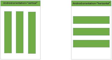
如果需要改变排列的方向,可以使用
android:orientation="vertical"或者:
android:orientation="horizontal"`Linear Layout里的元素会自动排列,如果超过屏幕,就不显示了,不会自动换行,记住哦!
<?xml version="1.0" encoding="utf-8"?>
<LinearLayout xmlns:android="http://schemas.android.com/apk/res/android"
android:orientation="horizontal"
android:layout_width="match_parent"
android:layout_height="match_parent">
<Button
android:layout_width="wrap_content"
android:layout_height="wrap_content"
android:text="Button1" />
<Button
android:layout_width="wrap_content"
android:layout_height="wrap_content"
android:text="Button2"/>
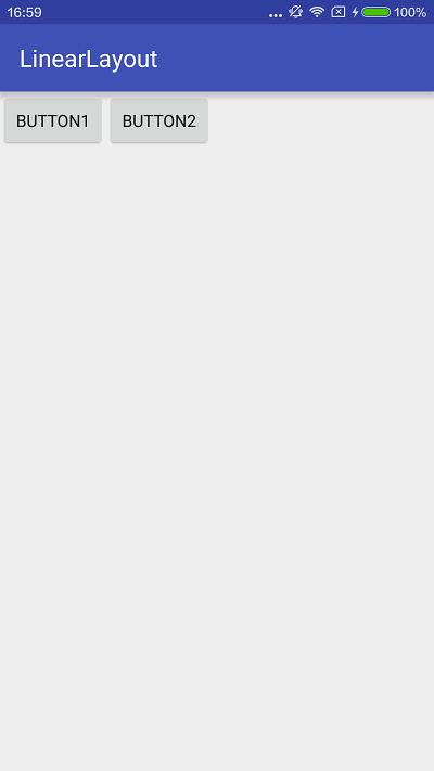
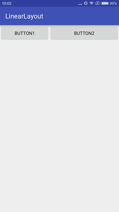
</LinearLayout>上面的代码片段中有两个button,使用了线性布局水平排列,两个button的宽度都为wrap_content,我们来看看效果:
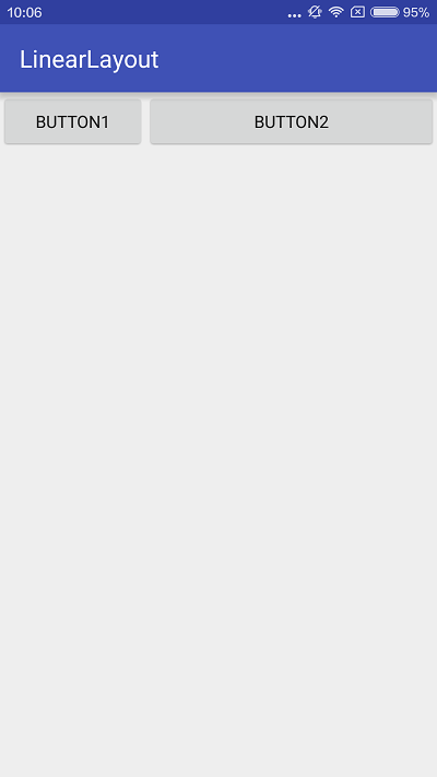
接下来,我们做个小小的改动,把两个button的layout_width改成match_parent,再来看看效果:
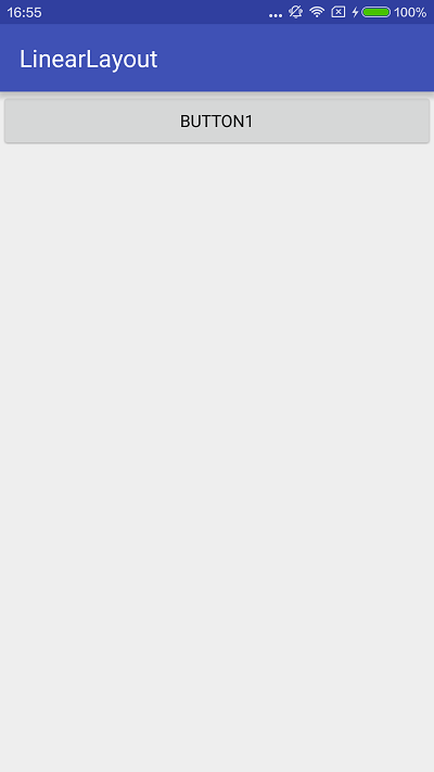
是不是应了上面那句话:超过屏幕就不会显示了,不会自动换行,它会一直往后排下去,不过在你的屏幕之外,哈哈。
就光看这两个按钮,要么两个很窄,要么只显示第一个按钮,这怎么行呢?我想要两个按钮都显示,并且两个按钮的总宽度充满屏幕,怎么办呢?没关系,这就得派Layout Weight上场了。
还是上面两个button,layout_width依然是match_parent,在这个基本上加上weight。
<?xml version="1.0" encoding="utf-8"?>
<LinearLayout xmlns:android="http://schemas.android.com/apk/res/android"
    android:orientation="horizontal"
    android:layout_width="match_parent"
    android:layout_height="match_parent">
    <Button
        android:layout_width="match_parent"
        android:layout_height="wrap_content"
        android:layout_weight="1"
        android:text="Button1" />
    <Button
        android:layout_width="match_parent"
        android:layout_height="wrap_content"
        android:layout_weight="2"
        android:text="Button2"/>
</LinearLayout>
好,来看效果:
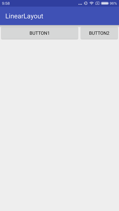
Button1大概占2/3,Button占1/3,就这样了吗?weight为1的占的比例大?为2的占的比例小?
No,重要的来了,把layout_width改为wrap_content试试
<?xml version="1.0" encoding="utf-8"?>
<LinearLayout xmlns:android="http://schemas.android.com/apk/res/android"
    android:orientation="horizontal"
    android:layout_width="match_parent"
    android:layout_height="match_parent">
    <Button
        android:layout_width="wrap_content"
        android:layout_height="wrap_content"
        android:layout_weight="1"
        android:text="Button1" />
    <Button
        android:layout_width="wrap_content"
        android:layout_height="wrap_content"
        android:layout_weight="2"
        android:text="Button2"/>
</LinearLayout>
看效果:
这样是不是比较符合你想的呢?1小2大。那么我再试试google推荐的写法layout_width=0dp
仔细观察一下以上两张图,使用wrap_content的写法Button1位置大概到APP BAR中标题LinearLayout后面,使用0dp的写法Button1位置是和“LinearLayout“的u对齐。
既然是google推荐的写法,那我就这样用吧,我也不是很清楚这其中的原理,有待进一步研究。截一张API的图吧:
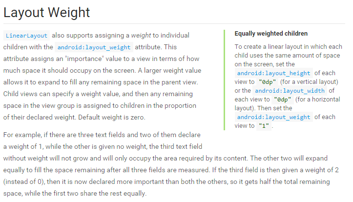
Layout Weight
Layout Weight只对Linear Layout有效。
权重和orientation的关系:
水平排列大小由宽度决定 horizontal : android:layout_width
垂直排列大小由高度决定 vertical:android:layout_height
用的时候要将width或height设置为0dp
下面一起来看看API里的例子。
<?xml version="1.0" encoding="utf-8"?>
<LinearLayout xmlns:android="http://schemas.android.com/apk/res/android"
android:layout_width="match_parent"
android:layout_height="match_parent"
android:paddingLeft="16dp"
android:paddingRight="16dp"
android:orientation="vertical" >
<EditText
android:layout_width="match_parent"
android:layout_height="wrap_content"
android:hint="@string/to" />
<EditText
android:layout_width="match_parent"
android:layout_height="wrap_content"
android:hint="@string/subject" />
<EditText
android:layout_width="match_parent"
android:layout_height="0dp"
android:layout_weight="1"
android:gravity="top"
android:hint="@string/message" />
<Button
android:layout_width="100dp"
android:layout_height="wrap_content"
android:layout_gravity="right"
android:text="@string/send" />
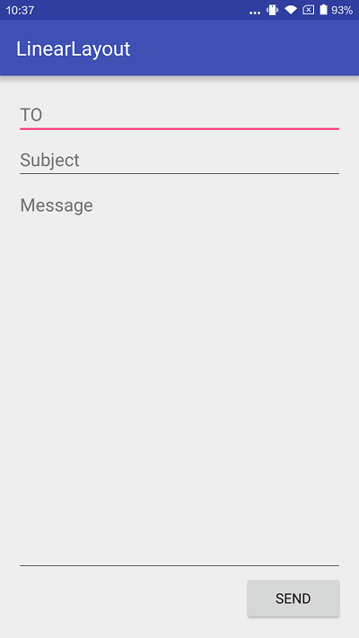
</LinearLayout>orientation为vertical,垂直方向排列,三个EditText,一个Button,前两个EditText本来多大就多大,第三个EditText设置了weight,它会占用所有剩余空间,Button设置了宽度为100dp,关于dp的概念与用法,我也还要再研究学习。
并设置靠右对齐。
看看效果:
没太明白的地方,有待研究的:
- 使用weight时,wrap_content和0dp的区别,网上说wrap_content是控件实际占用空间剩余的空间按大小比例分配,0dp就是按大小比例分配,match_parent是按比例反比显示大小
- weight一般设置什么样的数值,看有的例子有1、2等小数,有的有2000这么大
- dp这个单位在实际应用中应如何使用,多少dp是多大,显示在屏幕上的效果是怎么样,是不同尺寸的屏幕比例都一样吗?


 889
889

 被折叠的 条评论
为什么被折叠?
被折叠的 条评论
为什么被折叠?
 到【灌水乐园】发言


