


< meta > 元素
定义
meta标签提供关于HTML文档的元数据。元数据不会显示在页面上,但是对于机器是可读的。它可用于浏览器(如何显示内容或重新加载页面),搜索引擎(关键词),或其他 web 服务。 —— W3School
必要属性
| 属性 | 值 | 描述 |
|---|---|---|
| content | some text | 定义与http-equiv或name属性相关的元信息 |
可选属性
| 属性 | 值 | 描述 |
|---|---|---|
| http-equiv | content-type / expire / refresh / set-cookie | 把content属性关联到HTTP头部。 |
| name | author / description / keywords / generator / revised / others | 把 content 属性关联到一个名称。 |
| content | some text | 定义用于翻译 content 属性值的格式。 |
SEO优化
- 页面关键词,每个网页应具有描述该网页内容的一组唯一的关键字。
使用人们可能会搜索,并准确描述网页上所提供信息的描述性和代表性关键字及短语。标记内容太短,则搜索引擎可能不会认为这些内容相关。另外标记不应超过 874 个字符。
|
1
|
<
meta
name
=
"keywords"
content
=
"your tags"
/
>
|
- 页面描述,每个网页都应有一个不超过 150 个字符且能准确反映网页内容的描述标签。
|
1
|
<
meta
name
=
"description"
content
=
"150 words"
/
>
|
- 搜索引擎索引方式,robotterms是一组使用逗号(,)分割的值,通常有如下几种取值:none,noindex,nofollow,all,index和follow。确保正确使用nofollow和noindex属性值。
|
1
2
3
4
5
6
7
8
9
|
<
meta
name
=
"robots"
content
=
"index,follow"
/
>
<
!
--
all:文件将被检索,且页面上的链接可以被查询;
none:文件将不被检索,且页面上的链接不可以被查询;
index:文件将被检索;
follow:页面上的链接可以被查询;
noindex:文件将不被检索;
nofollow:页面上的链接不可以被查询。
--
>
|
- 页面重定向和刷新:content内的数字代表时间(秒),既多少时间后刷新。如果加url,则会重定向到指定网页(搜索引擎能够自动检测,也很容易被引擎视作误导而受到惩罚)。
|
1
|
<
meta
http
-
equiv
=
"refresh"
content
=
"0;url="
/
>
|
- 其他
|
1
2
3
4
|
<
meta
name
=
"author"
content
=
"author name"
/
>
<
!
--
定义网页作者
--
>
<
meta
name
=
"google"
content
=
"index,follow"
/
>
<
meta
name
=
"googlebot"
content
=
"index,follow"
/
>
<
meta
name
=
"verify"
content
=
"index,follow"
/
>
|
移动设备
- viewport:能优化移动浏览器的显示。如果不是响应式网站,不要使用initial-scale或者禁用缩放。
大部分4.7-5寸设备的viewport宽设为360px;5.5寸设备设为400px;iphone6设为375px;ipone6 plus设为414px。
|
1
2
|
<
meta
name
=
"viewport"
content
=
"width=device-width, initial-scale=1.0,maximum-scale=1.0, user-scalable=no"
/
>
<
!
--
`
width
=
device
-
width
`
会导致
iPhone
5
添加到主屏后以
WebApp
全屏模式打开页面时出现黑边
--
>
|
- width:宽度(数值 / device-width)(范围从200 到10,000,默认为980 像素)
- height:高度(数值 / device-height)(范围从223 到10,000)
- initial-scale:初始的缩放比例 (范围从>0 到10)
- minimum-scale:允许用户缩放到的最小比例
- maximum-scale:允许用户缩放到的最大比例
- user-scalable:用户是否可以手动缩 (no,yes)
- minimal-ui:可以在页面加载时最小化上下状态栏。(已弃用)
注意,很多人使用initial-scale=1到非响应式网站上,这会让网站以100%宽度渲染,用户需要手动移动页面或者缩放。如果和initial-scale=1同时使用user-scalable=no或maximum-scale=1,则用户将不能放大/缩小网页来看到全部的内容。
- WebApp全屏模式:伪装app,离线应用。
|
1
|
<
meta
name
=
"apple-mobile-web-app-capable"
content
=
"yes"
/
>
<
!
--
启用
WebApp
全屏模式
--
>
|
- 隐藏状态栏/设置状态栏颜色:只有在开启WebApp全屏模式时才生效。content的值为default | black | black-translucent 。
|
1
|
<
meta
name
=
"apple-mobile-web-app-status-bar-style"
content
=
"black-translucent"
/
>
|
- 添加到主屏后的标题
|
1
|
<
meta
name
=
"apple-mobile-web-app-title"
content
=
"标题"
>
|
![[]5B`Z{OA@R8K8D48M_YL3Y](http://www.xuanfengge.com/wp-content/uploads/2014/12/5BZOA@R8K8D48M_YL3Y.png)
- 忽略数字自动识别为电话号码
|
1
|
<
meta
content
=
"telephone=no"
name
=
"format-detection"
/
>
|
- 忽略识别邮箱
|
1
|
<
meta
content
=
"email=no"
name
=
"format-detection"
/
>
|
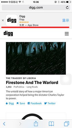
- 添加智能 App 广告条 Smart App Banner:告诉浏览器这个网站对应的app,并在页面上显示下载banner(如下图)。参考文档
|
1
|
<
meta
name
=
"apple-itunes-app"
content
=
"app-id=myAppStoreID, affiliate-data=myAffiliateData, app-argument=myURL"
>
|
- 其他 参考文档
|
1
2
3
4
5
6
7
8
9
10
11
12
13
14
15
16
17
18
|
<
!
--
针对手持设备优化,主要是针对一些老的不识别
viewport的浏览器,比如黑莓
--
>
<
meta
name
=
"HandheldFriendly"
content
=
"true"
>
<
!
--
微软的老式浏览器
--
>
<
meta
name
=
"MobileOptimized"
content
=
"320"
>
<
!
--
uc强制竖屏
--
>
<
meta
name
=
"screen-orientation"
content
=
"portrait"
>
<
!
--
QQ强制竖屏
--
>
<
meta
name
=
"x5-orientation"
content
=
"portrait"
>
<
!
--
UC强制全屏
--
>
<
meta
name
=
"full-screen"
content
=
"yes"
>
<
!
--
QQ强制全屏
--
>
<
meta
name
=
"x5-fullscreen"
content
=
"true"
>
<
!
--
UC应用模式
--
>
<
meta
name
=
"browsermode"
content
=
"application"
>
<
!
--
QQ应用模式
--
>
<
meta
name
=
"x5-page-mode"
content
=
"app"
>
<
!
--
windows
phone
点击无高光
--
>
<
meta
name
=
"msapplication-tap-highlight"
content
=
"no"
>
|
网页相关
- 申明编码
|
1
|
<
meta
charset
=
'utf-8'
/
>
|
- 优先使用 IE 最新版本和 Chrome
|
1
2
3
4
5
|
<
meta
http
-
equiv
=
"X-UA-Compatible"
content
=
"IE=edge,chrome=1"
/
>
<
!
--
关于
X
-
UA
-
Compatible
--
>
<
meta
http
-
equiv
=
"X-UA-Compatible"
content
=
"IE=6"
>
<
!
--
使用
IE6
--
>
<
meta
http
-
equiv
=
"X-UA-Compatible"
content
=
"IE=7"
>
<
!
--
使用
IE7
--
>
<
meta
http
-
equiv
=
"X-UA-Compatible"
content
=
"IE=8"
>
<
!
--
使用
IE8
--
>
|
- 浏览器内核控制:国内浏览器很多都是双内核(webkit和Trident),webkit内核高速浏览,IE内核兼容网页和旧版网站。而添加meta标签的网站可以控制浏览器选择何种内核渲染。参考文档
|
1
|
<
meta
name
=
"renderer"
content
=
"webkit|ie-comp|ie-stand"
>
|
国内双核浏览器默认内核模式如下:
- 搜狗高速浏览器、QQ浏览器:IE内核(兼容模式)
- 360极速浏览器、遨游浏览器:Webkit内核(极速模式)
- 禁止浏览器从本地计算机的缓存中访问页面内容:这样设定,访问者将无法脱机浏览。
|
1
|
<
meta
http
-
equiv
=
"Pragma"
content
=
"no-cache"
>
|
- Windows 8
|
1
2
|
<
meta
name
=
"msapplication-TileColor"
content
=
"#000"
/
>
<
!
--
Windows
8
磁贴颜色
--
>
<
meta
name
=
"msapplication-TileImage"
content
=
"icon.png"
/
>
<
!
--
Windows
8
磁贴图标
--
>
|
- 站点适配:主要用于PC-手机页的对应关系。
|
1
2
3
4
5
|
<
meta
name
=
"mobile-agent"
content
=
"format=[wml|xhtml|html5]; url=url"
>
<
!
--
[
wml
|
xhtml
|
html5
]根据手机页的协议语言,选择其中一种;
url
=
"url"
后者代表当前
PC页所对应的手机页
URL,两者必须是一一对应关系。
--
>
|
- 转码申明:用百度打开网页可能会对其进行转码(比如贴广告),避免转码可添加如下meta
|
1
|
<
meta
http
-
equiv
=
"Cache-Control"
content
=
"no-siteapp"
/
>
|
转自


 762
762


 被折叠的 条评论
为什么被折叠?
被折叠的 条评论
为什么被折叠?
 到【灌水乐园】发言


