


大端午节的在屋里吹着空调撸着代码真是酸爽 ;闲话也不多扯,直接看今天要分享的效果:

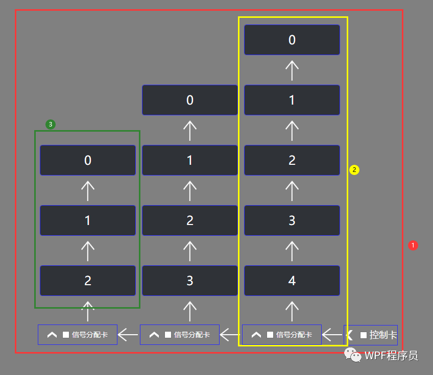
1、关于简单的布局设计:
2、前台先来个死布局,回头ListBox改模板:
<Expander ExpandDirection="Left" Header="控制卡" VerticalAlignment="Bottom" HorizontalAlignment="Right" Style="{StaticResource LeftExpanderStyle}">
    <StackPanel Orientation="Horizontal" VerticalAlignment="Bottom" HorizontalAlignment="Stretch">
        <Expander Header="信号分配卡" Style="{StaticResource ExpanderStyle}">
            <ListBox Style="{StaticResource FristListListBox}" ItemsSource="{Binding OneDataContext}" />
        </Expander>
        <Expander Header="信号分配卡" Style="{StaticResource ExpanderStyle}">
            <ListBox Style="{StaticResource FristListListBox}" ItemsSource="{Binding TwoDataContext}" />
        </Expander>
        <Expander Header="信号分配卡" Style="{StaticResource ExpanderStyle}">
            <ListBox Style="{StaticResource FristListListBox}" ItemsSource="{Binding ThreeDataContext}" />
        </Expander>
    </StackPanel>
</Expander>
3、Expander的模板:
<Setter Property="Template">
    <Setter.Value>
        <ControlTemplate TargetType="{x:Type Expander}">
            <Border BorderBrush="{TemplateBinding BorderBrush}" BorderThickness="{TemplateBinding BorderThickness}" Background="{TemplateBinding Background}" CornerRadius="3" SnapsToDevicePixels="True">
                <Grid>
                    <Grid.ColumnDefinitions>
                        <ColumnDefinition />
                        <ColumnDefinition Width="Auto" />
                    </Grid.ColumnDefinitions>
                    <ContentPresenter x:Name="ExpandSite" ContentTemplate="{TemplateBinding ContentTemplate}" Content="{TemplateBinding Content}" ContentStringFormat="{TemplateBinding ContentStringFormat}" Focusable="False" HorizontalAlignment="Right" VerticalAlignment="Bottom" Margin="{TemplateBinding Padding}" Visibility="Collapsed" />
                    <ToggleButton Grid.Column="1" x:Name="HeaderSite" ContentTemplate="{TemplateBinding HeaderTemplate}" Content="{TemplateBinding Header}" DockPanel.Dock="Top" Foreground="{TemplateBinding Foreground}" FontWeight="{TemplateBinding FontWeight}" FontStyle="{TemplateBinding FontStyle}" FontStretch="{TemplateBinding FontStretch}" FontSize="{TemplateBinding FontSize}" FontFamily="{TemplateBinding FontFamily}" HorizontalContentAlignment="{TemplateBinding HorizontalContentAlignment}" IsChecked="{Binding IsExpanded, Mode=TwoWay, RelativeSource={RelativeSource TemplatedParent}}" Margin="1" MinWidth="0" MinHeight="0" Padding="{TemplateBinding Padding}" VerticalContentAlignment="{TemplateBinding VerticalContentAlignment}" FocusVisualStyle="{x:Null}" VerticalAlignment="Bottom" HorizontalAlignment="Left" Height="40" />
                </Grid>
            </Border>
        </ControlTemplate>
    </Setter.Value>
</Setter>
4、Expander的Left属性触发器:
<Trigger Property="ExpandDirection" Value="Left">
    <Setter Property="Style" TargetName="HeaderSite">
        <Setter.Value>
            <Style TargetType="{x:Type ToggleButton}">
                <Setter Property="Template">
                    <Setter.Value>
                        <ControlTemplate TargetType="{x:Type ToggleButton}">
                            <Border Padding="{TemplateBinding Padding}">
                                <Grid Background="Transparent" SnapsToDevicePixels="False">
                                    <Border BorderBrush="#282BFF" BorderThickness="1" Padding="0">
                                        <WrapPanel VerticalAlignment="Center">
                                            <Path x:Name="arrow" Data="M0,0L8.5539884,0 17.246985,10.709991 17.32099,10.799011 17.359992,10.752991 21.637002,16.022003 17.359992,21.291992 8.6659879,32 0.11099243,32 9.9780006,19.847992 13.043004,16.069 12.970006,15.977997 9.8639869,12.153992z" SnapsToDevicePixels="False" Stroke="Transparent" StrokeThickness="0" Fill="White" Stretch="Uniform" Width="20" Height="20" />
                                            <CheckBox Margin="10,0,0,0" Content="{TemplateBinding Content}" HorizontalContentAlignment="Center" VerticalContentAlignment="Center" ContentStringFormat="{TemplateBinding ContentStringFormat}" Foreground="{TemplateBinding Foreground}" FontSize="{TemplateBinding FontSize}" HorizontalAlignment="Center" VerticalAlignment="Center" />
                                        </WrapPanel>
                                    </Border>
                                </Grid>
                            </Border>
                            <ControlTemplate.Triggers>
                                <Trigger Property="IsChecked" Value="True">
                                    <Setter Property="Data" TargetName="arrow" Value="M12.970992,0L21.524992,0 11.658996,12.152008 8.5930022,15.931 8.6660002,16.020996 11.772003,19.846008 21.636,32 13.082,32 4.3889922,21.290009 4.3150023,21.200989 4.2769927,21.247009 0,15.977997 4.2769927,10.708008z" />
                                </Trigger>
                            </ControlTemplate.Triggers>
                        </ControlTemplate>
                    </Setter.Value>
                </Setter>
             </Style>
        </Setter.Value>
    </Setter>
</Trigger>
5、ListBox的ItemsPanel:
<ItemsPanelTemplate x:Key="FristItemsPanelTemplate">
    <VirtualizingStackPanel VerticalAlignment="Bottom" />
</ItemsPanelTemplate>
6、关于ListBoxItem的Template:
<Setter Property="Template">
    <Setter.Value>
        <ControlTemplate TargetType="{x:Type ListBoxItem}">
            <StackPanel Background="Transparent">
                <Border x:Name="Bd" BorderBrush="{TemplateBinding BorderBrush}" BorderThickness="{TemplateBinding BorderThickness}" CornerRadius="4" Height="60" Background="{TemplateBinding Background}" Padding="{TemplateBinding Padding}" SnapsToDevicePixels="true">
                    <TextBlock Text="{Binding}" VerticalAlignment="Center" HorizontalAlignment="Center" Foreground="White" FontSize="24" />
                </Border>
                <Path Data="M13.002003,0L25.984006,13.004019 24.565005,14.420021 13.823991,3.6604153 13.823991,31.999021 11.818991,31.999021 11.818991,4.0220598 1.4180002,14.441021 0,13.025019z" Margin="0,10,0,0" Stretch="Fill" Fill="#FFFFFFFF" Width="26" Height="40" />
            </StackPanel>
        </ControlTemplate>
    </Setter.Value>
</Setter>
7、最后预告下一篇的效果:

最终简单的效果先这样吧 ;以后有时间的话,可以再去摸索一下更复杂的效果
 ;编程不息、Bug不止、无Bug、无生活
 ;改bug的冷静、编码的激情、完成后的喜悦、挖坑的激动 、填坑的兴奋;这也许就是屌丝程序员的乐趣吧;今天就到这里吧;希望自己有动力一步一步坚持下去;生命不息,代码不止;大家抽空可以看看今天分享的效果,有好的意见和想法,可以在留言板随意留言;我看到后会第一时间回复大家,多谢大家的一直默默的关注和支持!如果觉得不错,那就伸出您的小手点个赞并关注一下,多谢您的支持!


 240
240


 被折叠的 条评论
为什么被折叠?
被折叠的 条评论
为什么被折叠?
 到【灌水乐园】发言


