


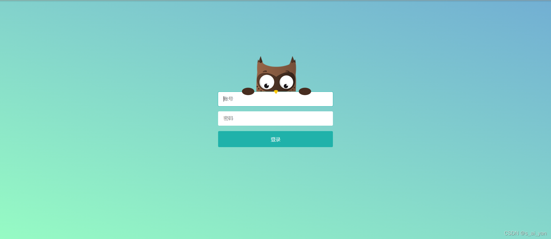
大家可以先看一下效果
点击密码猫头鹰会自动遮住眼睛
同时附上图片

以下是html和css:
<!DOCTYPE html>
<html>

<head>
    <meta http-equiv="content-type" content="text/html; charset=utf-8">
    <meta name="viewport" content="width=device-width,initial-scale=1,maximum-scale=1,user-scalable=no">

    <title>不偷看密码的超萌猫头鹰</title>
    <link rel="stylesheet" href="../css/50.css">
    <script src="http://code.jquery.com/jquery-2.1.4.min.js"></script>
    <script type="text/javascript">
        $(function(){
            $('#password').focus(function(){
                // 密码框获得焦点,追加样式.password
                $('#owl').addClass('password');
            }).blur(function(){
                // 密码框失去焦点,移除样式.password
                $('#owl').removeClass('password');
            })
        })
    </script>
</head>

<body>
    <div class="login-box">
        <div class="owl" id="owl">
            <div class="hand"></div>
            <div class="hand hand-r"></div>
            <div class="arms">
                <div class="arm"></div>
                <div class="arm arm-r"></div>
            </div>
        </div>
        <div class="input-box">
            <input type="text" placeholder="账号">
            <input type="password" placeholder="密码" id="password">
            <button>登录</button>
        </div>
    </div>
</body>

</html>
*{
/* 初始化 */
margin: 0;
padding: 0;
}
body{
/* 100%窗口高度 */
height: 100vh;
/* 弹性布局 居中 */
display: flex;
justify-content: center;
align-items: center;
/* 渐变背景 */
background: linear-gradient(200deg,#72afd3,#96fbc4);
}
.login-box{
/* 相对定位 */
position: relative;
width: 320px;
}
.input-box{
/* 弹性布局 垂直排列 */
display: flex;
flex-direction: column;
}
.input-box input{
height: 40px;
border-radius: 3px;
/* 缩进15像素 */
text-indent: 15px;
outline: none;
border: none;
margin-bottom: 15px;
}
.input-box input:focus{
outline: 1px solid lightseagreen;
}
.input-box button{
border: none;
height: 45px;
background-color: lightseagreen;
color: #fff;
border-radius: 3px;
cursor: pointer;
}
/* 接下来是猫头鹰的样式 */
.owl{
width: 211px;
height: 108px;
/* 背景图片 */
background: url("../images/owl-login.png") no-repeat;
/* 绝对定位 */
position: absolute;
top: -100px;
/* 水平居中 */
left: 50%;
transform: translateX(-50%);
}
.owl .hand{
width: 34px;
height: 34px;
border-radius: 40px;
background-color: #472d20;
/* 绝对定位 */
position: absolute;
left: 12px;
bottom: -8px;
/* 沿Y轴缩放0.6倍(压扁) */
transform: scaleY(0.6);
/* 动画过渡 */
transition: 0.3s ease-out;
}
.owl .hand.hand-r{
left: 170px;
}
.owl.password .hand{
transform: translateX(42px) translateY(-15px) scale(0.7);
}
.owl.password .hand.hand-r{
transform: translateX(-42px) translateY(-15px) scale(0.7);
}
.owl .arms{
position: absolute;
top: 58px;
width: 100%;
height: 41px;
overflow: hidden;
}
.owl .arms .arm{
width: 40px;
height: 65px;
position: absolute;
left: 20px;
top: 40px;
background: url("../images/owl-login-arm.png")
no-repeat;
transform: rotate(-20deg);
transition: 0.3s ease-out;
}
.owl .arms .arm.arm-r{
transform: rotate(20deg) scaleX(-1);
left: 158px;
}
.owl.password .arms .arm{
transform: translateY(-40px) translateX(40px);
}
.owl.password .arms .arm.arm-r{
transform: translateY(-40px) translateX(-40px) scaleX(-1);
}


 7428
7428


 被折叠的 条评论
为什么被折叠?
被折叠的 条评论
为什么被折叠?
 到【灌水乐园】发言


