


标准盒子模型 = margin + border +padding + content (content = width|height)
box-sizing:content-box
IE盒子模型 = margin + content(content = border +padding + width|height)
box-sizing:border-box
默认为标准盒模型
博主对外边距折叠问题的总结:
外边距折叠,指的是毗邻的两个或多个外边距 (margin) 会合并成一个外边距。其中所说的 margin 毗邻,可以归结为以下两点:
- 这两个或多个外边距没有被非空内容、padding、border 或 clear 分隔开。
- 这些 margin 都处于普通流中。
发生折叠的情况
两个或多个毗邻的普通流中的块元素垂直方向上的 margin 会折叠。
(此处仅讨论非浮动元素)
- 在没有被分隔开的情况下,一个元素的 margin-top 会和它普通流中的第一个子元素的 margin-top 相邻,没有height的限制;
- 只有在一个元素的 height 是 “auto” 的情况下(即如果height设置了值就不是),它的 margin-bottom才会和它普通流中的最后一个子元素的 margin-bottom 相邻。
- 即如果一个元素的 height 特性的值不是 auto,那么它的 margin-bottom 和它子元素的 margin-bottom 不算相邻,因此,不会发生折叠,margin-top无限制。
- 只有垂直方向的 margin 才会折叠,也就是说,水平方向的 margin 不会发生折叠的现象。
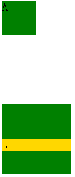
ex:
<div style="border:1px solid red; width:100px;">
    <div style="margin:50px 0; background-color:green; height:50px; width:50px;">
       <div style="margin:20px 0;">
           <div style="margin:100px 0;">B</div>
       </div>
    </div>
</div>
效果图
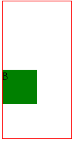
上面的例子margin-top 外边距折叠,所以是 100px,margin-bottom 没有折叠,只有 50px。
外边距折叠后 margin 的计算
1. 参与折叠的 margin 都是正值
在 margin 都是正数的情况下,取其中 margin 较大的值为最终 margin 值。
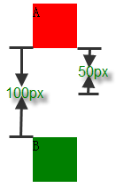
ex:
<div style="height:50px; margin-bottom:50px;width:50px; background-color: red;">A</div>
<div style="height:50px;margin-top:100px; width:50px; background-color: green;">B</div>
效果
2. 参与折叠的 margin 都是负值
当 margin 都是负值的时候,取的是其中绝对值较大的,然后,从 0 位置,负向位移。
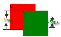
ex:
<div style="height:100px; margin-bottom:-75px;width:100px; background-color: red;">A</div>
<div style="height:100px;margin-top:-50px; margin-left:50px; width:100px; background-color: green;">B</div>
效果:
3. 参与折叠的 margin 中有正值,有负值
有正有负,先取出负 margin 中绝对值中最大的,然后,和正 margin 值中最大的 margin 相加。
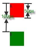
ex:
<div style="height:50px; margin-bottom:-50px;width:50px; background-color: red;">A</div>
<div style="height:50px;margin-top:100px; width:50px; background-color: green;">B</div>
效果:
4. 相邻的 margin 要一起参与计算,不得分步计算
相邻的元素不一定非要是兄弟节点,父子节点也可以,即使不是兄弟父子节点也可以相邻。而且,在计算时,相邻的 margin要一起参与计算,不得分步计算。
ex:
<div style="margin:50px 0;background-color:green; width:50px;">
    <div style="margin:-60px 0;">
           <div style="margin:150px 0;">A</div>
    </div>
</div>
<div style="margin:-100px 0;background-color:green; width:50px;">
    <div style="margin:-120px 0;>
           <div style="margin:200px 0;">B</div>
    </div>
</div>
结果:
以上例子中,A 和 B 之间的 margin 折叠产生的 margin,是6个相邻 margin 折叠的结果。将其 margin 值分为两组:
正值:50px,150px,200px
负值:-60px,-100px,-120px
根据有正有负时的计算规则,正值的最大值为 200px,负值中绝对值最大的是 -120px,所以,最终折叠后的 margin 应该是 200 + (-120) = 80px。
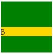
浮动元素、inline-block 元素、绝对定位元素的 margin 不会和垂直方向上其他元素的 margin 折叠
ex:
<div style="margin-bottom:50px;width:50px; height:50px; background-color:green;">A</div>
<div style="margin-top:50px; width:100px; height:100px; background-color:green; float:left;">
    <div style="margin-top:50px;background-color:gold;">B</div>
</div>
效果:
两个绿色的块儿之间,相距100px,而若 B 和它的浮动包含块发生 margin 折叠的话,金色的条应该位于绿色块的最上方,显然,没有发生折叠。inline-block 元素、绝对定位元素的 margin同样如此, 不会和垂直方向上其他元素的 margin 折叠。
创建了块级格式化上下文(BFC模式)的元素,不和它的子元素发生 margin 折叠
ex:
<div style="margin-top:50px; width:100px; height:100px; background-color:green; overflow:hidden;">
    <div style="margin-top:50px; background-color:gold;">B</div>
</div>
效果:
若 B 和它的 “overflow:hidden” 包含块发生 margin 折叠的话,金色的条应该位于绿色块的最上方,否则,没有发生。
元素自身的 margin-bottom 和 margin-top 相邻时也会折叠
ex:
<div style="border:1px solid red; width:100px;">
    <div style="margin-top: 100px;margin-bottom: 50px;></div>
</div>
效果:
如果未发生折叠,那么盒子的高度应该为150px,显然现在盒子的高度都是100px,所以发生了折叠
暂时到此结束,若有问题可以联系博主
博文参考地址
https://www.cnblogs.com/jackyWHJ/p/3756087.html


 6299
6299


 被折叠的 条评论
为什么被折叠?
被折叠的 条评论
为什么被折叠?
 到【灌水乐园】发言


