


目录
1.现象:
CSS中使用外边距margin定义块元素的垂直外边距会产生外边距合并(塌陷)
2.相邻块元素外边距合并(塌陷)的表现:
e.g.
a.上下两个相邻块元素,如上面块元素有下外边距margin-bottom,下面的块元素有上外边距margin-top
b.他们之间的外边距不是两个margin-bottom和margin-bottom的和,而是两个值中较大的那个值。
e.g.
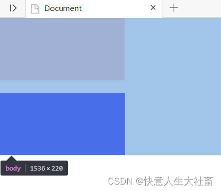
上面的盒子box1的margin-bottom:10px;下面的盒子box2的margin-top:20px;
<!DOCTYPE html>
<html lang="en">

<head>
    <meta charset="UTF-8">
    <meta http-equiv="X-UA-Compatible" content="IE=edge">
    <meta name="viewport" content="width=device-width, initial-scale=1.0">
    <title>Document</title>
    <style>
        * {
            margin: 0;
            padding: 0;
        }

        .box1 {
            width: 200px;
            height: 100px;
            background-color: pink;
            margin-bottom: 10px;


        }

        .box2 {
            width: 200px;
            height: 100px;
            background-color: blue;
            margin-top: 20px;
        }
    </style>
</head>

<body>
    <div class="box1"></div>
    <div class="box2"></div>
</body>

</html>
得到的结果是,整体height:220px;所以他们之间的margin取的是20px;(即是两者之间数值较大的margin-top)
解决方法:尽量只给相邻盒子中的一个盒子加margin值
3.嵌套块元素外边距合并(塌陷)的表现:
e.g.
a.有嵌套关系的两个块元素,如父级盒子无上内边距padding-top和边框border,且父级盒子和子级盒子都有上外边距margin-top
b.他们共同的上外边距margin-top是两个值中较大的那个值。
e.g,
父盒子box1的width:300px;height:200px;margin-top: 10px;粉色
子盒子box2的width:200px;height:100px;margin-top: 20px;蓝色
<!DOCTYPE html>
<html lang="en">

<head>
    <meta charset="UTF-8">
    <meta http-equiv="X-UA-Compatible" content="IE=edge">
    <meta name="viewport" content="width=device-width, initial-scale=1.0">
    <title>Document</title>
    <style>
        * {
            margin: 0;
            padding: 0;
        }

        .box1 {
            width: 300px;
            height: 200px;
            background-color: pink;
            margin-top: 10px;


        }

        .box2 {
            width: 200px;
            height: 100px;
            background-color: blue;
            margin-top: 20px;
        }
    </style>
</head>

<body>
    <div class="box1">
        <div class="box2"></div>
    </div>

</body>

</html>
得到的结果是整体height:220px;所以他们总体的margin-top取的是20px;(即是margin-top和margin-bottom中两者之间数值较大的margin-top)

解决方法1:给父元素加一个边框border(border-top),这样子元素加margin-top是从父元素的上边框开始算的
<!DOCTYPE html>
<html lang="en">

<head>
    <meta charset="UTF-8">
    <meta http-equiv="X-UA-Compatible" content="IE=edge">
    <meta name="viewport" content="width=device-width, initial-scale=1.0">
    <title>Document</title>
    <style>
        * {
            margin: 0;
            padding: 0;
        }

        .box1 {
            width: 300px;
            height: 200px;
            background-color: pink;
            border: 1px solid black;
            margin-top: 10px;

        }

        .box2 {
            width: 200px;
            height: 100px;
            background-color: blue;
            margin-top: 20px;
        }
    </style>
</head>

<body>
    <div class="box1">
        <div class="box2"></div>
    </div>

</body>

</html>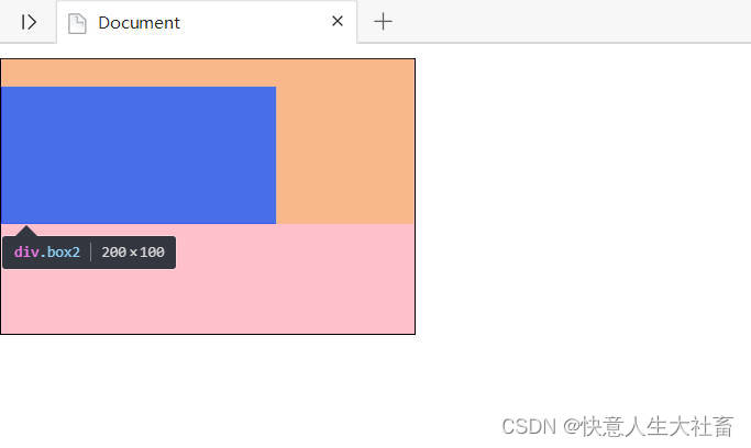
坏处:父盒子由于加了边框改变了大小

解决方法2:给父元素加一个上内边框padding-top,这样子元素加margin-top是从父元素的上边框开始算的
<!DOCTYPE html>
<html lang="en">

<head>
    <meta charset="UTF-8">
    <meta http-equiv="X-UA-Compatible" content="IE=edge">
    <meta name="viewport" content="width=device-width, initial-scale=1.0">
    <title>Document</title>
    <style>
        * {
            margin: 0;
            padding: 0;
        }

        .box1 {
            width: 300px;
            height: 200px;
            background-color: pink;
            padding-top: 1px;
            margin-top: 10px;

        }

        .box2 {
            width: 200px;
            height: 100px;
            background-color: blue;
            margin-top: 20px;
        }
    </style>
</head>

<body>
    <div class="box1">
        <div class="box2"></div>
    </div>

</body>

</html>
坏处:父盒子由于加了padding-top也改变了大小

解决方法3:给父元素加overflow:hidden溢出隐藏,这样子元素加margin-top是从父元素的上边框开始算的(最常用,因为不会改变盒子大小)
<!DOCTYPE html>
<html lang="en">

<head>
    <meta charset="UTF-8">
    <meta http-equiv="X-UA-Compatible" content="IE=edge">
    <meta name="viewport" content="width=device-width, initial-scale=1.0">
    <title>Document</title>
    <style>
        * {
            margin: 0;
            padding: 0;
        }

        .box1 {
            width: 300px;
            height: 200px;
            background-color: pink;
            overflow: hidden;
            margin-top: 10px;

        }

        .box2 {
            width: 200px;
            height: 100px;
            background-color: blue;
            margin-top: 20px;
        }
    </style>
</head>

<body>
    <div class="box1">
        <div class="box2"></div>
    </div>

</body>

</html>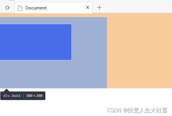
父盒子大小没有改变
解决方法4:给父元素加浮动,这样子元素加margin-top是从父元素的上边框开始算的(也不会改变父大小)
<!DOCTYPE html>
<html lang="en">

<head>
    <meta charset="UTF-8">
    <meta http-equiv="X-UA-Compatible" content="IE=edge">
    <meta name="viewport" content="width=device-width, initial-scale=1.0">
    <title>Document</title>
    <style>
        * {
            margin: 0;
            padding: 0;
        }

        .box1 {
            width: 300px;
            height: 200px;
            background-color: pink;
            float: left;
            margin-top: 10px;

        }

        .box2 {
            width: 200px;
            height: 100px;
            background-color: blue;
            margin-top: 20px;
        }
    </style>
</head>

<body>
    <div class="box1">
        <div class="box2"></div>
    </div>

</body>

</html>
结果与方法3同,就不贴图了
解决方法5:给子元素转换为行内块元素(display: inline-block;),这样子元素加margin-top是从父元素的上边框开始算的(也不会改变父大小)
<!DOCTYPE html>
<html lang="en">

<head>
    <meta charset="UTF-8">
    <meta http-equiv="X-UA-Compatible" content="IE=edge">
    <meta name="viewport" content="width=device-width, initial-scale=1.0">
    <title>Document</title>
    <style>
        * {
            margin: 0;
            padding: 0;
        }

        .box1 {
            width: 300px;
            height: 200px;
            background-color: pink;
            float: left;
            margin-top: 10px;

        }

        .box2 {
            width: 200px;
            height: 100px;
            background-color: blue;
            margin-top: 20px;
            display: inline-block;
        }
    </style>
</head>

<body>
    <div class="box1">
        <div class="box2"></div>
    </div>

</body>

</html>
结果也与方法3同,也就不贴图了


 1万+
1万+


 被折叠的 条评论
为什么被折叠?
被折叠的 条评论
为什么被折叠?
 到【灌水乐园】发言


