


From: https://blog.stylingandroid.com/floating-action-button-part-1/
Material Design的众多新设计中,有一个呢,就是那个悬浮的Action Bar。但是在我写这篇文章的时候,还没有一个比较官方的实现方式,所以在这个系列里,我们一起来看看怎么来实现这个FAB吧。
先说一下,这个系列里,api的最低版本是 minSdkVersion="21"。我费了九牛二虎之力想把他做到支持低版本。但是最终觉得利用“棒棒糖”的已有的功能特性去实现最符合Material Design风格的FAB才是王道。支持低版本不过是件费力不讨好的事情。
要做的第一件事情,是把FAB上的那个"+"图标给弄出来。我会经常提到Material Design的指导手册里关于FAB的设计指导,所以还是给个链接吧。点击打开链接 。
来看一下这个指导手册里扒来的图。
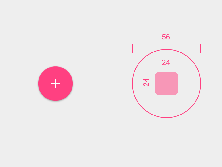
FAB里面的“+”的大小应该是24dp*24dp。整个按钮的大小应该是56dp*56dp。
我将把这个“+”做成VectorDrawable ,这样,方便以后添加动画神马的。来看一下代码。
res/drawable/plus.xml
<?xml version="1.0" encoding="utf-8"?>
<vector xmlns:android="http://schemas.android.com/apk/res/android"
    android:viewportHeight="24"
    android:viewportWidth="24"
    android:width="24dp"
    android:height="24dp">

    <group android:name="plus_group" android:pivotX="12" android:pivotY="12">
        <path
            android:name="plus_path"
            android:strokeColor="@android:color/white"
            android:strokeWidth="3"
            android:pathData="M12,0L12,24M0,12,L24,12" />
    </group>
</vector>
在这里,我们做的就是,画一横一竖两条在中点相交的横线。
然后呢,我们需要给FAB画一个背景。就用shape drawable 吧(nested inside a ripple)。这样比较好弄阴影。
res/drawable/fab_background.xml
<?xml version="1.0" encoding="utf-8"?>
<ripple xmlns:android="http://schemas.android.com/apk/res/android"
    android:color="?android:colorControlHighlight">
    <item>
        <shape android:shape="oval">
            <solid android:color="?android:colorAccent" />
        </shape>
    </item>
</ripple>
说到主题,就来看看主题里面对FAB样式的一个定义。
res/values/styles.xml
<?xml version="1.0" encoding="utf-8"?>
<resources>

    <style name="AppTheme" parent="android:Theme.Material.Light.DarkActionBar">
        <item name="android:colorPrimary">@color/sa_green</item>
        <item name="android:colorPrimaryDark">@color/sa_green_dark</item>
        <item name="android:colorAccent">@color/sa_green</item>
        <item name="android:colorControlHighlight">@color/sa_green_transparent</item>
    </style>

    <style name="FloatingActionButton" parent="android:Widget.Material.Button">
        <item name="android:background">@drawable/fab_background</item>
        <item name="android:stateListAnimator">@anim/fab_state_list_animator</item>
        <item name="android:layout_width">56dp</item>
        <item name="android:layout_height">56dp</item>
    </style>
</resources>现在我们详细说一下我们刚刚创建好的背景,并设置一下他的大小。一般来说,我不会把带有layout_* 的这个属性放到样式里,因为这样的前缀意味着他们依赖着父类的布局而不是视图本身。之前那个还只是一个布局,而不是一个样式。但是我们现在需要的是一个有着固定大小,宽高,对所有布局都适用的FAB,所以为了一致性,我们把他定义到样式里。
一定记得要继承自Material.Button样式,这里还有个东西需要说明下。一开始我继承这个样式,但是没有重写stateListAnimator属性。这样出来的效果也差不多是我想要的。FAB有一个自动产生的阴影-现在知道我们之前为什么用shape drawable了吧,因为安卓的框架会识别这种类型并自动画上阴影。当你按下FAB并放开,按钮会有一个轻微的上升效果。-差不多跟Material Design里的描述一样。当是有一点不对劲,就是按钮的高度。指导手册说了,FAB应该要比其他的按钮高,因为他应该是比较主要的操作按钮,他的高度应该比普通按钮高。杯具的是,我在布局跟样式里更改高度都没起作用。
原因是在父类样式(定义了各种状态,以及状态之间的专长动画)里定义的stateListAnimator 定义了高度,并且把translateZ 写死了,重写了样式跟布局。所以要改变高度,还要重写stateListAnimator 。
这个动画状态列表跟普通的按钮是一毛一样的,我改变了一下高度跟translationY ,让他比普通按钮高一点。
现在我们终于得到完整的FAB啦!
res/layout/activity_main.xml
<RelativeLayout xmlns:android="http://schemas.android.com/apk/res/android"
xmlns:tools="http://schemas.android.com/tools"
android:layout_width="match_parent"
android:layout_height="match_parent"
android:paddingLeft="@dimen/activity_horizontal_margin"
android:paddingRight="@dimen/activity_horizontal_margin"
android:paddingTop="@dimen/activity_vertical_margin"
android:paddingBottom="@dimen/activity_vertical_margin"
android:clipChildren="false"
android:clipToPadding="false"
tools:context=".MainActivity"
android:tag="main"
android:transitionName="content">
<ImageButton
android:id="@+id/fab"
style="@style/FloatingActionButton"
android:src="@drawable/plus"
android:layout_alignParentEnd="true"
android:layout_alignParentBottom="true"
android:layout_marginBottom="48dp"
android:contentDescription="@null" />
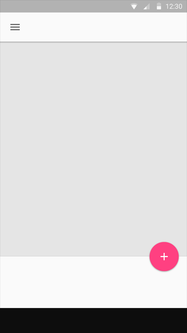
</RelativeLayout>好了,一个有高度跟阴影,会根据手势上升或者隐藏的FAB搞定了。下个部分我们看看怎么样让他动起来。


 5428
5428

 被折叠的 条评论
为什么被折叠?
被折叠的 条评论
为什么被折叠?
 到【灌水乐园】发言


