


文章目录
1. 小程序页面布局 - 记账页面
1.1. 记账页面的布局
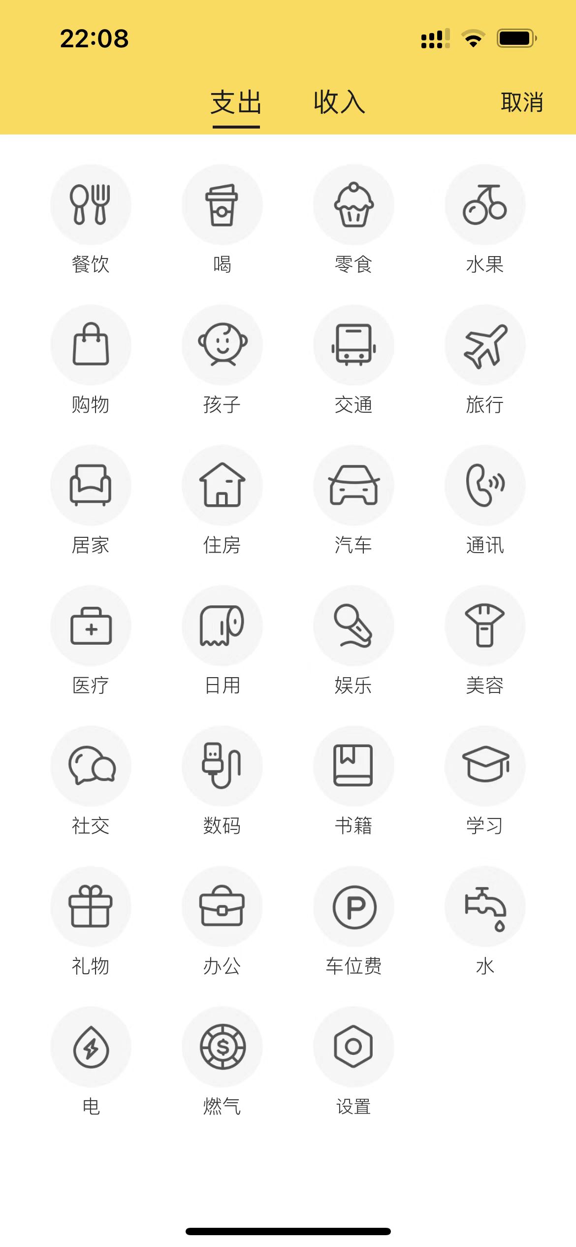
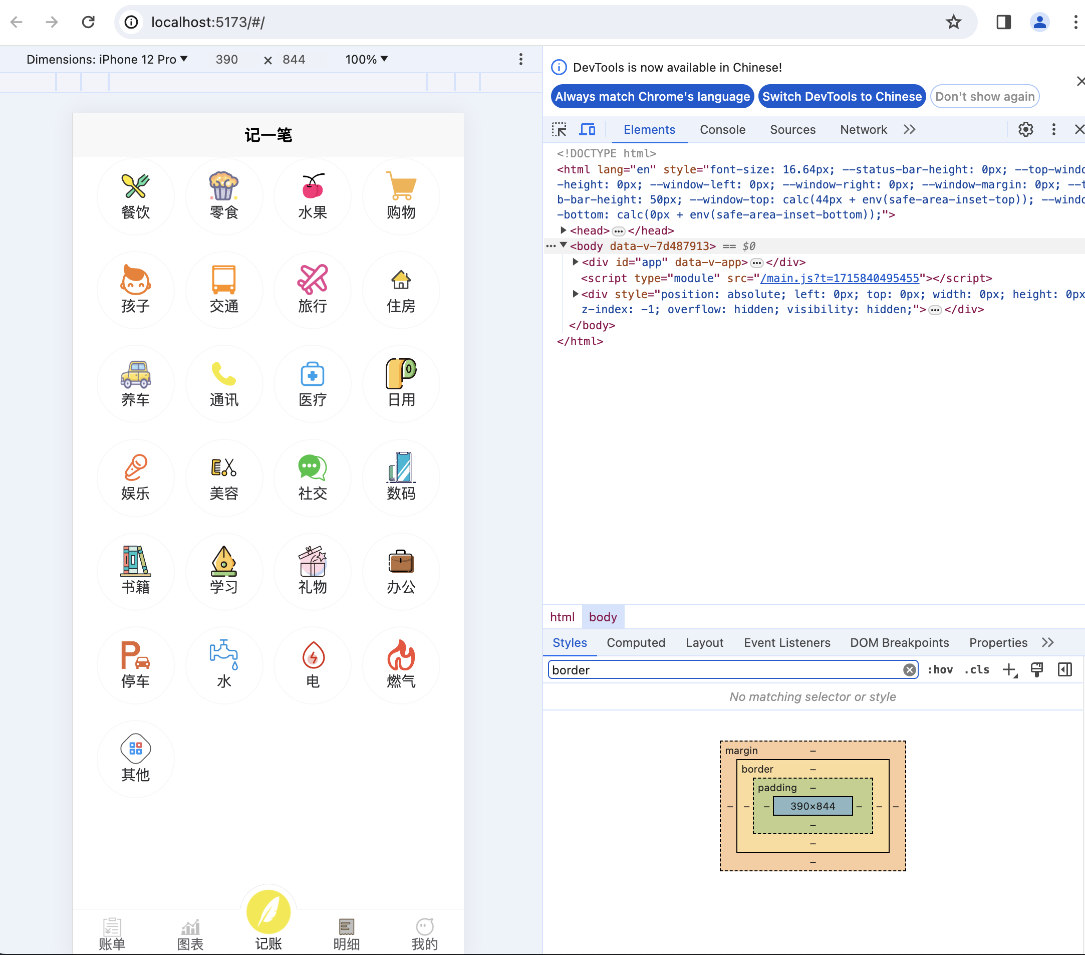
1.1.1. 样例
我们参考样例来做,会事半功倍,一些互联网叙事也是这么来的。
1.1.2. 页面解构
-
分为头部和内容区2个部分
-
头部是一个可以点击进行切换的组件,要找一下vView哪种合适
-
内容区,看起来也应该是2个,分别是对应“支出”和“收入”的不同的类型
-
我们观察“支出”这个页面内容区域,是典型的类似网格的布局,一行4个图标,中间均分。用css3里面的术语来描述就是:
justify-content: space-between
1.1.3. 内容布局的实现
- 绘制页面,渲染虚拟占位
- 找好对应的图标,写一个对应的js数组,替换虚拟占位
1.1.3.1. 填坑(display:flex)
先说一下坑,本来是准备使用display:flex布局来做,demo是这样:
<!DOCTYPE html>
<html lang="en">

<head>
    <meta charset="UTF-8">
    <title>flex布局-添加账单</title>
    <style>
        .content {
            width: 390px;
            height: 500px;
            display: flex;
            flex-wrap: wrap;
            flex-direction: row;
            background-color: gray;
            justify-content: center;
            align-content: flex-start;
            margin: 0 auto;
        }

        .item {
            width: 100px;
            height: 100px;
            background-color: green;
            border: 1px solid black;
        }
    </style>
</head>

<body>

    <div class="page">
        <div class="content">
            <div class="item">1</div>
            <div class="item">2</div>
            <div class="item">3</div>
            <div class="item">4</div>
        </div>
    </div>

</body>

</html>
这个最后的效果是这样:
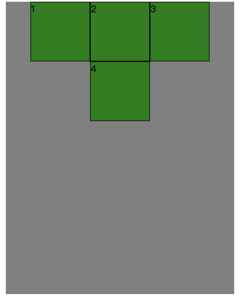
思考很久,最后一个4为什么是在中间呢?我明明写了align-content: flex-start;其实这个应该这么理解:
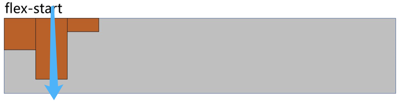
align-content: flex-start;是侧轴箭头从上到下的方式对齐。
在我们的demo代码里,4为什么居中,是因为使用了justify-content: center;这个是主轴居中对齐。
我们想要的:
- 主轴居中对齐
- 侧轴,最后也要从左往右排
思考一下:
能不能用 display: flex;不设置justify-content: center;呢?通过其他方式调整,让其居中。
好像不是特别的容易。有时间再细细思考能不能通过margin、padding的计算来做。
1.1.3.2. 突破(display:grid)
这是无意间学到的,在禹神的200集css课程里好像没看到有这个。
于是百度先找找资料:https://blog.csdn.net/cookcyq__/article/details/132382129
然后也是做了一个demo:
<!DOCTYPE html>
<html lang="en">

<head>
    <meta charset="UTF-8">
    <meta name="viewport" content="width=device-width, initial-scale=1.0">
    <title>grid布局</title>
    <style>
        .container {
            width: 1000px;
            display: grid;
            /* 4个 200*200的区域 */
            grid-template-columns: repeat(4, 200px);
            /* gap: 10px; */
            /* 行间距 */
            row-gap: 60px;
            /* 列间距 */
            column-gap: 20px;
            /* 4个盒子,在父容器中居中 */
            justify-content: center;
            background-color: gray;
            /* 让父容器在视口居中 */
            margin: 0 auto;
        }

        .component {
            background-color: orange;
            height: 200px;
        }
    </style>
</head>

<body>
    <div class="container">
        <div class="component">1</div>
        <div class="component">2</div>
        <div class="component">3</div>
        <div class="component">4</div>
        <div class="component">5</div>
        <div class="component">6</div>
        <div class="component">7</div>
        <div class="component">8</div>
        <div class="component">9</div>
        <div class="component">10</div>
    </div>
</body>

</html>
显示:
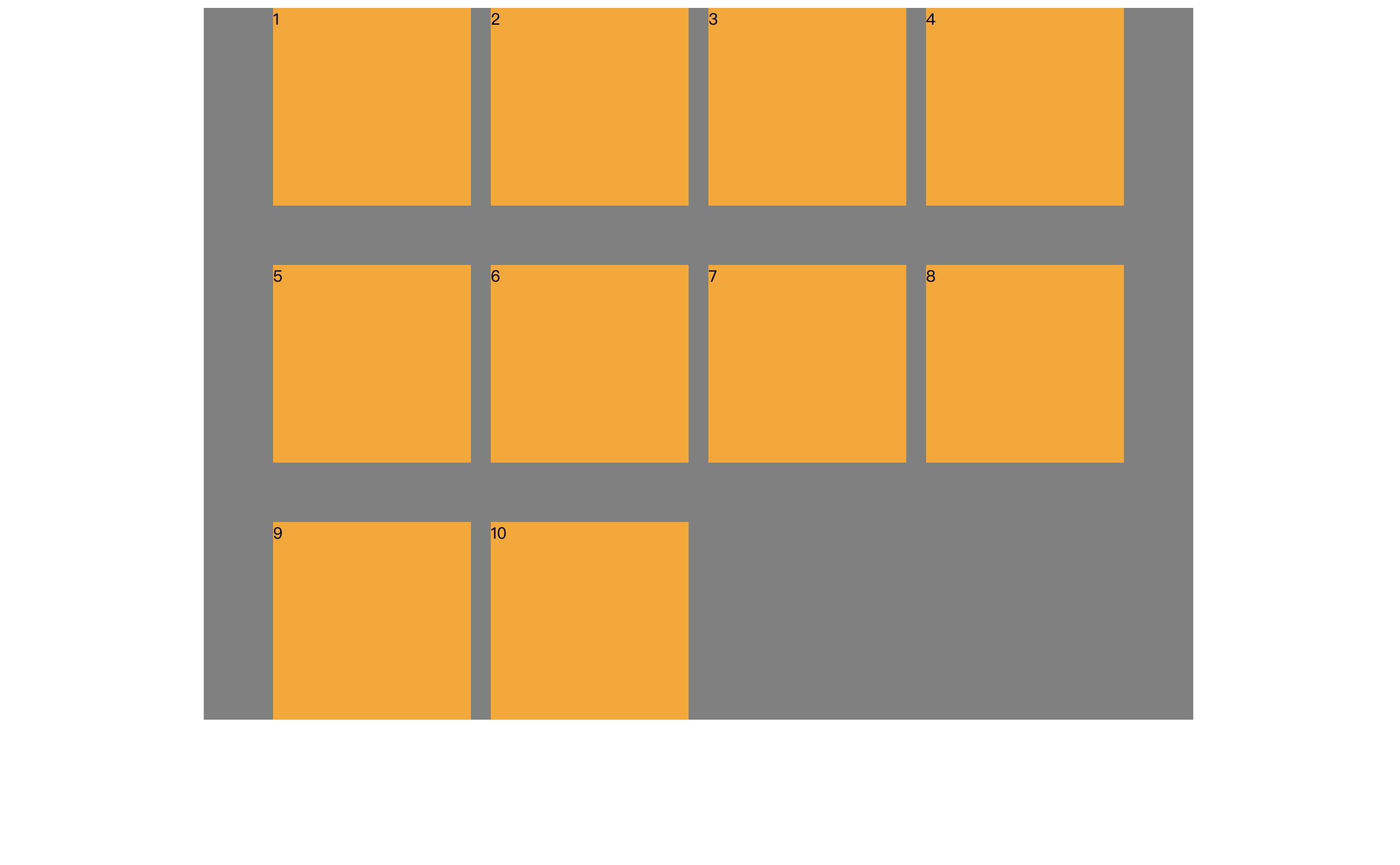
这个是能很好的满足我们的需求的。
1.1.3.3. 应用
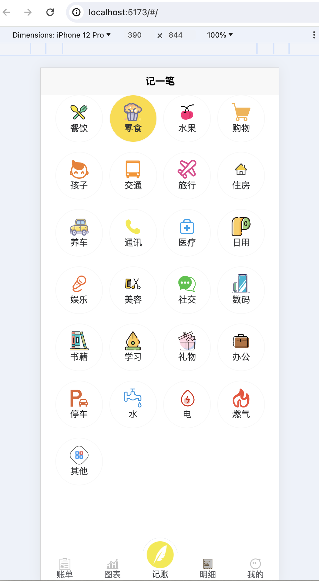
最后的呈现效果:
代码还是比较少的,css也不多,实现的效果还是不错的:
<template>


        <view v-if="current_active=='支出'" class="imgs_content">
            <view class="item_view" v-for="(item, index) in expenditure_list" :key="index" @click="selectItem(item.id)">
                <image slot="icon" class="box-icon" :src="item.icon">
                </image>
                <view>{{item.text}}</view>
            </view>
        </view>

        <view v-if="current_active=='收入'" class="imgs_content">
            <view class="item_view" v-for="(item, index) in income_list" :key="index" @click="selectItem(item.id)">
                <image slot="icon" class="box-icon" :src="item.icon">
                </image>
                <view>{{item.text}}</view>
            </view>
        </view>


        <u-tabbar :list="tabbar" :mid-button="true"></u-tabbar>

</template>

<script>
    import {
        useStore
    } from 'vuex'


    export default {
        data() {
            return {
                tabbar: [],

                current_active: '支出',

                expenditure_list: [{
                        "id": "1",
                        "text": "餐饮",
                        "icon": "../../static/type/餐饮.png"
                    },
                    {
                        "id": "2",
                        "text": "零食",
                        "icon": "../../static/type/零食.png"
                    },
                    {
                        "id": "3",
                        "text": "水果",
                        "icon": "../../static/type/水果.png"
                    },
                    {
                        "id": "4",
                        "text": "购物",
                        "icon": "../../static/type/购物.png"
                    },
                    {
                        "id": "5",
                        "text": "孩子",
                        "icon": "../../static/type/孩子.png"
                    },
                    {
                        "id": "6",
                        "text": "交通",
                        "icon": "../../static/type/交通.png"
                    },
                    {
                        "id": "7",
                        "text": "旅行",
                        "icon": "../../static/type/旅行.png"
                    },
                    {
                        "id": "8",
                        "text": "住房",
                        "icon": "../../static/type/住房.png"
                    },
                    {
                        "id": "9",
                        "text": "养车",
                        "icon": "../../static/type/养车.png"
                    },
                    {
                        "id": "10",
                        "text": "通讯",
                        "icon": "../../static/type/通讯.png"
                    },
                    {
                        "id": "11",
                        "text": "医疗",
                        "icon": "../../static/type/医疗.png"
                    },
                    {
                        "id": "12",
                        "text": "日用",
                        "icon": "../../static/type/日用.png"
                    },
                    {
                        "id": "13",
                        "text": "娱乐",
                        "icon": "../../static/type/娱乐.png"
                    },
                    {
                        "id": "14",
                        "text": "美容",
                        "icon": "../../static/type/美容.png"
                    },
                    {
                        "id": "15",
                        "text": "社交",
                        "icon": "../../static/type/社交.png"
                    },
                    {
                        "id": "16",
                        "text": "数码",
                        "icon": "../../static/type/数码.png"
                    },
                    {
                        "id": "17",
                        "text": "书籍",
                        "icon": "../../static/type/书籍.png"
                    },
                    {
                        "id": "18",
                        "text": "学习",
                        "icon": "../../static/type/学习.png"
                    },
                    {
                        "id": "19",
                        "text": "礼物",
                        "icon": "../../static/type/礼物.png"
                    },
                    {
                        "id": "20",
                        "text": "办公",
                        "icon": "../../static/type/办公.png"
                    },
                    {
                        "id": "21",
                        "text": "停车",
                        "icon": "../../static/type/停车.png"
                    },
                    {
                        "id": "22",
                        "text": "水",
                        "icon": "../../static/type/水.png"
                    },
                    {
                        "id": "23",
                        "text": "电",
                        "icon": "../../static/type/电.png"
                    },
                    {
                        "id": "24",
                        "text": "燃气",
                        "icon": "../../static/type/燃气.png"
                    },
                    {
                        "id": "25",
                        "text": "其他",
                        "icon": "../../static/type/其他.png"
                    },
                    // {"id":"-999","text":"设置","icon":"../../static/setting.png"}
                ],
                income_list: [{
                        "id": "1",
                        "text": "工资",
                        "icon": "../../static/type/工资.png"
                    },
                    {
                        "id": "2",
                        "text": "年终奖",
                        "icon": "../../static/type/年终奖.png"
                    },
                    {
                        "id": "3",
                        "text": "兼职",
                        "icon": "../../static/type/兼职.png"
                    },
                    {
                        "id": "4",
                        "text": "理财",
                        "icon": "../../static/type/理财.png"
                    },
                    {
                        "id": "5",
                        "text": "投资",
                        "icon": "../../static/type/投资.png"
                    },
                    {
                        "id": "6",
                        "text": "稿酬",
                        "icon": "../../static/type/稿酬.png"
                    },
                    {
                        "id": "7",
                        "text": "收租",
                        "icon": "../../static/type/收租.png"
                    },
                    {
                        "id": "8",
                        "text": "经营",
                        "icon": "../../static/type/经营.png"
                    },
                    {
                        "id": "9",
                        "text": "礼金",
                        "icon": "../../static/type/礼金.png"
                    },
                    {
                        "id": "10",
                        "text": "利息",
                        "icon": "../../static/type/利息.png"
                    },
                    {
                        "id": "11",
                        "text": "其他",
                        "icon": "../../static/type/其他.png"
                    },
                    // {"id":"-999","text":"设置","icon":"../../static/setting.png"}
                ],
            }
        },
        methods: {
            selectItem(index) {
                uni.showToast({
                    title: index
                })
            }
        },
        onLoad() {
            const store = useStore(); //获取store对象
            /**
             * 示例中为每个tabbar页面都写了一遍tabbar变量,您可以将tabbar数组写入到vuex中,这样可以全局引用
             */
            this.tabbar = store.getters.getTabbar;
        }
    }
</script>

<style>
    .imgs_content {
        display: grid;
        grid-template-columns: repeat(4, 150rpx);
        row-gap: 30rpx;
        column-gap: 20rpx;
        justify-content: center;
        /* background-color: gray; */
    }
    .item_view {
        width: 150rpx;
        height: 150rpx;
        /* background-color: green; */
        display: flex;
        flex-direction: column;
        justify-content: center;
        align-items: center;
        border: 1px solid rgb(248, 248, 248);
        border-radius: 100rpx;
    }

    .item_view .box-icon {
        width: 60rpx;
        height: 60rpx;
    }
</style>
1.1.4. 点击图片加背景色
主要判断当item值相等的时候,给渲染样式。
主要代码:class="[select_item==item.id ? 'select-item':'']":
<view v-if="current_active=='支出'" class="imgs_content">
            <view class="item_view" :class="[select_item==item.id ? 'select-item':'']" v-for="(item, index) in expenditure_list" :key="index"
            @click="selectItem(item.id)">
                <image slot="icon" class="box-icon" :src="item.icon">
                </image>
                <view>{{item.text}}</view>
            </view>
        </view>
CSS:
.select-item {
        background-color: #FDDC2D;
    }
JS:
methods: {
  selectItem(index) {
    this.select_item = index;
},
这样,点击后,就能有背景色,效果如下:
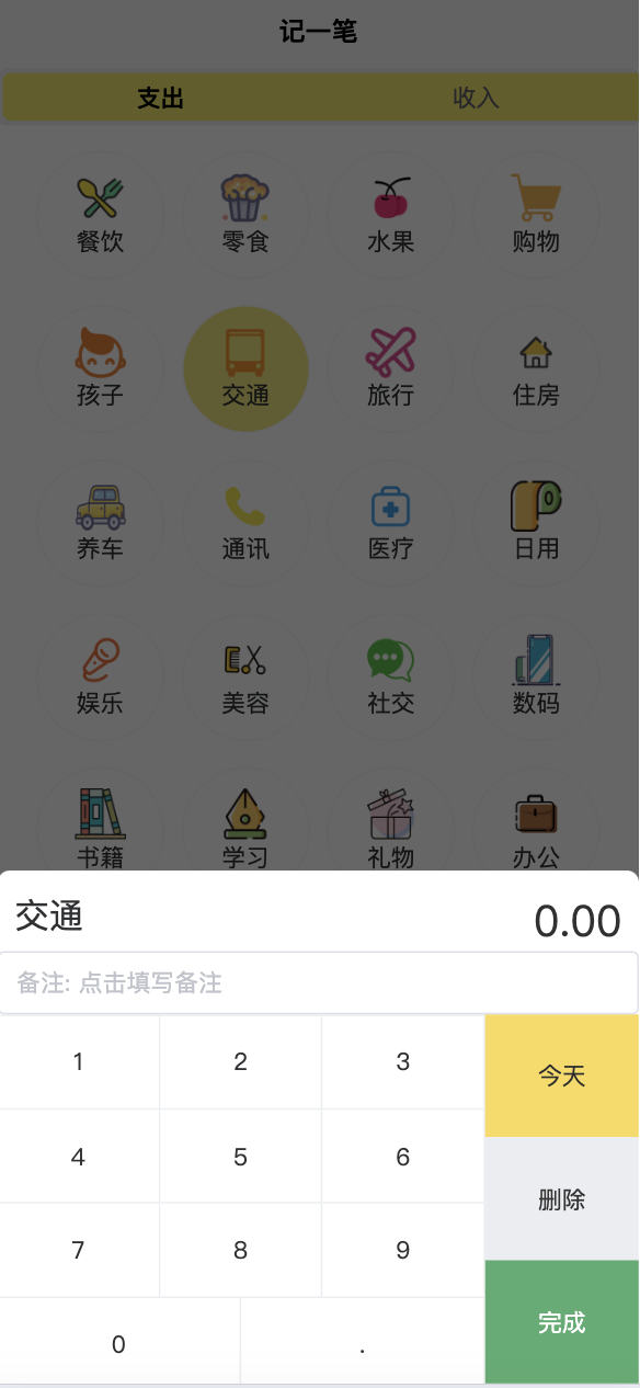
1.1.5. 添加一个键盘
设计思路:
键盘是其实是自己绘制出来的,不用键盘组件,方便后期的个性化定制。
键盘是放在一个popup弹出框组件里的,在点击了图片的时候,弹出显式。
- 页面代码
<u-popup v-model="popup_show" mode="bottom" border-radius="14" height="600rpx">
        <view class="keyboardbox">
            <view style="display: flex; ; font-size: 50rpx; justify-content: space-between; padding: 0 20rpx;">
                <view style="font-size: 40rpx;">{{item_name}}</view>
                <view color = '#bbb' >{{bill_money}}</view>
            </view>
            <u-input
                placeholder="备注: 点击填写备注"
                :border="true"
                v-model="bill_desc"
                clearable
            ></u-input>
            <view class="numkeyboard">
                <view class="num-area">
                    <view class="row" v-for="(item,index) in numKeybordList" :key="index">
                        <view class="item"
                            v-for="(ite,idx) in item" hover-class="active" :hover-start-time="0"
                            :hover-stay-time="5" :key="idx" @tap="input(ite)">{{ite}}</view>
                    </view>
                </view>
                <view class="btn-area">
                    <view :class="['item','dateChoose']" hover-class="active" :hover-start-time="0" :hover-stay-time="5"
                        @tap="dateVal">
                            <view class="uni-input">{{choosedDateShow}}</view>
                    </view>
                    <view :class="['item','del']" hover-class="active" :hover-start-time="0" :hover-stay-time="5"
                        @tap="deleteVal">
                        删除
                    </view>
                    <view class="confirem item" hover-class="active" :hover-start-time="0" :hover-stay-time="5"
                        @tap="submit">
                        完成
                    </view>
                </view>
            </view>
        </view>
    </u-popup>

<u-picker mode="time"
        :default-time="date_picker_date"
        v-model="date_picker_show"
        :params="date_picker_params"
        @confirm="date_pick_ok"
        >
    </u-picker>
-
初始化data
// 在点击了支出图片之后,显式弹出框,在其中输入金额或增加备注 popup_show: false, // 选择时间时候的时间选择组件,仅展示年月日 date_picker_params: { year: true, month: true, day: true, hour: false, minute: false, second: false }, // 默认不显示时间选择组件。在点击了“今天”之后,可以进行选择其他日期 date_picker_show: false, // 选择的时间,默认是今天 date_picker_date: this.getTodayDateTime().substring(0, 10), numKeybordList: [ // 键盘数值 [1, 2, 3], [4, 5, 6], [7, 8, 9], [0, '.'] ], // 自行填写的此笔账单的金额 bill_money: '0.00', // 记账时候填写的备注,可以不填。 bill_desc: '', // 点击图片时,用于显示要记账项目的名称。比如:餐饮、交通等 item_name: '', // 点击图片时,对应项目的图片相对路径,例如:"../../static/type/餐饮.png" item_img_path: '', // 点击图片时,对应项目的id item_id: -1,-
css样式
<style lang="scss">
    .keyboardbox {
        width: 100%;
        position: absolute;
        left: 0;
        bottom: 0;
        background-color: #FFFFFF;

        .numkeyboard {
            height: 432rpx;
            display: flex;
            background-color: #ebedf0;

            .btn-area {
                width: 180rpx;
                height: 100%;
                display: flex;
                flex-direction: column;

                .item {
                    width: 100%;
                    display: flex;
                    justify-content: center;
                    align-items: center;
                    flex-grow: 1;
                }

                .del {
                    background-color: #ebedf0;
                    color: #333;

                    &.active {
                        background-color: #f1f3f5;
                    }
                }

                .confirem {
                    background-color: #4fae70;
                    color: #FFFFFF;

                    &.active {
                        background-color: #4fae70;
                    }
                }

                .dateChoose {
                    background-color: #f9db56;
                    color: #2d2d2d;

                    &.active {
                        background-color: #f9db56;
                    }
                }
            }

            .num-area {
                flex-grow: 1;
                display: flex;
                flex-wrap: wrap;

                .row {
                    width: 100%;
                    height: 25%;
                    display: flex;
                    margin-top: 1px;

                    .item {
                        flex-grow: 1;
                        height: 100%;
                        display: flex;
                        justify-content: center;
                        align-items: center;
                        background-color: #FFFFFF;
                        border-right: 1px solid #ebedf0;
                        width: 33.33%;

                        &.active {
                            background-color: #ebedf0;
                        }

                        &.z {
                            flex-grow: 2;
                            width: 66.66%;
                        }

                        &.disabled {
                            background: #FFFFFF;
                            color: #B9B9B9;
                        }
                    }
                }

            }
        }
    }
</style>
-
呈现的效果如下:
1.1.6. 日期选择组件
最好的使用方式还是看官网:
picker选择器:https://vkuviewdoc.fsq.pub/components/picker.html
为了减少跳出感,直接写好:
<u-picker mode="time"
		:default-time="date_picker_date"
		v-model="date_picker_show"
		:params="date_picker_params"
		@confirm="date_pick_ok"
		>
	</u-picker>
// 选择时间时候的时间选择组件,仅展示年月日
date_picker_params: {
  year: true,
  month: true,
  day: true,
  hour: false,
  minute: false,
  second: false
},
// 默认不显示时间选择组件。在点击了“今天”之后,可以进行选择其他日期
date_picker_show: false,
// 选择的时间,默认是今天
date_picker_date: this.getTodayDateTime().substring(0, 10),
// 设置 this.date_picker_show = true; 即可让日期选择组件展示出来。

date_pick_ok(callback_data) {
  this.date_picker_date = callback_data.year + '-' + callback_data.month + '-'  + callback_data.day;
  console.log('选择了:' + this.date_picker_date);
},

getTodayDateTime() {
  var date = new Date();
  var Y = date.getFullYear() + '-';
  var M = (date.getMonth()+1 < 10 ? '0'+(date.getMonth()+1):date.getMonth()+1) + '-';
  var D = (date.getDate()< 10 ? '0'+date.getDate():date.getDate())+ ' ';
  var h = (date.getHours() < 10 ? '0'+date.getHours():date.getHours())+ ':';
  var m = (date.getMinutes() < 10 ? '0'+date.getMinutes():date.getMinutes()) + ':';
  var s = date.getSeconds() < 10 ? '0'+date.getSeconds():date.getSeconds();
  return Y+M+D+h+m+s;
},


 被折叠的 条评论
为什么被折叠?
被折叠的 条评论
为什么被折叠?
 到【灌水乐园】发言


