


一、自定义组件
1.组建的样式
-
样式隔离
options:{ // 样式隔离:apply-shared 父影响子,shared父子相互影响, isolated相互隔离 styleIsolation:"isolated", }, -
外部类
 externalClasses:["cell-class"],
 <view class="cell cell-class">我是cell组件</view>
 页面中
 <cell cell-class="mycell"></cell>
 <cell></cell>
 .mycell{
  line-height: 120rpx !important;
  color:#F70;
 }
2.组件的插槽
-
默认插槽
父组件 <cell> <text>插槽内容</text> </cell> 子组件 <view><slot></slot></view> -
命名多插槽
父组件 <cell> <text slot="pre"> 🚒</text> <text slot="next">🥗</text> </cell> 子组件 options:{ multipleSlots:true} <view> <slot name="pre"></slot> <slot name="next"></slot> </view> -
组件的传参
 父传子
 	property
 子传参父
 	triggerEvent
二、组件的使用
1. 定义组件(js,wxml,json,wxss)
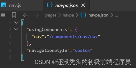
2. 页面的 xxx.json usingComponent 注册
"usingComponents": {
	"cell":"/components/cell/cell",
	"item":"/components/item/item"
}
3. 使用组件
<cell></cell>
<item></item>
三、自定义组件 Component
-
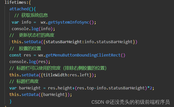
生命周期lifetimes
attach 组件的挂载 -
data 数据
-
methods 方法
-
properties 属性(只读)
-
externalClasses 外部类
-
options选项
multipleSlots:true 多个插槽
styleIsolation:"isolated" 组件的样式格式
四、自定义组件生命周期
1.组件的生命周期 lifetimes
-
created 创建
此时还不能调用 setData -
attached 挂载
-
detached 卸载
2.页面的生命周期 pageLifetimes
- show显示
- hide后台运行
- resize尺寸变化


 841
841


 被折叠的 条评论
为什么被折叠?
被折叠的 条评论
为什么被折叠?
 到【灌水乐园】发言


