


应用场景:
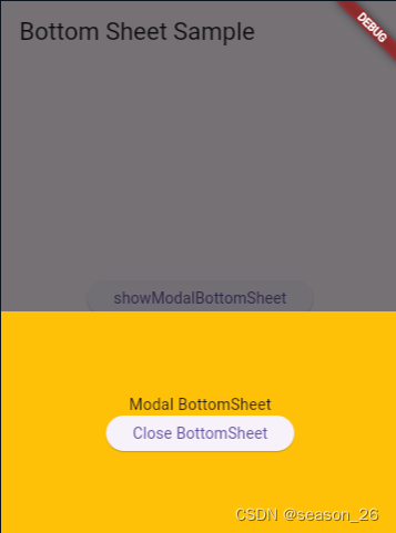
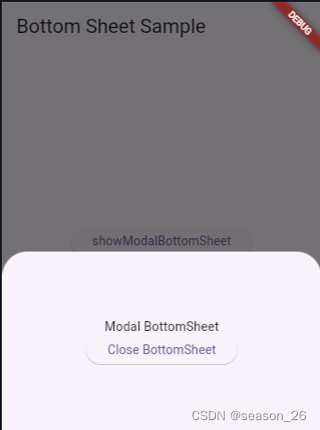
对当前界面信息进行修改时,底部弹出一个【占据页面一定尺寸】的界面,界面内容包括【输入框】、【保存按钮】和【软键盘】。
要点:
- 使用
showModalBottomSheet函数,实现底部弹窗效果。
官网https://api.flutter.dev/flutter/material/showModalBottomSheet.html - 原页面布局改为
SingleChildScrollView,解决键盘顶起内容问题。 Container作为Stack的背景色,实现径向渐变。TextFiled定制化,属性详解- 组件封装逻辑,实现子组件向父组件传参
部分问题解决记录:
弹窗出现同时唤起软键盘:
- 只需要对
TextField设置autofocus: true,弹窗出现时输入框有焦点,键盘就会唤起。
键盘顶起原页面,遮挡当前弹窗部分内容:
- 将原页面布局改为
SingleChildScrollView - 获取键盘高度+设计图内容高度,作为弹窗高度
height: MediaQuery.of(context).viewInsets.bottom + 256,
夜神模拟器没有软键盘:
- 下载搜狗输入法
弹窗布局实现组件树状图
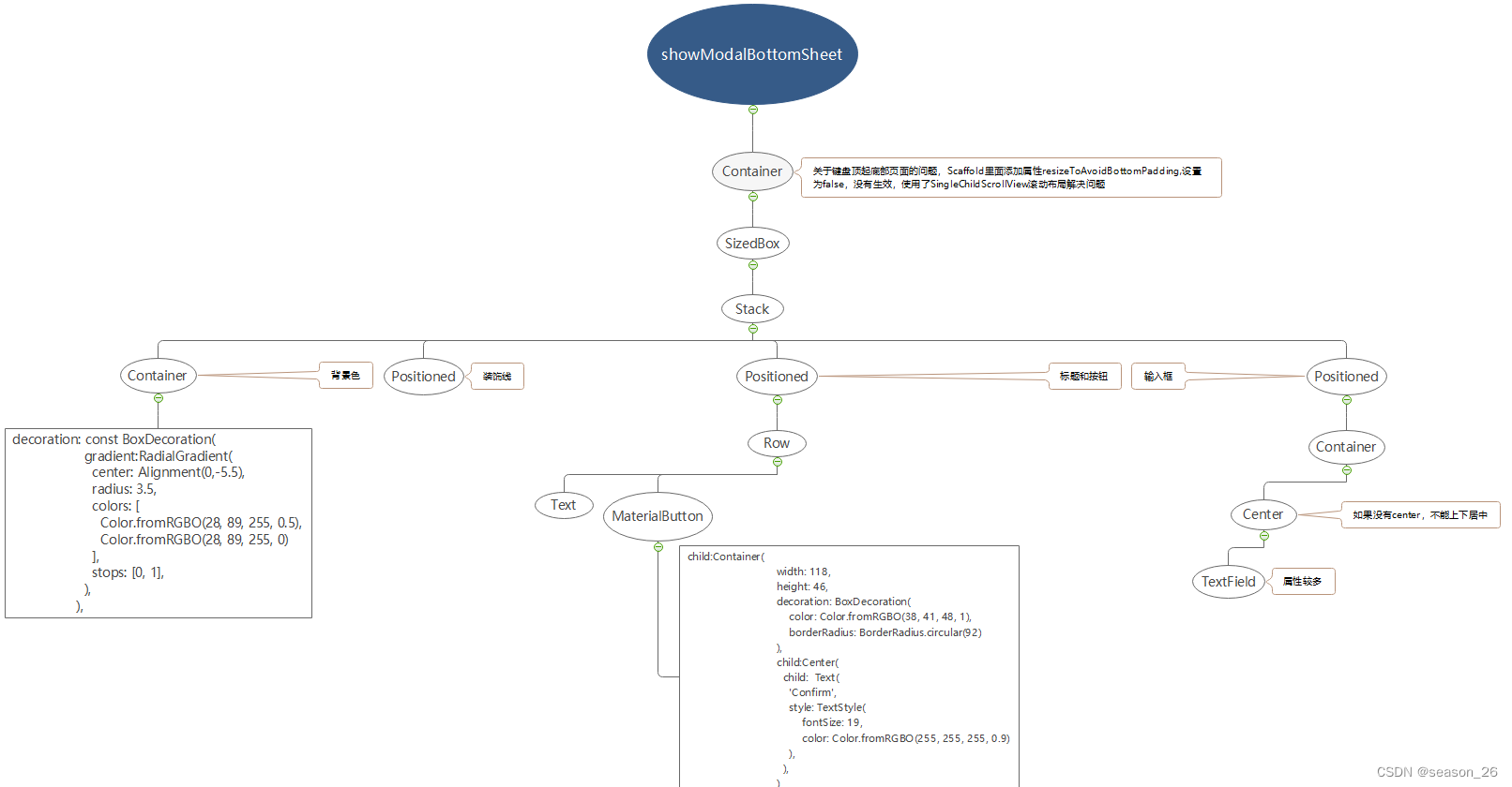
1.showModalBottomSheet
参考资料:
showModalBottomSheet function - material library - Dart API (flutter.dev)
【Flutter】Flutter底部弹窗ModalBottomSheet详解
Future<T?> showModalBottomSheet<T>(
	{required BuildContext context,
	required WidgetBuilder builder,
	Color? backgroundColor,
	String? barrierLabel,
	double? elevation,
	ShapeBorder? shape,
	Clip? clipBehavior,
	BoxConstraints? constraints,
	Color? barrierColor,
	bool isScrollControlled = false,
	double scrollControlDisabledMaxHeightRatio = _defaultScrollControlDisabledMaxHeightRatio,
	bool useRootNavigator = false,
	bool isDismissible = true,
	bool enableDrag = true,
	bool? showDragHandle,
	bool useSafeArea = false,
	RouteSettings? routeSettings,
	AnimationController? transitionAnimationController,
	Offset? anchorPoint,
	AnimationStyle? sheetAnimationStyle}
)
28
backgroundColor:当return SizedBox时可见,return Container时会被遮挡elevation:阴影高度,没看出效果shape:可以用于设置弹窗为圆角。可以放置RoundedRectangleBorder组件。clipBehavior:容器如何剪裁其子组件。只是裁剪模式,并不决定弹窗为直角还是圆角。
接受Clip枚举类型的值,效率依次降低,效果依次提高:
Clip.none:不对子组件进行任何剪裁,子组件可以超出容器的边界显示
Clip.hardEdge:对子组件进行硬边缘剪裁
Clip.antiAlias:对子组件进行反锯齿剪裁,使得边缘看起来更加平滑
Clip.antiAliasWithSaveLayer:对子组件进行反锯齿处理,并且使用单独的绘制层来绘制被裁剪的子组件barrierColor: 蒙版颜色,就是遮住原页面内容的半透明黑色,默认是Colors.black54isScrollControlled:是否可滚动, 默认为false,我使用时不设置会使得输入框部分 被键盘覆盖|不显示
官网的两种示例,一种是直角弹窗,一种是圆角弹窗。经过对比区别是一个return Container一个return SizeBox。但是通过设置Container的
borderRadius: BorderRadius.only(// topLeft: Radius.circular(20.0),// topRight: Radius.circular(20.0),// )也可以达到圆角效果。
代码提示建议我们使用SizedBox,理由是
Use a ‘SizedBox’ to add whitespace to a layout. (Documentation) Try using a ‘SizedBox’ rather than a ‘Container’.(没有看懂)
还有一个区别是SizedBox不能添加背景色,可以通过给showModalBottomSheet设置背景色实现但是和Container设置的有所区别。如果使用了Container,其背景色会覆盖弹窗的背景色设置,弹窗背景色就无法被看到。
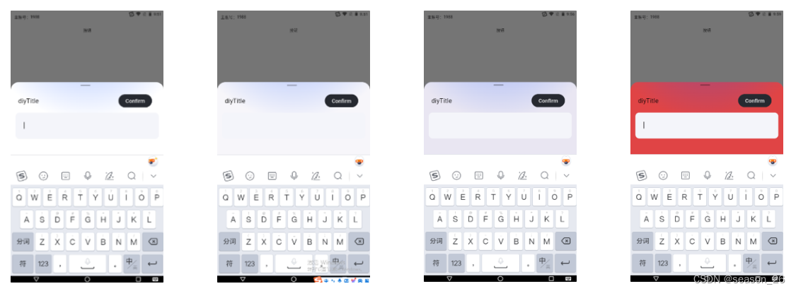
图一,为return Container设置背景色为white,输入框的灰色十分明显。
图二,如果为return SizedBox给弹窗设置背景色为white,输入框看不清楚。这时候如果给Stack添加一个Container作为白色背景色(我的渐变背景是半透明的),情况就恢复了。必须设置弹窗的clipBehavior: Clip.antiAliasWithSaveLayer属性。
图三,在图二基础上,elevator设置为20。
图四,弹窗背景色为red。
经过以上实验,大概有这些总结:
- 弹窗本身自带圆角。
- SizedBox只有大小,没有样式,作为弹窗的主体,不会覆盖弹窗的圆角——现象是使用SizedBox自带圆角。
- Container默认为直角矩形,作为弹窗的主体,又没有设置弹窗的子组件切割方式,会超出弹窗显示——现象是使用Container时不进行任何设置,弹窗为直角。
- 无法解释使用SizedBox、设置弹窗背景色为white时,为什么灰色输入框看不清楚。
2.组件封装
这里复用部分为showModalBottomSheet函数,且定制化程度较低,只能修改标题。
如果希望弹窗内容都发生变化,需要将builder抽离,传一个builder类型的参数。
针对函数的封装,可以封装为一个类,也可以封装为单独的函数。
具体如何选择,可以参考gpt的建议:
- 封装为类的情况:
- 数据和功能有关联:如果需要封装的逻辑涉及到一系列相关的属性和方法,可以考虑使用类来组织这些数据和功能。
- 多个函数共享状态:如果多个函数需要共享状态或状态需要在多个函数之间传递,可以考虑使用类来管理这些状态。
- 需要实例化多个对象:如果需要在不同地方创建多个实例化对象来独立管理各自的状态和逻辑,可以使用类来创建多个对象。
- 使用单独的函数的情况:
- 独立的功能逻辑:某些功能逻辑比较简单,只需要进行一次调用并返回结果,可以考虑使用单独的函数。
- 不需要维护状态:如果功能逻辑不涉及管理状态或者状态不需要在不同函数之间共享,可以使用单独的函数。
- 辅助函数:对于一些辅助性的函数,只负责完成特定的任务而不涉及其他功能,可以单独封装为函数。
封装一个函数通用形式:
typedef ClickCallBack = void Function(String newContent);
Future<Future<int?>> showCustomModalBottomSheet({
  required BuildContext context,
  required String title,
  required ClickCallBack clickCallBack
}) async {
	...
	MaterialButton(
     onPressed: (){
       print(upper_controlle.text);

       if(upper_controlle.text=='') {
         Loading.showWarning('内容不能为空!');
       }else {
         clickCallBack(upper_controlle.text);
         Navigator.pop(context);
       }
   	},
   	...
}
使用:
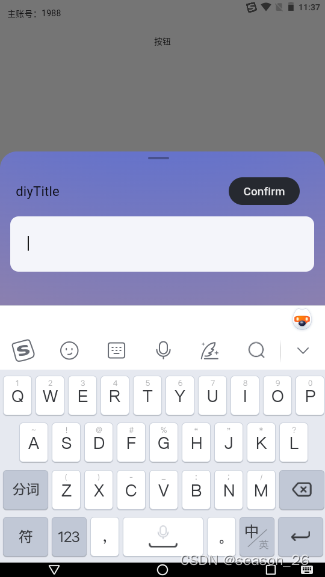
onPressed() async {
    await showCustomModalBottomSheet(
      context:context,
      title:'diyTitle',
      clickCallBack: (String newContent){
        setState(() {
          valueToChange= newContent;
        });
      }
    );
  }
这里涉及拿到弹窗内部输入的值,赋给原始界面对应位置显示。其实就是子组件给父组件传参。类似vue框架的思想,父组件给子组件一个函数作为参数。子组件接收到这个函数,在对应位置调用这个函数,将内部值作为函数参数(父组件对该函数作具体规定,如对接收的参数作何处理等),父组件就拿到了弹窗内的值。
3. 径向渐变的使用
设置Container的decoration
	decoration: const BoxDecoration(
       gradient:RadialGradient(
         center: Alignment(0,-5.5),   // 猜测为圆心
         radius: 3.5,  // 径向渐变的半径
         colors: [
           Color.fromRGBO(28, 89, 255, 0.5),
           Color.fromRGBO(28, 89, 255, 0)
         ],
         stops: [0, 1],
       ),
     ),
线性渐变:
gradient: LinearGradient(
   begin: Alignment.topCenter,
   end: Alignment.bottomCenter,
   colors: [Colors.blue, Colors.green], // 渐变色数组
),
4.输入框
TextField class- material library - Dart API (pub.dev)
TextField(
  // focusNode: _focusNode,   // 什么作用?
  maxLength: 20,  // 输入长度,右下角会显示 /20
  maxLines: 1,
  obscureText: false,   // 是否为密码
  autofocus: true,  // autofocus设置为true,输入框一出现键盘就出现,否则需要二次点击使得键盘出现
  controller: upper_controlle,   // upper_controlle.text用于获取输入内容
  textInputAction: TextInputAction.done,
  keyboardType: TextInputType.text,
  // 让TextField内容实现左右居中,
  textAlign: TextAlign.left,
  enabled: true,
  cursorColor: Color.fromRGBO(0,0,0,0.9),
  // 数字、手机号限制格式为0到9, 密码限制不包含汉字
  // inputFormatters: widget.inputFormatters ??
  //     ((widget.keyboardType == TextInputType.number ||
  //         widget.keyboardType == TextInputType.phone)
  //         ? [FilteringTextInputFormatter.allow(RegExp('[0-9]'))]
  //         : [LengthLimitingTextInputFormatter(100)]),
  style: TextStyle(
      color: Color.fromRGBO(0,0,0,0.9),
      fontSize: 16
  ),
  decoration: const InputDecoration(
    filled: true,
    fillColor: Color.fromRGBO(244,245,250,1),
    // contentPadding和border的设置是为了让TextField内容实现上下居中
    contentPadding:  EdgeInsets.symmetric(horizontal: 29,vertical: 26),
    // hintText: "修改名称",
    // hintStyle: TextStyle(
    //     fontSize: FontSize.font_sp14,
    //     fontWeight: FontWeight.w500,
    //     color: Color(0xFF999999)),
    // counterText: '',
    //默认边框为红色,边框宽度为1
    enabledBorder: OutlineInputBorder(
        borderRadius: BorderRadius.all(Radius.circular(30)),
        borderSide: BorderSide(color: Colors.transparent, width: 1)),
    disabledBorder: OutlineInputBorder(
        borderRadius: BorderRadius.all(Radius.circular(30)),
        borderSide: BorderSide(color: Colors.transparent, width: 1)),
    //获取焦点后,边框为黑色,宽度为2
    focusedBorder: OutlineInputBorder(
        borderRadius: BorderRadius.all(Radius.circular(30)),
        borderSide: BorderSide(color: Colors.transparent, width: 1)),
  ),
  onSubmitted:(String value) {
    // 在这里处理用户按下键盘上的"完成"或"提交"按钮时的操作
    print("用户输入的内容是: $value");
    // 可以在这里执行提交表单等操作
  },
)
textInputAction: 设置键盘动作按钮的类型,比如TextInputAction.done会显示一个"完成"按钮,当用户点击时,会触发onSubmitted回调函数。其他常用的值还有TextInputAction.go,TextInputAction.next,TextInputAction.search,TextInputAction.sendkeyboardType: 指定键盘类型,比如TextInutType.text是文本键盘,TextInputType.number是数字键盘,TextInputType.phone是电话号码键盘textAlign: 控制文本在输入框中的对齐方式,比如TextAlign.left是左对齐,TextAlign.center是居中对齐,TextAlign.right是右对齐inputFormatters: 限制输入格式,比如通过正则表达式限制输入的内容,或者通过LengthLimitingTextInputFormatter限制输入的长度。可以根据需要添加多个TextInputFormatter来组合限制条件


 389
389


 被折叠的 条评论
为什么被折叠?
被折叠的 条评论
为什么被折叠?
 到【灌水乐园】发言


