


*/
body {
height: 100vh;
width: 100vw;
background: #FFE3EC;
font-family: ‘Pangolin’, cursive;
font-size: 1vmin;
/弹性布局/
display: flex;
/设置flex子项在每个flex行的交叉轴上的中心对齐,交叉轴方向为column,即垂直方向*/
align-items: center;
/设置flex子项在主轴上的中心对齐/
justify-content: center;
}
/*
使用相对定位(什么时候用相对定位或绝对定位?在文档流中相对定位的元素占有位置,而且会影响后面的元素(块元素、行内块元素),比如两个div并排,另外一个会换行。而绝对定位就是把该元素从文档流中踢出,不会占用文档流的位置,也不会影响后面的元素。)
vmin:当前 vw 和 vh 中较小的一个值
vmax:当前 vw 和 vh 中较大的一个值
*/
.container {
position: relative;
top: 0vmin;
}
/相对定位,并设置背景色和大小/
.envelope {
position: relative;
background: #eb7885;
height: 30vmin;
width: 48vmin;
}
.cover {
position: absolute;
height: 0;
width: 0;
border-bottom: 15vmin solid #f5b5bb;
border-left: 24vmin solid transparent;
border-right: 24vmin solid transparent;
top: 15vmin;
z-index: 3;
}
.cover::after { /left triangle/
position: absolute;
content: ‘’;
border-left: 24.5vmin solid #ffbbc1;
border-bottom: 15vmin solid transparent;
border-top: 15vmin solid transparent;
top: -15vmin;
left: -24vmin;
}
.cover::before {
position: absolute;
content: ‘’;
border-right: 24.5vmin solid #ffbbc1;
border-bottom: 15vmin solid transparent;
border-top: 15vmin solid transparent;
top: -15vmin;
left: -0.5vmin;
}
/创建信件打开的动画,使用rotateX(),围绕其在给定的度数在x轴旋转/
@keyframes open {
100% {
transform: rotatex(180deg);
}
}
/信件合上的动画/
@keyframes open-rev {
from {
transform: rotatex(-180deg);
}
}
.lid {
position: absolute;
height: 0;
width: 0;
border-top: 15vmin solid #ff8896;
border-left: 24vmin solid transparent;
border-right: 24vmin solid transparent;
top: 0;
/设置旋转元素的基点位置,为盒子的顶部边缘/
transform-origin: top;
animation: open-rev 2s;
}
.container:hover .lid {
animation: open 0.5s;
animation-fill-mode: forwards;
}
.shadow {
position: relative;
top: 3vmin;
border-radius: 50%;
opacity: 0.7;
height: 2vmin;
width: 48vmin;
background: #e8c5d0;
}
2.1 加入卡片元素并设置其样式
接着,就是绘制卡片部分了,也较为简单,是一个长方形的白色卡片,设置其样式,并为其添加滑动的动画。
首先,我们在container内添加元素
代码如下:
envelope.html
接着,设置样式为白色背景的长方形。
envelope.css
.card {
position: absolute;
/白色的卡片/
background: white;
height: 25vmin;
width: 43vmin;
display: flex;
/设置div水平显示/
flex-direction: column;
/设置flex子项在每个flex行的交叉轴上的中心对齐,交叉轴方向为column,即垂直方向*/
align-items: center;
/设置flex子项在主轴上的中心对齐/
justify-content: center;
left: 2.5vmin;
top: 0vmin;
/卡片落回动画/
animation: slide-rev 0.2s ease-out;
}
运行效果:
2.2 加入卡片划出的动画
首先,编写划出和落回信封的滑动动画。命名为slide和slide-rev。
我们通过transform属性来实现,设置translatey参数,使卡片纵向移动。
同时,由于卡片设置为绝对定位,为了不被信封遮挡住,我们需要在卡片划出时,提高元素的堆叠顺序,通过更改z-index属性实现。
滑动动画代码如下:
envelope.css
/卡片划出信封/
@keyframes slide {
100% {
transform: translatey(-15vmin);
z-index: 2;
}
}
/卡片落回信封/
@keyframes slide-rev {
from {
transform: translatey(-15vmin);
}
}
接着,我们加入鼠标hover于信封时,卡片执行划出动画。
.container:hover .card {
/卡片划出动画/
animation: slide 0.2s;
animation-delay: 0.5s;
/把卡面动画地从一个地方移动到另一个地方,并让它停留在那里。/
animation-fill-mode: forwards;
}
至此,我们的卡片就完成了。
运行效果:
2.3 加入卡片后的全部代码
envelope.html
envelope.css
@import url(‘https://fonts.googleapis.com/css2?family=Pangolin&display=swap’);
/重置浏览器样式/
- {
margin: 0;
padding: 0;
}
/*
使主体居中
vw:视窗宽度的百分比(1vw 代表视窗的宽度为 1%)
vh:视窗高度的百分比
*/
body {
height: 100vh;
width: 100vw;
background: #FFE3EC;
font-family: ‘Pangolin’, cursive;
font-size: 1vmin;
/弹性布局/
display: flex;
/设置flex子项在每个flex行的交叉轴上的中心对齐,交叉轴方向为column,即垂直方向*/
align-items: center;
/设置flex子项在主轴上的中心对齐/
justify-content: center;
}
/*
使用相对定位(什么时候用相对定位或绝对定位?在文档流中相对定位的元素占有位置,而且会影响后面的元素(块元素、行内块元素),比如两个div并排,另外一个会换行。而绝对定位就是把该元素从文档流中踢出,不会占用文档流的位置,也不会影响后面的元素。)
vmin:当前 vw 和 vh 中较小的一个值
vmax:当前 vw 和 vh 中较大的一个值
*/
.container {
position: relative;
top: 0vmin;
}
/相对定位,并设置背景色和大小/
.envelope {
position: relative;
background: #eb7885;
height: 30vmin;
width: 48vmin;
}
.cover {
position: absolute;
height: 0;
width: 0;
border-bottom: 15vmin solid #f5b5bb;
border-left: 24vmin solid transparent;
border-right: 24vmin solid transparent;
top: 15vmin;
z-index: 3;
}
.cover::after { /left triangle/
position: absolute;
content: ‘’;
border-left: 24.5vmin solid #ffbbc1;
border-bottom: 15vmin solid transparent;
border-top: 15vmin solid transparent;
top: -15vmin;
left: -24vmin;
}
.cover::before {
position: absolute;
content: ‘’;
border-right: 24.5vmin solid #ffbbc1;
border-bottom: 15vmin solid transparent;
border-top: 15vmin solid transparent;
top: -15vmin;
left: -0.5vmin;
}
/创建信件打开的动画,使用rotateX(),围绕其在给定的度数在x轴旋转/
@keyframes open {
100% {
transform: rotatex(180deg);
}
}
/信件合上的动画/
@keyframes open-rev {
from {
transform: rotatex(-180deg);
}
}
.lid {
position: absolute;
height: 0;
width: 0;
border-top: 15vmin solid #ff8896;
border-left: 24vmin solid transparent;
border-right: 24vmin solid transparent;
top: 0;
/设置旋转元素的基点位置,为盒子的顶部边缘/
transform-origin: top;
animation: open-rev 2s;
}
.container:hover .lid {
animation: open 0.5s;
animation-fill-mode: forwards;
}
.shadow {
position: relative;
top: 3vmin;
border-radius: 50%;
opacity: 0.7;
height: 2vmin;
width: 48vmin;
background: #e8c5d0;
}
.card {
position: absolute;
/白色的卡片/
background: white;
height: 25vmin;
width: 43vmin;
display: flex;
/设置div水平显示/
flex-direction: column;
/设置flex子项在每个flex行的交叉轴上的中心对齐,交叉轴方向为column,即垂直方向*/
align-items: center;
/设置flex子项在主轴上的中心对齐/
justify-content: center;
left: 2.5vmin;
top: 0vmin;
animation: slide-rev 0.2s ease-out;
}
.container:hover .card {
/卡片划出动画/
animation: slide 0.2s;
animation-delay: 0.5s;
/把卡面动画地从一个地方移动到另一个地方,并让它停留在那里。/
animation-fill-mode: forwards;
}
/卡片划出信封/
@keyframes slide {
100% {
transform: translatey(-15vmin);
z-index: 2;
}
}
/卡片落回信封/
@keyframes slide-rev {
from {
transform: translatey(-15vmin);
}
}
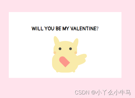
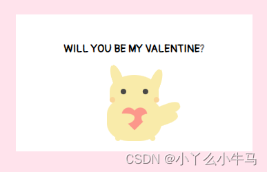
现在,要开始绘制卡片上的内容啦!由文本及可爱的皮卡丘组成。为了方便观察,我们还是注释掉信封元素。
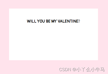
3.1加入文本
首先,我们从简单的开始,在card元素间,加入我们的文本元素,命名为message,大家可以写自己想说的话。
WILL YOU BE MY VALENTINE?
加入文本后的代码:
envelope.html
WILL YOU BE MY VALENTINE?
然后,设置文本向上移。
envelope.css

运行效果:
3.2 绘制皮卡丘
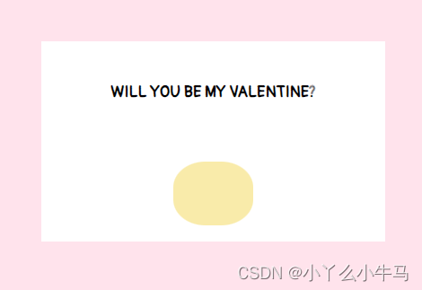
皮卡丘由躯干,耳朵,尾巴,手臂,嘴巴,以及捧着的小心心组成。我们将一一绘制。
3.2.1 绘制躯干
首先,在card元素内,加入命名为pikachu的div元素。
envelope.html
WILL YOU BE MY VALENTINE?
接着,我们通过设置该元素(pikachu)及其前后伪元素的样式,来绘制躯干,眼睛,脸颊以及小脚丫。
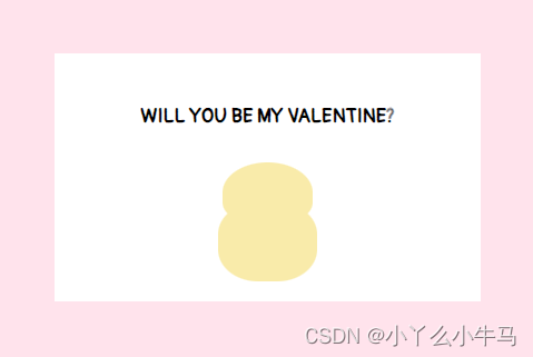
3.2.1.1 身体
身体部分,是一个黄色的椭圆形。我们通过设置pikachu元素的样式来实现。
envelope.css
.pikachu {
position: absolute;
background: #f9ebaa;
height: 8vmin;
width: 10vmin;
border-radius: 40%;
top: 15vmin;
display: flex;
}
运行效果:
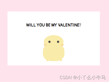
3.2.1.2 绘制头部
头部,是一个较小的黄色椭圆形。我们通过设置pikachu::before选择的伪元素的样式来实现。
envelope.css
.pikachu::before {
content: ‘’;
position: absolute;
background: #f9ebaa;
height: 6vmin;
width: 9vmin;
border-radius: 90% 90% 60% 60%;
top: -4vmin;
left: 0.5vmin;
}
运行效果:
3.2.1.3 绘制眼睛,脸颊以及脚
眼睛,脸颊以及脚,通过设置pikachu::after选择的伪元素中的阴影(box-shadow)实现。
envelope.css
.pikachu::after {
content: ‘’;
position: absolute;
background: transparent;
height: 1vmin;
width: 1vmin;
top: 2vmin;
left: -1.5vmin;
color: #4a4947;
border-radius: 50%;
box-shadow:
4vmin -3.5vmin, 8vmin -3.5vmin,
2vmin -2vmin #fad598, 10vmin -2vmin #fad598,
3vmin 5vmin #f9ebaa, 9.3vmin 5vmin #f9ebaa;
}
运行效果:
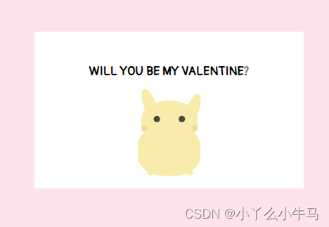
3.2.2 绘制耳朵及尾巴
首先,在pikachu元素内,加入命名为limbs的div元素。
envelope.html
WILL YOU BE MY VALENTINE?
接着,我们通过设置该元素(limbs)及其前后伪元素的样式,来绘制左耳右耳及尾巴。
3.2.2.1 绘制耳朵
两只耳朵分别为两个椭圆形。形状相同,但位置及偏移角度不同。我们通过设置limbs元素及.limbs::after选择的伪元素的样式分别实现左耳和右耳。
envelope.css
.limbs {
position: relative;
width: 0;
height: 0;
border-left: 1vmin solid transparent;
border-right: 1vmin solid transparent;
border-bottom: 6vmin solid #f9ebaa;
border-radius: 80%;
top: -6vmin;
left: 1vmin;
transform: rotate(-20deg);
}
.limbs::after {
content: ‘’;
position: absolute;
width: 0;
height: 0;
border-left: 1vmin solid transparent;
border-right: 1vmin solid transparent;
border-bottom: 6vmin solid #f9ebaa;
border-radius: 80%;
top: 3vmin;
left: 5vmin;
transform: rotate(40deg);
}
运行效果:
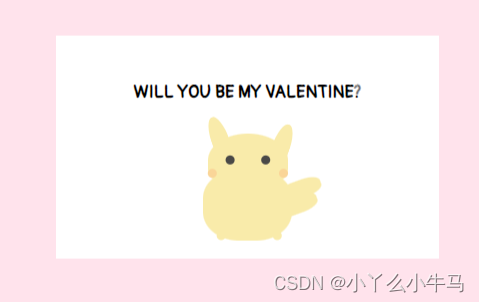
3.2.2.2 绘制尾巴
尾巴也由两个椭圆形组成。我们通过设置.limbs::before选择的伪元素的样式,设置元素为椭圆形,再设置该元素的阴影(box-shadow)为相同颜色的椭圆形,绘制出尾巴。
envelope.css
.limbs::before {
content: ‘’;
position: absolute;
background: #f9ebaa;
width: 5vmin;
height: 2vmin;
border-radius: 40%;
top: 10vmin;
left: 4vmin;
box-shadow:
-1vmin 1.5vmin #f9ebaa;
}
运行效果:
至此,皮卡丘的绘制就完成一大半啦!
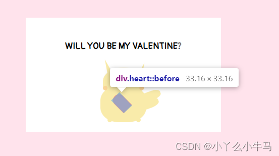
3.2.3 绘制爱心
首先,在pikachu元素内,加入命名为heart的div元素。
envelope.html
WILL YOU BE MY VALENTINE?
爱心由两个相同的不知道怎么说的形状组成(见图),我们通过设置heart元素样式,来固定爱心的位置,设置其前后伪元素相同的样式,并将其中一个伪元素旋转一定的角度,绘制出爱心。
首先,固定位置,并绘制出两个半个的爱心。
envelope.css
.heart {
position: relative;
width: 5vmin;
height: 4vmin;
top: 2vmin;
left: 0.6vmin;
}
.heart:before,
.heart:after {
position: absolute;
content: “”;
left: 2.5vmin;
top: 0;
width: 2.5vmin;
height: 4vmin;
background: #fc978b;
border-radius: 2.5vmin 2.5vmin 0 0;
transform: rotate(-45deg);
transform-origin: 0 100%;
}
运行效果:
由下图,可以看到,由于设置为绝对定位,两个相同的半个爱心,是重叠在一起的。
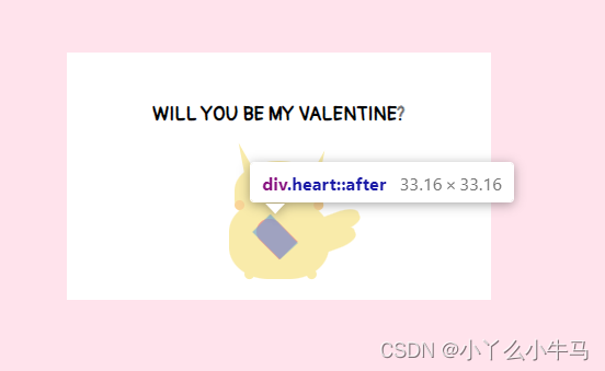
因此,我们只需要将其中一个,旋转一定的角度,使两个元素对称即可。
envelope.css
.heart:after {
left: 0;
transform: rotate(45deg);
transform-origin: 100% 100%;
}
至此,我们的小爱心,也绘制完成了。
3.2.4 绘制手臂
首先,在pikachu元素内,加入命名为arms的div元素。
envelope.html
WILL YOU BE MY VALENTINE?
手臂也是由两个与身体颜色相同的椭圆形组成的,我们通过设置arms元素及其后伪元素的样式,绘制出两只手臂。
envelope.css
.arms {
position: relative;
background: #f9ebaa;
width: 4.2vmin;
height: 2vmin;
border-radius: 60% 60% 90% 60% / 50% 50% 90% 90%;
top: 3vmin;
left: -5vmin;
}
.arms::after {
content: ‘’;
position: absolute;
background: #f9ebaa;
width: 4vmin;
height: 2vmin;
border-radius: 60% 60% 90% 60% / 50% 50% 90% 90%;
left: 5vmin;
top: 0vmin;
}
运行效果:
3.2.5 绘制嘴巴
首先,在pikachu元素内,加入命名为smile的div元素。
envelope.html
WILL YOU BE MY VALENTINE?
嘴巴也是由两条弧线组成的,我们通过设置smile元素及其伪元素的样式,绘制出两条弧线,组成嘴巴。
envelope.css
.smile {
position: relative;
background: transparent;
height: 1vmin;
width: 1vmin;
border-radius: 50%;
border-bottom: 0.3vmin solid #4a4947;
left: -5vmin;
top: -1.3vmin;
}
.smile::before {
position: absolute;
content: ‘’;
background: transparent;
height: 1vmin;
width: 1vmin;
border-radius: 50%;
border-bottom: 0.3vmin solid #4a4947;
left: 0.7vmin;
}
运行效果:
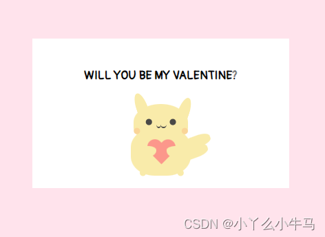
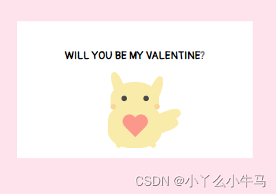
我们的信件部分到此就完成了,解开注释看看具体效果吧。

全部代码如下:
envelope.html
WILL YOU BE MY VALENTINE?
envelope.css
@import url(‘https://fonts.googleapis.com/css2?family=Pangolin&display=swap’);
/重置浏览器样式/
- {
margin: 0;
padding: 0;
}
/*
使主体居中
vw:视窗宽度的百分比(1vw 代表视窗的宽度为 1%)
vh:视窗高度的百分比
*/
body {
height: 100vh;
width: 100vw;
background: #FFE3EC;
font-family: ‘Pangolin’, cursive;
font-size: 1vmin;
/弹性布局/
display: flex;
/设置flex子项在每个flex行的交叉轴上的中心对齐,交叉轴方向为column,即垂直方向*/
align-items: center;
/设置flex子项在主轴上的中心对齐/
justify-content: center;
}
/*
使用相对定位(什么时候用相对定位或绝对定位?在文档流中相对定位的元素占有位置,而且会影响后面的元素(块元素、行内块元素),比如两个div并排,另外一个会换行。而绝对定位就是把该元素从文档流中踢出,不会占用文档流的位置,也不会影响后面的元素。)
vmin:当前 vw 和 vh 中较小的一个值
vmax:当前 vw 和 vh 中较大的一个值
*/
.container {
position: relative;
top: 0vmin;
}
/相对定位,并设置背景色和大小/
.envelope {
position: relative;
background: #eb7885;
height: 30vmin;
width: 48vmin;
}
.cover {
position: absolute;
height: 0;
width: 0;
border-bottom: 15vmin solid #f5b5bb;
border-left: 24vmin solid transparent;
border-right: 24vmin solid transparent;
top: 15vmin;
z-index: 3;
}
.cover::after { /left triangle/
position: absolute;
content: ‘’;
border-left: 24.5vmin solid #ffbbc1;
border-bottom: 15vmin solid transparent;
border-top: 15vmin solid transparent;
top: -15vmin;
left: -24vmin;
}
.cover::before {
position: absolute;
content: ‘’;
border-right: 24.5vmin solid #ffbbc1;
border-bottom: 15vmin solid transparent;
border-top: 15vmin solid transparent;
top: -15vmin;
left: -0.5vmin;
}
/创建信件打开的动画,使用rotateX(),围绕其在给定的度数在x轴旋转/
@keyframes open {
100% {
transform: rotatex(180deg);
}
}
/信件合上的动画/
@keyframes open-rev {
from {
transform: rotatex(-180deg);
}
}
.lid {
position: absolute;
height: 0;
width: 0;
border-top: 15vmin solid #ff8896;
border-left: 24vmin solid transparent;
border-right: 24vmin solid transparent;
top: 0;
/设置旋转元素的基点位置,为盒子的顶部边缘/
transform-origin: top;
animation: open-rev 2s;
}
.container:hover .lid {
animation: open 0.5s;
animation-fill-mode: forwards;
}
.shadow {
position: relative;
top: 3vmin;
border-radius: 50%;
opacity: 0.7;
height: 2vmin;
width: 48vmin;
background: #e8c5d0;
}
.card {
position: absolute;
/白色的卡片/
background: white;
height: 25vmin;
width: 43vmin;
display: flex;
/设置div水平显示/
flex-direction: column;
/设置flex子项在每个flex行的交叉轴上的中心对齐,交叉轴方向为column,即垂直方向*/
align-items: center;
/设置flex子项在主轴上的中心对齐/
justify-content: center;
left: 2.5vmin;
top: 0vmin;
animation: slide-rev 0.2s ease-out;
}
自我介绍一下,小编13年上海交大毕业,曾经在小公司待过,也去过华为、OPPO等大厂,18年进入阿里一直到现在。
深知大多数前端工程师,想要提升技能,往往是自己摸索成长或者是报班学习,但对于培训机构动则几千的学费,着实压力不小。自己不成体系的自学效果低效又漫长,而且极易碰到天花板技术停滞不前!
因此收集整理了一份《2024年Web前端开发全套学习资料》,初衷也很简单,就是希望能够帮助到想自学提升又不知道该从何学起的朋友,同时减轻大家的负担。
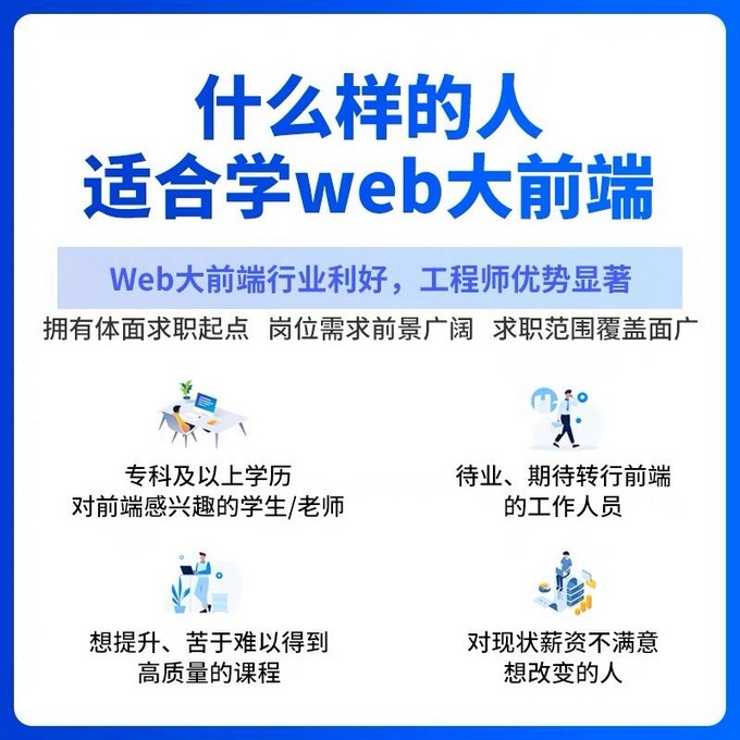
既有适合小白学习的零基础资料,也有适合3年以上经验的小伙伴深入学习提升的进阶课程,基本涵盖了95%以上前端开发知识点,真正体系化!
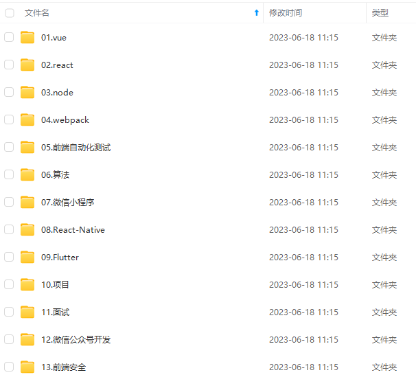
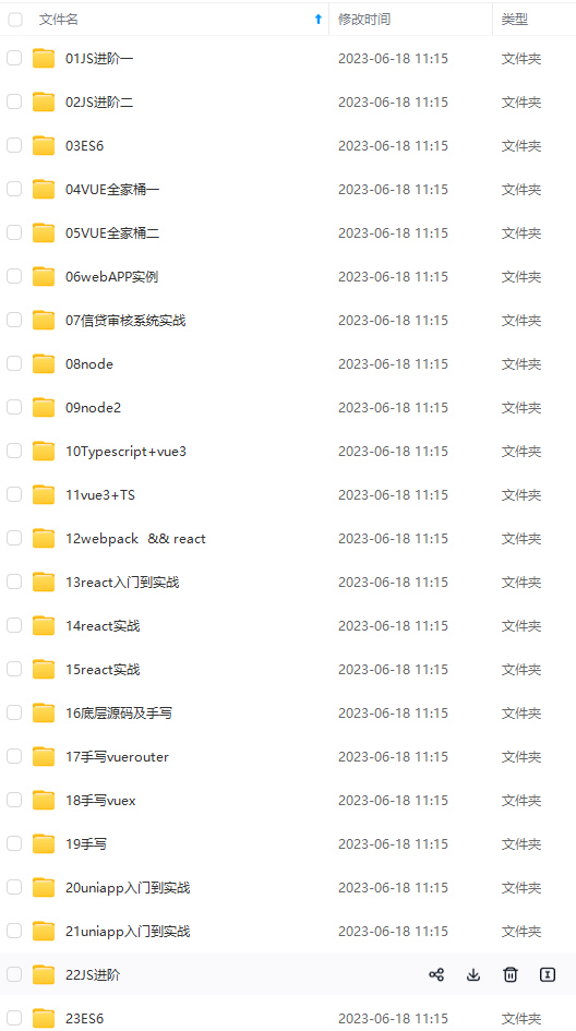
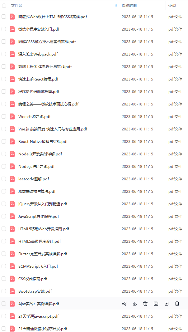
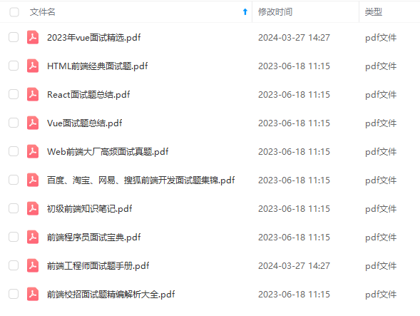
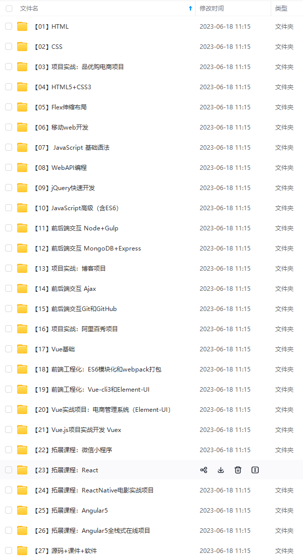
由于文件比较大,这里只是将部分目录大纲截图出来,每个节点里面都包含大厂面经、学习笔记、源码讲义、实战项目、讲解视频,并且后续会持续更新
如果你觉得这些内容对你有帮助,可以添加V获取:vip1024c (备注前端)

对象篇
模块化编程-自研模块加载器
一个人可以走的很快,但一群人才能走的更远。不论你是正从事IT行业的老鸟或是对IT行业感兴趣的新人,都欢迎扫码加入我们的的圈子(技术交流、学习资源、职场吐槽、大厂内推、面试辅导),让我们一起学习成长!

}
.shadow {
position: relative;
top: 3vmin;
border-radius: 50%;
opacity: 0.7;
height: 2vmin;
width: 48vmin;
background: #e8c5d0;
}
.card {
position: absolute;
/白色的卡片/
background: white;
height: 25vmin;
width: 43vmin;
display: flex;
/设置div水平显示/
flex-direction: column;
/设置flex子项在每个flex行的交叉轴上的中心对齐,交叉轴方向为column,即垂直方向*/
align-items: center;
/设置flex子项在主轴上的中心对齐/
justify-content: center;
left: 2.5vmin;
top: 0vmin;
animation: slide-rev 0.2s ease-out;
}
自我介绍一下,小编13年上海交大毕业,曾经在小公司待过,也去过华为、OPPO等大厂,18年进入阿里一直到现在。
深知大多数前端工程师,想要提升技能,往往是自己摸索成长或者是报班学习,但对于培训机构动则几千的学费,着实压力不小。自己不成体系的自学效果低效又漫长,而且极易碰到天花板技术停滞不前!
因此收集整理了一份《2024年Web前端开发全套学习资料》,初衷也很简单,就是希望能够帮助到想自学提升又不知道该从何学起的朋友,同时减轻大家的负担。
[外链图片转存中…(img-0QNR7Pxm-1712754288399)]
[外链图片转存中…(img-6o6ZC0ji-1712754288400)]
[外链图片转存中…(img-Yiwu9R2g-1712754288400)]
[外链图片转存中…(img-h4nG5knD-1712754288400)]
[外链图片转存中…(img-7PInIcA5-1712754288400)]
[外链图片转存中…(img-mnKkONEV-1712754288401)]
既有适合小白学习的零基础资料,也有适合3年以上经验的小伙伴深入学习提升的进阶课程,基本涵盖了95%以上前端开发知识点,真正体系化!
由于文件比较大,这里只是将部分目录大纲截图出来,每个节点里面都包含大厂面经、学习笔记、源码讲义、实战项目、讲解视频,并且后续会持续更新
如果你觉得这些内容对你有帮助,可以添加V获取:vip1024c (备注前端)
[外链图片转存中…(img-JfuVWeln-1712754288401)]
对象篇
模块化编程-自研模块加载器
一个人可以走的很快,但一群人才能走的更远。不论你是正从事IT行业的老鸟或是对IT行业感兴趣的新人,都欢迎扫码加入我们的的圈子(技术交流、学习资源、职场吐槽、大厂内推、面试辅导),让我们一起学习成长!
[外链图片转存中…(img-Ija6yVR6-1712754288401)]


 1039
1039


 被折叠的 条评论
为什么被折叠?
被折叠的 条评论
为什么被折叠?
 到【灌水乐园】发言


