


使用场景:
例如:适用于app、微信小程序、H5的自定义底部导航 ,5种动态切换
问题描述
大部分小程序底部导航都是用原生的来写,但是如果遇到难缠的甲方,要各式各样的底部导航,这时候就不得不写自定义导航。但是 平时还是推荐用官方的底部导航,加载快,很少出bug,处理好的生命周期。
我这里是使用uniapp来写的,可以转任意app、微信小程序、H5端,讲一下基本逻辑。
项目结构分析:
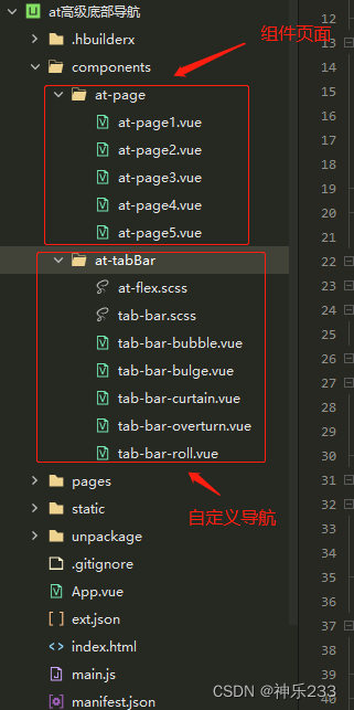
第一步:
上面的是index.vue页面,用来引入5种底部导航, 根据tabBarType来切换不同的底部导航。
<template>
	<view>
		<!-- 翻滚效果 -->
		<view v-if="tabBarType == 1 ">
			<at-tab-roll :fixed-bottom="false"></at-tab-roll>
		</view>

		<!-- 凸起效果 -->
		<view v-if="tabBarType == 2 ">
			<at-tab-bulge :fixed-bottom="false"></at-tab-bulge>
		</view>

		<!-- 冒泡效果 -->
		<view v-if="tabBarType == 3 ">
			<at-tab-bubble :fixed-bottom="false"></at-tab-bubble>
		</view>

		<!-- 窗帘效果 -->
		<view v-if="tabBarType == 4 ">
			<at-tab-curtain :fixed-bottom="false"></at-tab-curtain>
		</view>

		<!-- 翻转效果 -->
		<view v-if="tabBarType == 5 ">
			<at-tab-overturn :fixed-bottom="false"></at-tab-overturn>
		</view>
	</view>
</template>

<script>
	import tabBarRoll from "../../components/at-tabBar/tab-bar-roll.vue" // 翻滚切换方式
	import tabBarBulge from "../../components/at-tabBar/tab-bar-bulge.vue" // 凸起切换方式
	import tabBarBubble from "../../components/at-tabBar/tab-bar-bubble.vue" // 冒泡切换方式
	import tabBarCurtain from "../../components/at-tabBar/tab-bar-curtain.vue" // 窗帘切换方式
	import tabBarOverturn from "../../components/at-tabBar/tab-bar-overturn.vue" // 翻转切换方式
	export default {
		components: {
			"at-tab-roll": tabBarRoll,
			"at-tab-bulge": tabBarBulge,
			"at-tab-bubble": tabBarBubble,
			"at-tab-curtain": tabBarCurtain,
			"at-tab-overturn": tabBarOverturn
		},
		data() {
			return {
				tabBarType: 1,  // tabbar类型依次是 (引入方式顺序)
			}
		},
		methods: {

		}
	}
</script>

<style lang="scss" scoped>

</style>
第二步:
每个导航里面引入自定义页面,每切换下面的导航index, 会显示不同的组件页面。
<template>
	<view class="">
		<!-- 各组件页面 -->
		<view class="module">
			<view :style="{ display: current == 0 ? 'block' : 'none' }">
				<at-page1 ref="page1"></at-page1>
			</view>
			<view :style="{ display: current == 1 ? 'block' : 'none' }">
				<at-page2 ref="page2"></at-page2>
			</view>
			<view :style="{ display: current == 2 ? 'block' : 'none' }">
				<at-page3 ref="page3"></at-page3>
			</view>
			<view :style="{ display: current == 3 ? 'flex' : 'none' }">
				<at-page4 ref="page4"></at-page4>
			</view>
			<view :style="{ display: current == 4 ? 'flex' : 'none' }">
				<at-page5 ref="page5"></at-page5>
			</view>
		</view>

		<!-- tabbar组件 -->
		<view class="at-tab-bar">
			<view class="placeholder" v-if="fixedBottom"></view>
			<view class="bar h-flex-x h-flex-5" :class="{'fixed':fixedBottom}">
				<view class="item" v-for="(item,index) in  tabList" :key="index" :class="{'active':current == index,'recover':prevIndex == index}" @tap="change(index)">
					<view>
						<view class="h-flex-x h-flex-center">
							<image style="width: 48rpx;height: 48rpx;" :src="item.icon" mode=""></image>
						</view>
						<view class="h-flex-x h-flex-center">
							{{item.text}}
						</view>
					</view>
				</view>
			</view>
		</view>
	</view>
</template>

<script>
	import atPage1 from '@/components/at-page/at-page1.vue';
	import atPage2 from '@/components/at-page/at-page2.vue';
	import atPage3 from '@/components/at-page/at-page3.vue';
	import atPage4 from '@/components/at-page/at-page4.vue';
	import atPage5 from '@/components/at-page/at-page5.vue';

	export default {
		// 翻滚切换方式
		name: "atTabBarRoll",
		props: {
			// 固定底部
			fixedBottom: {
				type: Boolean,
				default: true
			}
		},
		components: {
			"at-page1":atPage1,
			"at-page2":atPage2,
			"at-page3":atPage3,
			'at-page4':atPage4,
			"at-page5":atPage5,
		},
		data() {
			return {
				prevIndex: -1,
				current: 0,
				tabList: [{
						"icon": "../../static/tabbar/home_no.png",
						"iconSelected": "../../static/tabbar/home.png",
						"text": "首页"
					},
					{
						"icon": "../../static/tabbar/order_no.png",
						"iconSelected": "../../static/tabbar/home.png",
						"text": "翻滚1"
					},
					{
						"icon": "../../static/tabbar/order_no.png",
						"iconSelected": "../../static/tabbar/home.png",
						"text": "翻滚2"
					},
					{
						"icon": "../../static/tabbar/store_no.png",
						"iconSelected": "../../static/tabbar/home.png",
						"text": "翻滚3"
					},
					{
						"icon": "../../static/tabbar/my_no.png",
						"iconSelected": "../../static/tabbar/home.png",
						"text": "翻滚4"
					},
				],
			};
		},
		methods: {
			change(index) {
				console.log(index);
				let that = this;
				if (that.current == index) return;
				that.prevIndex = that.current;
				that.current = index;

				if (that.current == 0) {
					that.$refs.page1.ontrueGetList();
				} else if (that.current == 1) {
					that.$refs.page2.ontrueGetList();
				} else if (that.current == 2) {
					that.$refs.page3.ontrueGetList();
				} else if (that.current == 3) {
					that.$refs.page4.ontrueGetList();
				} else if (that.current == 4) {
					that.$refs.page5.ontrueGetList();
				}
			}
		}
	}
</script>

<style lang="scss" scoped>
	@import "./at-flex.scss";
	@import "./tab-bar.scss";

	.module{
		display: flex;
		align-items: center;
		justify-content: center;
		// background: pink;
	}
	.at-tab-bar {
		padding: 30rpx 0 0;
		width: 100%;
		height: 160rpx;
		position: fixed;
		bottom: 0;
		left: 0;
		background-color: #82a9f2;
		.item {
			height: 100rpx;
			position: relative;
			overflow: hidden;

			>view {
				height: 200%;

				>view {
					height: 50%;
					color: #0043e3;
					font-size: 30rpx;
				}
			}

			&.active {
				&::before {
					content: '';
					display: block;
					position: absolute;
					width: 90rpx;
					height: 90rpx;
					box-sizing: border-box;
					border-color: #0043e3;
					border-style: solid;
					border-width: 2px;
					border-radius: 50%;
					top: 5rpx;
					left: 50%;
					margin-left: -45rpx;
					z-index: 1;

					animation: scale 0.3s ease 0s 1 normal;
					animation-fill-mode: forwards;
				}

				&::after {
					content: '';
					display: block;
					background-color: #0043e3;
					width: 4px;
					height: 4px;
					border-radius: 50%;
					position: absolute;
					bottom: 3px;
					left: 50%;
					margin-left: -2px;
					z-index: 2;
					opacity: 0;

					animation: fide-in 0.5s ease 0.3s 1 normal;
					animation-fill-mode: forwards;
				}

				>view {
					animation: translate 0.4s ease 0.3s 1 normal;
					// transform:translateY(-100rpx);
					animation-fill-mode: forwards;
				}
			}

			&.recover {
				>view {
					animation: recover 0.3s ease 0s 1 normal;
				}
			}
		}
	}

	// 恢复默认
	@keyframes recover {
		from {
			transform: translateY(-100rpx);
		}

		to {
			transform: translateY(0);
		}
	}

	// 转换移动
	@keyframes translate {
		from {
			transform: translateY(0);
		}

		to {
			transform: translateY(-100rpx);
		}
	}

	// 圆圈缩放
	@keyframes scale {
		0% {
			transform: scale(0, 0);
			opacity: 0;
			border-width: 2px;
		}

		50% {
			opacity: 0.5;
			border-width: 5px;
		}

		100% {
			transform: scale(0.95, 0.95);
			opacity: 0;
			border-width: 0px;
		}
	}

	// 淡入
	@keyframes fide-in {
		from {
			transform: scale(0, 0);
			opacity: 0;
		}

		to {
			transform: scale(1, 1);
			opacity: 1;
		}
	}
</style>
最后:
如果你看不太懂,没关系,附上个人gitee 项目地址: https://gitee.com/deer-stars/btm-seniorNavigation.git
如果文章对你帮助,请点个赞支持一下。


 2144
2144


 被折叠的 条评论
为什么被折叠?
被折叠的 条评论
为什么被折叠?
 到【灌水乐园】发言


