


一、设置具有特定比例的高宽比的容器
对于主页的轮播图容器,当宽度设置为100%后,想让高度为宽度的指定比例的值。这时候height就可以用上了。
  .app {
            width: 100%;
            height: 0;
            background-color: #3CC51F;
            padding-bottom: 40%;
            position: relative;
        }
以上代码就把宽度设置为指定高度的40%了,这个比例可以根据轮播图的实际高宽比来设置了。 再也不用担心图片变形了。
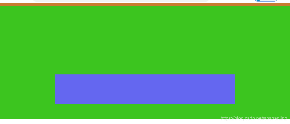
二、让子容器位于父容器特定的位置(比如居中)
子容器(bottom-bts)为固定宽度,需要绝对定位于父容器(app)的底部正中位置。这时候,可以在 子容器(bottom-bts)的外部包装一个height=0的容器,此包装容器设置为flex布局来居中子元素。代码如下:
 .app {
            width: 100%;
            height: 0;
            background-color: #3CC51F;
            padding-bottom: 40%;
            position: relative;
        }
        .bottom-bts-wrap {
            width: 100%;
            display: flex;
            justify-content: center;
            /*为了演示效果,特意给了一个高度和背景色*/
            height: 10px;
            background-color: #c87d2f;
        }
        .bottom-bts {
            position: absolute;
            background-color: #6467f0;
            width: 600px;
            height: 100px;
            bottom: 50px;
        }
<div class="app">
<div class="bottom-bts-wrap">
<div class="bottom-bts"></div>
</div>
</div>外包装div的作用只是让这个子元素居中对齐,绝对定位还是相对于app的位置进行定位。页面显示效果如下:
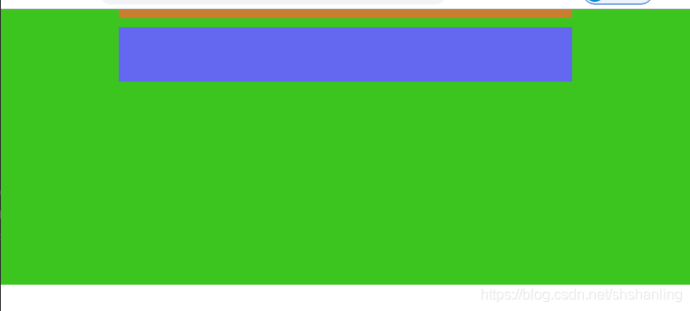
三、让子容器位于父容器特定的位置(比如居中)之2
代码原理和上面的基本类似,只不过这次子元素是fixed布局,并且外包装元素的宽度设置为和子元素的宽度一致。
 .app {
            width: 100%;
            height: 0;
            background-color: #3CC51F;
            padding-bottom: 40%;
            position: relative;
        }
        .fixed-nar-wrap {
            width: 500px;
            margin: 0 auto;
            /*为了演示效果,特意给了一个高度和背景色*/
            height: 10px;
            background-color: #c87d2f;
        }
        .fixed-nar {
            position: fixed;
            background-color: #6467f0;
            width: 500px;
            height: 60px;
            top: 20px;
        }
<div class="app">
<div class="fixed-nar-wrap">
<div class="fixed-nar"></div>
</div>
</div>上述代码由于外包装元素的宽度和子元素的宽度一致,包装元素已近居中了,因此子元素定位时只需要设置相对于页面顶部的top属性,就可以位于页面正中了。为什么要设置为宽度一致?这是因为如果宽度不一致,那么子元素就要用left属性来定位,而这个left是相对于整个页面的,这样包装元素就没有存在的意义了。这个包装元素的意义就是居中对于子元素。


 扫一扫
扫一扫


 490
490

 被折叠的 条评论
为什么被折叠?
被折叠的 条评论
为什么被折叠?
 到【灌水乐园】发言


