


2017Google Study Jams China:Google Study Jams活动官网
我的简书:简书
前言
习惯性的在文章开始先来一段介(fei)绍(hua)。Material Design是在Google I/O 2014提出的一套全新的设计语言规范。其目的是专为设计适用于多个平台和设备的视觉、运动与互动效果而制定的综合指南。 Android 现在已支持 Material Design 应用。 如果要在Android 应用中使用 Material Design,请遵循Material Design 规范内定义的指导方针,并使用Android 5.0(API级别21)及以上版本所提供的新组件和功能。
另外对于这次Study Jams举报的第二届Android开发者活动,我已经完成了结业APP—简云Note。一款很简单很水的APP,主要目的是为了应用Material Desian的组件和配色。欢迎各位小伙伴体验、点评:
所以本文主要以简云Note为例来讲述Material Design的使用。

一、Color—颜色的选择
1、灵感来源
颜色Material Design的色彩从当代建筑、路标、人行横道以及运动场馆中获取灵感,由此引发出大胆的颜色表达激活了色彩,与单调乏味的周边环境形成鲜明的对比。强调大胆的阴影和高光。引出意想不到且充满活力的颜色。
2、建议颜色
首先我们要选择APP的色彩、主题色等,这里推荐一个调色板网站,通过下图可以看到在这些基础的颜色真的很大胆鲜艳。其次点击某一项颜色的时候,会列举出以当前基础色为准的其他对比色,在左上角都标出了一个饱和度。官方建议我们以饱和度500的颜色作为APP的主色(colorPrimary),通过颜色的对比又发现饱和度700更适合作为状态栏的颜色,即比主色更暗一点的颜色(colorPrimaryDark),我还通过网上的一个教程说建议使用饱和度A200的颜色作为强调色(colorAccent)。有了这些建议我们可以更方便,快速的选择所要搭配的颜色。当然这只是一个建议,我个人觉得只要能将调色板上的这些颜色很好的搭配起来即可。

3、如何应用
在Android Studio新建项目之后,我们会发现项目中res/values/colors.xml中有三个默认的颜色,所以我们可以直接引用:
<resources>
    <color name="colorPrimary">#03a9f4</color>   // 主色,建议饱和度500
    <color name="colorPrimaryDark">#0288d1</color> // 暗色,建议饱和度700
    <color name="colorAccent">#FF4081</color> // 强调色,建议饱和度A200
</resources>
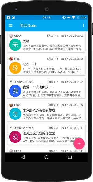
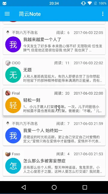
下图为简云Note首页运行图,可以看到除了主色、暗色和强调色之外,在左侧每一个字的背景又选择了其他饱和度为500的颜色,字体的颜色采用了黑色和灰色:
二、Icon—图标的设计
定义:系统图标的设计要简洁友好,有潮流感,有时候也可以设计的古怪幽默一点。要把很多含义精简到一个很简化的图标上表达出来,当然要保证在这么小的尺寸下,图标的意义仍然是清晰易懂。
设计原则:展示一些黑体的几何形状。一个简洁的黑体图形在采用对称一致的设计时,一样能够拥有独一无二的品质。
网格、比例和大小:图标网格是所有图标的基准网格并且具有特定的组成和比例。图标由一些对齐图标网格的平面几何形状组成。基本的平面几何形状有四种,具有特定尺寸以保证所有图标有一致的视觉感和比例。
两种形状相同尺寸不同的图标集供您在应用程序中使用:状态栏、上下文图标集和操作栏、桌面图标集。
了解了图标的这些规则之后,好像还是没有什么卵用,我还是不知道该怎么用,当然这些只是了解一下就可以了,我们又不是美工,不会做图。我们可以使用现有的资源来帮助我们独立完成开发所需要的icon:
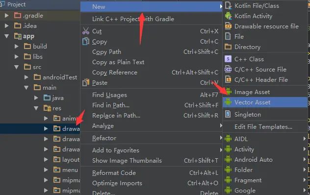
1、使用Android Studio创建icon(矢量图片):
在 Android 5.0(API 级别 21)及更高版本中,可自己定义矢量图片,而且图片可在不损失清晰度的情况下缩放。 只需一个资产文件即可创建一个矢量图像,而位图图像则需要为每个屏幕密度提供一个资产文件。 如果要创建一个矢量图像,请您在 XML 元素中定义形状的详情。
在res/drawable右击选择 New->Vector Asset:
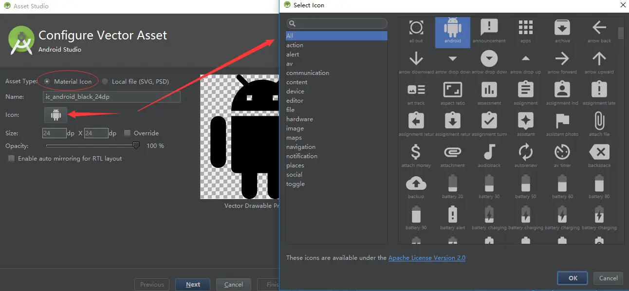
可以看到Android Studio为我们提供了Material icon,而且可以选择大小,颜色的填充饱和度,以及各种icon供我们选择:
创建之后会在drawable下生成一个xxx.xml的文件,我们可以在通过@drawable/xxx直接引用。文件内容如下,通过这种方式创建图标的话,优点在于节省资源,而且可以通过控制代码来直接更换颜色。
<vector xmlns:android="http://schemas.android.com/apk/res/android"
        android:width="24dp"
        android:height="24dp"
        android:viewportWidth="24.0"
        android:viewportHeight="24.0">
    <path
        android:fillColor="#FF000000"  //可以更换填充的颜色
        android:pathData="M11.99,2C6.47,2 2,6.47 2,12s4.47,10 9.99,10S22,17.53 22,12 17.52,2 11.99,2zM12,20c-4.42,0 -8,-3.58 -8,-8s3.58,-8 8,-8 8,3.58 8,8 -3.58,8 -8,8zM16.18,7.76l-1.06,1.06 -1.06,-1.06L13,8.82l1.06,1.06L13,10.94 14.06,12l1.06,-1.06L16.18,12l1.06,-1.06 -1.06,-1.06 1.06,-1.06zM7.82,12l1.06,-1.06L9.94,12 11,10.94 9.94,9.88 11,8.82 9.94,7.76 8.88,8.82 7.82,7.76 6.76,8.82l1.06,1.06 -1.06,1.06zM12,14c-2.33,0 -4.31,1.46 -5.11,3.5h10.22c-0.8,-2.04 -2.78,-3.5 -5.11,-3.5z"/>
</vector>
2、推荐几个下载Icon的网站(支持png、svg):
三、Components—组件的实践
1、Toolbar
- a、在app的build.gradle中添加所需依赖包(新建项目默认有):
dependencies {
    compile 'com.android.support:appcompat-v7:25.3.1'
    compile 'com.android.support:design:25.3.1'
}
- b、确保每个使用Toolbar的Activity继承AppCompatActivity(默认):
public class MyActivity extends AppCompatActivity {
  // ...
}- c、使用NoActionBar主题,去除默认的ActionBar:
<!-- res/values/styles.xml-->
<style name="AppTheme" parent="Theme.AppCompat.Light.NoActionBar">
        <!-- Customize your theme here. -->
        <item name="colorPrimary">@color/colorPrimary</item>
        <item name="colorPrimaryDark">@color/colorPrimaryDark</item>
        <item name="colorAccent">@color/colorAccent</item>
</style>

<!--manifest.xml中配置-->
<application
        android:name=".app.NoteApp"
        android:allowBackup="true"
        android:icon="@mipmap/ic_launcher"
        android:label="@string/app_name"
        android:roundIcon="@mipmap/ic_launcher_round"
        android:supportsRtl="true"
        android:theme="@style/AppTheme">  //引用主题
   // ...
</application>- d、在Activity的布局中添加Toolbar:
<android.support.v7.widget.Toolbar
   android:id="@+id/my_toolbar"
   android:layout_width="match_parent"
   android:layout_height="?attr/actionBarSize"
   android:background="?attr/colorPrimary"
   android:elevation="4dp" // 仰角
   android:theme="@style/ThemeOverlay.AppCompat.ActionBar"
app:popupTheme="@style/ThemeOverlay.AppCompat.Light"/>注:Material Design 规范建议标题栏具有4dp的仰角。
- e、将Toolbar设置为Activity的标题栏:
@Override
protected void onCreate(Bundle savedInstanceState) {
super.onCreate(savedInstanceState);
setContentView(R.layout.activity_my);
Toolbar myToolbar = (Toolbar) findViewById(R.id.my_toolbar);
setSupportActionBar(myToolbar);
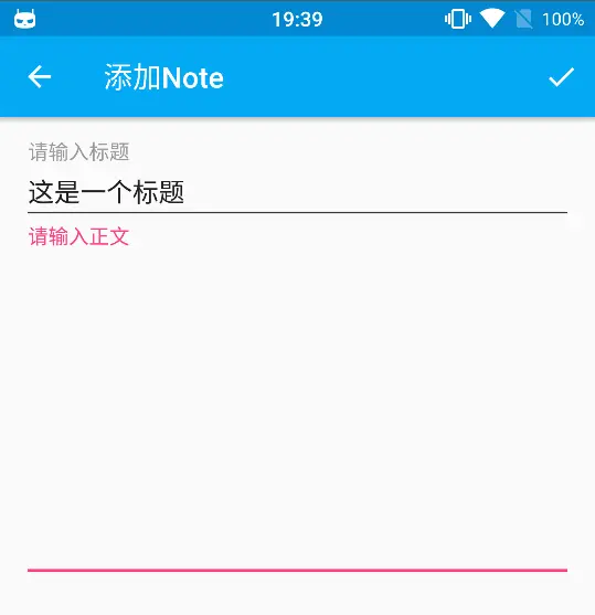
getSupportActionBar().setTitle("这是一个标题"); //设置标题
}
- f、为Toolbar添加Action Button(菜单操作按钮):
在res/menu下创建xxx.xml:
<?xml version="1.0" encoding="utf-8"?>
<menu xmlns:android="http://schemas.android.com/apk/res/android"
    xmlns:app="http://schemas.android.com/apk/res-auto">
    <item
        android:id="@+id/action_done"
        android:orderInCategory="100"
        android:title="@string/menu_note_done"
        android:icon="@mipmap/ic_action_done"
        app:showAsAction="always" />
</menu>
ps: app:showAsAction的属性值:
always: 无论是否溢出,总是显示;ifRoom: 根据屏幕的宽度来定是否显示;never:总是显示在溢出菜单中。
在Activity中重写onCreateOptionsMenu()关联菜单:
    @Override
    public boolean onCreateOptionsMenu(Menu menu) {
        getMenuInflater().inflate(R.menu.meun_add_or_edit, menu);
        return true;
    }

    @Override
    public boolean onOptionsItemSelected(MenuItem item) {
        int id = item.getItemId();

        if (id == R.id.action_done) {
           //点击菜单选项进行的操作
            return true;
        }

        return super.onOptionsItemSelected(item);
    }
拓展:APP中经常会实现沉浸式(透明式)状态栏,请参考我的另一篇文章:
2、SwipeRefreshLayout + RecyclerView + CardView
- 下拉刷新:*SwipeRefreshLayout为v4包下的一个组件,其动画也符合Material Design设计,通过给RecyclerView的addOnScrollListener()设置滑动监听来实现上拉加载更多*。每一个item是一个CardView,可以设置阴影,按下的动画等等。
<android.support.v4.widget.SwipeRefreshLayout
        android:id="@+id/swipeRefreshLayout"
        android:layout_width="match_parent"
        android:layout_height="match_parent"
        app:layout_behavior="@string/appbar_scrolling_view_behavior">

        <android.support.v7.widget.RecyclerView
            android:id="@+id/recyclerView"
            android:layout_width="match_parent"
            android:layout_height="match_parent"
            android:scrollbars="vertical">

        </android.support.v7.widget.RecyclerView>
    </android.support.v4.widget.SwipeRefreshLayout>
- 每一条item的CardView:
在app的build.gradle中添加所需依赖包:
dependencies {
   compile 'com.android.support:cardview-v7:25.3.1'
}
<android.support.v7.widget.RecyclerView
    android:id="@+id/my_recycler_view"
    android:scrollbars="vertical"
    android:layout_width="match_parent"
    android:layout_height="match_parent"/>
3、TextInputLayout
TextInputLayout的使用只需要在EditText外层嵌套一个布局即可,可以友好的提示用户输入框所填写的内容的要求:
<android.support.design.widget.TextInputLayout
            android:layout_width="match_parent"
            android:layout_height="wrap_content"
            app:hintTextAppearance="@style/MyHintText">

            <EditText
                android:id="@+id/ed_title"
                android:layout_width="match_parent"
                android:layout_height="wrap_content"
                android:gravity="top|left"
                android:hint="@string/input_title_hint"
                android:maxLines="1"
                android:theme="@style/MyEditText" />
</android.support.design.widget.TextInputLayout>
4、SncakBar 和 FloatingActionButton
- SncakBar是Toast的替代品,在页面底部弹出:
Snackbar.make(view, "这massage",Snackbar.LENGTH_LONG).show();
- FloatingActionButton浮动按钮:
<android.support.design.widget.FloatingActionButton
        android:id="@+id/fab"
        android:layout_width="wrap_content"
        android:layout_height="wrap_content"
        android:layout_gravity="bottom|end"
        android:layout_margin="@dimen/fab_margin"
        android:tag="@color/colorAccent"
        app:rippleColor="@color/click_bg"
        app:layout_anchor="@id/content"
        app:layout_anchorGravity="bottom|right"
        app:srcCompat="@mipmap/ic_action_add"/>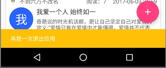
5、DrawerLayout + NavigationView
<?xml version="1.0" encoding="utf-8"?>
<android.support.v4.widget.DrawerLayout xmlns:android="http://schemas.android.com/apk/res/android"
    xmlns:app="http://schemas.android.com/apk/res-auto"
    xmlns:tools="http://schemas.android.com/tools"
    android:id="@+id/drawer_layout"
    android:layout_width="match_parent"
    android:layout_height="match_parent"
    tools:openDrawer="start">

    <include
        layout="@layout/app_bar_main"
        android:layout_width="match_parent"
        android:layout_height="match_parent" />

    <android.support.design.widget.NavigationView
        android:id="@+id/nav_view"
        android:layout_width="wrap_content"
        android:layout_height="match_parent"
        android:layout_gravity="start"
        app:headerLayout="@layout/nav_header_main"  //设置头布局
        app:menu="@menu/activity_main_drawer" /> //设置菜单项

</android.support.v4.widget.DrawerLayout>

6、CoordinatorLayout的使用
<?xml version="1.0" encoding="utf-8"?>
<android.support.design.widget.CoordinatorLayout xmlns:android="http://schemas.android.com/apk/res/android"
    xmlns:app="http://schemas.android.com/apk/res-auto"
    android:id="@+id/main_content"
    android:layout_width="match_parent"
    android:layout_height="match_parent"
    android:fitsSystemWindows="true">

    <android.support.design.widget.AppBarLayout
        android:id="@+id/appbar"
        android:layout_width="match_parent"
        android:layout_height="256dp"
        android:fitsSystemWindows="true"
        android:theme="@style/ThemeOverlay.AppCompat.Dark.ActionBar">

        <android.support.design.widget.CollapsingToolbarLayout
            android:id="@+id/collapsing_toolbar"
            android:layout_width="match_parent"
            android:layout_height="match_parent"
            android:fitsSystemWindows="true"
            app:contentScrim="@color/colorPrimary"
            app:expandedTitleMarginEnd="64dp"
            app:expandedTitleMarginStart="48dp"
            app:layout_scrollFlags="scroll|exitUntilCollapsed">

            <ImageView
                android:id="@+id/backdrop"
                android:layout_width="match_parent"
                android:layout_height="match_parent"
                android:fitsSystemWindows="true"
                android:scaleType="centerCrop"
                android:src="@mipmap/note_detail_bg"
                app:layout_collapseMode="parallax" />

            <android.support.v7.widget.Toolbar
                android:id="@+id/toolbar"
                style="@style/SimpleToolbarStyle"
                android:layout_width="match_parent"
                android:layout_height="?attr/actionBarSize"
                app:layout_collapseMode="pin"
                app:popupTheme="@style/ThemeOverlay.AppCompat.Light" />

        </android.support.design.widget.CollapsingToolbarLayout>

    </android.support.design.widget.AppBarLayout>

    <android.support.v4.widget.NestedScrollView
        android:layout_width="match_parent"
        android:layout_height="match_parent"
        app:layout_behavior="@string/appbar_scrolling_view_behavior">
            <LinearLayout
                android:layout_width="match_parent"
                android:layout_height="match_parent"
                android:orientation="vertical">
           //...
            </LinearLayout>

    </android.support.v4.widget.NestedScrollView>

    <android.support.design.widget.FloatingActionButton
        android:id="@+id/fab_detail_favorite"
        android:layout_width="wrap_content"
        android:layout_height="wrap_content"
        android:layout_margin="@dimen/fab_margin"
        android:clickable="true"
        android:src="@mipmap/ic_action_favorite_border"
        app:layout_anchor="@id/appbar"
        app:layout_anchorGravity="bottom|right|end" />

</android.support.design.widget.CoordinatorLayout>

7、过渡动画
采用第三方库,添加相关依赖:
compile 'com.github.XunMengWinter:CircularAnim:0.3.4'
代码中应用:
CircularAnim.fullActivity(MainActivity.this, view)
                .colorOrImageRes(R.color.colorPrimary)
                .duration(300)
                .go(new CircularAnim.OnAnimationEndListener() {
                    @Override
                    public void onAnimationEnd() {
                        //具体操作
                    }
                });
8、高度(Z轴)、阴影和触摸反馈
Toolbar:设置android:elevation=”4dp”来设置仰角高度,且点击Aciton Buttn时Toolbar自带触摸按下效果。
CardView设置android:clickable=”true”和android:foreground=”?android:attr/selectableItemBackground”可以出现一个触摸反馈,其次还可以增加Z轴的考虑,当我们点击CardView的时候,给一个抬起的操作,通过 android:stateListAnimator=”@animator/selector_cardview”进行引用:
在res下新建animator文件夹,然后新建xxx.xml:
<!-- res/animtor/xxx.xml -->
<?xml version="1.0" encoding="utf-8"?>
<selector xmlns:android="http://schemas.android.com/apk/res/android">

    <item   android:state_pressed="true">
        <objectAnimator
            android:duration="@android:integer/config_shortAnimTime"
            android:propertyName="translationZ"
            android:valueTo="6dp"
            android:valueType="floatType"></objectAnimator>
    </item>
    <item>
        <objectAnimator
            android:duration="@android:integer/config_shortAnimTime"
            android:propertyName="translationZ"
            android:valueTo="0dp"
            android:valueType="floatType"></objectAnimator>
    </item>

</selector>
- Button点击反馈,apiv21+显示水波纹操作,apiv21以下显示渐变,通过设置android:background=“@drawable/selector_button”来自动进行版本兼容:
res/drawable/selector_button.xml:
<?xml version="1.0" encoding="utf-8"?>
<selector xmlns:android="http://schemas.android.com/apk/res/android">
    <item android:drawable="@drawable/shape_btn_pressed" android:state_pressed="true"/>
    <item android:drawable="@color/disable_gray" android:state_enabled="false"/>
    <item android:drawable="@drawable/shape_btn_normal"/>
</selector>
res/drawable-v21/selector_button.xml:
<?xml version="1.0" encoding="utf-8"?>
<ripple xmlns:android="http://schemas.android.com/apk/res/android"
        android:color="@color/colorPrimaryDark">//这里是扩散水波纹的色值
    <!--<item android:drawable="@drawable/shape_btn_normal"/>-->
    <item>
        <selector>
            <item
                android:drawable="@drawable/shape_btn_normal"
                android:state_pressed="false">
            </item>
            <item
                android:drawable="@color/disable_gray"
                android:state_enabled="false">
            </item>
        </selector>
    </item>
</ripple>

建议:如果想要更深入的学习Material Design,请参考Material Design的最佳实例APP—Google Play。


 239
239

 被折叠的 条评论
为什么被折叠?
被折叠的 条评论
为什么被折叠?
 到【灌水乐园】发言


