


需求
Ant Design Vue1想要实现控制表头展示、隐藏、排序
功能只针对Ant Design Vue1,Ant Design Vue3以上版本,带有完整成熟的功能
布局的拖拽功能使用draggable实现,需要安装
draggable使用教程在官方文档很齐全,下边直接贴官网链接
链接: vue.draggable中文文档
下载draggable
npm i -S vuedraggable
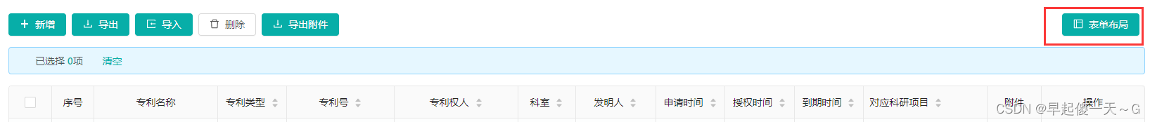
效果图
调整布局按钮
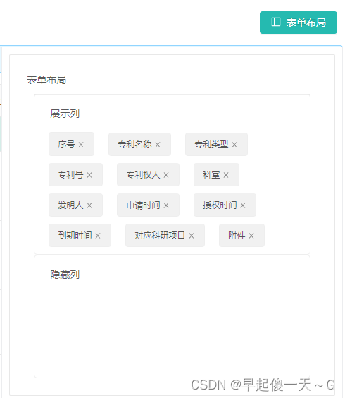
调整布局展示效果
标签可拖拽、点击x号控制表头展示、隐藏、排序
完整代码
列表页面-按钮、页面引入
按钮、页面引入
<!-- 自定义筛选菜单的插槽:隐藏/展示列 add by start --><!-- 按钮 -->
      <span style="float: right;overflow: hidden;" class="table-page-search-submitButtons">
        <a-button type="primary" style="margin-left: 8px" @click="handleTable"><a-icon type="layout"/>表单布局</a-button>
      </span>
      <column-draggable-select-tag :originalColumns="columns" :tableSelectVisible="tableSelectVisible" @change="loadColumns"/>
      <!-- 自定义筛选菜单的插槽:隐藏/展示列 add by end -->
导入页面和js
//自定义筛选菜单的插槽:隐藏/展示列 add by start
import {ColumnShowJs} from './columnShowJs'
import ColumnDraggableSelectTag from './columnDraggableSelectTag'
//自定义筛选菜单的插槽:隐藏/展示列 add by end
注册组件
components: {
    //自定义筛选菜单的插槽:隐藏/展示列 add by start
    ColumnDraggableSelectTag,
    //自定义筛选菜单的插槽:隐藏/展示列 add by end
  },
混入js
mixins: [
    //自定义筛选菜单的插槽:隐藏/展示列 add by start
    ColumnShowJs,
    //自定义筛选菜单的插槽:隐藏/展示列 add by end
  ],
vue页面:columnCheckboxSelectTag.vue
<template>
  <div class="right-btns">
    <!-- 弹出框 -->
    <div class="tableSelect" v-if="tableSelectVisible">
      <a-card>
        <div>表单布局</div>
        <div class="itxst">
          <div class="col">
            <div class="title">展示列</div>
            <draggable v-model="showColumn" group="site" animation="300" dragClass="dragClass" ghostClass="ghostClass" chosenClass="chosenClass" @start="onStart" @end="onEnd">
              <transition-group  :style="style">
                <a-tag class="item" v-for="(item, index) in showColumn"
                       style="margin-top: 10px"
                       :key="item.dataIndex"
                       closable
                       @close="closeFilter(1, item, index)"
                >{{item.title}}</a-tag>
              </transition-group>
            </draggable>
          </div>
          <div :style="{width: '100%',border: '1px solid #e9e9e9',background: '#fff',}">
          </div>
          <div class="col">
            <div class="title">隐藏列</div>
            <draggable v-model="hiddenColumn" group="site" animation="100" dragClass="dragClass" ghostClass="ghostClass" chosenClass="chosenClass" @start="onStart" @end="onEnd">
              <transition-group :style="style">
                <a-tag class="item" v-for="(item, index) in hiddenColumn"
                       style="margin-top: 10px"
                       :key="item.dataIndex"
                       closable
                       @close="closeFilter(2, item, index)"
                >{{item.title}}</a-tag>
              </transition-group>
            </draggable>
          </div>
        </div>
      </a-card>
    </div>
  </div>
</template>
<script>
//导入draggable组件
import draggable from 'vuedraggable'
export default {
  //注册draggable组件
  components: {
    draggable,
  },
  props: {
    tableSelectVisible: false,
    // 原始表头
    originalColumns:{
      type: Array,
      default: ()=>[]
    },
  },
  created() {
    // 实例创建完成将columns备份给filterColumns
    this.showColumn = [];
    this.originalColumns.filter(item =>{
      if (item.dataIndex !== 'action') {
        this.showColumn.push(item);
      }
    })
  },
  data() {
    return {
      drag:false,
      hiddenColumn: [],
      showColumn: [],
      //空数组之在的样式,设置了这个样式才能拖入
      style:'min-height:120px;display: block;',
    };
  },
  methods: {
    //关闭列
    closeFilter(type, item, index){
      if(type ==1){
        this.hiddenColumn.push(item);
        this.showColumn.splice(index, 1);
      }else{
        this.showColumn.push(item);
        this.hiddenColumn.splice(index, 1);
      }
      console.log("closeFilter:" + JSON.stringify(this.showColumn))
      this.checkChange(this.showColumn);
    },
    //开始拖拽事件
    onStart(){
      this.drag=true;
    },
    //拖拽结束事件
    onEnd() {
      this.drag=false;
      console.log(JSON.stringify(this.showColumn))
      this.checkChange(this.showColumn);
    },
    // 多选框的事件回调
    checkChange(checked) {
      // 初始是默认全选的,假设此刻点击了name的选择框
      // const columns = this.originalColumns
      // const filterValue = [];
      // 核心部分,数组过滤循环遍历columns,如果选择的值中包含dataIndex则为true并暴露出去,反之亦然
      // for(let itemChecked of checked){
      //   for(let item of columns){
      //     if (itemChecked.dataIndex == item.dataIndex){
      //       // 当暴露值为true时,循环遍历的值会赋给filterValue
      //       filterValue.push(item)
      //     }
      //   }
      // }
      this.$emit('change', checked);
    },
  },
};
</script>
<style scoped>
/*定义要拖拽元素的样式*/
.ghostClass {
  background-color: #f1f1f6 !important;
}

.chosenClass {
  background-color: #f1f1f6 !important;
  opacity: 1 !important;
}

.dragClass {
  background-color: #f1f1f6 !important;
  opacity: 1 !important;
  box-shadow: none !important;
  outline: none !important;
  background-image: none !important;
}

.itxst {
  margin: 10px;
}

.title {
  padding: 6px 12px;
}

.col {
  width: 100%;
  flex: 1;
  padding: 10px;
  border: solid 1px #eee;
  border-radius: 5px;
  float: left;
}

.col + .col {
  margin-left: 10px;
}
.item {
  padding: 6px 12px;
  margin: 0px 10px 0px 10px;
  border: solid 1px #eee;
  background-color: #f1f1f1;
}

.item:hover {
  background-color: #fdfdfd;
  cursor: move;
}

.item + .item {
  border-top: none;
  margin-top: 6px;
}
/*选中样式*/
.chosen {
  border: solid 1px #3089dc !important;
}

.right-btns{
  position:relative;
  .tableSelect{
    position: absolute;
    background:#fff;
    border:1px solid #ecedef;
    display:inline-block;
    top: 10px;
    right: 0;
    z-index: 100;
    padding: 10px;
    width: 30%;
  }
}
</style>
js ColumnShowJs
/**
 * 自定义筛选菜单的插槽:隐藏/展示列
 */
export const ColumnShowJs = {
  data(){
    return {
      // 自定义筛选菜单的插槽:隐藏/展示列 add by start
      tableSelectVisible: false,
      // table的列需要由columns改成filterColumn
      filterColumn: [],
      // 自定义筛选菜单的插槽:隐藏/展示列 add by end
    }
  },
  created() {
    // 自定义筛选菜单的插槽:隐藏/展示列 add by start
    // 实例创建完成将columns备份给filterColumns
    this.filterColumn = this.columns;
    // 自定义筛选菜单的插槽:隐藏/展示列 add by end
  },
  computed: {
    // 用计算属性取出columns的dataIndex,作为多选框的选项数据
    checkColumn: function() {
      return this.columns.map(item => {
        if (item.dataIndex === 'action') {
          return {label: item.title, value: item.dataIndex, disabled: true}
        }
        return {label: item.title, value: item.dataIndex}
      })
    },
    // 用计算属性取出columns的dataIndex,作为多选框的选项数据
    checkValue: function() {
      return this.columns.map(item => item.dataIndex)
    }
  },
  methods:{
    handleTable(){//打开菜单栏
      this.tableSelectVisible= this.tableSelectVisible ? false : true;
    },
    // 自定义筛选菜单的插槽:隐藏/展示列 add by start
    // 多选框的事件回调
    loadColumns(checked) {
      this.filterColumn = [];
      checked.filter(item =>{
        if (item.dataIndex !== 'action') {
          this.filterColumn.push(item);
        }
      })
      this.filterColumn.push(
        {
          title: '操作',
          dataIndex: 'action',
          align: "center",
          fixed: "right",
          width: 147,
          scopedSlots: {
            customRender: 'action',
          }
        }
      )
      // this.$emit('change', filterValue);
    },
    // 自定义筛选菜单的插槽:隐藏/展示列 add by end
  }

}


 6483
6483


 被折叠的 条评论
为什么被折叠?
被折叠的 条评论
为什么被折叠?
 到【灌水乐园】发言


