


1.padding 不可用为负值
W3School padding 。margin 可以;
2.背景图片居中铺平占满
background url('/images/login-bg.png') no-repeat center center;
background-size: 100% 100%;
3.居中对齐
不知元素自身宽度
left: 50%;
transform: translateX(-50%);
4.单行或多行文字省略
单行
div {
    width: 70px;// 必须设置宽度
    overflow: hidden;// 溢出隐藏
    text-overflow: ellipsis;// 用 ... 代替
    white-space: nowrap;// 不换行(单行)
}
多行
div {
    height: 35px;
    overflow: hidden;
    display: -webkit-box;
    -webkit-box-orient: vertical;
    -webkit-line-clamp: 2;// 第 2 行省略,同理为 1 则是第 1 行省略。但注意要控制高度
}
5.原生 input 改变 placeholder 字体颜色
// WebKit 谷歌
input::-webkit-input-placeholder {
    color: #8ba6cd;
}
// Mozilla Firefox 4 - 18 适配火狐
input::-moz-placeholder {
    color: #8ba6cd;
}
// Mozilla Firefox 19+ 适配火狐
input::-moz-placeholder {
    color: #8ba6cd;
}
// IE 10+
input:-ms-input-placeholder {
    color: #8ba6cd;
}
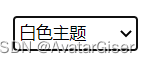
6.原生 select 标签选择后的边框修改
![[外链图片转存失败,源站可能有防盗链机制,建议将图片保存下来直接上传(img-uCg0XQzb-1667745825610)(../images/原生 select 边框01.png)]
[外链图片转存失败,源站可能有防盗链机制,建议将图片保存下来直接上传(img-tn9Bsvk8-1667745825611)(../images/原生 select 边框02.png)]
左图是初始化边框样式,右图是选择后,自带了粗边框。太丑了....要去除,修改如下:](https://img-blog.csdnimg.cn/352541e3caef4c57ab055553ae188cb4.png)
select:focus-visible {
    /* outline: -webkit-focus-ring-color auto 1px; 这是谷歌浏览器的原生样式*/
    outline: none;
}
7.字体颜色渐变
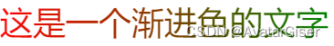
html
<span>这是一个渐进色的文字</span>
CSS
-
文字 color 没有渐变设置,这里使用 background 做背景渐进色,然后设置 background-clip:text 裁剪,最后让 color 为透明。以此达到渐变效果;
-
一定要先设置 background 再 设置 background-clip 做裁剪,是有先后顺序的。否则,无效!!!
注意:目前只在 Chrome 和 Microsoft Edge上测试可用。
span {
    font-size: 36px;
    background: linear-gradient(to right,red, green);
    background-clip: text;
    -o-background-clip: text;
    -ms-background-clip: text;
    -moz-background-clip: text;
    -webkit-background-clip: text;
    color: transparent;
}
8.两边细中间粗的渐变直线效果

html
<div class="line"></div>
css
  .line {
    width: 380px;
    height: 1px;
    background-image: linear-gradient(90deg, rgba(21,94,162,0)0%, rgba(21,94,162,0.5)50%,rgba(21,94,162,0)100%);
    opacity: 0.46;
  }
9.英文单词首字母大写
<span style="text-transform:capitalize">hello world</span>
注意:对每个单词的首字母都改为大写
单词capitalize 百度翻译如下:
![[外链图片转存失败,源站可能有防盗链机制,建议将图片保存下来直接上传(img-8GSJGm8H-1668069746223)(../images/capitalize.png)]](https://img-blog.csdnimg.cn/c00e01a2546e4e058748ad1315b94637.png)
10.正方形列表
![[外链图片转存失败,源站可能有防盗链机制,建议将图片保存下来直接上传(img-jANAtJjb-1668069746224)(../images/正方形列表.png)]](https://img-blog.csdnimg.cn/478ab778ac704466886d2137fc9bc5a7.png)
html:默认是圆形
<ul>
	<li>one</li>
	<li>two</li>
	<li>three</li>
</ul>
css
ul {
	list-style-type: square;
	// list-style-type: none;// 取消圆点
}
11. 元素是否对鼠标事件做出反应
pointer-events: none;// 不反应,类似挖空效果
12.改变 li 点符号
li::marker {
	content: '>';
}
li::marker {
    color:#69afe5;
    margin-right: 5px;
    font-size: 20px;
}
13.清明站点变灰
CSS3 filter(滤镜):定义了元素(通常是)的可视效果(例如:模糊与饱和度)。
html{
  filter: grayscale(100%);
  -webkit-filter: grayscale(100%);
  -moz-filter: grayscale(100%);
  -ms-filter: grayscale(100%);
  -o-filter: grayscale(100%);
}
14.Html 导入其它字体
15倾斜 30°
// 向右
transform: skewX(-30deg);
// 向左
transform: skewX(30deg);
16.input 聚焦时,父 div 边框变化使用
input-div:focus-within {
	border-color: red;
}
stylus写法
input-div {
	&:focus-within {
        border-color: red;
    }
}
17.滚动条
::-webkit-scrollbar {/*滚动条整体样式*/
    width: 6px;     /*高宽分别对应横竖滚动条的尺寸*/
    height: 6px;
}
::-webkit-scrollbar-thumb {/*滚动条里面小方块*/
    border-radius: 1px;
    background: rgb(43, 103, 176);
}
::-webkit-scrollbar-track {/*滚动条里面轨道*/
    background: rgb(20, 67, 125);
}
::-webkit-scrollbar-corner {/* 边角 */
    background: rgb(20, 67, 125);
}
18.pointer-events
pointer-events:设置元素是否对鼠标事件做出反应。
此篇说的特别详细。
none 和 auto(默认值)


 1022
1022


 被折叠的 条评论
为什么被折叠?
被折叠的 条评论
为什么被折叠?
 到【灌水乐园】发言


